Currency
About Andrew Cusack
 Writer, web designer, etc.; born in New York; educated in Argentina, Scotland, and South Africa; now based in London.
 read more
News
Blogs
Reviews & Periodicals
Arts & Design
World
France
Mitteleuropa
Knickerbockers
Argentina
The Levant
Africa
Cape of Good Hope
Netherlands
Scandinavia
Québec
India
Muscovy
Germany
Academica
A Dwiggins Roundup
WE LOVE FEW things more than a talent rediscovered after decades of neglect, and in the realms of graphic design no one fits this bill better than William Addison Dwiggins (1880-1956).
This man was a type designer, calligrapher, illustrator, book designer, and commercial artist with a good eye and just the right level of whimsy.
Much of the revival of interest is thanks to Bruce Kennett and his book W. A. Dwiggins: A Life in Design which has done a great deal to spread the gospel of Dwiggins.
Here below are a series of links about the man and his work. (more…)
A Fifty Pound Note
The recent arrival of the new fiver has caused some flurry of excitement and one of the notes finally reached the Cusackian exchequer via the barmaid at the Ox Row Inn in Salisbury on Friday night. I’m indifferent to the design; it’s inoffensive but I’d prefer to see Churchill depicted in his coronation robes rather than Yousuf Karsh’s iconic photograph.
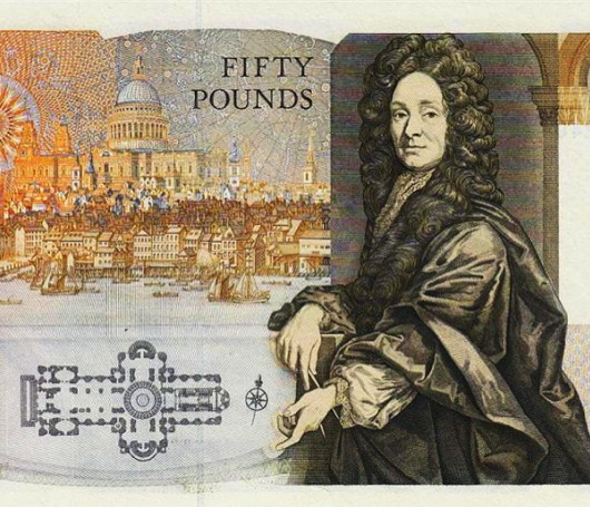
My favourite Bank of England note, however, remains the Series D £50 first issued in 1981 designed by the Black Country artist Harry Eccleston. Sir Christopher Wren lookings crackingly baroque, and St Paul’s Cathedral looms like a great ship over the City of London he helped to rebuild after the Great Fire 350 years ago.
Eccleston was the first banknote designer to work fulltime for the Bank of England which he joined in 1958, retiring in 1983, and introduced the concept of historical figures from British history gracing the back of the notes (which are of course fronted with an image of the Sovereign). This particular note was the first fifty-pound note to be issued since 1943. It was replaced in 1994 and withdrawn from circulation two years later.
South Africa Gets Personal with Banknotes
New series will feature face of former president Nelson Mandela
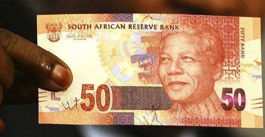
South African President Jacob Zuma recently announced that the country’s central bank would issue a new series of banknotes featuring his world-famous predecessor, Nelson Mandela. As the South African Rand is a widely used currency throughout southern Africa, its banknotes have become well-known throughout the region, and current international standards recommend banknotes change their security features every seven-to-ten years. The changeover will take place as the South African government makes a significant investment in the state-owned South Africa Bank Note Company which also prints banknotes for a number of neighbouring countries. SABN hopes to upgrade its printing facilities to take into account the most recent improvements in banknote security features in order to prevent counterfeiting.

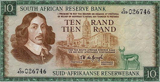
I’ll rather miss the old notes (above), branded into my memory from my time living in South Africa. For some reason (the exchange rate, perhaps?) I have nought but happy memories of the Rand and always enjoyed the beautiful animals in a variety of colours printed on the notes. While Mandela will feature on one side of the new issue of notes, the ‘Big Five’ game animals will continue to grace the reverse. The inoffensive animal theme was introduced to keep the currency relatively apolitical, and despite the widespread admiration for Mandela across South Africa, the introduction of the former president’s visage on bank notes is another symbolic way of imprinting the ANC’s grasp on power into the population’s psyche.
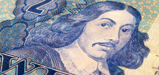
As for myself, being obsessed with everything Cape Dutch and Afrikaans, I rather miss the old image of Jan van Riebeeck which once graced South Africa’s rand notes.
The New Zealand Half-Crown
In the 1930s, New Zealand devalued its pound in relation to sterling and a whole new series of coinage and bank notes were introduced under the authority of the Reserve Bank of New Zealand. The government commissioned the accomplished English numismatic artist George Kruger Gray to design the dominion’s new coinage, which included this very handsome half-crown. It’s a splendid convergence between Maori and European design, two cooperating strains of New Zealand’s national culture. The country’s shield of arms is topped by a Tudor crown and flanked by indigenous motifs. (more…)
‘Handmade’ by Xavi García
‘A reaction to the soullessness of digital design’
Not many artists or designers have a business degree from Salamanca or studied management in Gothenburg. Xavi García has, though, and it’s obvious his grounding in the financial realm had an influence on his personal art project ‘Handmade’ — a banknote meticulously created by hand using drypoint, screenprinting, and stamps on newsprint. García describes the project as “a reaction to the soullessness of digital design”. (more…)
Some New York Coinage
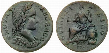
IT MAY INTEREST our readers to know that before the Feddle Gummint started throwing its weight around, the Great State of New York was in the habit of minting its own coinage. One of the most famous of the coins produced during the era is the 1787 ‘Nova Eborac’, so called for its abbreviation of Nova Eboracum; that’s ‘New York’ in the language of our ancient Roman forbearers.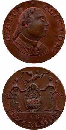 All decent people being lovers of monarchy, the New Yorkers of yore found themselves in a slight predicament. Their king had granted them independence four years earlier, but George III (the forgetful man!) neglected to indicate who would be king once he relinquished the sacred office. Every country must have a king — if not, then whose face would go on coins and such? “Not to worry,” saith the designer of the Nova Eborac. “We’ll stick a king on and just not say who he is.” And so they did, as seen on the obverse of the above Nova Eborac. The reverse depicts a figure who looks suspiciously like the Britannia on the old British coins. Old habits die hard. Around this Britannia-esque figure is the inscription VIRT. ET LIB for Virtus et Libertas – Virtue and Liberty.
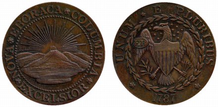
One Thomas Machin, however, clearly thought this was a bit silly and so decided to simply put the Governor on the coins he produced. His coins (seen on the right) show Gov. George Clinton on the obverse and a depiction of the arms of the Empire State on the reverse (they also grace the banner of this webpage). A chap named Ephraim Brasher went a little further and depicted neither the anony-king nor the governor but instead put depictions of heraldic arms on both side of the coin; New York on the obverse and the United States on the reverse. These coins are known as ‘Brasher’s Dubloons’ and the front and back can be seen below.
Previously: New York Currency
New York Currency
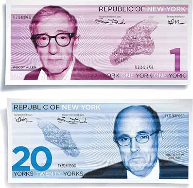
When New York magazine speculated on the prospects of an independent New York they postulated Woody Allen gracing a “1 York” note with Rudolph Guliani on the “20 York” note. In Caledonia they’re used to dealing with many different varieties of banknotes. In Scotland alone there are three different institutions authorised ot print currency: the Royal Bank of Scotland, the Bank of Scotland, and the Clydesdale Bank. Northern Ireland, meanwhile, has four: the Bank of Ireland, Ulster Bank, Northern Bank, and First Trust Bank. England and Wales, on the other hand, have but the Bank of England to issue legal tender, that institution having been granted a monopoly so to do in 1921. [More on British banknotes]
Nonetheless, this got me to thinking who and what I would put on New York bank notes if we had them. First of all, none of this “York” business; dollars they are and dollars they would remain in my land of fancy. Anyhow, here’s what I generally came up with: (more…)
Res Publica Nova Eboraci

Gothamist picks up the idea of the City of New York seceding from either the State or the Country. Normally I’m in favor of anything seceding from anything else. However, the City and State have to stick together. I wouldn’t mind the State of New York regaining complete sovereignty, but I think we’d want to take Connecticut and northern New Jersey with us for the sake of geographic integrity.
New York currency illustrations from an article on secession in New York magazine.
Search
Instagram: @andcusack
Click here for my Instagram photos.Most Recent Posts
- Waarburg October 2, 2024
- A Prize for the General September 23, 2024
- Articles of Note: 17 September 2024 September 17, 2024
- Equality September 16, 2024
- Rough Notes of Kinderhook September 13, 2024
Most Recent Comments
Book Wishlist
Monthly Archives
Categories

