About Andrew Cusack
 Writer, web designer, etc.; born in New York; educated in Argentina, Scotland, and South Africa; now based in London.
 read more
News
Blogs
Reviews & Periodicals
Arts & Design
World
France
Mitteleuropa
Knickerbockers
Argentina
The Levant
Africa
Cape of Good Hope
Netherlands
Scandinavia
Québec
India
Muscovy
Germany
Academica
The Architecture of Immaturity

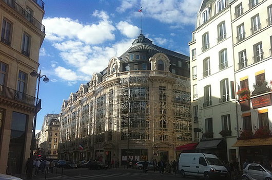
Have you ever come across the French Ministry of Culture on the Rue Saint-Honoré? It’s a perfect example of the architecture of immaturity. The government ministry was formerly strewn across nineteen different sites throughout Paris. The decision was made to consolidate their offices in one place, and the suitably central location near the Palais Royal was chosen.
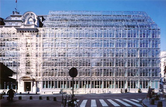
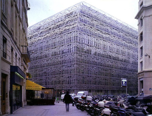
The main building on the site is a handsome building from the late nineteenth-century or at the latest 1900s, with a modern 1960s office building stuck behind it. The Ministère chose architect Francis Soler to “unify” the buildings into one. At first, this was meant to be done solely through an interior reorganisation, but Soler decided to add a strange grille to the façade.

A certain unity is achieved, but to what end? Soler’s veil feels like a cheap trick, and an unsuccessful one at that since through the grille we still perceive the difference in the two components of the building. It achieves little more than scarring an otherwise handsome and contextual façade. Furthermore, the windows and doors chosen for the renovation of the older building are inappropriate and feel out of place.
Another point is the failed engagement with the street. This area has many shops, restaurants, and the like and yet the Ministry has decided to keep for itself even the street-level space in the building. Why not rent the space out to various enterprises, which would act as a source of revenue and integrate the building better into the neighbourhood?

Search
Instagram: @andcusack
Click here for my Instagram photos.Most Recent Posts
- Gellner’s Prague December 19, 2024
- Monsieur Bayrou December 18, 2024
- Dempsey Heiner, Art Critic December 17, 2024
- Vote AR December 16, 2024
- Articles of Note: 12 December 2024 December 12, 2024
Most Recent Comments
Book Wishlist
Monthly Archives
Categories


I must say, when I saw the first picture and read the headline, I was a bit taken aback. I thought, “why, that’s a perfectly charming building in the process of being cleaned. See, it’s covered in scaffolding.” How very, very odd.
I completely agree. It’s such a shame that Paris is trading in its spectacular designs for such ambiguous and unnecessarily ‘edgy’ rot that utterly fails to impress. Architects should leave their theorizing for the folio, and try to use their common-sense in the field.
I would also wonder, as any true canadian would, about how those iron (?) grilles hold up in the winter, and whether there have been a spike in icicle-related fatalities since the 1960s…
That’s exactly what I thought at first glance–scaffolding. Reminds me of the renovations done to the Carmel of Lisieux, a perfectly beautiful little chapel whose walls are now dressed in horizontal and irregularly spaced wood paneling. I honestly wondered when I first walked in whether or not the place was under construction. It wasn’t.
Cultural vandalism from the Ministry of Culture. Is there a ministry of culture anywhere which has actually made a contribution to culture?
I came over here to say the same thing Dino did. They should all be fired.
I, too, thought it was under scaffolding. Quelle horreur!
Thank you for your intelligent blogs.
This is beyond immaturity. Deliberately defacing two buildings and demanding the public accept this vandalism as architecture is decadence worthy of Nero.
They did the opposite for the old GPO building in Edinburgh: they refurbished the exterior and built a striking office complex within.
http://www.flickr.com/photos/sh0rty/114688907/
http://www.flickr.com/photos/sh0rty/114689517/in/photostream/
The contrast couldn’t be more remarkable.
Pity about Princes Street, though!
Also, didn’t the Vandals/Goths invent the concept of a “Ministry of Culture”?
Isn’t the very concept Philistine?
I see I’m not alone in mistaking the Soler’s design for scaffolding. They could have saved money by simply hiring one of those contractors in Manhattan who puts up scaffolding and then never gets around to finishing his job, so the scaffolding stays on for years. To think that I just saw an article a few weeks ago about scaffolding as a Manhattan eyesore. The good thing about this, I guess, is that if they later change their minds, it’s easy to remove without doing much to the real building.