About Andrew Cusack
 Writer, web designer, etc.; born in New York; educated in Argentina, Scotland, and South Africa; now based in London.
 read more
News
Blogs
Reviews & Periodicals
Arts & Design
World
France
Mitteleuropa
Knickerbockers
Argentina
The Levant
Africa
Cape of Good Hope
Netherlands
Scandinavia
Québec
India
Muscovy
Germany
Academica
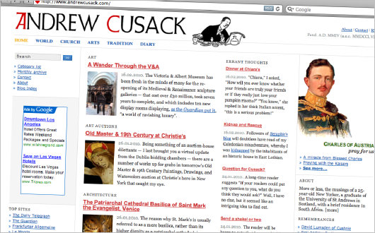
The new look of the place

I know, it’s disgraceful. Wasn’t this place just redesigned in November? That was practically yesterday! Still, one is sometimes bitten by a bug and must simply get it out of one’s system without complaining. I hope readers will forgive this recent set of changes; I’m sure you are all as opposed to change as I am.
This is perhaps the most radical redesign of our little corner of the web ever. The front page at andrewcusack.com now features little snippets and extracts from the latest posts, but blog posts can still be viewed in the previous, chronological fashion by clicking ‘Blog Index’ in the left-hand column.
The Google ads have returned, and I hope our readers will be vigilant in rooting out any nefarious or inappropriate ads that the lords of misrule place mischievously in our midst. The way to point out an inappropriate ad is to note the web address (www.whatever-it-is.com, for example) and to e-mail me so that I can add that address to the banned list.
Search
Instagram: @andcusack
Click here for my Instagram photos.Most Recent Posts
- Waarburg October 2, 2024
- A Prize for the General September 23, 2024
- Articles of Note: 17 September 2024 September 17, 2024
- Equality September 16, 2024
- Rough Notes of Kinderhook September 13, 2024
Most Recent Comments
Book Wishlist
Monthly Archives
Categories


Hmmm… While I like the general idea of what you’re trying to accomplish on the site, I must admit that I am partial to your old design. Presently, it just looks too cluttered and busy…
A better implementation of the “snippets of the stories” layout was in your Norumbega site, which, as web sites go, was quite handsome indeed. I realize that Norumbega required your hand-coding the updates for the front page — something that is barely tolerable for sites that have monthly or quarterly updates, but completely unmanageable for a more frequently updated blog.
Still, I hope you can find a happy medium between trying to convey as much as possible of the wealth and goodness that your site offers, and keeping it manageable and readable.
Perhaps you could move the links to a dedicated Links or Friends page? That could remove one entire column.
Well, that’s my two cents. I do admire what you’re trying to accomplish, though. Keep up the hard work and the great writing.
Best Regards,
~ Alessandro.
I am happy you kept the dingbat. By the way, is there any danger that the newspaper in the digbat might tip over that round vessel that is propping it up?
Love the new look. It reminds we of many newspaper websites. Keep up the good work.
No!
The new portrait of the Kaiser is an improvement.
For the rest, I am silent.
I like the searchable index idea and your love of traditional broadsheets, but I adamantly insist that the “Blog Index” must remain the front page. A blog must not relegate its biggest and boldest part to the sidebar. With the deepest respect, I command you to revert to your former glory at the earliest possible moment.
Kindest regards,
The Monarchist
With the deepest respect, visitors do not issue commands.
I humbly approve and greatly encourage your high-class Catholic journalism. The new style is convenient to use. Thank you. Please continue.
Oh brother, belay that last order. It seems I suffered a bout of unintended aggressiveness with my last comment. It’s the Olympics up here, and Canada was about to dominate Russia in men’s hockey, hence the testosterone moment.
By the way, I actually do admire what you have done to the blog; my only advice (feel free to ignore) would be to make the broadsheet the Blog Index, but only after a period of time has elapsed so that visitors have a chance to get attached to it.
In any event, if you can forgive me I promise to never issue any more bareknuckled edicts.
New look,bad look.
Just glad to see new content.