About Andrew Cusack
 Writer, web designer, etc.; born in New York; educated in Argentina, Scotland, and South Africa; now based in London.
 read more
News
Blogs
Reviews & Periodicals
Arts & Design
World
France
Mitteleuropa
Knickerbockers
Argentina
The Levant
Africa
Cape of Good Hope
Netherlands
Scandinavia
Québec
India
Muscovy
Germany
Academica
How Not to Build a Library

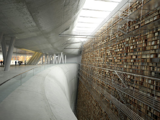
This computer-generated image has been doing the rounds on a variety of blogs across the internet. It depicts one of the numerous proposals for the extension of the Stockholm Public Library, this one drafted by a team from the Paris-Val de Seine architecture school. Over at the Long Now Blog, Alexander Rose calls it “awesome” and says “This design seems like it would lend itself well to a 10,000 year library”. As a monument this design is impressive — perhaps intimidating is the more appropriate word — but as a library it’s hard to conclude it would be anything other than a complete and total failure. And as for lasting 10,000 years, all those walkways to access the books look exceptionally brittle — I doubt they’d last a hundred years let alone ten thousand.

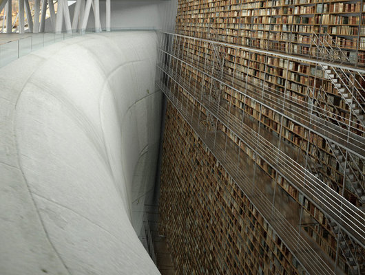
And just look at those walkways! They are made of glass! Can you think of how intimidating, how frightening, how disturbing and uncomfortable it would be to work or do research in this library? This unsettling design is an insult to librarians and readers. It seems that the architects intended for most of the books on this wall to be inaccessible anyway. Go figure.

And look at that chasm! I hope the architect included a fancy device for retrieving the bodies innocent bibliophiles who didn’t notice the “Slippery When Wet” sign after the janitor washed the floors.
Compare this to more traditional designs (such as the this library) where the scholar, the bibliophile, the researcher, and the librarian are elevated to the position of members of an imperial court instead of lemmings in a dystopian nightmare. What’s more, the actual library this is supposed to be an extension of is Erik Gunnar Asplund’s Stockholms stadsbibliotek, one of the more handsome designs of early twentieth-century modern traditional.
The civic authorities held a competition to design the extension, and not a single entry of those short-listed was complementary to the original structure. This was ego-tecture made real, with each successive entry presumably as ugly as the souls of the architects who drafted them. After choosing a winning design (by Germany’s Heike Hanada), they exhibited some old-fashioned Scandinavian common sense by cancelling the whole project and devoting the millions of kronor it would have cost to other causes. Not long ago, Oslo commissioned Rem Koolhaas to design a new central library for the Norwegian capital, which the city fathers ultimately scrapped. Is this a new regional trend?
Search
Instagram: @andcusack
Click here for my Instagram photos.Most Recent Posts
- Amsterdam November 26, 2024
- Silver Jubilee November 21, 2024
- Articles of Note: 11 November 2024 November 11, 2024
- Why do you read? November 5, 2024
- India November 4, 2024
Most Recent Comments
Book Wishlist
Monthly Archives
Categories


I think “dystopian nightmare” is the right phrase here…
It looks like something from the set of Metropolis.
Your observations are spot-on. Those images are terrifying.
And good on Oslo for rejecting the Rem Koolhaas library — I’ve visited the library he designed in Seattle and found it a travesty of unwelcoming spaces, poor organization and general nonsense. If I hadn’t needed to use its resources, I’d have fled immediately.
This design would keep me away from Libraries for the rest of my life
On the other hand…
Take a look at these libraries from the site
“Librophiliac Love Letter: A Compendium of
Beautiful Libraries”:
.
At last a literal chasm for all to see separates modern man from the accumulated culture and knowledge of our forebears.
Well there is still a lot of ugly buildings being built i Sweden. As recent as 2007 politicians in Uppsala, the oldest university town in Sweden, built this horrible concert hall:
http://www.ukk.se/Uppsala-Konsert-Kongress/Bildspel/
The building already has several nick-names like “the Borg-ship (with reference to the Star Trek robots spaceships) and Forsmark 4 (Forsmark is the close by nuclear plant with three reactors, implying the concert hall being the fourth).
It is said that a former Rector Magnificus commented on the (at that time planned) building in the presence of the danish architect saying that with this building the architect must be trying to get revenge because of the march across the Belts.
http://en.wikipedia.org/wiki/March_across_the_Belts
It seems as if the design intends to lead to the perception of being “sucked into” the wall of books, which perhaps might symbolize knowledge- but if that were to be the case, knowledge becomes a bottomless pit.
It looks like the Beinecke Library at Yale, put onto a photocopier and blown up to ten times its original size.
I think it’s beautiful, unique, and inspiring.