
About Andrew Cusack
 Writer, web designer, etc.; born in New York; educated in Argentina, Scotland, and South Africa; now based in London.
 read more
News
Blogs
Reviews & Periodicals
Arts & Design
World
France
Mitteleuropa
Knickerbockers
Argentina
The Levant
Africa
Cape of Good Hope
Netherlands
Scandinavia
Québec
India
Muscovy
Germany
Academica
Wisconsin Baroque, Priests, and Paper Architecture
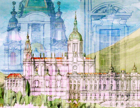
Matthew G. Alderman
Taken from: Dappled Things, Ss. Peter & Paul, 2009
MY FAVORITE BUILDINGS never got around to being built. Some, like Sir Edwin Lutyen’s majestic design for Liverpool Cathedral, fell victim to budget cuts and the vagaries of history. Others were consigned by good taste, or occasionally outright timidity, to competition honorable mentions, and still others, like numerous student proposals or visionary dreams—like Boulée’s alarming hemispherical cenotaph for Newton, or an imaginary papal palace in Jerusalem cooked up by one of the votaries of the Vienna Sezession—weren’t terribly serious to begin with, unfortunately.
Note that I say favorite buildings, my own personal favorites, rather than the best or the most beautiful. Lutyens’ and Boulée’s fantasies may cross into that sublime territory of beauty by the power of their imaginative vision, but so many of the others owe their charm to their dreamlike extravagances, their intriguing if perhaps incomplete answers. An architect’s education lies in gathering up such fragmentary answers for the questions he will face down the road from clients and patrons. And therein lies the lure, and the value, of paper architecture.
I, like most of my colleagues, spent much of my time in school devising such useful fantasies, sometimes grand, sometimes small. Yet, they were not castles in the air. Each, while often existing in something like the best of all possible worlds in terms of budget and client, was grounded by an actual site and the laws of nature.
The most elaborate of all was my thesis project. It was an imaginary American seminary for a very real religious order, the fast-growing Institute of Christ the King, Sovereign Priest. This new congregation, dedicated to evangelization through the beauty of art, music, and the traditional Latin Mass, started out in, of all places, Gabon in Africa, but its present headquarters lies in Tuscany, in a villa bursting at the seams with seminarians in formation. While their ranks are dominated by Germans and Frenchmen, the increasing number of American clergy and their recent erection of a number of apostolates scattered across the Midwest suggested that a seminary in the United States, if not planned, might at least make for a plausible student project. Also, they seemed to have adventurous taste. I have since developed a passion for the Gothic but my first love has always been the Italian baroque. Perhaps they might be open to its vigorous beauty.
I garnered an award for the end result, the Rambusch Prize for Religious Architecture, and my putative patrons wanted copies of my enormous presentation watercolors to hang on their office walls—though, of course, the seminary would forever remain unbuilt. Its gigantic scale—typical for a student project—put it outside budgetary reach, unless, as someone cheerfully quipped, Bill Gates converted. Yet, the design was logical, consistent, and helped hone design skills I use every day at my drafting board.
The notion for the seminary came shortly after my first real-life encounter with the Institute’s work. My friends and I were road-tripping through the hill country of central Wisconsin, thick with vivid fall colors, and had just come back from a serene, silent low Mass and a long, talkative, private tour of St. Mary’s Oratory in Wausau. The Institute had transformed from a bland Midwestern Gothic to a dazzling near-replica of a fourteenth-century Bavarian court chapel. Bill Gates or no, these priests think big. Since then, they’ve overhauled a historic church in downtown Kansas City, and they’re presently turning their American priory from a burnt-out shell in a borderline south-side Chicago neighborhood into something out of Counter-Reformation Rome, and I have no doubt they’re going to succeed. Lest these projects seem like archaeological transplants, they are in fact derived from a logical extrapolation from local Catholic culture—Chicago’s colorful Polish cathedrals brought back to their ultramontane source, or, as I had just discovered, Midwestern Gothic returned to its Germanic roots.
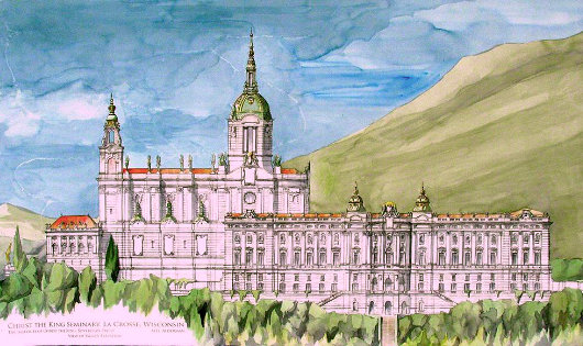
As we headed north out into the rolling countryside, my head full of gilded angels and polychromed heraldry, I saw the high knobs of hill bright in the sunlight and the wistful ghost of an idea formed in the back of my mind. A city on a hill—the heavenly city on a hill—a great domed church on a hill, with a seminary clustered round its flanks. A little less than a year later, I started prepping for the project. I phoned the North American superior for the society in Chicago and found him very happy to give me the background to make my imaginary project feel a little more real. I subsequently spent one summer afternoon engaged in a rather strange three-way conversation between Monsignor the vicar-general, the Institute’s art director, and myself, hashing out numbers and locations of classrooms, refectories, audience halls, chapels, even confessionals. Monsignor spoke German and English, the Abbé understood English but spoke only German, and I barely speak even Spanish. When I asked about style, the answer I got was “Barock! Barock! Barock!” punctuated by fingertips stabbing the tabletop. I had found the right client.
A year later, I was back in the same wood-paneled study, showing off the finished product as several black-cassocked German clerics pored over vast rolls of watercolor paper. This new, imagined seminary I showed them stood on an 80-acre site nestled amid the bluff-land of La Crosse, Wisconsin, a site proposed by my thesis advisor, Prof. Duncan Stroik, who was familiar with the locale from his own work designing the much more real shrine of Our Lady of Guadalupe.
THE SEMINARY LOOMS picturesquely on a long narrow promontory overlooking a thickly forested valley. The complex is divided into two principal parts: the seminary with its classrooms and dormitories, and the chapel and its associated sacristies. The layout of the design is inspired by both seminary models such as the great Roman colleges and the typologies of the isolated princely abbeys of the German Baroque.
The geography of the site—and the Teutonic-Midwestern cultural makeup of the area, and that of the Institute itself—suggested I study the magnificent Melk Abbey in Austria in terms of plan and profile, while the ultramontane and specifically Tridentine charism of the Institute meant that the architectural style I would choose should reflect, or at the very least harmonize with, the great churches of Rome. The result was a regionalized reinterpretation of Baroque, drawing on the vigorous muscularity of the Italians Juvarra and Rainaldi, the classicism and imperial iconography of the German Fischer von Erlach, and the beaux-arts tradition of nearby Minneapolis exemplified by such local masters as Emmanuel Masqueray. A number of other churches in the region, such as St. Agnes in St. Paul and Milwaukee Cathedral, might be described as revived German Baroque as well. In using this vocabulary, rich with history, both local and international, and the timeless symbols of royal power, I sought to create in stone a building which would not only form a suitable backdrop for priestly formation in the service of the King of Glory, but also play a real and active role in that development, through ordered mirroring of heavenly realities.
The spacious oratory, seating more than 400, is intended to serve the seminarians in their public and private worship as well as to reach out to the local faithful. Given the great interest that has inevitably accompanied the Institute’s celebrations of the Tridentine rite, in addition to the large number of visitors attending the ordination of new priests and other public ceremonies, the Institute’s chapel should be grander and more elaborate than most other seminary churches. It also draws on the typology of the monastic church, in keeping with the Benedictine spirituality the Institute practices.
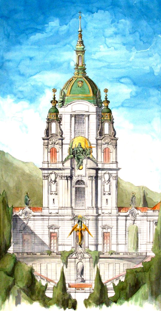
Visitors enter the church through a grand public staircase decorated with images of the patriarchs and prophets, culminating in a fountain representing the Tree of Jesse topped with a gilded image of the expectant Virgin of the Apocalypse standing on the horns of the moon. The front elevation of the church continues this apocalyptic theme, derived in part from the traditional tympanum iconography of mediaeval churches, but translated into a Baroque idiom. At the summit of the church façade is Christ the King seated in judgment, flanked by two angels bearing instruments of the Passion.
The twin themes of Christ’s kingship and Christ’s priesthood are threaded together throughout the complex. Crowns, regal stars of David, and other courtly images are common, while Christ the High Priest is referenced through the repeated iconography of the heavenly Mass. Throughout the church, statues of angels are shown garbed in liturgical vesture, bearing the instruments of the Passion as the deacons, sub-deacons, and acolytes of the eternal liturgy. Marbles in strong, masculine, imperial colors predominate—reds, amber-browns, golds, and yellows, a palette rich in symbolism derived from Melk and Munich’s Asamkirche and reminiscent of the churches of northern Italy.
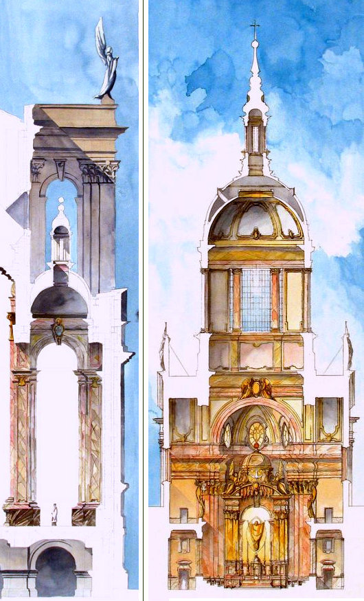
Within the church, six chapels with side altars are dedicated to the order’s various patron saints and other appropriate clerical exemplars. Choir stalls for the clergy are placed under the dome, with two galleries on either side for the pipes of a chancel organ intended to sustain the chant and set pitches and also as an alternate location for small groups of chanters and musicians. This arrangement, with the galleries occupying shallow transepts, is derived from the local precedent of St. Mary’s Basilica in Minneapolis, though domed chancels of various type are not unknown in the German rococo. A larger organ is placed in the choir loft over the narthex of the church, with additional space for professional choirs and visiting orchestras. The high altar stands in the curve of the apse, a great mass of gilding and golden marble serving as the culminating moment of the entire design. Christ is depicted with arms outstretched in the vestments of the eternal priest, hovering over the altar in silver and gold against a background of gilded mosaic. (Note: The Institute’s dedication to the Sovereign Priest has more recently become identified with a special devotion to Christ the Infant King, a feature which would perhaps entail the reworking of the altarpiece’s iconographic program slightly, while their recent adoption of a handsome new choir-habit piped in Marian blue also suggests new symbolic avenues not open at the time of this design.)
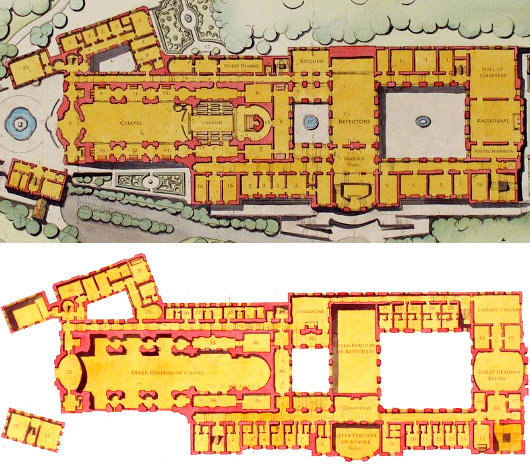
The seminary proper is arranged around two primary courtyards. The church’s apse is ringed with a series of sizable sacristies designed to accommodate the large volume of seminarians and clerical visitors likely to assist during the Divine Office and Mass. The public and private apartments of the rector and vice-rector are located above, allowing some measure of separation and also the ability to be equally close to guests and professors. A small guest wing, located close to the church for the convenience of visiting prelates, is tucked into the curve of the hill on the east flank of the complex. The farther end of the east wing is occupied by classrooms on the first floor, with the second and third floors housing the two-room apartments of the professors and priest-students.
The west wing, closer to the church, is occupied by the administrative offices of the seminary, while the remainder holds classrooms with four floors of student dormitories, two above and two below. A careful separation is maintained between academic and residential functions, allowing easy access to the library and classrooms by lay professors and researchers without interfering with the privacy of the seminarians and clergy. Facilities such as small chapels for meditation, recreation rooms, a crypt church, and even a subterranean basketball court for those long Wisconsin winters are not neglected. Two transverse wings hold the refectory, a large assembly or chapter hall, a double-height library, and an audience hall for visiting prelates. These also serve as circulation space and define the larger seminary and smaller sacristy courts. A sizable public entrance is located on the western side of the seminary, leading to an elegant public staircase and marble hall intended for the ceremonial reception of distinguished guests, both clerical and lay.
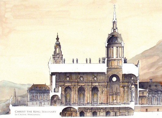
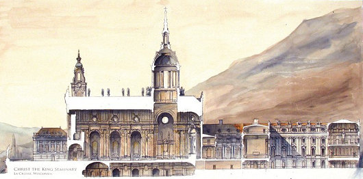
THIS PROJECT WAS a fascinating opportunity to explore a web of differing functions and needs, both spiritual and physical, required by such a complex. The ordered hierarchy of such a structure serves to create a practical environment for the education and formation of future priests, but beyond that, the seminary becomes an icon of the invisible reality of the heavenly Jerusalem—solemn but joyous, ordered but not merciless, splendid but appropriately sober, with beauty given back to the public and austerity provided for the seminarians in their private cells, like a prelate clothed in cloth-of-gold with the rough fiber of a hair shirt underneath.
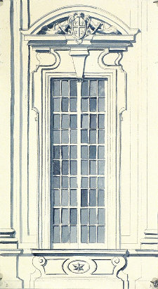 It may be a fantasy. But so much that has been achieved in recent years in the realm of church-building would have seemed equally as fantastic a decade ago. The completion of Duncan Stroik’s career-crowning design for the shrine of Our Lady of Guadalupe, which, as I mentioned above, is also in La Crosse, Wisconsin, shows that a monumental sacred architecture just as richly endowed with iconographic ornament, if perhaps embodied in a smaller envelope, is within our grasp, while the controversial erection of blockbuster bank-breaking monstrosities such as Los Angeles Cathedral and even the puny, over-budget, over-priced Jubilee Church in Rome, reminds us that ugliness, as well as beauty, comes with a hefty price tag.
I still am quite proud of the seminary design, even if perhaps there are some aspects I might now handle differently. One of the smaller plates from the set, a four-foot-long cutaway drawing in pleasantly soft sepia tones, hangs over my couch, and has followed me from Notre Dame to New York and finally to Milwaukee, a reminder that I must measure myself—success and failure alike—not against my peers, but against the great cathedral-builders of old, who had to think big as a matter of course.
I have retained my old loves, but added new ones—a deep interest in the later Gothic revival, an occasional taste for art deco, an eagerness to take on the austere and simple, when reality necessarily intrudes. But I would have never gotten here had I not first tackled this grand paper project. Architectural decorum reminds us that a grand building requires grand ornament—something I still firmly believe—but grand ornament requires funding that is not always at hand. To design a beautiful, strong, and simple structure, you must design a beautiful, strong, and complex one first, and then carefully, gently, and logically remove all the bits reality cannot quite handle yet. This is how you pack as much as you can into as little as you may have been given. The simplicity of the California missions could not have blossomed without the exuberance of Mexico’s cathedrals before it. And we may yet have that glorious, busy exuberance in small doses, as the classical revival continues to grow outward and upward, as the Institute brings Baroque Rome to Chicago, or converted Anglicans plant English Gothic parishes in Texas.
Daniel Burnham, that great fin-de-siècle shaper of cities, is frequently—perhaps too frequently—quoted as saying “Make no little plans. They have no magic to stir men’s blood and probably will not themselves be realized.” He also remarked, more significantly from an aesthetic point of view, “A noble, logical diagram once recorded will never die, but long after we are gone will be a living thing, asserting itself with ever-growing insistency.” Even when we cannot raise a building in bricks and mortar, the soul of a building may yet inspire a little tribe of intellectual children. Such exercises serve to generate fruitful discussion, and more importantly and intangibly, spur us forward. May these explorations, and those like them, inspire us to demand more in church architecture—to return to an architecture which truly speaks of transcendent realities, of the realm of the King and Sovereign Priest, Jesus Christ the Lord.
P.S.: We now have a Matt Alderman category archive.
Search
Instagram: @andcusack
Click here for my Instagram photos.Most Recent Posts
- Silver Jubilee November 21, 2024
- Articles of Note: 11 November 2024 November 11, 2024
- Why do you read? November 5, 2024
- India November 4, 2024
- The Lithe Efficiency of the Old Constitution November 4, 2024
Most Recent Comments
Book Wishlist
Monthly Archives
Categories

Fascinating! Was any of this submitted to Msgr. Schmitz at the ICRP Chicago headquarters?
Spectacular.