Unbuilt
About Andrew Cusack
 Writer, web designer, etc.; born in New York; educated in Argentina, Scotland, and South Africa; now based in London.
 read more
News
Blogs
Reviews & Periodicals
Arts & Design
World
France
Mitteleuropa
Knickerbockers
Argentina
The Levant
Africa
Cape of Good Hope
Netherlands
Scandinavia
Québec
India
Muscovy
Germany
Academica
London’s Unbuilt University
The Bloomsbury Scheme of Sir Edwin Landseer Lutyens

The University of London is a curious institution that these days no one really knows quite what to do with. At its zenith it was an imperial giant, validating the degrees of institutions from Gower Street to the very ends of the earth.
University College was founded — as “London University” — by the rationalist faction in 1826, prompting the supporters of the Anglican church to establish King’s College with royal approval in 1829.
Neither institution had the right to grant degrees, which led to the overarching University of London being created in 1836 with the power to grant degrees to the students of both colleges — and the further colleges and schools that would be founded later or come within its remit.
The University was run from the Imperial Institute in South Kensington but soon outgrew its quarters within that complex. The 1911 Royal Commission on University Education concluded that the University of London “should have for its headquarters permanent buildings appropriate in design to its dignity and importance, adequate in extent and specially constructed for its purpose”. But where?
Lord Haldane, the commission’s chairman, preferred Bloomsbury. University College was already there, as was the British Museum, and the Dukes of Bedford as the local landowners were happy to provide sufficient space to build a proper centre for the institution.
Charles Fitzroy Doll, the Duke’s own surveyor, designed a rather heavy classical scheme for academic buildings on the site north of the Museum but no progress was made before the Great War erupted.
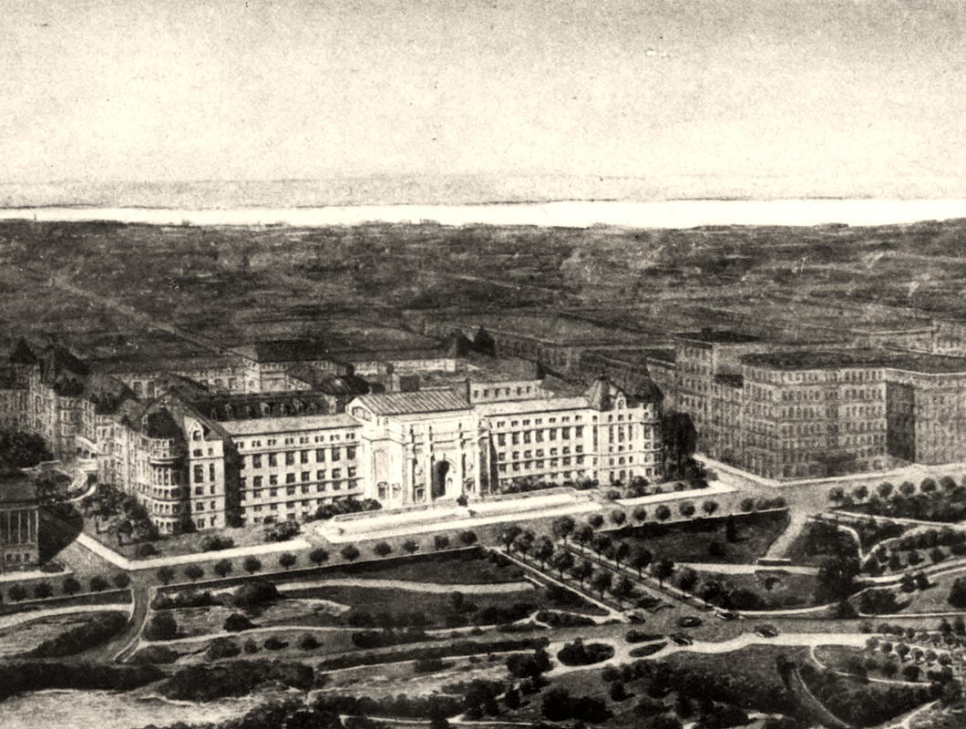
Unfinished Business at Audubon Terrace
One of the little tragedies of New York urbanism is that when Archer Milton Huntington was transforming a block of upper Manhattan into an acropolis of culture he failed to buy the entire block.
Huntington named his complex Audubon Terrace in honour of the artist and ornithologist John James Audubon whose home, Minniesland, overlooked the Hudson at the western end of the block. His failure to obtain Minniesland meant that the remainder of the block was snapped up by developers instead of incorporated into his campus.
In the 1910s, the speculators built apartment buildings that turned their rather rude and unadorned backs to Audubon Terrace, terminating the vista from Broadway. When you imagine the potential prospect all the way to the river, it is all the more tragic.
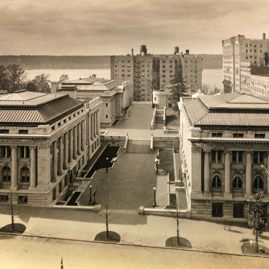
The crass posterior of these apartment blocks naturally dissatisfied the members of the American Academy of Arts & Letters, whose building sits on either side — and indeed beneath — the part of the terrace immediately adjacent to them.
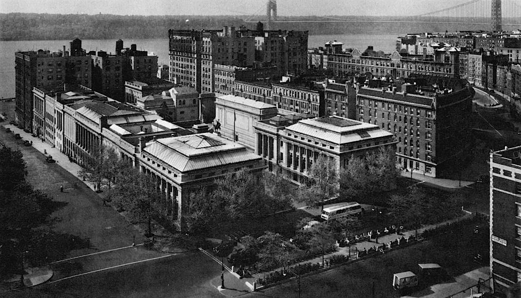
McKim Mead & White had designed the first phase of the Academy’s handsome building facing on to West 155th Street, which opened in 1923, and Cass Gilbert was chosen to design the auditorium and pavilion which would complete the body’s portion of the site.
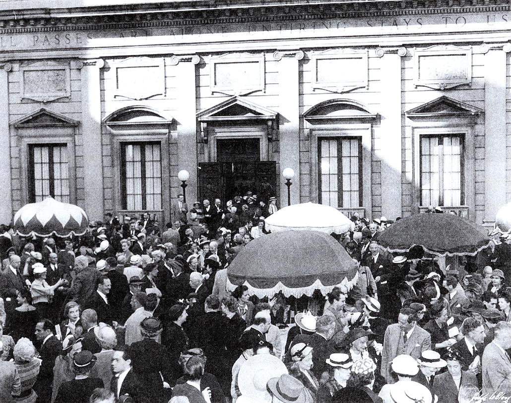
The Academy used the pavilion for art exhibitions and other events, with the terrace in between serving as a useful spot for springtime drinks parties for the academicians and their many guests.
The infelicitous nature of their neighbours clearly irritated the Academy, and in 1929 they had a conversation with Cass Gilbert about designing some sort of screen to satisfyingly terminate the vista down Audubon Terrace and block the view of the apartment buildings.
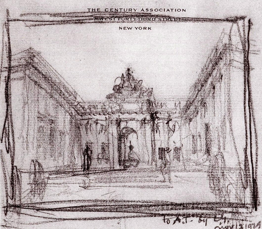
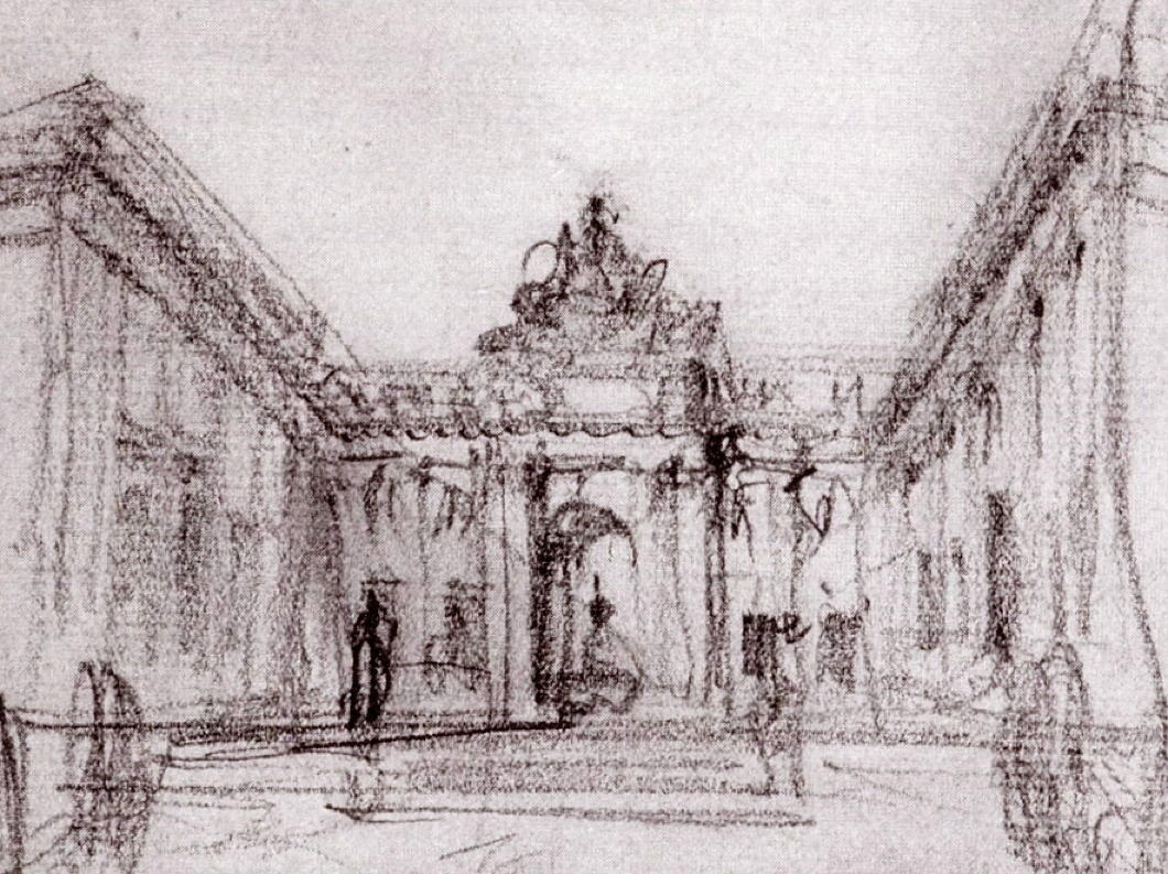
Gilbert sketched out a plan to build an arched screen connecting the pavilion to the main building across the terrace, topped off by a sculptural flourish.
There is a danger its scale may have overwhelmed the space, but that seems a preferable struggle to face when compared to the problem of the rude neighbours.
Events, as they so often do, intervened. The Wall Street Crash badly affected the American Academy’s finances, and Archer Huntington was forced to increase his already generous subsidy to the body even more just to make ends meet.
Gilbert’s final completion of Audubon Terrace was not to be.
The Academy was founded as a bastion of the old guard against the avante-garde, but in recent decades it has let its hair down a little, and leans more towards the modern than the traditional.
All the same, its current president is an English-public-school-and-Cambridge-educated philosopher from one of the most aristocratic families in Ghana, so it’s reassuring they’re keeping a bit of the old with the new.
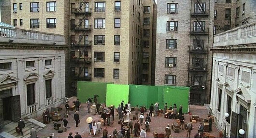
The terrace is often used as a filming location for cinema and television, given the high quality of its architecture and the fact that it is visually not well-known even among New Yorkers, so can be deployed as a foreign setting.
The HBO programme ‘Boardwalk Empire’ used the American Academy’s terrace as an Italian port, using green screens (instead of a Cass Gilbert monumental arch) to transform the piazza.
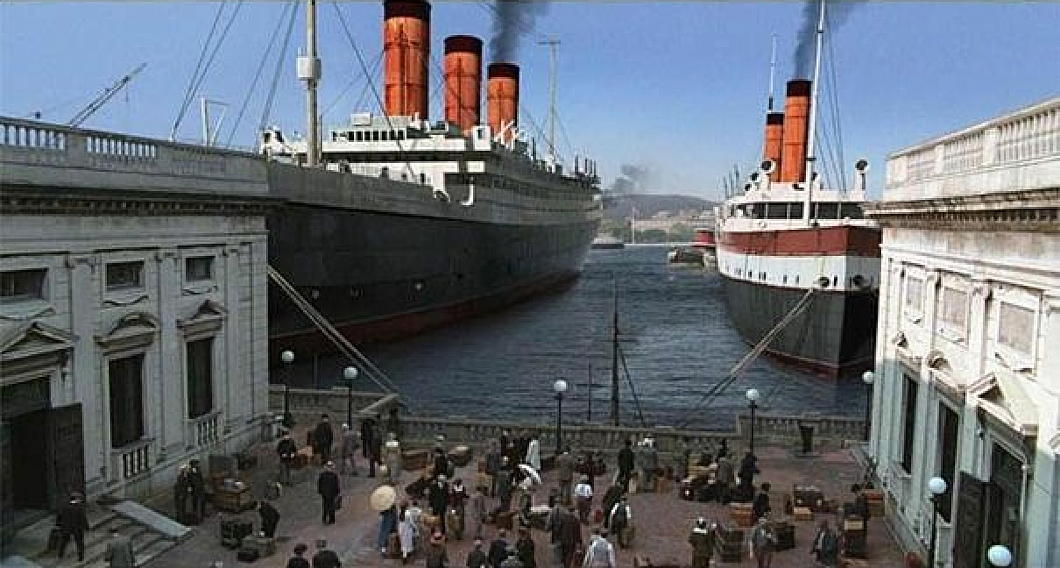
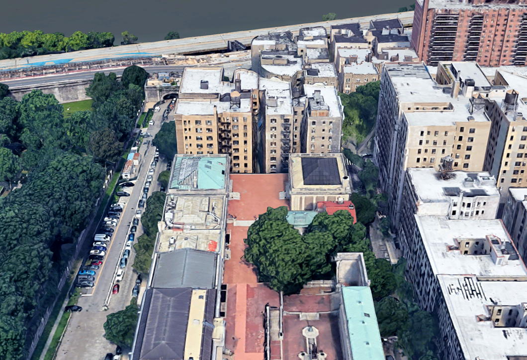
Audubon Terrace and its surviving institutions — the expanding and renovating Hispanic Society, the American Academy of Arts & Letters, and the Church of Our Lady of Esperanza — are an intriguing hidden gem of upper Manhattan, well worth a visit.
I don’t imagine anything like Cass Gilbert’s screen will ever be built, but every time I drop in to this neck of the woods I can’t help but thinking there’s some unfinished business.
A Home for Bard and Ballet
Sir Basil Spence’s unbuilt Notting Hill theatre
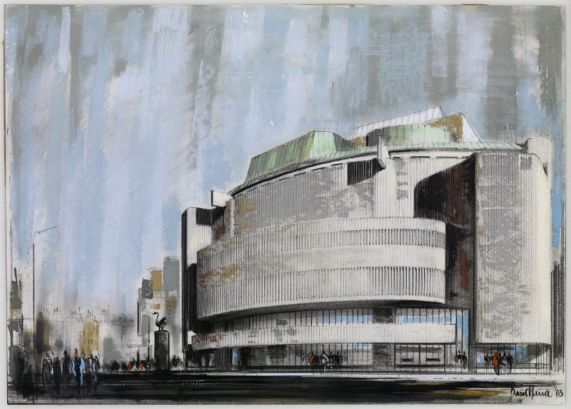
Sir Basil Spence was just about the last (first? only?) British modernist who was any good. His British Embassy in Rome is hated by some but combines a baroque grandeur appropriate to the Eternal City with the crisp brutalism of modernity that makes it true to its time.
In 1963, Spence accepted the commission from the Royal Shakespeare Company and the Ballet Rambert for a London venue to host the performances of both bodies.
The poet, playwright, and theatre manager Ashley Dukes had died in 1959, leaving a site across Ladbroke Road from his tiny Mercury Theatre (in which his wife Marie Rambert’s ballet company performed) for the building of a new hall.
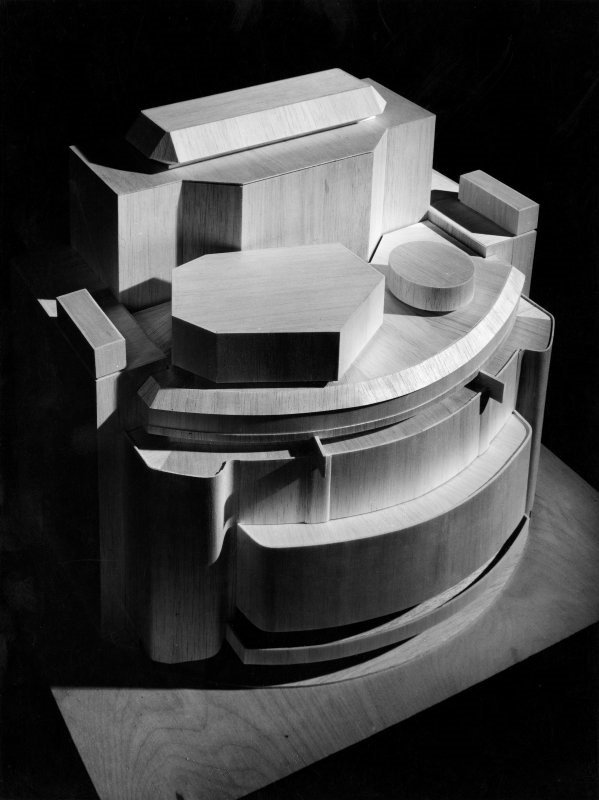
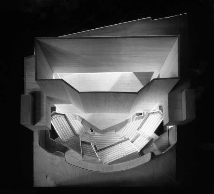
The design moves from the sweeping curve of the street frontage up to a series of angular concoctions and finally the large fly-space above the stage itself.
It made the most of a highly constricted site and would have housed 1,100-1,600 patrons (historical sources vary on this figure). This was a big step up from the old Mercury Theatre which housed 150 at a push.
Ultimately, the plan failed. London County Council was worried there wasn’t enough parking in the area, and the Royal Shakespeare Company was tempted away by the City of London Corporation which was building the Barbican Centre.
An Approach Not Taken
John Russell Pope’s Unexecuted ‘Museum Walk’
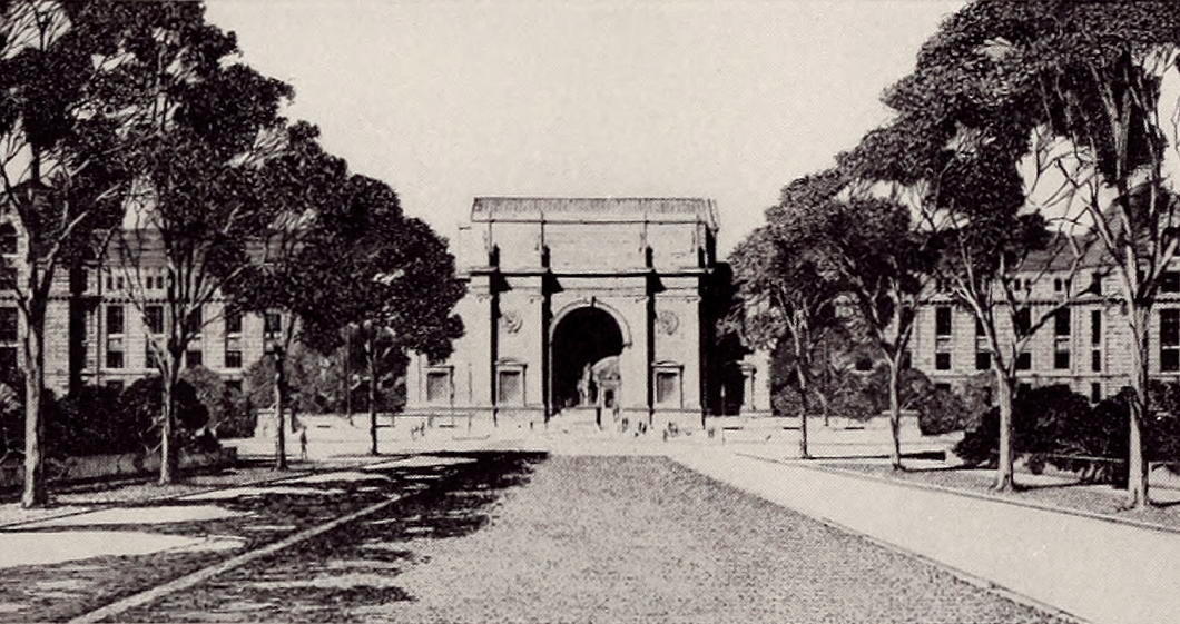
While John Russell Pope won the competition to design the New York State Theodore Roosevelt Memorial currently under attack, not every aspect of his design was executed.
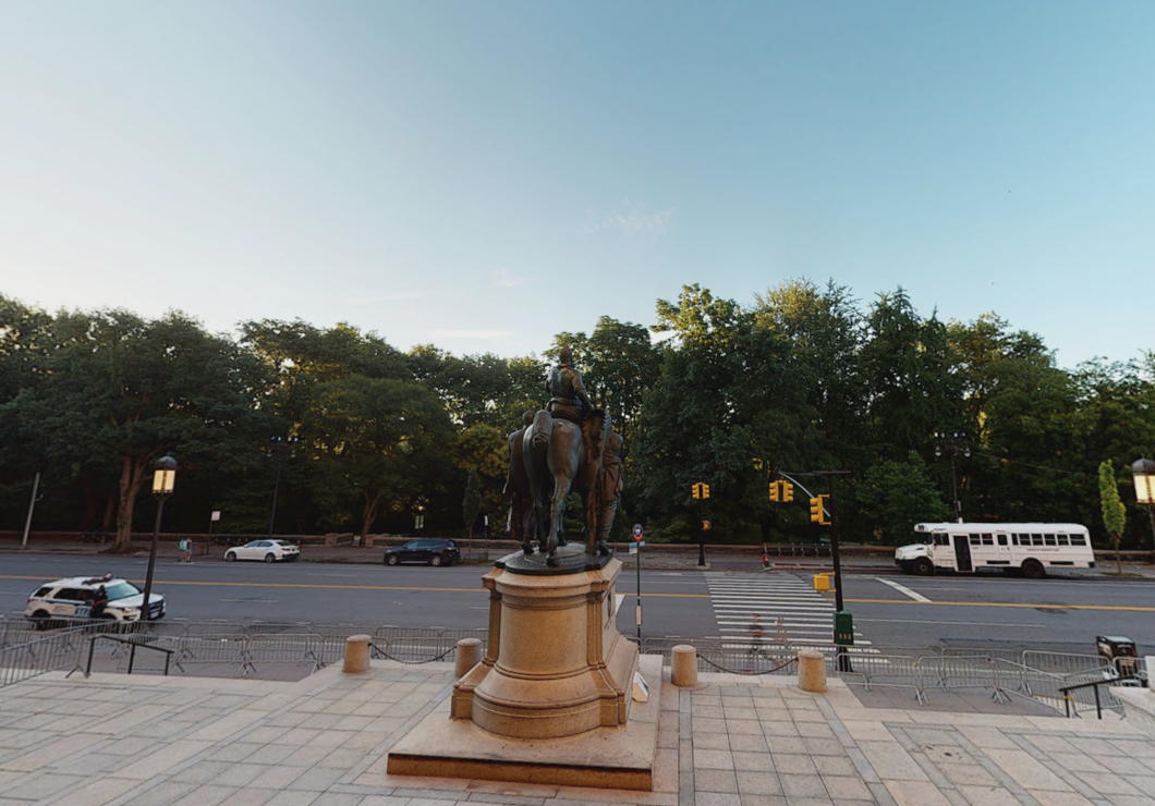
The architect planned for an avenue to be built in Central Park to provide a suitable approach to the American Museum of Natural History and his memorial to the twenty-sixth president.
160 feet wide and 500 feet long, it would feature a broad central lawn flanked by drives and forming an allée of trees. Other versions of the plan have a roadway heading down the middle of the approach.
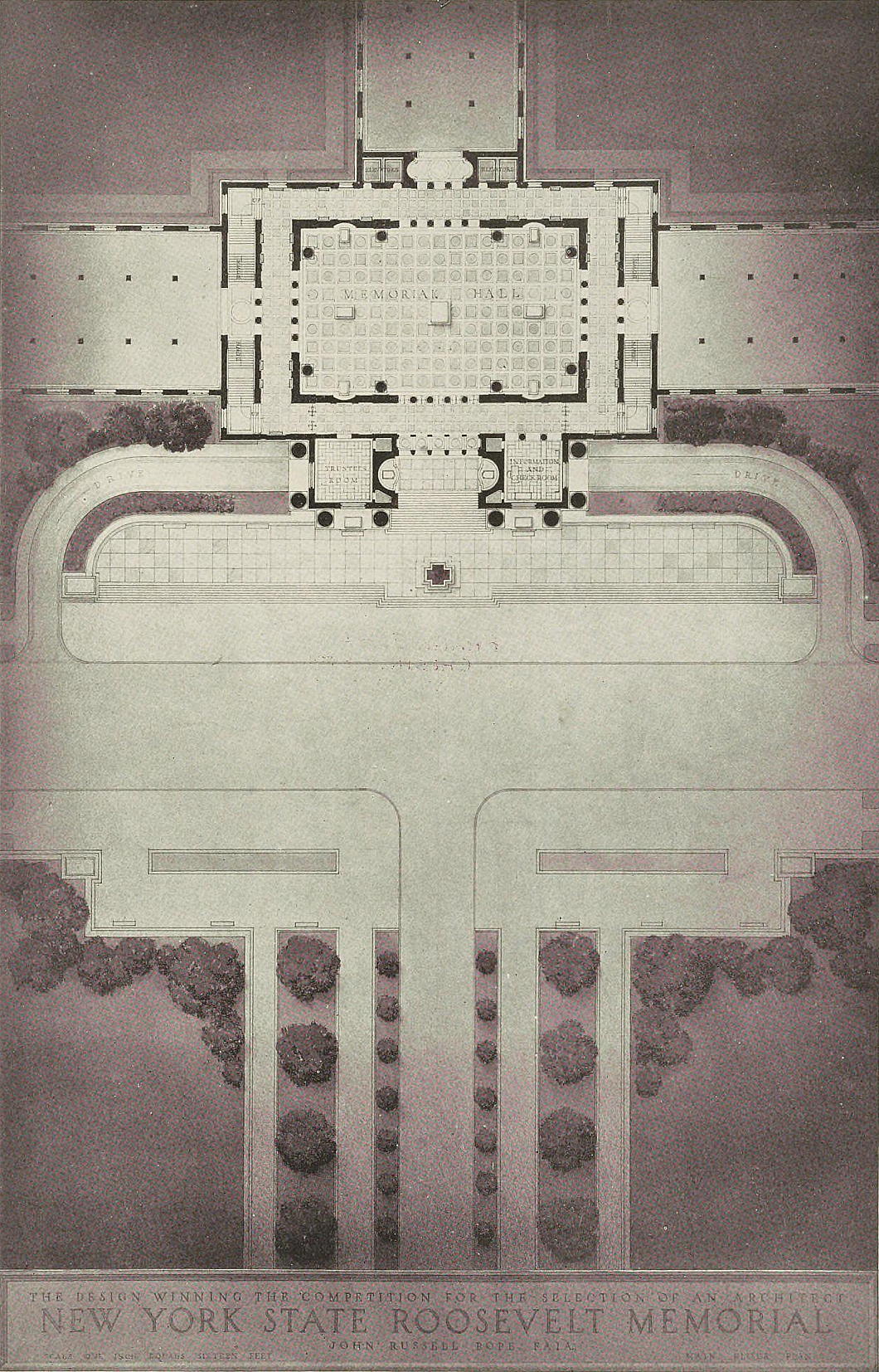
The idea of this ‘museum walk’ was originally that of Henry Fairfield Osborn, for a quarter-century president of the American Museum of Natural History.
Osborn was also president of the New York Zoological Society — they who run the Bronx Zoo — while his brother was president of the Metropolitan Museum across Central Park.
His son Fairfield also led the NYZS (renamed the Wildlife Conservation Society in 1993) and both père et fils held dodgy pseudoscientific Malthusian views about race and eugenics.
Their family house, Castle Rock, has one of the finest views of West Point across the Hudson and is still in private hands.
For whatever reason — possibly not wanting to redirect the 79th Street Transverse Road through the park that was in the way — Obsborn/Pope’s approach was never built.
It’s a shame as, aside from augmenting the impact of Theodore Roosevelt Memorial, it also would have provided a better vista from the steps of Museum itself.
The Other Modern: Otto Schöntal
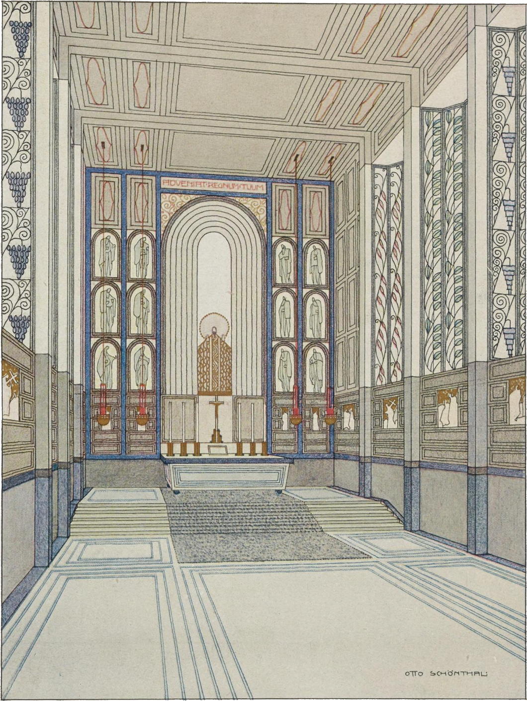
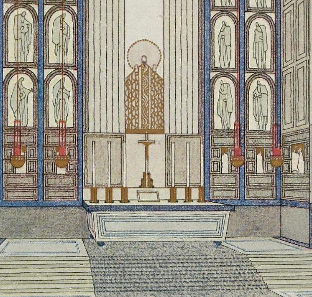
The Viennese architect Otto Schöntal was a student of Otto Wagner at the Academy of Fine Arts and exhibited this project for a Schloßkapelle in the periodical Moderne Bauformen in 1908.
It combines a simplicity of form with greater complexity in its decoration but like the work of many of the more mid-ranking architects of the Secession it comes across as a bit rigid and angular despite a certain freeness in its design.
Scipione Perosini’s Imperial Palace
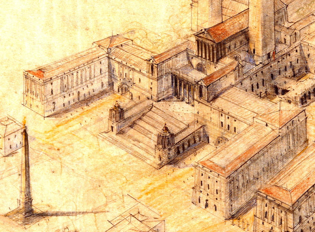
An ambitious Italian’s mad plan to bulldoze the Roman Forum, destroy Michaelangelo’s Piazza del Campidoglio, and build a Napoleonic palace atop the Capitoline Hill.
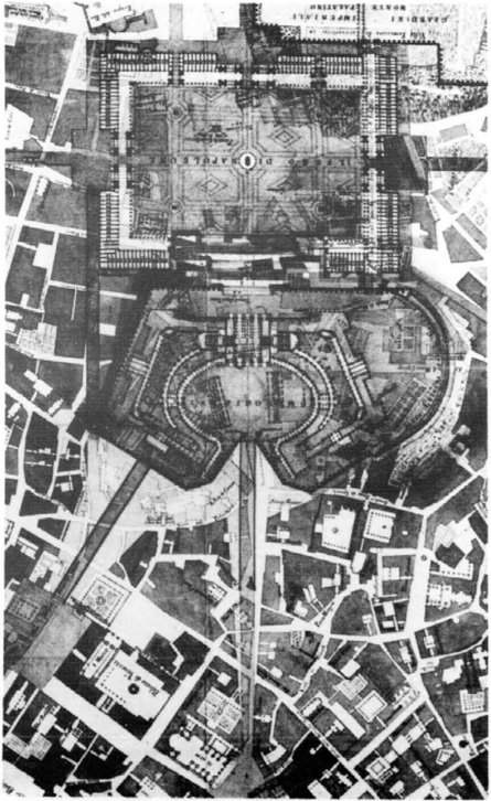 Some architectural projects are just so completely mental and insane that you actually have to doff your cap to the creativity of their inventors. Scipione Perosini’s ‘Projet d’un palais impérial à Rome’ is one such plan.
In the 1800s, with Napoleon the master of Europe, prominent citizens of various Italian cities submitted plans for the architectural aggrandisement of their communities under the beneficent patronage of the revolutionary monarch. In Rome, the architect and hydraulic engineer Scipione Perosini drafted his project for a imperial Napoleonic megapalace.
Atop the Capitoline, Michaelangelo’s Piazza del Campidolgio would be destroyed except for the Palazzo dei Senatori, which would be the central focus of a massive neo-classical palace encompassing the entire Capitoline Hill. From the Hill, a series of terraces would cascade down to the Roman Forum, which would be demolished and paved over to form a new ‘Foro di Napoleone’ celebrating the emperor. Across the Forum, on the Palatine, a new imperial residence circled by gardens would house Napoleon, who proclaimed himself King of Italy, during his prospective stays in the second capital of his empire. (more…)
The Kaiserforum
The Unrealised Vision of an Imperial Forum for Vienna
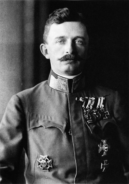
SIDLING UP THE KOHLMARKT and entering the Hofburg through the Michaelerplatz is a glorious architectural experience, but viewing Vienna’s imperial palace from the Ringstraße end, one is left with a certain awkwardness. This is because what is now the Heldenplatz, open to the neighbouring Volksgarten, was conceived as part of a great imperial forum, the Kaiserforum, but the scheme has been left incomplete.
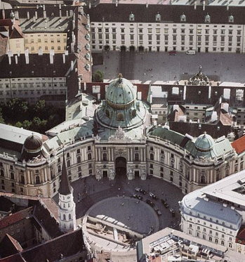
The original impetus for this forum was the plan to build the identical Kunsthistoriches Museum and Natural History Museum across from the Hofburg next to the former imperial stables. Emperor Franz Joseph held a closed competition for four invited architects — Carl Hasenauer, Theophil von Hansen, Heinrich Ferstel, and Moritz Löhr — to conceive of an overall scheme to expand the Hofburg in order to provide an architectural connection to the two new museums. (more…)
The most beautiful city never built
Ernest Gimson’s Canberra
Whenever I’m in in Westminster Cathedral, I feel obliged to nip in to and say a prayer in the chapel dedicated to St Andrew. The apostle is my patron many times over: in addition to being my name-saint, he is the patron of the university, the town, and the country in which I spent four luxurious years. His is one of the most finely decorated chapels in the cathedral, and boasts a beautiful mosaic depiction of the ‘Auld Grey Toun’ above the arms of the donor, the 4th Marquess of Bute. (His father, the eccentric 3rd Marquess, had been Lord Rector of the University of St Andrews.)
Stumbling upon the genial Cathedral Historian, Patrick Rogers, the other day, he shared with me that the stalls and kneelers in St Andrew’s Chapel are widely considered the finest works of arts-and-crafts furniture design in all of Great Britain. They are the creation of a man I had never heard of: the craftsman, designer, and architect Ernest Gimson.
An unfamiliar name is always a potential new avenue of knowledge down which to saunter, and so it proved with Ernest Gimson. His talent at furniture is undoubted but, given my obsession with architecture, it was instead that field of his expertise which particularly drew me in. It was then that I discovered his submission for the 1911-1912 Australian Federal Capital Competition.
The British colonies in Australia federated in 1901, and the dispute between Sydney and Melbourne as to which would be the capital of the youthful nation was settled by agreeing to build a new planned city within New South Wales (the state Sydney is in) but not more than 200 miles from Melbourne.
Ten years later, an international competition was announced to determine the design for this new capital being created ex nihilo on the banks of the Molonglo river, which was given the name of Canberra.
Of the 137 entries received, many of them were very handsome, but some of them were frankly awful. Rather than have a team of architects, artists, or urbanists choose the winning design, the Minister for Home Affairs, Mr King O’Malley, was the sole decision-maker.
He eventually chose the plan submitted by the Chicago architect Walter Burley Griffin, awarding a second prize to Eliel Saarinen of Finland, with third prize going to Alfred Agache of Paris.
The design I would have chosen, however, was Ernest Gimson’s.
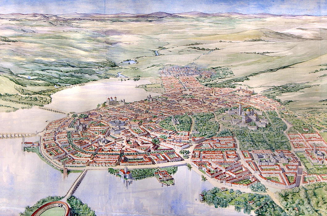
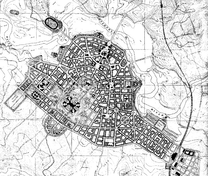
Gimson designed a compact capital city of 25,000 inhabitants that would be able to support itself based on neighbouring farms and small-scale industry.
The city is entirely concentrated along the south bank of an artificial lake and centred on a wooded park containing Kurrajong Hill and Camp Hill, with the streets of the city radiating down from there toward the lakeside.
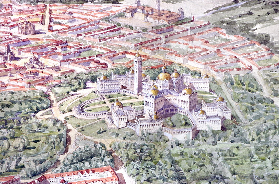
Kurrajong Hill, with its dominating position over the city, was selected for the Houses of Parliament, with eight departmental buildings surrounding it on a lower terrace.
Official residences for the Governor-General and Prime Minister are located nearby, each with six acres of private grounds.
The State Hall is located atop the adjacent, slightly lower, Camp Hill, with the Printing Office and Mint located at either side, where the park ends.
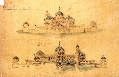
North-west of Kurrajong is the City Hall, flanked by the Courts of Justice, with its main entrance facing towards the central park.
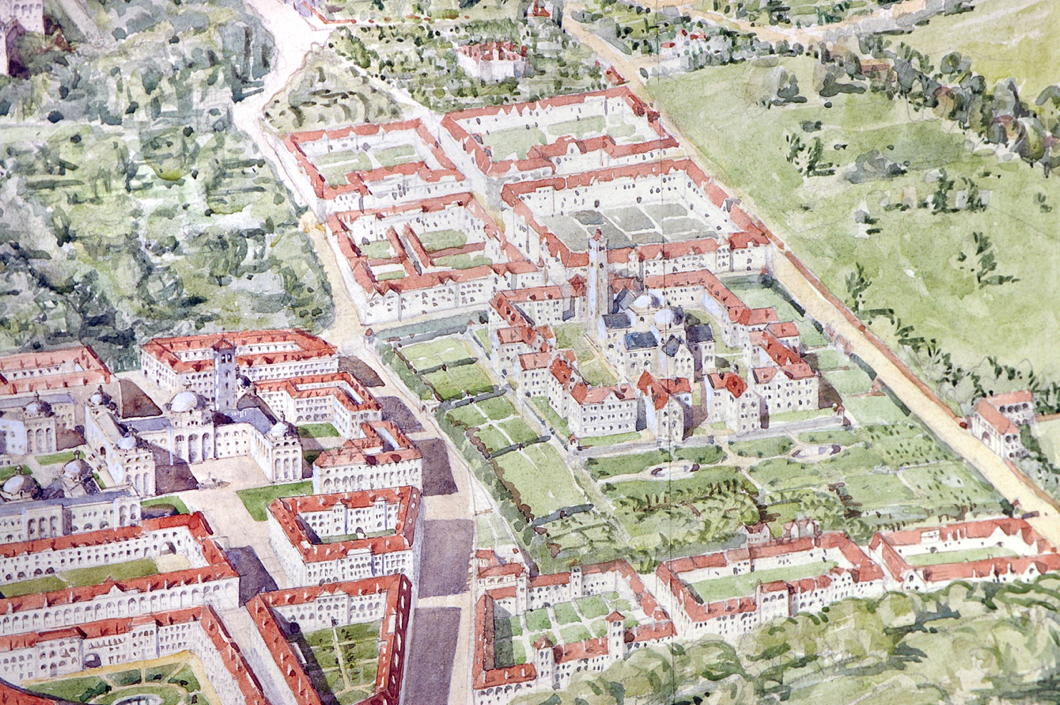
On a small hill nearby is the University, its double-domed central block surrounded again by ancillary buildings on a lower terrace. Playing fields are allotted nearby.
The market is located on the east side “with a covered arcade for the stalls enclosing an open square”, alongside a market house and technical colleges.
The Cathedral rises from the center of the city proper and forms an axis with the State Hall on Camp Hill and the Houses of Parliament atop Kurrajong.
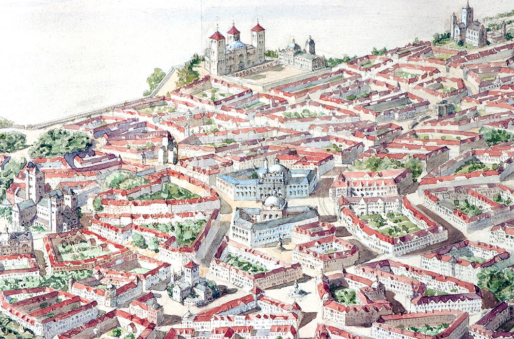
At the near-midpoint of the street connecting the Cathedral to the State Hall, a public square is flanked by a National Art Gallery and Library. Around the Cathedral itself are the National Theatre and the General Post Office.
A stadium is located on the north side of the lake, connected to the city by a bridge, and further provision is made for siting barracks, gas works, a power station, cattle market, and other necessities.
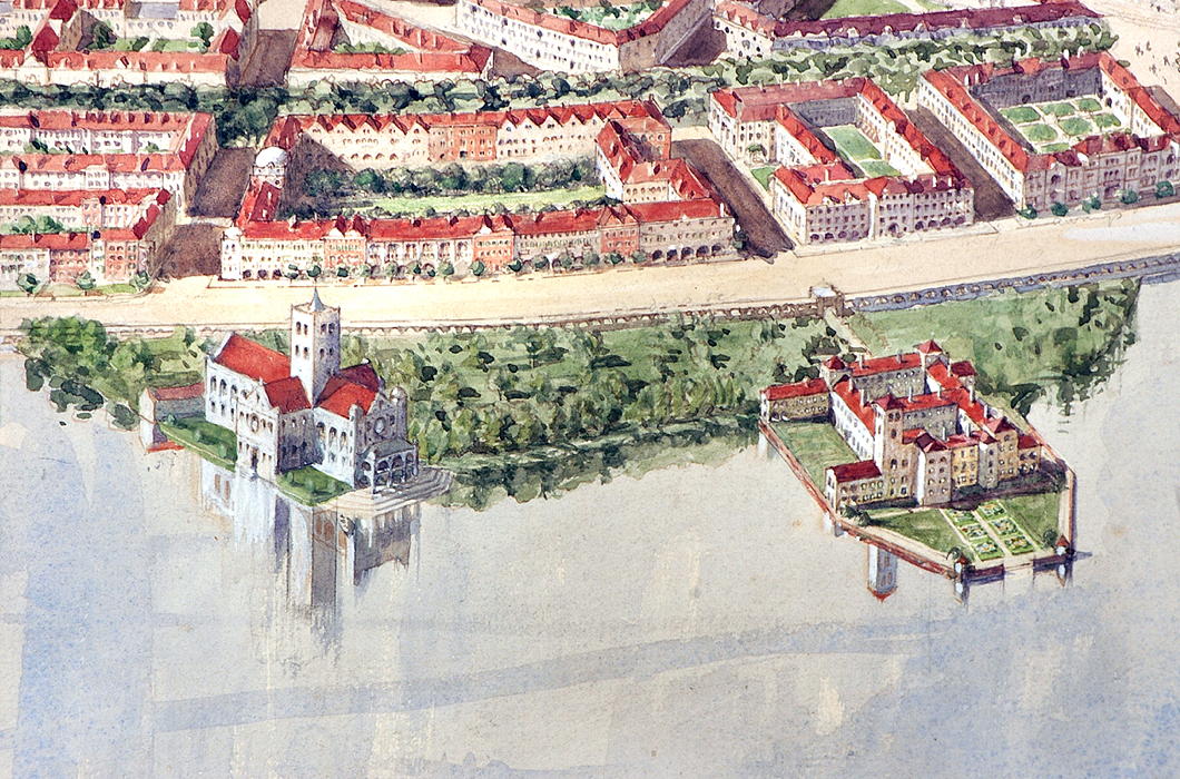
Buildings would chiefly be faced in a light-coloured local stone which gives the plan, deeply influenced by tradition, both a brightness and a more vernacular feel.
To discuss the design of the buildings is tricky: this proposal is an initial plan and, had it been selected, the architect would have had more time to then further refine what he was proposing.
The Houses of Parliament, with their eccentric X-footprint, are a curious conglomeration and not quite right. There seem to be a surfeit of towers that look too similar to one other.
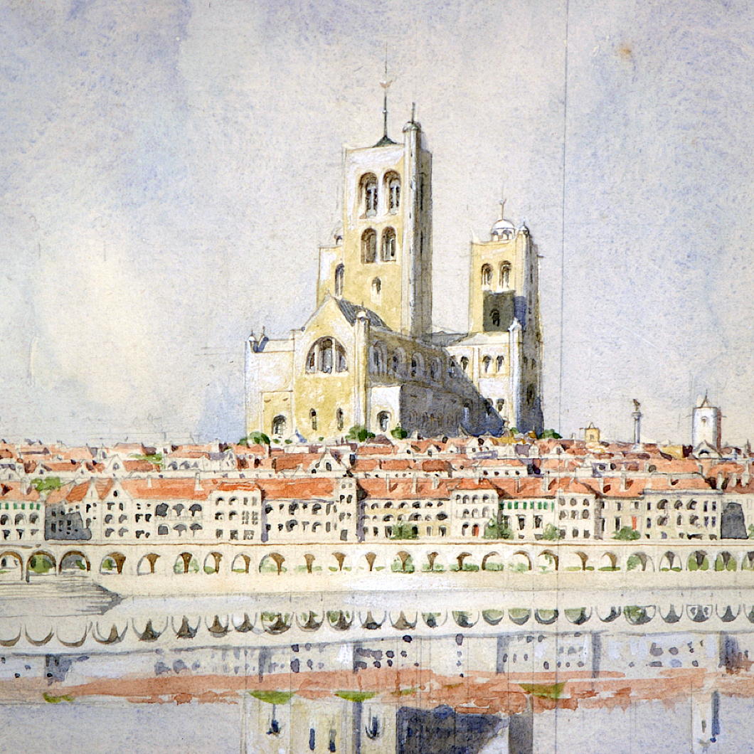
But the Cathedral — my favourite part of Gimson’s plan — is a magnificent creation with an assertive central crossing tower that doubtless would become the visual focus of the city.
The embankment, with its long, generous, 20-foot-deep arcade providing “sheltered walk in hot and wet weather”, is both picturesque and useful.
“While screening in some measure the near part of the lake from the ground floor windows of the houses opposite,” the arcade, Gimson notes, “would enhance rather than diminish, the interest of the wider views.”
Indeed, it provides a useful transition point from lakeside to the rise of the buildings.
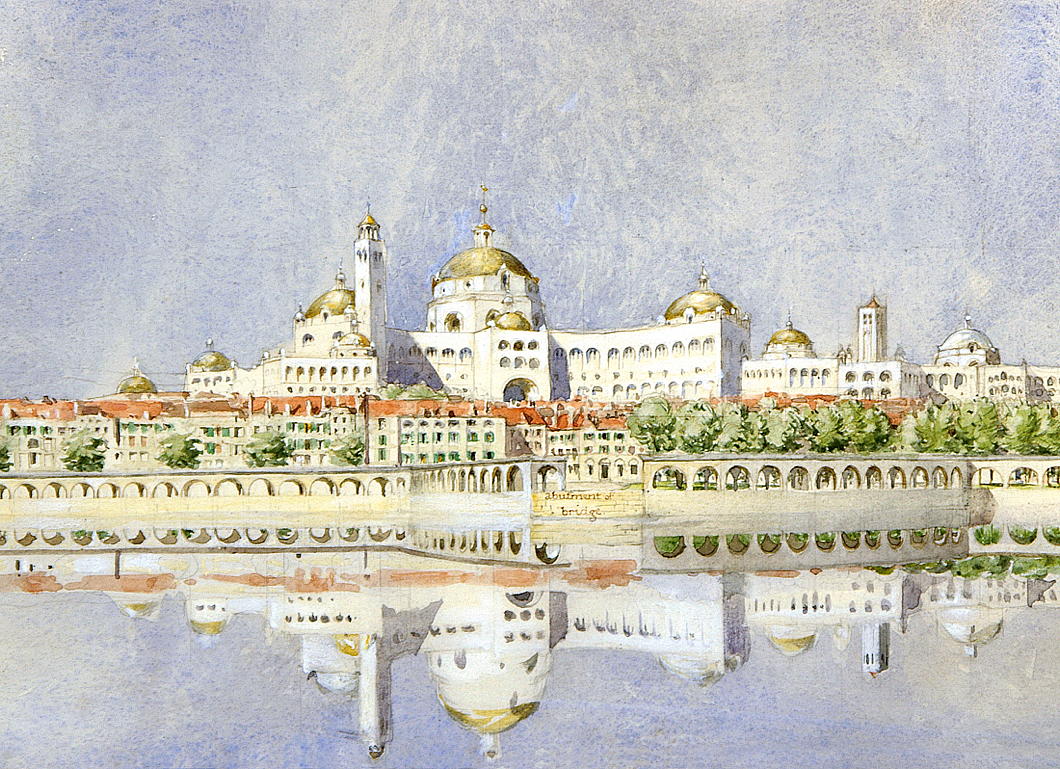
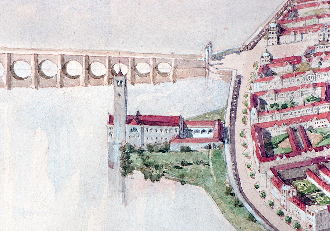
The architect’s layout of streets, public spaces, and important buildings, meanwhile, shows the influence of the aesthetic principles of the Austrian urbanist Camillo Sitte, now unjustly neglected since being contemptuously derided by Le Corbusier and other leading modernists.
Gimson’s Canberra is an unpretentious city: its lack of grandeur is what most likely secured its rejection by the fathers of the young and vigorous nation, who were keen to impress. Burley Griffin provided them with a plan redolent of modernity and progress, but marred by fading modishness.
The Gimson plan would have provided Australia a beautiful modern capital city with a design deeply rooted in tradition, and with appropriate consideration of locality and climate. One can imagine that, as the course of history continued, ‘Old Canberra’ would have formed a handsome and much-loved heart of an ever-growing city.
The humane, natural traditionalism of Gimson’s Canberra would have made it much more popular with ordinary people than the sprawling, overly spacious modern city that Canberra is today. Still, it provides a model that urbanists of the future should be mindful of and take inspiration from.

Palacio Legislativo Federal
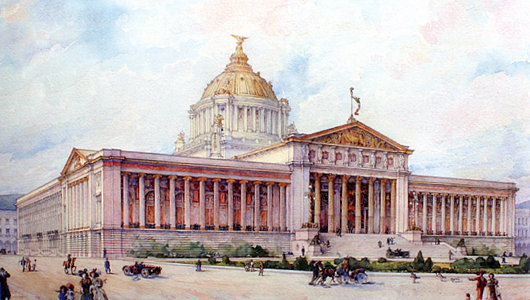
MOST OF THE major American countries have large parliamentary buildings built at the height of their prosperity in the decade before and after 1900, but Mexico is a particular exception. (Brazil, for complicated reasons, is another). In the 1890s, the government of President Porfirio Díaz decided that it needed a grand legislative palace whose magnificence would be worthy of the head of state’s own grand appearance. A competition was held and an entry chosen as the winner, but the victor was disregarded in favour of a new design by a French architect.
Émile Bénard had assisted the great Charles Garnier in draught work for the celebrated Paris Opera House which now bears that architect’s name. In the 1890s, Bénard became famous for winning Phoebe Hearst’s architectural competition for the campus of the University of California at Berkeley with his entry “Roma”. The Spectator wrote from the London of the day, “On the face of it this is a grand scheme, reminding one of those famous competitions in Italy in which Brunelleschi and Michelangelo took part. The conception does honor to the nascent citizenship of the Pacific states.” Unfortunately, very little of Bénard’s scheme for the academic complex was completed.
An Otto Wagner Embassy
The unbuilt Imperial Russian Embassy in Vienna
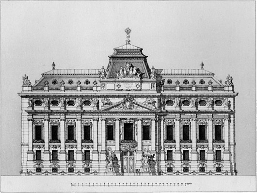
Otto Wagner was an exceptionally talented architect, though not, I think, the genius that many people would credit him with being. In the most emblematic work for which he is known, the Kirche am Steinhof in Vienna, there is too much angularity and not enough flow, curvature. For a free-standing structure it feels a bit stultified and uptight despite the brilliance of the individual elements of the design. I much prefer his Post Office Savings Bank and Stadtbahn stations.
Stumbling through the archives the other day, I came across this unexecuted Otto Wagner design for an Imperial Russian Embassy in Vienna: one now-vanished emperor’s embassy to another. From earlier in his career, it’s not as distinctively Ottowagnerian, but I admire the composition of the façade. The bulbous curved projections into the courtyard, however, are unfortunate, and too large for the space. (more…)
The UN at Quebec
IN 1943, THE BRITISH, Canadian, and American governments descended upon the city of Quebec, capital of la vieille province, for an intergovernmental conference to plan the invasion of France — surely one of the greatest military tasks ever undertaken in the modern era. The site proved auspicious due to a peculiar combination of factors: Quebec City enjoys a certain European cachet but with both the geographic safety of North America and the more spacious accommodation usual to that continent. The three governments held a second conference there in 1944, and in 1945 the International Labour Organisation met in the city, followed a few months later by the Food & Agriculture Organisation of the nascent United Nations.
With this track record of indisputable experience, the ville de Québec, lead by its mayor Lucien Borne, put in a bid to be the permanent seat of the United Nations Organisation. (more…)
Comper in Clerkenwell
The unbuilt Church of St John of Jerusalem
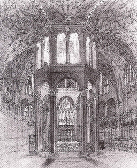
IN THE REALMS of architecture, the unexecuted project has a certain air of fantasy to it — the allure of what might have been. Ranking high amongst my favourite unbuilt proposals is Sir Ninian Comper’s project for the Church of St John of Jerusalem at Clerkenwell. Comper designed the scheme in the middle of the Second World War as a conventual church for the Venerable Order of St John, the Victorian Protestant revival of the old Order of St John (now more commonly known as the Order of Malta) which was banished from England at the Reformation. The design (below) is a Romanesque-Gothic hybrid, a splendidly exuberant cross-fertilisation of two styles more frequently opposed to one another in the minds of most.
One of the proposals for the serious reform of the Order of Malta in Britain is for the Grand Priory of England to divest itself of its interest in the Hospital of St John & St Elizabeth and its associated chapel in St Johns Wood. Owing to a complicated series of events, conventual events are taking place at the Church of St James, Spanish Place already. As the Venerable Order never executed Comper’s brilliant design, perhaps the Order of Malta might consider buying a suitable site in London and making Comper’s fantasy a reality.
The South Kensington Museum
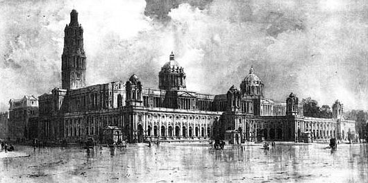
ANOTHER unbuilt project: this time a plan for completing the South Kensington Museum (or the Victoria & Albert as it’s now called) in the part of London which has become known as ‘Albertopolis’. The museum grew incrementally from its first foundation as the Museum of Manufactures after Prince Albert’s Great Exhibition of 1851. 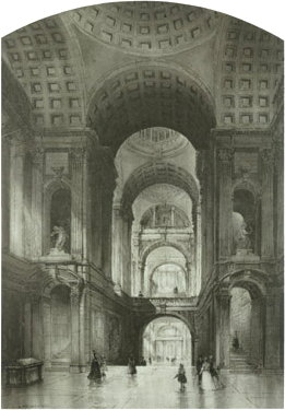 The first design for the museum at its current site was by Gottfried Semper, but the plan was rejected as being too expensive. And so over the years the facilities grew incrementally and according to to haphazard plans. In the 1890s, eight architects were invited to submit proposals for a grand scheme completing the site under a unified architectural plan.
The judges cited this plan, by John Belcher, as the most original of the eight submissions. It’s a splendid composition in high Edwardian neo-baroque. The duality of the main domes is a particular confident touch, and harks back to Greenwich. Belcher’s baroque conception was not just an external factor: his interiors featured vast, sweeping spaces that would have been impressively monumental and reflecting the power and influence of the British Empire at its presumed cultural zenith.
“Although unsuccesful in the competition,” writes Iain Boyd Whyte of Edinburgh University, “this project attracted considerable praise in the professional journals for the plasticity of the main street facade and for its grand, Michelangelesque domes.” While the judges appreciated Belcher’s design, they worried about the cost of its execution, and awarded first prize to Aston Webb instead. His scheme was inaugurated in 1899 by the Queen-Empress, who renamed the institution ‘the Victoria & Albert Museum’ simultaneously.
I wonder if Belcher’s design would have gone better with the neighbouring Brompton Oratory, or if the Oratory benefits from having the V&A in a differing, brick-based style.

Fellowes Prynne in Johannesburg
A Rejected Proposal for St. Mary’s Anglican Church
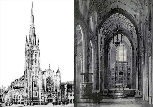
We rarely mention Johannesburg on this little corner of the web because our mother taught us that if you don’t have anything nice to say, don’t say anything at all. While ruffling through the archives the other day, however, I came across this design for the Johannesburg cathedral of the Church of the Province of South Africa. George Halford Fellowes Prynne (1853–1927) was an accomplished Gothic architect whose work is mostly found in the south of England. He’s notable for his rood screens in particular, worked in a variety of forms and materials (wood, stone, and metal), though this design employs a hanging rood. (more…)
Unbuilt St. Thomas
Lord & Hewlett’s Competition Entry for the Church of St. Thomas
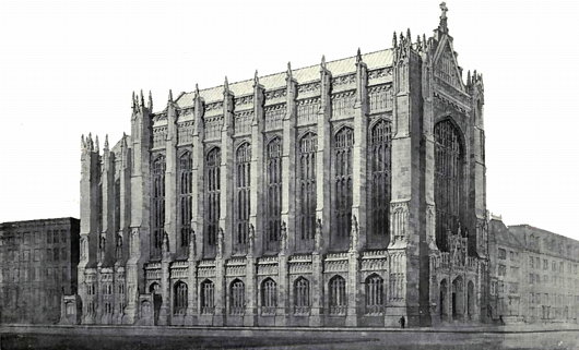
THE CHURCH OF Saint Thomas on the corner of Fifty-third Street and Fifth Avenue in New York is one of the artistic gems of the city: both as an architectural marvel designed by Ralph Adams Cram & Bertram Grosvenor Goodhue and as a musical paradise with its renowned choir of men & boys formerly under the tutelage of Gerre Hancock. (It’s foolish for anyone in the city during Advent to miss the Service of Lessons & Carols). The parish of the Episcopal Diocese of New York was established in 1834, and its first building was erected in the Gothic style on the corner of Broadway and Houston.
In 1870, after that neck of the woods became less fashionable, the congregation moved to its current location at 53rd & Fifth, to a new Gothic edifice by Richard Upjohn. That church hosted the marriage of Consuelo Vanderbilt to the 9th Duke of Marlborough. When it burned down in 1905, a competition was held to select the design of the new Church of St. Thomas, then perhaps at the peak of its high social status among Manhattan’s Protestant congregations. (more…)
Unbuilt Cape Town: Municipal Offices
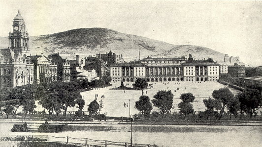
UNBUILT ARCHITECTURAL PROPOSALS fascinate me. Unfortunately most of the books documenting the more prominent examples of unbuilt buildings focus on space-age hyper-modernist ideas that never got off the drawing board, but these tend towards the tawdry and ridiculous. Far more interesting are the rejected proposals for buildings that did get built — for example the rival schemes to rebuild the Palace of Westminster after the 1834 fire — or this example of a proposal for a building never executed. I came upon these scheme thanks to the uploads of the Flickr user Berylmd. While Cape Town has a splendidly grand City Hall in an Edwardian Baroque style, the city fathers were unwise in providing insufficient space for the ever-blossoming municipal bureaucracy. This plan would have put a new municipal office building spanning the entire western side of the Grand Parade, replacing those little unremarkable market buildings whose existence on the square persists to this day. (more…)
London Bridge City: The Neo-Venetian Scorned
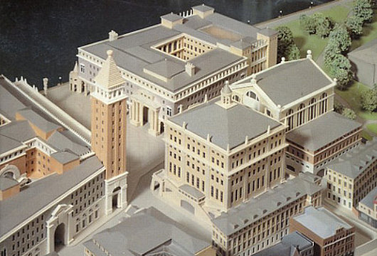
JOHN SIMPSON AND Partners 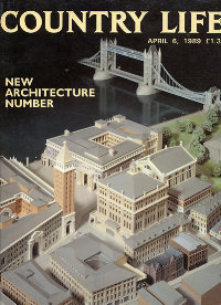 are one of the most prominent firms promoting classical architecture and urban design in Great Britain. They are perhaps most widely known for the work they did on the Queen’s Gallery at Buckingham Palace, as well as for the rejected scheme to redevelop Paternoster Square next to St. Paul’s Cathedral. Contemporary to their ultimately unsuccessful Paternoster Square bid was another ambitious scheme, Phase Two of the London Bridge City development. For Phase Two, Simpson composed a miniature Venice-on-the-Thames complete with Piazza San Marco and ersatz campanile. There seems, however, to be something just a bit un-English about the whole project. There are numerous examples of Ruskinian Venetian buildings throughout Britain, and indeed the Commonwealth, but an entire complex of Anglo-Neo-Venetian seems a bit over-the-top. Still, one can’t deny preferring a touch of Simpson’s over-the-top Venetian to the glass-plated boredom developers usually offer the public.
London Bridge City, Phase Two was proposed in the aftermath of the hugely popular speech by Prince Charles in which he condemned a planned modernist addition to the National Gallery as a “monstrous carbuncle on the face of a much-loved and elegant friend”. A bit of a donnybrook erupted between the architectural elite on the one hand (supporting the carbuncle) and the public on the other (supporting the Prince of Wales) and many a property developer was caught in the rhetorical crossfire. LBC’s backers decided, as an act of pragmatism, to come up with three radically different schemes in different styles and present them for consideration. (more…)
Baron Bossom’s Bridge
The Unbuilt ‘Victory Bridge’ Crossing the Hudson River at Manhattan
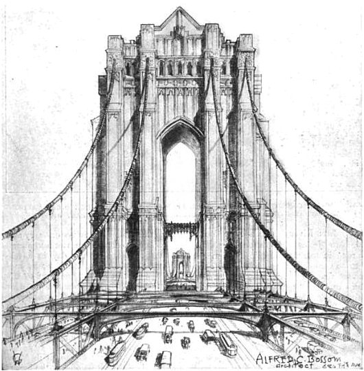
After the victory of America and her “co-belligerents” in the First World War, a temporary victory arch was erected out of wood and plaster to welcome the troops home from Europe. After the arch was dismantled, however, discussions soon arose on how to permanently commemorate the war dead of New York, with a surprising variety of suggestions made. A beautiful water gate for Battery Park was suggested, with a classical arch flanked by Bernini-like curved colonnades, so that a suitable place existed to welcome important dignitaries and visitors to New York. (Little did they know how soon the airlines would replace the ocean lines). Another proposal was for a giant memorial hall located at the site of a shuttered hotel across from Grand Central Terminal, while others suggested a bell tower.
An entirely different proposal, however, was made by the New York architect Alfred C. Bossom (later ennobled as Baron Bossom of Maidstone). Bossom, an Old Carthusian, was an Englishman by birth and eventually returned to his native land, where (in 1953) he gave away the future prime minister Margaret Roberts at her marriage to Denis Thatcher. He himself served in parliament from 1931 until 1959, excepting his wartime Home Guard service. Jokes were often made about his surname resembling both “bottom” and “bosom”. Upon being introduced to Bossom, Churchill jested “Who is this man whose name means neither one thing nor the other?” (more…)
Brompton Oratory as It Might Have Been
Failed Entries of the 1878 London Oratory Architectural Competition
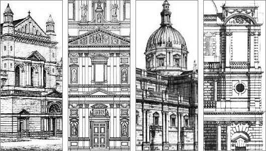
ARCHITECTURAL COMPETITIONS have always fascinated me because they give us the opportunity to glance at multiple executions for a single concept, to see different minds solve a “problem” with their own particular formulas and theorems. The designs of many of the world’s prominent buildings were chosen by competition, perhaps the Palace of Westminster — Britain’s Houses of Parliament — is most famous among them. When the Hungarian Parliament held a competition to design a grand palace to house the body, it found the top three prize designs so compelling that it built the first-prize design as parliament and the second and third places as government ministries nearby. To my surprise, I have only ever come across one book which adequately surveyed the subject of competitive architecture, Hilde de Haan’s Architects in Competition: International Architectural Competitions of the Last 200 Years. Most of the contests covered in the book are, naturally, for government buildings of national importance — private clients usually have a very firm idea of what they want and choose an architect accordingly.
One building not mentioned in the book but nonetheless very dear to me (and no doubt to many readers of this little corner of the web) is the Church of the Immaculate Heart of Mary of the Congregation of the London Oratory, more popularly known to friend and foe alike as the Brompton Oratory. It was the first church in Britain in which I ever heard mass, the summer after kindergarten when I was still but a tiny, blond-haired whippersnapper, in the midst of my first visit ever to the Old World, and the Oratory made quite a strong impression upon my young mind. It is usually one of my very first ports of call whenever I am in the capital, and I once even managed to slip in having just arrived at Heathrow while making my way to King’s Cross and the train to Scotland.
The Brompton Oratory is known for having good priests, traditional liturgy, and beautiful architecture. The final design was by one Herbert Gribble, but there was quite a bit of to-ing and fro-ing before Gribble was selected. The temporary church which had been erected on the site had been condemned by one critic as “almost contemptible” in its exterior design. In 1874, the Congregation of the Oratory (which is to say, the priests) put out an appeal for funds towards the construction of a permanent church. The 15th Duke of Norfolk obliged with £20,000 to get the ball rolling, and the next year a design by F. W. Moody and James Fergusson was agreed upon in principle. But the Reverend Fathers soon began to get creative and hatch ideas and contact other architects and very soon it was claimed that there were as many counter-proposals as there were priests of the Oratory, and perhaps more. A pack of clerics supported a suggested design by Herbert Gribble, but no accord could be reached among the Congregation as a whole.
In January 1878, then, it was announced that a competition would take place to decide the design of the permanent church of the London Oratorians. First prize was £200, with £75 for the runner-up. All entries had to meet the certain requirements drawn up by the Congregation. The style was to be “that of the Italian Renaissance”. The sanctuary, at least sixty feet deep, must be “the most important part of the Church. … Especially the altar and tabernacle should stand out as visibly the great object of the whole Church.” The minimum width of the nave was fifty feet, and maximum length 175 feet. Subsidiary chapels must be “distinct chambers”, not merely side altars. One aspect not mentioned was the projected execution costs of the designs — “an omission criticized by architectural journalists and disgruntled competitors,” the London Survey tells us, “whose designs called for expenditure ranging from £35,000 to £200,000”.
Over thirty entries were submitted to the competition, and Alfred Waterhouse was commissioned by the Fathers to provide comment on the submissions. Significantly, George Gilbert Scott, Jr. submitted a design, though I haven’t been able to get my hands on any depictions of it. Waterhouse praised it as “of no ordinary merit. … I feel that it is impossible to speak too highly of its beauty, its quiet dignity, its absence of all vulgarity and its concentration of effect around the high altar.” (more…)
Unbuilt Pugin in Boston
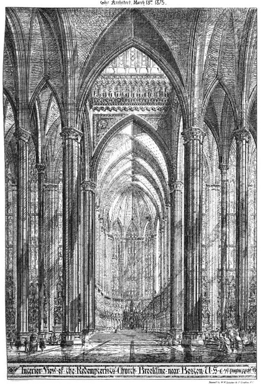
Unbuilt proposal for a Redemptorist church in Boston by Edward Welby Pugin, eldest son of Augustus Welby Northmore Pugin.
Search
Instagram: @andcusack
Click here for my Instagram photos.Most Recent Posts
- Faithful Shepherd of the Falklands April 8, 2025
- Articles of Note: 8 April 2025 April 8, 2025
- Proportionality Destroys Representation April 8, 2025
- Sag Harbor Cinema March 26, 2025
- Teutonic Takeover March 10, 2025
Most Recent Comments
Book Wishlist
Monthly Archives
Categories

