Design
About Andrew Cusack
 Writer, web designer, etc.; born in New York; educated in Argentina, Scotland, and South Africa; now based in London.
 read more
News
Blogs
Reviews & Periodicals
Arts & Design
World
France
Mitteleuropa
Knickerbockers
Argentina
The Levant
Africa
Cape of Good Hope
Netherlands
Scandinavia
Québec
India
Muscovy
Germany
Academica
A new bookplate for the NYG&B
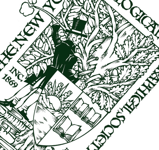
Fr. Guy Selvester reports on his resurrected Shouts in the Piazza blog that the great Marco Foppoli has designed a new bookplate for the New York Genealogical & Biographical Society. Mr. Foppoli is the most highly-regarded heraldic artist of our day, and the influence of the style of his mentor, the late Archbishop Bruno Heim, is apparent in his work.
Matt Alderman’s at it again
The king of counter-proposals sets eyes on Divine Mercy shrine
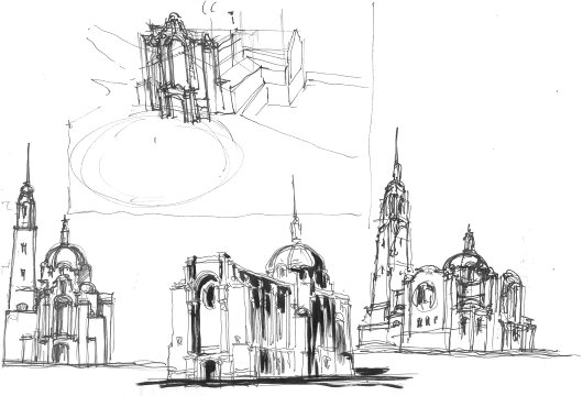
Young architect Matt Alderman presents his counter-proposal to a horrifyingly kitsch proposal for a West-Coast U.S. shrine to the Divine Mercy. Why, given that the recovery of skill & talent in architecture in the past few decades, are most new churches still revoltingly ugly? “The problem is not that it is hard to get beautiful churches built, but that the wrong people seem to end up getting the commissions,” Matt writes. “Oakland and Los Angeles were, of course, going to go modernistic no matter what, but Houston Cathedral could have been a masterpiece if handled by someone with a greater openness to traditional design, rather than settling for a mediocre pseudo-traditionalism.”
Un soupçon de couleur
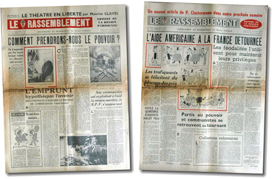
These two numbers of the Gaullist newspaper Le Rassemblement show what even a little dose of colour can do for a journal printed in black-and-white. The lack of additional colour was due to economical, not to mention technological, restraints, but we have now gotten well used to our newspapers being printed in a full array of colour. Yes, even the FAZ.
The Groote Kerk
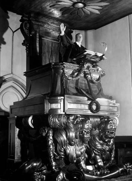
Dr. van der Merwe, moderator of the Dutch Reformed Church, poses in the splendidly carved pulpit of the Groote Kerk in Cape Town.
Von hier an blind
 The German band “Wir sind Helden” is a quartet purveying inoffensive pop rock, and recommended to us by one of our continental cronies. For their 2005 album cover, Von hier an blind, the band commissioned a group portrait in the ligne-claire style. The design is an obvious homage to Hergé’s Tintin. “Wir sind Helden” are little-known in the English-speaking world, though they have played three sold-out concerts in London, and are available from the iTunes Music Store.
Peter van Dongen
Dutch champion of the Ligne Claire style
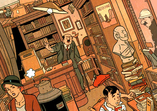
No doubt one of the most enjoyable aspects of Hergé’s great Tintin series of bandes desinées is the brilliant ligne claire style in which they are drawn; the most talented living exponent of which is surely Peter van Dongen. This Dutch striptekenaar (“comic-strip draughtsman”) first came to the attention of the comic world in his mid-twenties with Muizentheater (1990), a tale of two working-class Amsterdammers growing up during the Great Depression. As van Dongen despises clichés, it is one of the few books about Amsterdam that doesn’t feature a single canal. It was nearly ten years before van Dongen produced his second comic work, Rampokan, depicting the Dutch East Indies during their final years before independence. (On Rampokan, van Dongen collaborated with fellow ligne-clairist Joost Swarte, whose work is often seen in The New Yorker).
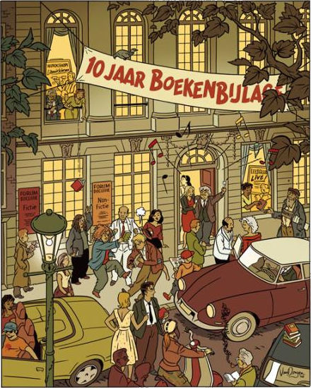
Van Dongen works as a commercial illustrator, and he often provides illustrations for NRC Boeken, the book review of the NRC Handelsblad. A celebration of the tenth anniversary of NRC Boeken was held at the Felix Meritis and is commemorated in the drawing above.
Propaganda Fide

Cheers to the unknown wag who created this delightful poster, parodying the Obama “HOPE” posters.
Le monde diplomatique

The German edition of Le monde diplomatique underwent a complete overhaul not too long ago. Unlike the main French edition of Le monde diplo, which exhibits the exact style of a French newspaper of mediocre design circa 1996, the German edition now exudes a certain calm and composed modernity. The redesign is the work of the German typographer and designer Erik Spiekermann, whom the Royal Society have named a Royal Designer for Industry (entitling him to an HonRDI after his name; only “hon” because he is not a British subject). Mr. Spiekermann was responsible for the much-lauded redesign of The Economist, the magazine you read when the airport lounge doesn’t have a copy of The Spectator.
The European I grew up with
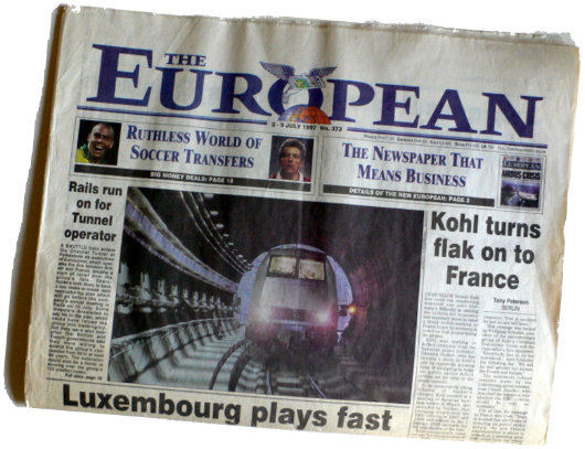
When I was a kid, The European — the weekly broadsheet that billed itself as “Europe’s national newspaper” from 1990 to 1998 — was my favourite newspaper and was an indelible part of our Sunday routine in the Cusack household. First Mass, then a trip to the pastry shop, then pick up The European at the newsagents next door, and back home to read and munch al fresco.
The paper was fiercely Euro-federalist until Andrew Neil took over, so I suspect were I to look back on a few copies now, I would probably strongly disagree with its politics. The late Peter Ustinov was a columnist, and he was not just a European integrationist but indeed a major supporter of world federalism (i.e. the abolition of nations and the rule of the planet by a single government; in theory democratic but inevitably a dictatorship of course).
Nonetheless, it was a very broad paper, with news from all across the continent from Cork to Constantinople, and I have no doubt its coverage played at least some role in the formation of your humble and obedient scribe.
The Primera Revista Latinoamericana

We are of the opinion that the more publications, the merrier, and so we certainly welcome the foundation of the Primera Revista Latinoamerican de Libros. The PRL, which is a sort of Hispanic version of the TLS, started printing last September and is based right here in New York. The bimonthly is published in Spanish but reviews both books that are printed in Spanish and books printed in English. Again, like the TLS, it is not limited to book reviews but features other literary essays as well.

The head honcho at the PRL is Fernando Gubbins, who has earned a master’s degree in Public Affairs from Columbia here in New York and a philosophy degree from the Pontifical Catholic University of Peru. Mr. Gubbins previously edited the opinion & editorial section of the Peruvian newspaper Expreso, and has worked with the Economist Intelligence Unit.
Not being a hispanophone, I am not qualified to render judgement on the quality of the publication’s content, the PRL in print is well designed and has a very traditional but modern feel to it, and it was a pleasure flicking through its pages. The Primera Revista is a welcome addition to the literary world of New York, and of Latin America.

New vice-regal flag for New Zealand

Elizabeth II, Queen of New Zealand, recently approved a new vice-regal flag (above) for her governor-general, His Excellency the Honourable Anand Satyanand, PCNZM, QSO, KStJ. The flag has a blue field charged with the shield from the coat of arms of Her Majesty in Right of New Zealand, topped by St. Edward’s crown. The previous flag (below) was of the standard viceregal type for the British Commonwealth of Nations, depicting the crest from the British royal arms with a scroll bearing the name of the dominion.
His Excellency, incidentally, is the first Catholic governor-general in the history of New Zealand.

How a newspaper should look
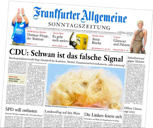
The Sunday edition of the Frankfurter Allgemeine Zeitung has always been a handsome newspaper. I admired its appearance so much that it provided much of the inspiration for the look of the Mitre during my editorship of that august publication. The weekday FAZ was famously reactionary in forbidding the appearance of photographs or any colour on the front page, so the Sonntagszeitung was viewed as an opportunity to be a bit more colourful and a little more free, but still within a solid traditional design.
It saddened me to learn that the Monday-through-Thursday FAZ has given in to the Spirit of the Age and now allows not only colour on its front page but photographs there as well. It now looks like a fairly conventional German newspaper, rather than the king of German dailies.
I will miss the old black-and-white FAZ because for me it brings back memories of visits to Dr. Timmerman‘s flat in St Andrews. Sofie and I used to go over to the good professor’s place for German pancakes on Shrove Tuesday (or to listen to his giant old radio, or to simply enjoy good conversation with good wine) and he had a massive pile of Frankfurter Allgemeine Zeitungs which I believe he only discarded at the end of the month.
Because the Frankfurter Allgemeine‘s front page is now a little less boring, the world in general is now a little less interesting.

The Late Great Bank of New York

Doesn’t it often seem that as soon as something you actually like comes along, it’s only a short amount of time before it’s gone again? This is how I feel about the latest, and indeed last, logo and general visual identity of the Bank of New York. Readers are no doubt aware that the Bank of New York is the oldest bank in America (founded by Alexander Hamilton) and that its was the first share traded on the New York Stock Exchange when that great financial market was founded beneath a buttonwood tree in 1792.
In 2005, the Bank of New York finally dumped their 1980’s-feel, dated-but-traditional logo in favor of a new design put together by the New York brand house of Lippincott (then still known as Lippincott Mercer). The logo suggested an old stock or bank note but its polychromatic scheme gave it a modern vibrancy. The adjacent logotype was along similar lines: “Bank” and “New York” in a tasteful, restrained modern with “The” and “of” in a delightfully traditional fluid colonial script.
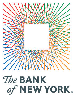
But on July 1, 2007, the ancient Bank of New York merged with a foreign interloper, the Mellon Financial Corporation of Pennsylvania and the disgusting hybrid child of the marriage is cumbersomely monikered: “The Bank of New York Mellon”. How awkward and ungainly! Along with the merger came a new logo, also designed by Lippincott, which you can see on the BNYM website. This pitiful modern arrowhead design says little, other than one might suffer bodily harm at its handling.
The 2005 Bank of New York logo evoked a sense of solidity. “I have deep roots and firm foundations,” it seemed to say, “but am nonetheless modern and adapting to change”. Think of the feel, the smell, of a worn bank note and then compare it to the dull, prickly arrowhead which threatens injury. The old logo you stick in you pocket and gain a sense of security from. The new logo you worry a ninja might hurl at you.
It was an error even to change the name, if you ask me. “The Bank of New York” has such a simplicity and a solidity to it, which the new name rather lacks. It is just like the old New York law firm of Dewey Ballantine, which suffered a takeover recently and is now known as “Dewey and LeBoeuf”. Rather sounds like a pair of huckster Louisiana lawyers hoping to make a few off the innocent inhabitants of the Bayou. So stick to the tried and the true, folks. It usually works.
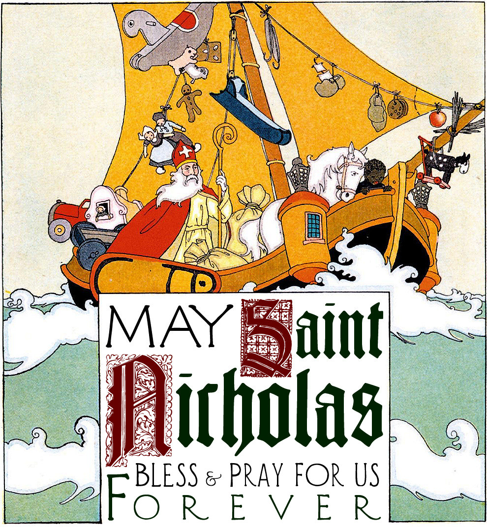
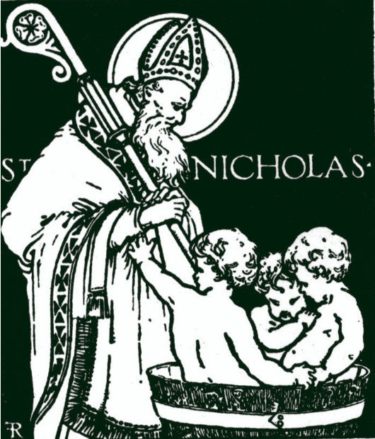
Sinterklaasfeest

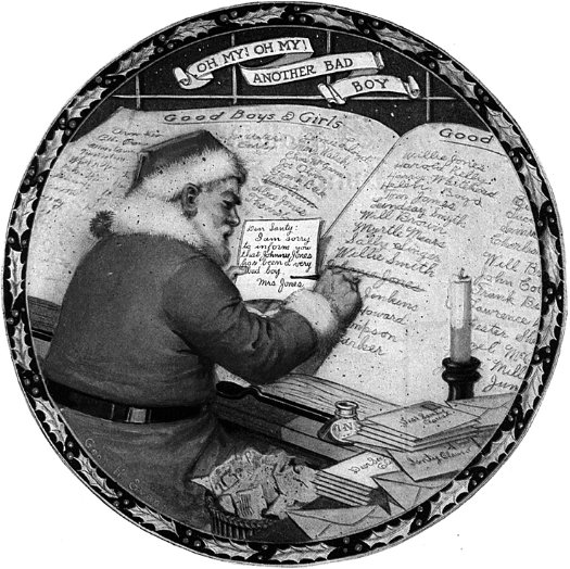
Wishing you all a very blessed Saint Nicholas day!
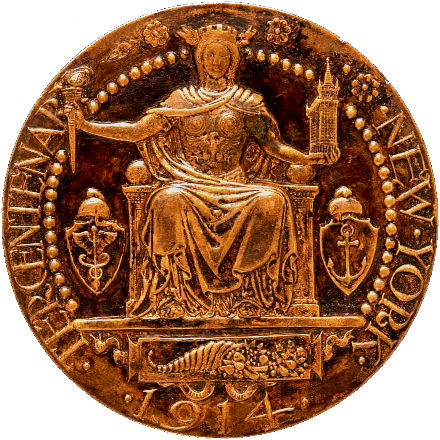
New Netherland Medal
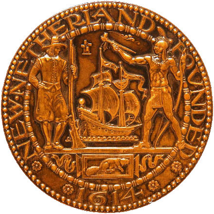
Paul Manship, New York Tercentenary Medal
Bronze, 2 3/4 inch diameter
1914, Smithsonian American Art Museum
Lions and Torches and Trees (Oh My!)
Or, What £40,000 Gets You in Today’s World


A
MONG THE MANY changes which the Rt. Hon. David Cameron MP has wrought in his ten months as leader of the Conservatives one of the most public is the change of the party’s emblem. The flaming torch is out and the solid oak is in, at a cost of £40,000 to Conservative Central Office (according to the Times). There are three slightly different designs of the tree for the UK-wide, Scottish, and Welsh parties. Previously, the national party used the ‘flaming torch of liberty’ logo while the Scottish party used a blue lion rampant and Wales had its rather comely red-white-and-blue dragon with fire pouring forth from its mouth. The former logo was the ‘flaming torch of liberty’, which only entered into usage in the 1980’s under Mrs. Thatcher. In its place, we find instead an oak tree with healthy greenery on its limbs and a trunk made out in the traditional Tory blue. (more…)
Search
Instagram: @andcusack
Click here for my Instagram photos.Most Recent Posts
- Gellner’s Prague December 19, 2024
- Monsieur Bayrou December 18, 2024
- Dempsey Heiner, Art Critic December 17, 2024
- Vote AR December 16, 2024
- Articles of Note: 12 December 2024 December 12, 2024
Most Recent Comments
Book Wishlist
Monthly Archives
Categories

