Design
About Andrew Cusack
 Writer, web designer, etc.; born in New York; educated in Argentina, Scotland, and South Africa; now based in London.
 read more
News
Blogs
Reviews & Periodicals
Arts & Design
World
France
Mitteleuropa
Knickerbockers
Argentina
The Levant
Africa
Cape of Good Hope
Netherlands
Scandinavia
Québec
India
Muscovy
Germany
Academica
4 de Junio
On June 4, 1943, 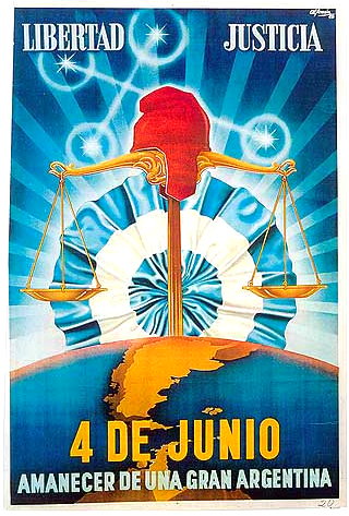 a murky group of Argentine military officers called the GOU (standing for United Officers’ Group, or Government, Order, Unity) overthrew President Ramon Castillo and ended the Década Infame, or ‘Infamous Decade’ that had begun with the 1930 coup against Hipólito Yrigoyen. The ’43 coup was led by General Arturo Rawson, who served as President of Argentina for a month before being replaced by the more politically minded Gen. Pedro Ramírez.
Ramírez sympathised with the Axis powers in the Second World War, and his inability to successfully maintain Argentina’s neutrality in the face of U.S. pressure led to his resignation and succession by Gen. Edelmiro Farrell, who was viewed by most as the instrument of his charismatic junior, the infamous Col. Juan Perón (with whom we are all too familiar).
This poster produced by the junta incorporates a number of the symbols of Argentine patriotism and nationalism. ‘Liberty’ and ‘Justice’ are proclaimed the principles of the junta, and underneath the date of the coup is announced the ‘Dawn of a Greater Argentina’. The Phrygian cap of liberty, a frequent Argentine emblem, rests atop the scales of justice while the stars of the Southern Cross imply a divine favour over the new regime.
The map of Argentina coloured in yellow includes the British colony of the Falkland Islands and Antártida Argentina, the Argentine Republic’s claimed possession on the Antarctic continent (which overlaps with competing claims by Chile and the United Kingdom). Behind the whole composition, the Argentine Cockade looms ascendant like a rising sun, affirming the text’s proclamation of a new dawn under the nationalist-revolutionary regime.
The new Times of London online

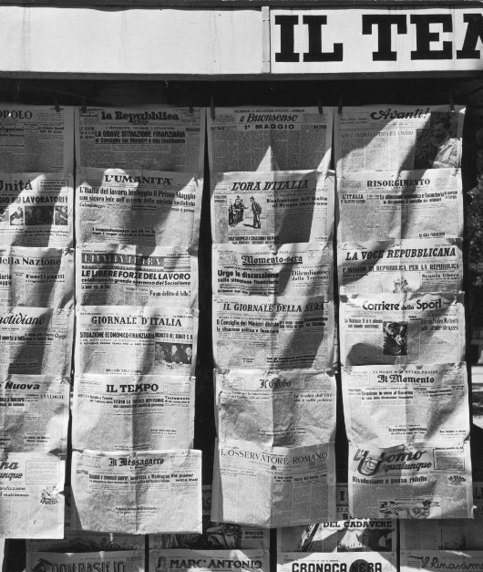
IAM MILDLY obsessed with newspaper design (in case you hadn’t noticed that already). But even those few newspapers that manage to either be attractive or worth reading (or indeed both) usually have websites that are astoundingly ugly. Check out the websites of The Scotsman, Le Monde, or the Times of India. They vary from awful to “meh”. The website of The Hindu is ugly, but is being replaced by a much more handsome design. Despite the over-sized ad on the index page, Die Zeit‘s website is on the handsome side of things, but that of the Neue Zürcher Zeitung is a mixed bag, some well-done details here, other poor ones there. I despise lefigaro.fr, especially since they started charging for their e-paper edition. The structure and flow of telegraph.co.uk is actually good, but the detailing isn’t and (like faz.net) it poorly reflects its newspaper’s personality.
Along then strolls the once-venerable Times (f. 1785), with a brand spanking new website at thetimes.co.uk. Clear, orderly, precise in its details, and just plain handsome in its overall design. There’s nothing particularly special or over-the-top about it; it’s just well done, but that is shockingly rare for newspapers today. (more…)
Cape Town’s New Way to Get Around

Over at Fascination Street, Brent Smith shows us the newly revealed branding for Cape Town’s new integrated rapid transit system: MyCiti. I’m not partlicularly impressed. Most of my fellow uitlanders will be forgiven for lacking an understanding of the stylised freehand letter ‘y’, which is rather tortured into representing an outline of Devil’s Peak, Tafelberg, and Lion’s Head. Mr. Smith diplomatically reserves judgement but I think they could’ve done better, although they could have done much worse.
Classical South Africa

I’m rather fond of the little coin logo of the Classical Association of South Africa, which appears on the front page of the society’s scholarly journal, Acta Classica: Verhandelinge van die Klassieke Vereniging van Suid-Afrika.
CASA also publishes, in cooperation with Stellenbosch University, Akroterion: Tydskrif vir die Klassieke in Suid-Afrika.
The study of our ancient civilisation is alive & well in South Africa!
The Clootie Dumpling
 IT IS A DESIGN masterstroke, combining simplicity and ease of recognition with layers of symbolism. The emblem of the Scottish National Party is just one single line that descends, turns around, and crosses itself, but while remaining uncomplicated manages to evoke the Saltire (Scotland’s flag), the thistle (Scotland’s flower), and — the pudding which has given the logo its nickname — the clootie dumpling, a Scots specialty. And yet, despite its ubiquity, there is surprisingly little to be found online about the history of the SNP’s clootie dumpling.
The emblem was commissioned by William Wolfe (right) in 1962 for the parliamentary by-election in which he was standing as the Scottish Nationalist candidate. The party had typically employed a lion rampant as its symbol, which Wolfe thought too complex, and got Julian Gibb (in his own words, “scarcely out of childhood”) to design the brilliantly simple logo. “A political visionary with an eye for iconography,” according to Gibb, Wolfe used the emblem in the unsuccessful by-election campaign and a year later successfully proposed it to the party for adoption as the party emblem.
“The adoption of a geometric logotype is a bold act for a political organisation, especially a nationalist one, with the swastika a not too distant memory,” writes Gibb. “But the inner logic of the thing was persuasive. Forbye imagined allusions to saltire, thistle, and clootie dumpling, there was perhaps something irresistible about virile angularity supported on swelling curvature, implying among other things that in this outfit, the mechanistic depended on the organic. At one end of the scale of application it was devised to be hastily slapped on walls with a furtively loaded brush (the aerosol age had yet to come) and a quick flick of the wrist – no skill required. Try doing that with the lion rampant.” (more…)
Hollandic Heraldry
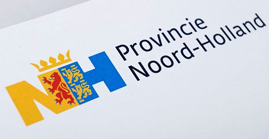
The Eden Spiekermann group, who were responsible for the redesign of The Economist in 2001, recently developed this logotype for the Dutch province of North Holland. The conjoined legs of the ‘N’ and ‘H’ integrate the province’s coat of arms.
’n Indiese woning in die Moederstad
Kaapstad het ’n bietjie van die Himalajas
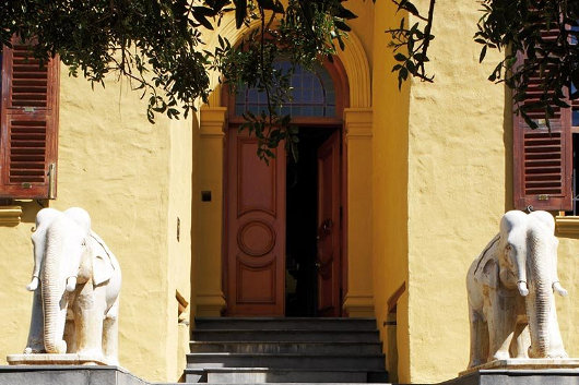
Twee versamelaars van suid-Asiatiese kuns het ’n subkontinentale woning in ’n Kaapstadse meenthuis geskep. Die huis was die onderwerp van ’n artikel deur Johan van Zyl in ’n onlangse uitgawe van Visi-tydskrif met hierdie foto’s van Mark Williams. Die algehele effek is ’n bietjie “over the top” vir my, maar die verleiding van die Oriënt sal nooit ophou. (Bo: ’n Paar van marmer-olifante uit Udaipur wagte by die hoofingang).
“In ’n nou keisteenstraat aan die rand van die Kaapse middestad staan ’n huis met ‘n geskiedenis” Mnr van Zyl skryf. “Toe dit in 1830 vir Britse soldate gebou is, het die branders nog digby die voordeur geklots, en nie lank daarna nie het Lady Anne Barnard hier sit en peusel aan ’n geilsoet vy wat ’n slaaf vir haar gepluk het, stellig van dieselfde boom wat nou in die huis se (nuwe) trippelvolume-glashart staan, ’n knewel met ’n vol lewe agter die blad.”
“’n Dekade of twee gelede het die reeds luisterryke geskiedenis van die huis ’n eksotiese dimensie bygekry toe twee toegewyde versamelaars — selferkende stadsjapies wat destyds in die modebedryf werksaam was — hier kom nesskop met hulle groeiende versameling Indiese oudhede.” (more…)
Baptizing the Tricolore
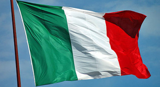
THE RECENT RULING of the self-styled “European Court of Human Rights” that the presence of crucifixes in Italian schools is a violation of the rights of a non-practicing Lutheran from Finland has sparked a surge of outrage against European institutions in Italy, and indeed elsewhere. While (as Gerald Warner has reported), the Italian Constitutional Court has shown the proverbial two fingers to the ECHR judgement in a ruling of its own, one junior cabinet minister has a suggestion of his own. Roberto Castelli, Italy’s deputy minister for infrastructure and transportation, suggests the country should reassert its Christian identity by adding a cross or crucifix to the Italian flag.
“I believe,” Mr. Castelli said, “that Europe has the right to recognize its true identity that we are starting to lose completely.” Even the Minister of Foreign Affairs, the Freemason and ex-Socialist Franco Frattini, seemed amenable to the idea. “Nine European countries already have the cross on their flag,” Frattini pointed out. “It is an extremely common proposition.” (more…)
Fraktur Ausgabe

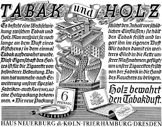
Little known fact: when this website is accessed from German-speaking countries, it appears in an old-fashioned fraktur typeface. (more…)
The Australian
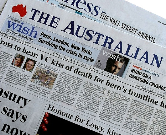
A surprisingly handsome newspaper, especially considering it is owned by (and, indeed, was founded by) Rupert Murdoch. Reminds me of The Scotsman in its broadsheet days.
Scottish Field

“He looked up from Scottish Field and all the colour, all the warmth of the world of those pages seemed to drain away.” So writes Alexander McCall Smith in The World According to Bertie, in which the eponymous minor’s enforced visits to the child psychiatrist at the command of his overbearing mother are made at least somewhat bearable by the freedom to flip through the pages of the magazine. Scottish Field is an institution, a staple of doctors’ waiting rooms and bed-and-breakfast sideboards, as well as acting as a Caledonian companion to Country Life and The Field (both of which are produced south of the Tweed, a world away). Your humble & obedient scribe even once graced the high-and-mighty social pages of Scottish Field, beside Lt. Col. Bogle and His Eminence the Cardinal Archbishop of St Andrews & Edinburgh.
Scottish Field recently underwent a bit of a redesign, which included a typographical change to its old-fashioned nameplate (often called a banner or, erroneously, the masthead). (more…)
Joost Swarte

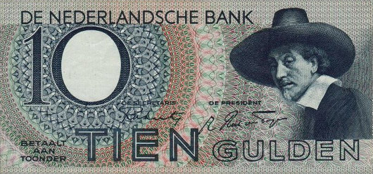
This year’s summer issue of The Walrus featured a cover from the cartoonist Joost Swarte, which occasioned a post about the Dutch ligne-clairist on the magazine’s blog. Mijnheer Swarte actually invented the term ligne-claire (or klare lijn) to describe the Tintin-esque school of bandes-dessinees, and has collaborated with the noted Peter van Dongen on the latter’s Rampokan series depicting the late years of the Dutch East Indies before it became Indonesia. Swarte’s work has also featured in The New Yorker, our “local” weekly which partly inspired the Canadian Walrus. Jumping from the printed page to brick and mortars, the new Musée Hergé in Louvain-le-Neuve was actually designed by Swarte. His previous architectural work includes a theatre building in his home town of Haarlem in North Holland. (more…)
The Nook, Stellenbosch
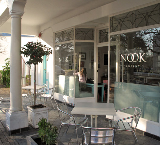
This place opened up in Stellenbosch just before I left South Africa, but I never had the chance to check it out. I like to look of the place, even though the colours are a bit too subdued for my taste. (more…)
Swanndri
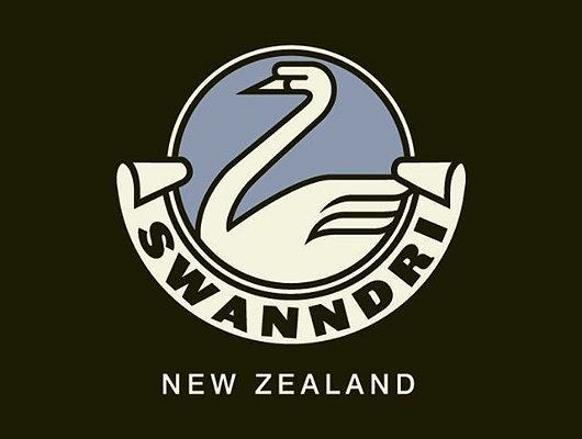
Founded in 1913, this New Zealand outdoor clothing company advertises: “We have to make a good garment. Most of our customers have guns.” Their classic heavy woollen garment with a lace-up section at the neck has been a favourite of Kiwi farmers for decades, but the firm now produces clothing for city-dwellers and outdoor adventurers as well.
I just like their logo.
Richard Demarco
“We didn’t know quite how to take this, but we sat there entranced.”
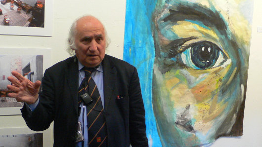
ONE OF THE markedly few deficiencies of the English language is coming up with a word to describe Richard Demarco. The Scottish press have generally settled upon “impresario” but even that somewhat-ambiguous word fails to do the man justice. Ricky was born in Edinburgh in 1930, grew up in Portobello, and remembers the day when his mother held him back from school because Italy — from whence he stock came — had just declared war on Great Britain. He’s attended every Edinburgh Festival since the very first one began in 1947 — as the founders put it, to “provide a platform for the flowering of the human spirit” in the grim aftermath of the Second World War.
 Richard Demarco, couchant, with noted Scots caricaturist Emilio Coia.
In 1963, he cofounded the Traverse Theatre, Scotland’s theatre for new writing, and three years after that founded the Richard Demarco Gallery which promoted Scotland’s cultural interchange with artists across Europe including — very importantly to Richard — from behind the Iron Curtain that divided the continent into free and captive halves. This was during an age when many in the arts world were too busy sympathizing with the murderous totalitarianism that had subjugated half of Europe. Richard has been a deep critic of the choices made by the British government as patron of the arts throughout the decades of his life, but not too long ago he finally patched things up with the Scottish Arts Council.
Readers of Alexander McCall Smith’s 44 Scotland Street might recall the man who comes to speak to the Scottish Police College. The “really important person from the art world in Edinburgh”, as Mr. McCall Smith puts it, comes and tells the trainee constables about the gorgeousness of Italian carabinieri uniforms and how the Scottish psyche still suffers from the iconoclasm of the Reformation, and even suggests architectural alterations and more sympathetic decoration of the Police College. “We didn’t know quite how to take this, but we sat there entranced,” the character admits in 44 Scotland Street. Anyone who either knows Ricky or has been to one of his lectures would immediately recognize the unnamed subject of the passage.
I first met the man when I was a first-year student at St Andrews and he had come up from the capital to give a lecture. I can’t remember what the stated subject was but this is entirely irrelevant as so vast and wide-ranging is the mind & experience of Richard Demarco that he is known for (some would say “notorious for”) never keeping within the bounds of the stated subject. Those who invite Richard to speak shouldn’t bother with a subject, just make posters stating “RICHARD DEMARCO SPEAKS”, giving the date, time, and place, and a crowd of interested characters is bound to turn up. (more…)
Search
Instagram: @andcusack
Click here for my Instagram photos.Most Recent Posts
- Gellner’s Prague December 19, 2024
- Monsieur Bayrou December 18, 2024
- Dempsey Heiner, Art Critic December 17, 2024
- Vote AR December 16, 2024
- Articles of Note: 12 December 2024 December 12, 2024
Most Recent Comments
Book Wishlist
Monthly Archives
Categories

