Featured
About Andrew Cusack
 Writer, web designer, etc.; born in New York; educated in Argentina, Scotland, and South Africa; now based in London.
 read more
News
Blogs
Reviews & Periodicals
Arts & Design
World
France
Mitteleuropa
Knickerbockers
Argentina
The Levant
Africa
Cape of Good Hope
Netherlands
Scandinavia
Québec
India
Muscovy
Germany
Academica
Googlebosch
Google Street View Comes to the Eikestad and all South Africa
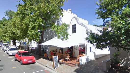
There had been rumours for a while. Talk had spread around the land of strangely equipped vehicles criss-crossing the country, and now the whole world can access Google Street View for South Africa. Naturally, they haven’t managed to capture every street in the whole country, but Cape Town, the Peninsula, and the Boland are well-covered, which naturally includes the handsome town of Stellenbosch that I used to call home. This of course provoked a mini-tour of the Eikestad and environs to see all the old familiar places. Above is Basic Bistro, the finest establishment in town, where one would oft find me planted outside with a pot of rooibos and the day’s edition of the Cape Times or Die Burger. The little alleyway to the right led to the back entrance to my old place. (more…)
Our Cardinal Strikes Again
Cardinal O’Brien, Scottish Primate, Preaches at Newly Ordained Priest’s First Mass in the Extraordinary Form at St. Mary’s Cathedral Edinburgh
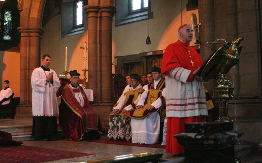
Keith Patrick O’Brien, the Primate of Scotland and Cardinal Archbishop of St Andrews & Edinburgh, this weekend preached at the first mass offered by the recently ordained Fr. Simon Harkins of the Priestly Fraternity of St. Peter. The mass was offered in the Cardinal’s own Cathedral of St. Mary in Edinburgh, Fr. Harkins’s own home town. The Very Rev. Fr Josef Bisig FSSP and the Very Rev. Fr. Franz-Karl Banauch FSSP assisted, and monks from the Transalpine Redemptorists of Papa Stronsay (who provided these photos) were also present, in addition to a number of diocesan priests.
I’ve spent the past eight years of my life divided between three (arch-) dioceses and I have to admit that Cardinal O’Brien is still the one I feel the greatest affection for. He’s an affable, uncomplicated fellow, and can be relied upon to defend what’s right in the media — unquestionably one of the best prelates in Britain today.
“I find him a much more approachable figure than other Scots prelates,” writes Damian Thompson, “less inclined to stand on his dignity despite (or perhaps because of) his red hat. I met him once at a party to relaunch the Scottish Catholic Observer, to whom he’s been a good friend; he didn’t sweep in surrounded by flunkeys, but hung around chatting in ordinary priest’s dress, reminding me a bit of Basil Hume in that respect.”
As it happens, I’m head of Cardinal O’Brien’s fan club on Facebook, which I encourage any Facebook users out there to join.
God bless our cardinal, and many congratulations to Fr. Hawkins! (more…)
The Versatility of the Cape Dutch Style
ORANJEZICHT IS ONE of my favourite parts of Cape Town, nestled in the bowl between Table Mountain and Signal Hill. Its name betrays it’s sloping location, which offers a view towards the Oranje bastion, one of the five of the Castle, which take their name from the titles of William, the Stadthouder of the United Provinces. The architecture is generally handsome, even if it often tends towards the Victorian. A few years ago, Cape Town Daily Photo featured a view (above) of the corner of Montrose Avenue and Bo-Oranjestraat in Oranjezicht. The late-autumn/early-winter street scene focusses on the Oranjezicht Carlucci’s, one of a small chain of delicatessens and wine shops founded in the mid-1990s.
The architecture of the shop is by no means in the strictest confines of the Cape Dutch style but is instead a more modern design influenced by the local architectural tradition of the Cape. While the Cape tradition is better known for larger country houses and wine-growing estates or small cottages, it’s just as useful a guide in the urban context. Dating the age of the building just by this photo would be tricky, as the region has some fairly convincing recent structures built in the old style (the dovecot at Alphen, for example), but I’d wager it’s 1900s-1910s construction that underwent a substantial renovation in the 1990s. (more…)
The new Times of London online

IAM MILDLY obsessed with newspaper design (in case you hadn’t noticed that already). But even those few newspapers that manage to either be attractive or worth reading (or indeed both) usually have websites that are astoundingly ugly. Check out the websites of The Scotsman, Le Monde, or the Times of India. They vary from awful to “meh”. The website of The Hindu is ugly, but is being replaced by a much more handsome design. Despite the over-sized ad on the index page, Die Zeit‘s website is on the handsome side of things, but that of the Neue Zürcher Zeitung is a mixed bag, some well-done details here, other poor ones there. I despise lefigaro.fr, especially since they started charging for their e-paper edition. The structure and flow of telegraph.co.uk is actually good, but the detailing isn’t and (like faz.net) it poorly reflects its newspaper’s personality.
Along then strolls the once-venerable Times (f. 1785), with a brand spanking new website at thetimes.co.uk. Clear, orderly, precise in its details, and just plain handsome in its overall design. There’s nothing particularly special or over-the-top about it; it’s just well done, but that is shockingly rare for newspapers today. (more…)
“The Reality is Love”
“The doom and gloom conveyed by the media is not the full picture.”
by HILARY WHITE
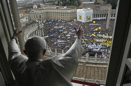
ROME, May 17, 2010 (LifeSiteNews.com) – There is one thing that still surprises me about Italy: the Italians love the pope. Even when they don’t necessarily listen to or obey him on every point, even when he is not an Italian, the Italians have a genuine and very warm paternal relationship with the holder of the Keys. This Sunday, 150,000 people packed into St. Peter’s Piazza to hear Benedict XVI give an address after reciting the Regina Caeli, and to show their Holy Father their love and support after the trying period of the last few months.
I suppose coming from the Anglo world, imbued with its perpetually simmering anti-Catholicism inherited from the Elizabethans and the Glorious Revolution, it will always come as a pleasant surprise to see that, whatever vitriol the mainstream media of the anglosphere continues to pour onto this papacy, that vitriol is not the reality. Whatever Reuters or the New York Times or even Ansa will tell you, the crowd of over 150,000 people gathered in St. Peter’s Piazza on Sunday were nearly beside themselves with joy to see their Papa.
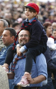 It has been unseasonably cold and raining more or less steadily for weeks, and being still something of a newbie around here, I had not expected to have to hurry on Sunday. Still thinking like an Anglo and not expecting the Italian enthusiasm for their pope, I had planned to make my way over to St. Peter’s Piazza about 11:30, and thought I could take a leisurely 9:30 train into the City and take the bus down to the Campo di Fiori to have a sandwich and a cup of awful Roman tea first. But in the café a television was playing live coverage of the Piazza and I could see the crowd was already, at 10:45, starting to fill the huge space. I took my panino di pollo to go.
I had read that the Piazza could hold about 100,000 people, and remembered the day a couple of years ago when the Italians gathered to give a collective two-fingers-up to Rome’s heavily secularist Sapienza University, who had insulted their Holy Father by rescinding his invitation to speak. The English-language press was most reluctant to report that thousands of happy, shouting, smiling Sapienza students filled the square at the General Audience that week.
Today they are admitting that the Piazza held over 150,000 on Sunday, called together from all over Italy by a coalition of Italian lay associations – and that seems about right. What they don’t seem to want to report is the spell of joy that held them, many of whom waited for hours to see and hear and shout cheers to the pope. (more…)
Nuns!
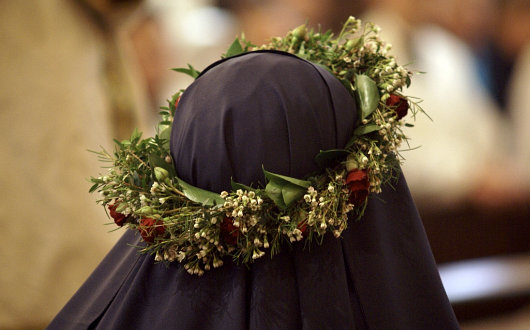
The author of Kansas Catholic was gracious enough to provide his readers with numerous photos of the recent profession of vows of the Benedictines of Mary, Queen of the Apostles that took place recently at Old St. Patrick’s in Kansas City, Mo. The Benedictines of Mary, Queen of the Apostles are a “traditional monastic community of women who desire to imitate the Blessed Virgin Mary in the giving of herself to God to fulfill His Will, especially in her role of assistance by prayer and work to the Apostles, first priests of the Catholic Church”.
Founded fifteen years ago in Pennsylvania, they accepted the invitation of the Most Rev. Robert W. Finn, the Bishop of Kansas City-St. Joseph, to move to his diocese in 2006. You can find out more about this relatively young community at their website here. (more…)
London Bridge City: The Neo-Venetian Scorned
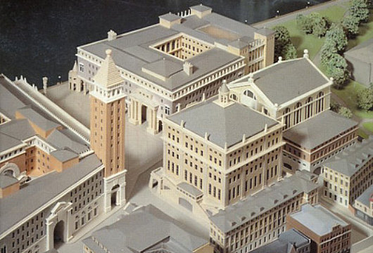
JOHN SIMPSON AND Partners 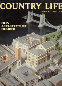 are one of the most prominent firms promoting classical architecture and urban design in Great Britain. They are perhaps most widely known for the work they did on the Queen’s Gallery at Buckingham Palace, as well as for the rejected scheme to redevelop Paternoster Square next to St. Paul’s Cathedral. Contemporary to their ultimately unsuccessful Paternoster Square bid was another ambitious scheme, Phase Two of the London Bridge City development. For Phase Two, Simpson composed a miniature Venice-on-the-Thames complete with Piazza San Marco and ersatz campanile. There seems, however, to be something just a bit un-English about the whole project. There are numerous examples of Ruskinian Venetian buildings throughout Britain, and indeed the Commonwealth, but an entire complex of Anglo-Neo-Venetian seems a bit over-the-top. Still, one can’t deny preferring a touch of Simpson’s over-the-top Venetian to the glass-plated boredom developers usually offer the public.
London Bridge City, Phase Two was proposed in the aftermath of the hugely popular speech by Prince Charles in which he condemned a planned modernist addition to the National Gallery as a “monstrous carbuncle on the face of a much-loved and elegant friend”. A bit of a donnybrook erupted between the architectural elite on the one hand (supporting the carbuncle) and the public on the other (supporting the Prince of Wales) and many a property developer was caught in the rhetorical crossfire. LBC’s backers decided, as an act of pragmatism, to come up with three radically different schemes in different styles and present them for consideration. (more…)
Titles in Afrikaans
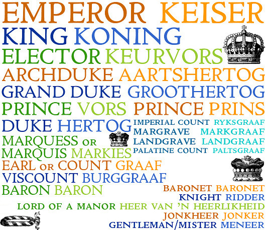
ROYAL, NOBLE, AND common titles in Afrikaans are, like most of the language, descended from Dutch antecedents which, in turn, come from German. The Cape knew not the Kingdom of the Netherlands, which was established after the Dutch relinquished the colony, but was founded as an outlet of the Dutch East India Company (or V.O.C., to give its Dutch acronym). After a brief period of British occupation, Dutch dominion over the Cape returned during the Batavian Republic before finally being seized by the British in 1806 and erected as a British colony in 1814. When the Union of South Africa was created in 1910, the country had its first king, George V, though the sovereign was generally only referred to as ‘King of South Africa’ from 1927 onwards.
The country has had no emperors, though some like to attribute that title to Shaka, the greatest King of the Zulus. Typically, however, he is known as king (as in King Shaka International Airport, Durban’s brand new landing-place). South Africa’s royalty have tended to be either native (like Prince Nelson Rolihlahla Mandela) or German (like Prince Hubertus of Prussia, d. 1950, and a few Blüchers, etc.). (more…)
Victory+65 in Moscow
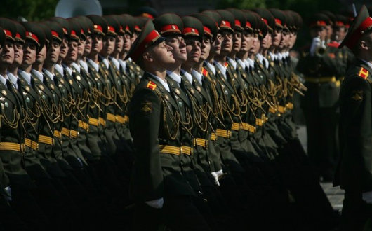
ANOTHER VICTORY DAY in Moscow — sixty-five years now since the Allied Powers defeated the crisply attired Axis of Nazi Germany and her slightly foppish cohort Fascist Italy. Russia commemorates V-E Day a day “late” because the German instrument of surrender entered into force at 23:01 CET on May 8, 1945 — by which time it was already May 9 in Moscow. For this reason most countries within the ex-Soviet sphere celebrate the end of the Second World War a day later than in western Europe. It is also customary on this day for patriotic citizens to wear the orange-and-black ‘Ribbon of St. George’, which recalls the Military Order of the Holy Great-Martyr and the Triumphant George established in 1769 and revived in 1994. The Order of St. George is the highest military honour awarded by Russia after the paramount Order of St. Andrew. (more…)
Dr. Cornelis Pama
Die grootste Suid-Afrikaanse heraldikus
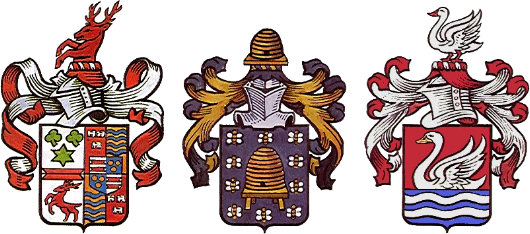
Ferreira — Bezuidenhout — Swanepoel
THE GRANDPAPA OF South African heraldry studies is undoutedly Dr. Cornelis Pama, a heraldist, genealogist, author, and editor of great importance in the field. Pama was one of the original members of the State Heraldry Council when it was founded in 1963 and refined the genealogical numbering system invented by Christoffel Coetzee de Villiers in the nineteenth century and which is now known as the de Villiers/Pama system in recognition of his contribution.
When I resume acquisitioning for my personal library, a whole slew of Pama’s works are on the ‘works sought’ list. Foremost among them is the excellent Lions and virgins: Heraldic state symbols, coats-of-arms, flags, seals and other symbols of authority in South Africa, 1487-1962 which I frequently made use of in the Stellenbosch university library.
Pama also wrote Heraldiek ABC (1980), Heraldiek in Suid-Afrika (1956), Simbole van die Unie (1960), British Families in South Africa: Their Surnames and Origins (1992), The Wine Estates of South Africa (1979), Vintage Cape Town: Historic Houses and Families In and Around the Old Cape (1973), and a history of the South African Library (the Cape Town institution which has since been foolishly merged with the Staatsbiblioteek in Pretoria to form the National Library of South Africa). The S.A.L. received his important private collection of over 800 genealogical and heraldic books and other works after Dr. Pama’s death in 1994. (more…)
A New Scots Town in the Highlands
The 20th Earl of Moray teams up with Miami-based firm Duany Plater-Zyberk to plant a New Town of 10,000 inhabitants outside Inverness
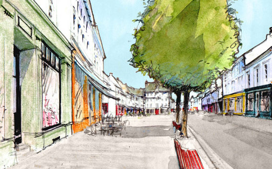
BELEIVE IT OR not, Inverness is one of the fastest-growing cities in Europe, and a local landowner, the 20th Earl of Moray, has teamed up with Duany Plater-Zyberk, an American firm known for its traditional architecture and urbanist ideas, to help create a sustainable new town of 10,000 inhabitants near the “Capital of the Highlands”. Tornagrain will rest on a 200-hectare (500-acre) site on the A96 corridor between Inverness and Nairn. Much of the recent growth in the Highlands has been poorly managed, raising concerns of suburban sprawl and poor land management. Moray Estates, the land holding company of the Earl of Moray (pronounced ‘Murry’) has decided to take the lead by planning a new town in the best tradition of Scottish architecture and urban development. (more…)
The Old New York Observer Building
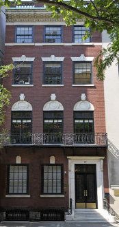
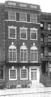
No. 54, East Sixty-fourth Street
“FOR 17 YEARS,” writes Peter W. Kaplan, “since The New York Observer entered city life in 1987, it has existed within a red brick and white-marble-stepped townhouse on East 64th Street.” Designed by Ernest Flagg and Walter B. Chambers during their brief partnership, No. 54 East Sixty-fourth Street (between Park & Madison) was built in 1907 as a private residence for Robert I. Jenks. The AIA guide accurately describes it as “four stories of delicate but unconvincing neo-Federal detail… a minor Flagg.” In 1947, the townhouse was converted into offices for the Near East Foundation, which was founded in 1915 to provide relief for Armenian refugees from the Ottoman Empire and later took on greater responsibilities in North Africa and the Levant. It was then bought by Arthur L. Carter, the founder and publisher of the New York Observer for use as the salmon-tinted newspaper’s headquarters.
In 2004, the Observer moved down to Broadway, two blocks south of the Flatiron Building (and just a few blocks up from The New Criterion whose founder, Hilton Kramer, was for nearly two decades the art critic for the Observer). The townhouse was sold by Carter to the Russian-born Janna Bullock, real estate developer & sometime Guggenheim foundation board member for $9.5 million in the year the newspaper moved out. In 2005, Bullock renovated the building and had it used at the Kips Bay Decorator Show House for the year before selling it on to the Irish investor Derek Quinlan for $18.74 million. Quinlan put it on the market for $36 million but last year the asking price was chopped to $27 million.
Twenty-five feet wide, five stories, and with over 10,000 square feet, No. 54 was probably the only newspaper headquarters to feature nine working fireplaces, rosewood panelling, and oak wainscoting. But the best feature, by a mile, is the splendid iron-railed staircase, which looks like it was lifted straight from Paris. Elegant and graceful, a rare century-old survival in Manhattan. (more…)
Cockerell’s Carlton Club
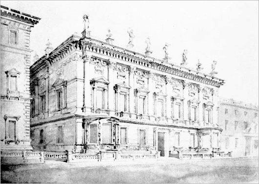
Charles Robert Cockerell is best known for designing both the Ashmolean Museum at Oxford and its Cambridge equivalent, the Fitzwilliam Museum. He is also, alongside William Henry Playfair, responsible for the twelve-columned National Monument that sits atop Calton Hill in Edinburgh — allegedly unfinished, though there is considerable debate over whether this is so. It’s not widely known, however, that the famous architect Cockerell completed a design for a new home for the Carlton Club on Pall Mall in London.
Originally Cockerell had declined the opportunity to submit a design, with such lofty names as Pugin, Wyatt, Barry, and Decimus Burton also declining the offer. A few years later, Cockerell nonetheless worked on this design for the Tory gentlemen’s club, which is superior to that conceived by another architect which was eventually built. Cockerell devised a “lofty Corinthian colonnade of seven bays” according to the Survey of London. “The columns have plain shafts, their capitals are linked by a background frieze of rich festoons, and the Baroque bracketed entablature is surmounted by an open balustrade with solid dies supporting urns and gesticulating statues.” (more…)
The Oriental Club
Stratford House, London
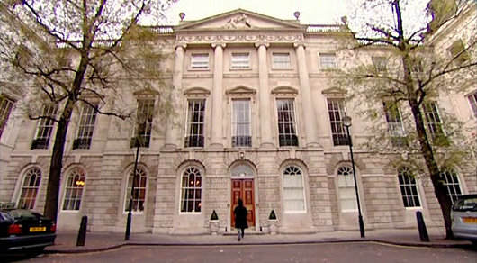
JUST STEPS AWAY  from Oxford Street, one of London’s busiest thoroughfares, rests a quiet little street called Stratford Place probably familiar only to Tanganyikans or Batswana seeking counsel from their countries’ high commissions. At the termination of the dead-end street sit the stately quarters of the Oriental Club: Stratford House. The club was founded in 1824, as British involvement and influence in both India and the Orient was waxing rapidly. General Sir John Malcolm, sometime Ambassador of His Britannic Majesty to the Court of the Peacock Throne (which is to say, Persia), coordinated the founding committee and advertised a club which would draw its members from “noblemen and gentlemen associated with the administration of our Eastern empire, or who have travelled or resided in Asia, at St. Helena, in Egypt, at the Cape of Good Hope, the Mauritius, or at Constantinople.” (more…)
The New Yale Colleges
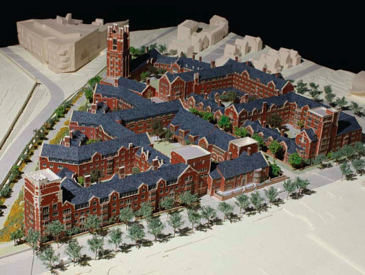
Yale University announced in 2008 that it would erect two new residential colleges in order to expand its undergraduate population without putting further strain on the twelve residential colleges that currently exist. Reportedly, Yale officials took a look at the new Whitman College at Princeton University, designed by traditional architect Demetri Porphyrios and decided even that wasn’t traditional enough. They commissioned Robert A. M. Stern, an architect who has, on occasion, proved exceptionally capable in traditional styles (the American Shingle style in particular), to design the two new colleges at the Connecticut university.
While the new colleges are currently being referred to as ‘North College’ and ‘South College’, there is little doubt that each college will find a generous benefactor who will endow it with funds and in return deign to allow the college to be named after the deep-pocketed soul.
The new colleges will, appropriately, be built in the Collegiate Gothic style, but will be faced in brick instead of stone. Brick facing in Gothic-style buildings always leaves one with a slight dissatisfaction, I’m afraid. Still, the decision to build in a traditional style is of course commendable.
For a commentary on the Collegiate Gothic of today, see this bit from Dino Marcantonio.
Here follow a few of the architect’s renderings of the new colleges. (more…)
Engelsman se Graf

It was just a dot and a name on the map on our way to Wupperthal — Englishman’s Grave, “Hmmm… I wonder what that could be”. The Cederberg mountains have many charms, and of course any one who drinks as much rooibos tea as I must be intrigued to see the only place in the world where it is commercially grown. Leopards, caracals, and bonteboks guard these hills, and of course our friend the dassie (previously seen here) is known to wander around its rocks. (more…)
The Clootie Dumpling
 IT IS A DESIGN masterstroke, combining simplicity and ease of recognition with layers of symbolism. The emblem of the Scottish National Party is just one single line that descends, turns around, and crosses itself, but while remaining uncomplicated manages to evoke the Saltire (Scotland’s flag), the thistle (Scotland’s flower), and — the pudding which has given the logo its nickname — the clootie dumpling, a Scots specialty. And yet, despite its ubiquity, there is surprisingly little to be found online about the history of the SNP’s clootie dumpling.
The emblem was commissioned by William Wolfe (right) in 1962 for the parliamentary by-election in which he was standing as the Scottish Nationalist candidate. The party had typically employed a lion rampant as its symbol, which Wolfe thought too complex, and got Julian Gibb (in his own words, “scarcely out of childhood”) to design the brilliantly simple logo. “A political visionary with an eye for iconography,” according to Gibb, Wolfe used the emblem in the unsuccessful by-election campaign and a year later successfully proposed it to the party for adoption as the party emblem.
“The adoption of a geometric logotype is a bold act for a political organisation, especially a nationalist one, with the swastika a not too distant memory,” writes Gibb. “But the inner logic of the thing was persuasive. Forbye imagined allusions to saltire, thistle, and clootie dumpling, there was perhaps something irresistible about virile angularity supported on swelling curvature, implying among other things that in this outfit, the mechanistic depended on the organic. At one end of the scale of application it was devised to be hastily slapped on walls with a furtively loaded brush (the aerosol age had yet to come) and a quick flick of the wrist – no skill required. Try doing that with the lion rampant.” (more…)
Christen Købke in London
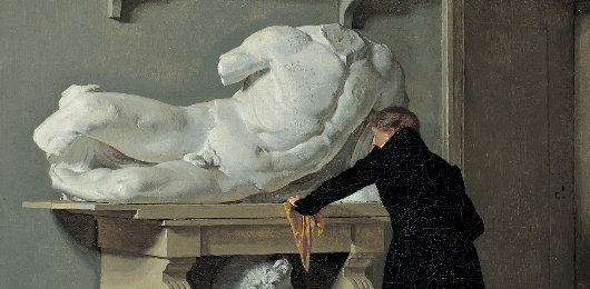
THROUGH JUNE 13, the National Gallery in London is exhibiting “Christen Købke: Danish Master of Light”, a small show of the neglected Danish Golden Age painter but the first exhibition exclusively of his works outside of Denmark. “Kobke generally chooses the quietest corner, or a view from the side,” writes Waldemar Januszczak in The Times. “What fascinates him is the way light falls on the old stones, or the tufts of grass growing between the cracks. Throughout his art, whether he is painting landscapes or people, Købke seems always to be noticing the decay of the world he grew up in.” Januszczak suggests that the warmth of Købke’s work is in reaction to the turbulence of his country’s position in Europe at the time — Denmark backed the wrong horse in the Napoleonic wars and turned to neutrality, only to face a pre-emptive attack by the British in which Copenhagen was ferociously bombarded. The painter was born three years after this humiliation, and at age 12 began his studies at the Royal Danish Academy, where he studied under Christoffer Wilhelm Eckersberg, the ‘Father of Danish painting’.
The talented Købke painted portraits, landscapes, and other scenes. The show at the National Gallery includes my favourite Købke portrait, that of his friend and fellow artist, the landscape painter Frederik Hansen Sødring, on loan from Copenhagen’s Hirschsprung Collection.
His capability aside, what I like about Købke is that he is a certifiable local boy, rarely straying from the vicinity of his native Copenhagen except for the period of study in Italy required of the academically trained artist. His portraits are of his family and his friends, his landscapes of nearby rustic lanes and royal castles. A shame he died of pneumonia just 37 years old.
I haven’t had the chance to view any of his works in the flesh, but Londoners might want to avail themselves of this rare chance to see most of Købke’s capable work while on show in the metropolis. (more…)
Post Renovation
Every now and then I go back and renovate an old post. When this site started, posts had a maximum width of 440 pixels, which is why images tend to be narrower in older posts (such as this). Then, in December 2007, we broadened our horizon to 530 pixels wide, taking into account a move towards more horizontal aspect ratios on most computers. And so, from time to time, I go back to an old post and retro-fit it for 530px-wide from its former width.
The most recent post to undergo such a transformation is the one on the Felix Meritis in Amsterdam. Another is my bit on the Dahlgren townhouse on Ninety-sixth Street. Other than that, there have been only very minor renovations to posts, perhaps one or two images broadened.
Potsdam’s City Palace to be Resurrected
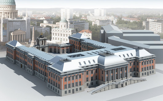
THE OLD STADTSCHLOSS of Potsdam, destroyed by aerial bombing during the Second World War, will rise again next to the Old Market in the Brandenburg capital. The provincial government has decided to rebuild the old Stadtschloss to serve as a home for the Landtag, Brandenburg’s provincial parliament. While it was first conceived of building a modern building on the site, or having some reconstructed façades and others modern, a €20-million donation from the software entrepreneur Hasso Plattner has ensured the façades and massing of the building will follow the outline of the old stadtschloss. The interiors will be simple and modern, and to keep the costs down, much of the finer Baroque detailing of the façades will not be included. “I hope,” Herr Plattner said, “that the necessary compromises do not diminish the great impression overall.” (more…)
Search
Instagram: @andcusack
Click here for my Instagram photos.Most Recent Posts
- Gellner’s Prague December 19, 2024
- Monsieur Bayrou December 18, 2024
- Dempsey Heiner, Art Critic December 17, 2024
- Vote AR December 16, 2024
- Articles of Note: 12 December 2024 December 12, 2024
Most Recent Comments
Book Wishlist
Monthly Archives
Categories

