Arts & Culture
About Andrew Cusack
 Writer, web designer, etc.; born in New York; educated in Argentina, Scotland, and South Africa; now based in London.
 read more
News
Blogs
Reviews & Periodicals
Arts & Design
World
France
Mitteleuropa
Knickerbockers
Argentina
The Levant
Africa
Cape of Good Hope
Netherlands
Scandinavia
Québec
India
Muscovy
Germany
Academica
Holborn Town Hall
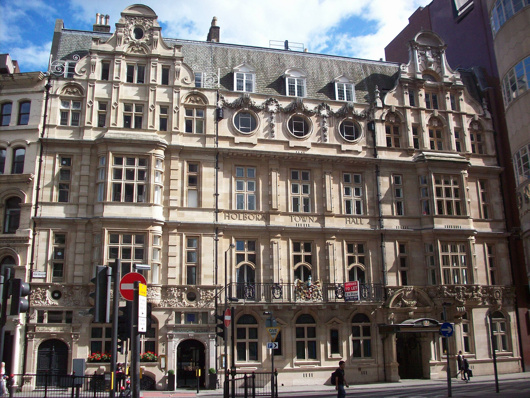
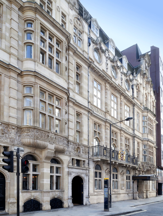
The Metropolitan Borough of Holborn was the smallest borough of London both in geography and population so perhaps it’s not surprising that its town hall was a pretty but rather humble affair. The civic pride and municipal pomposity for which this realm was once renowned are nowhere on show in this handsome building which, but for a few details, could easily be mistaken for a hotel, office building, or private residences.
Holborn Town Hall was built in stages, with the public library on the left-hand side completed in 1894 by the Holborn District Board of Works to a design by Isaacs. With the erection of the borough in 1900, a town hall was needed, and the central and right-hand sections of the building were added between 1906 and 1908 by the architects Hall & Warwick.
In 1965 the borough was merged with St Pancras to form the new London Borough of Camden. It was decided to consolidate the civic government at St Pancras Town Hall, to which the local government union members objected. To placate their ire, a bar for the use of employees was erected atop the annexe being added to the Camden (ex St Pancras) Town Hall — quickly nicknamed ‘the White Elephant bar’.
Though long sold off and converted into office space, the arms of the old borough of Holborn still grace the first floor balcony.
Knickerbocker Spires
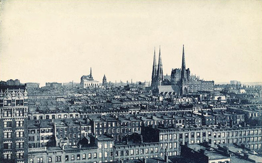
Before the age of the skyscrapers, New York’s church spires dominated the horizon and dwarfed their neighbours just like in the medieval towns and cities of the old world — as this photo from the 1900s shows.
Here St Patrick’s Cathedral holds court, with the St. Nicholas Collegiate Reformed Protestant Dutch Church poking up a few blocks down Fifth Avenue.
Slightly north on that same boulevard sits the grand renaissance palazzo of the University Club, with the spire of the Fifth Avenue Presbyterian Church poking up behind it.
Ten Books
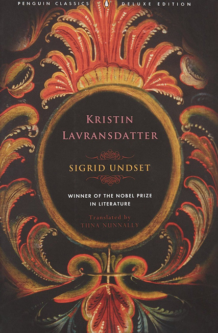
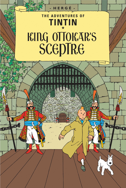
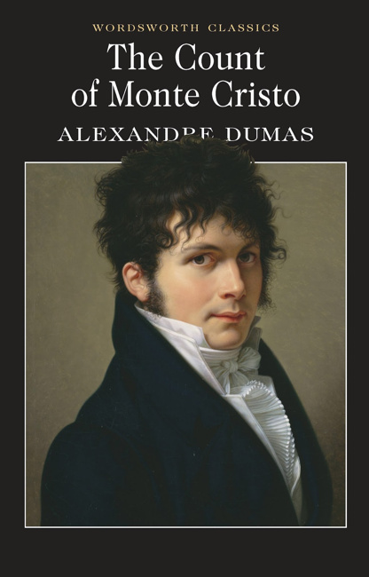
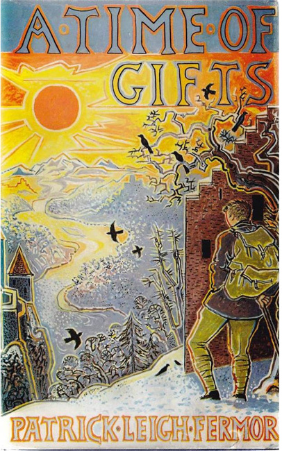
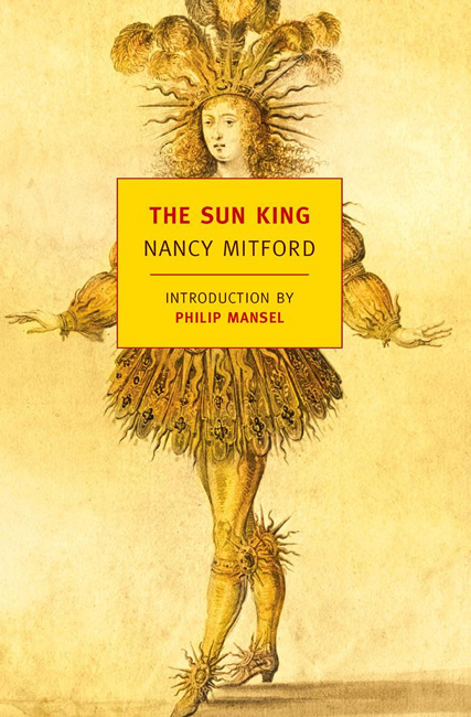
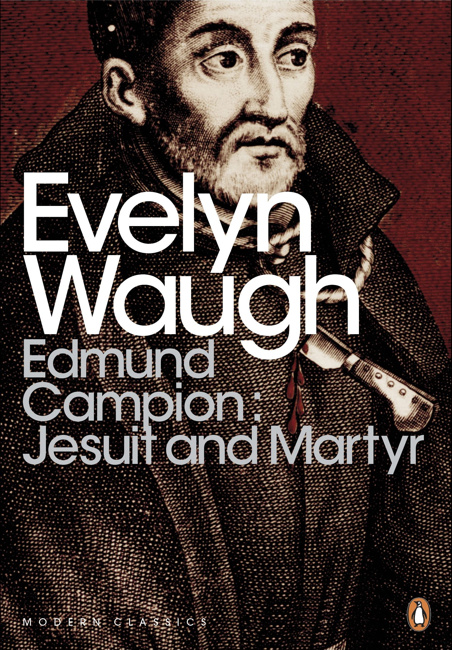
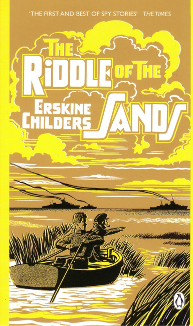
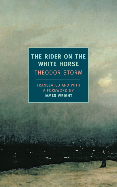
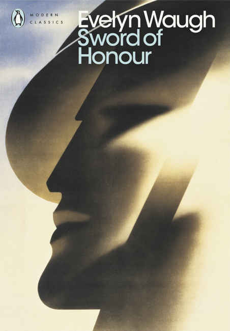
Marian Chashuble
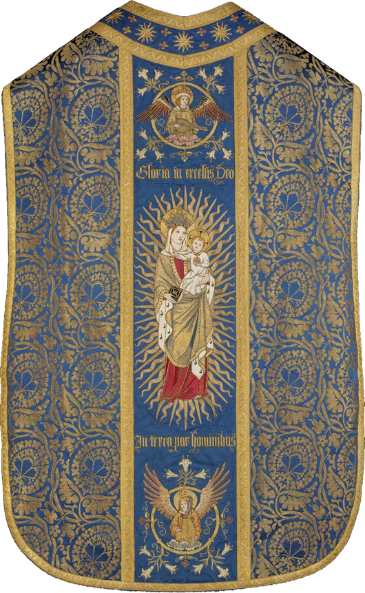
Now in the collection of the Museum of Fine Arts in Boston, it was embroidered by the Sisters of Bethany, a Protestant order of nuns based in Clerkenwell. The Sisters specialised in church vestments and embroidery, and this object is believed to have been produced between 1909 and 1912.
Fr Anthony Symondson SJ has written in greater depth about Comper and the Sisters of Bethany here.
Inside Governors Island
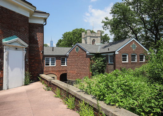
This intriguing little island in New York Harbour has always held something of a fascination for me — viz. articles previous on the subject. Aside from its interesting history there is the matter of the complete lack of foresight in ending its military use as well as the failure to imagine a future use suitable to its history and, if the word is not hyperbole, majesty.
Gothamist recently featured a new peek inside some of the abandoned buildings on Governors Island, a mere selection of which are reproduced here. (more…)
Hollandic Fever
Adapted from the Deborah Moggach novel of the same name, ‘Tulip Fever’ is a curious concoction. Some of the plot holes are so big you could drive a coach and horses through them. For example, how is it that – in Calvinist-controlled seventeenth-century Amsterdam – there is a massive Catholic convent perfectly accepted by everyone and operating as if nothing is out of place? It’s the size of Norwich Cathedral! (In fact, it is Norwich Cathedral – this entire production was filmed in Great Britain.)
The often excellent Chrisoph Waltz is curiously mismatched with his role here: a little bit too much of a parody of the proud, pious Amsterdam merchant in the start, which makes his eventual transformation a little unconvincing. The plot also shows little of the brilliance of its co-writer Sir Tom Stoppard. (In fact, there’s a bit too much plot.) At least Dame Judi Dench is effortless in her role as the unnamed Abbess of St Ursula. Tom Hollander is thrown in for a laugh, in a role suited to his abilities.
For curiosity’s sake the most interesting casting choice was Joanna Scanlan, known as the useless press officer at DOSAC in ‘The Thick of It’. Here she is the dressmaker Mrs Overvalt, but she was Vermeer’s cook Tanneke in ‘Girl with the Pearl Earring’. If my rudimentary calculations are correct, this means she has been in two-thirds of twenty-first-century films set in the Dutch seventeenth century.
It is, however, a beautifully shot production, for which I suspect we have the cinematographer Eigil Bryld to thank. (He’s worked on one seventeenth-century film before, and on another set in the Low Countries.) Bookended by scenes of Friedrichian romanticism (I’m into that) the film encourages me in my deeply felt belief that we need to revive seventeenth-century Dutch domestic architecture as a style.
Scribbled Notes
Does anyone talk on the phone anymore? Reading a book in which a casual conversation takes place and the main character hangs up the phone, the fact that the author reveals this hanging-up seems surprising. We didn’t need to know it took place over the phone. But it situates the exchange in a concrete reality of sorts.
I never really feel comfortable speaking on such devices, so I only ever speak to people who are far away, pretty much only my parents. Other people use them voluminously, but I only know for certain myself of very few who do. When CSG was alive (and suspicions still linger over the nature of his death), CDL would sometimes spend hours talking to him on the phone, like two old ladies who suffer too many ailments to get out and meet in person. (I’ll concede that they were in different countries.)
I find the very idea revolting. What could one possibly discuss for hours at length down a strange device it’s not even comfortable to handle? My thoughts don’t flow properly over the phone in a way they do naturally face-to-face or via the written word.
I remember Farley’s stories about when he was a correspondent in Rome and — taking no heed of time differences — his editor would phone him up and deliver long screeds which Farley would make a few accommodating noises to then gently place the phone down on his bedside table and let the man carrying on while he gently faded back into the realms of slumber.
Then again the Major sometimes phones during his lunchtime saunter and he usually has information worth sharing or complaints that are satisfying to share, imbued with doom-laden pessimism.
On the whole, then, I am not a telephone enthusiast. Their primary purpose now is of course as smart phones — incredibly useful devices which have lured us into slavery and the impossibility of living without them.
The book I am reading — the one I mentioned earlier — is The Informers by Juan Gabriel Vásquez. I had never read any Colombians — except for Nicolás Gómez Dávila, but as he spoke in aphorisms he is in another category entirely. Colombia is a mysterious realm to me, with only little snippets having ever filtered down to me. When I was a boy, for a year or two we had the daughter of a Colombian senator at our school who taught me the words to ‘La Cucaracha’ but who, out of fear, was always entirely silent on the subject of home; she point blank refused to talk about it. (There were many killings in those days, and I suppose she was abroad for her own safety.)
But the Colombians are by no means an un-literary people — far from it. As someone briefly educated in Argentina it’s sometimes difficult to concede there is any culture in the Americas outside of Argentina, but Colombia’s Gabriel García Márquez is well-known outside his home country. I suppose I will have to read him some day but I decided to start with Vásquez having read a review of one of his more recent books in the Speccie.
Much as one hates to admit that any living writer is worth reading, Vásquez is good, and just a few pages in I got in touch with my old school friend Lucas to tell him I thought he’d like it. Lucas is an Austro-Argentine-Peruvian-Estadounidense living in Guatemala so he gets it, though what he gets is hard to describe. This novel, for example, is not action-driven but primarily from the interior life, which I think is what I mean.
Ever since school days, Lucas has always had a particular genius for over-analysis that I have always criticised him for and do my best not to provoke or indulge in, though this is difficult. Tell him you love the rain. “What? Do you? Wow! But what is it about the rain you love? Is it a primeval force? Is it because we [meaning humanity] are farmers? Well I suppose you’re Irish so you have to love the rain.” (Lucas has always wanted to be Irish.) Thus, having a furiously intensive interior life himself, Lucas might enjoy a novel set primarily (though not entirely) in the interior realm.
Hippo was here the other day in between Rome and Scotland or wherever. (He’s off to Montepulciano for a few weeks, actually.) We had a jolly auld lunch at the Farmers’ Club and discovered over a cigarette and gin-and-tonic aperitif a mutual love for Balzac. Balzac got it — well, not quite, but pretty damned close enough. I am forever reading Balzac, and going on about him to Beatrice who is mostly uninterested (her late father called him “Balls-ache”) though she is perhaps the person with whom I discuss writing most often.
And so, finishing Vásques, I am continuing through Balzac, and others. I am off to the New World later this week, for not terribly long, but I am bringing Gerard Skinner’s book on Father Ignatius Spencer, Barry Hutton’s history of Lisbon, Sandy’s Corduroy Mansions (seeing as I used to live in Pimlico), Lindie Koorts’s biography of DF Malan, and one or two others in the hope of making some progress and being entertained, informed, or enlightened.
We shall see.
Classical New England
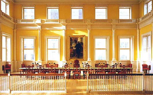
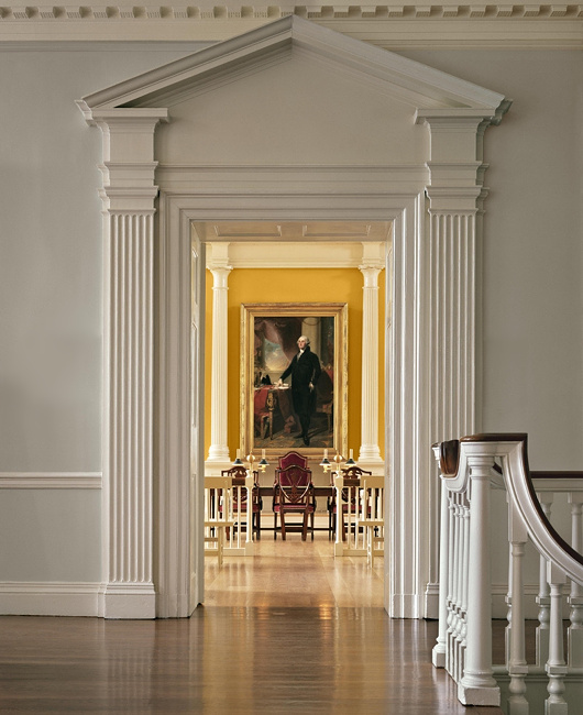
A reminder that Russell Kirk once described the piano nobile of the Old State House in Hartford, Connecticut, as:
“perhaps the most finely proportioned rooms in all America”
Given the elegant restraint and classical detail of the old Senate chamber, it’s hard to disagree.
Observations
All those interested in the history of the workers’ struggle would have enjoyed a letter to the editor printed in last week’s Observer.
Floreat Etona, left and right
Alex Renton is correct when he points out that the 20 old Etonian MPs currently sitting are all Tories, but this is far from usually the case (“Our educational apartheid laid bare”, Books, New Review). The first OE to be elected a Labour MP was in 1923, and the party consistently had OE representation on its benches from then all the way to 2010. Even Clement Attlee’s transformative postwar Labour government included two old Etonians: Hugh Dalton as chancellor of the exchequer and Frederick Pethick-Lawrence as India secretary.
Andrew Cusack (Conservative, non-OE)
London SE1
Of course, no one actually reads the Observer, so it went entirely unnoticed.
I have acquired a dangerously successful rate of my pedantic missives being printed in periodicals. The editors of the Irish Times, Times Literary Supplement, Catholic Herald, and even the Tablet have all been guilty of lapses in judgement in this regard.
Passport Innovation

It is a truth universally acknowledged that changes to passport designs are almost never improvements. Take the new Lebanese passport above. The old passport was a simple and elegant affair, with the noble cedar gracing centre stage, beautiful Arabic script above and the French text in a sturdy typeface below.
The new one, however, is a sorry thing altogether. The central motif is an odd pseudo-fingerprint impression of a cedar, and the national emblem is repeated on a smaller scale above left in gold. Next to that the name of the state is written in Arabic and French. But then it is mistranslated into English as ‘Republic of Lebanon’ – the actual name of the state is the ‘Lebanese Republic’.
(I could bore you with a tirade against the continuing encroachment of the English language into Lebanon – par example street signs used to always be in French and Arabic but often you see newer ones in Arabic and English – but that is a subject for another day.)
It is not at all that passports cannot be done well to a modern design – just look at Swiss passport designs from 1985 onwards, and we’ve already mentioned the elegant new Norwegian numbers. But Lebanon’s new passport gives the impression of being done by a third-rate in-house designer at a midranking corporation. As a country with enormous soft-power potential Lebanon could do with guarding and guiding its brand better and passports are just one aspect of many involved in a country’s image.
Passports, of course, have to change their design every so often to keep one step ahead of counterfeiters and fraudsters. In the past ten years most countries have substantially changed their passports to give them a biometric capability, though in most cases this led to little difference on the cover beyond a change in thickness and the addition of the biometric emblem.
Redesigns of the interior pages are more common and the results have been poor: my U.S. passport now features garish patriotic eagles and such, while luckily I have a few years left before I have to submit to the new Irish passport with its infelicitous pseudo-celtic tourist backgrounds. Foolishly I still haven’t got my UK passport but I understand that’s had its inner pages tarted up recently as well.
The upcoming change for British passports, of course, is that following the UK’s exit from the European Union the passports are going back to blue. Of course, they never actually needed to change to EU burgundy, but civil servants and ministers rather typically chose to change it regardless.
If recent experience shows anything, however, it’s that we should be looking to Scandinavia for models of how to do modern design well.
The Governor’s Room
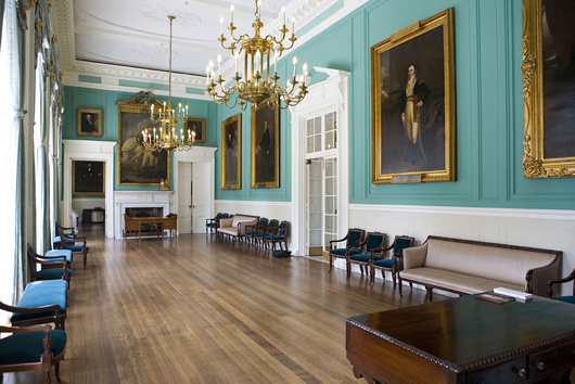
Pursuant to my post of John Bartlestone’s photographs of City Hall, I came across this photo the other day and it reminded me that this is still one of my favourite rooms in all New York. There’s something about that particular shade of green. I previously wrote about this suite of three rooms in 2006.
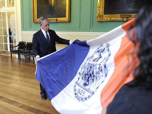
The above photo is by Ramin Talaie while below, in 2010, Mayor Bloomberg inspects a city flag being sent to a New Yorker serving in Afghanistan as reported by the Daily News.
The late & much-missed New York Sun also reported on the portraits hanging in City Hall in 2008.
Eton College Chapel
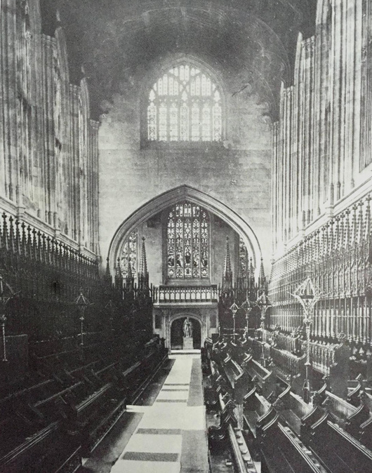
The interior of Eton’s chapel has changed markedly over the past hundred or so years, mostly so thanks to the rediscovery of the priceless medieval wall paintings which had been hidden for centuries by the choir stalls. Painted in the Flemish style in 1479–87, they were whitewashed over by the college barber in 1560 on orders from the wicked new Protestant authorities who had taken over this Catholic school.
The wall paintings were rediscovered in 1847 but it wasn’t until 1923 that the stall canopies in the photograph above were permanently removed, allowing the medieval paintings to be cleaned, restored, and permanently viewed.
In addition to this, in the 1880s (after this photograph was taken) the Great Organ was installed in the broad entrance arch between the narthex and the body of the chapel. The Victorians very handsomely painted it in the medieval fashion and it fits in rather well.
More recently, most of the stained glass was blown out by a German bomb landing in the adjacent Upper School in 1940. A decade later, deathwatch beetles claimed the wooden roof, which was then replaced by fan vaulting (of stone-fronted concrete) in line with the original intentions of Eton’s holy founder, King Henry VI.
A Chapel in Bavaria
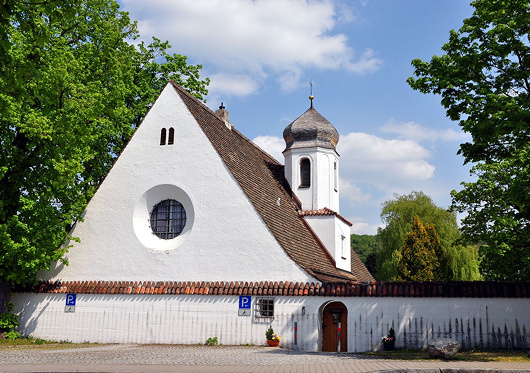
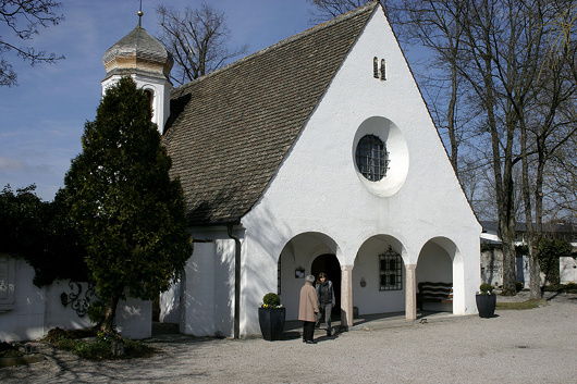
The Friedhofskapelle, or cemetery chapel, in Herrsching on the Ammersee in Upper Bavaria is a wonderful model of a small church or chapel.
It was designed in 1926 by Roderich Fick, who was a disciple of Theodor Fischer. Herr Fick participated in an expedition to traverse Greenland and joined the German colonial service in Cameroon, after the war moving to Herrsching in 1920.
During the Third Reich he was tasked with redesigning the city of Linz where Hitler had spent his childhood, but the dictator found Fick’s plans somewhat restrained, while Martin Bormann was constantly picking fights with the architect. The dominant style of the regime did not align with Fick’s preference for humble, unpretentious tradition in building design.
After the war he was sentenced to aid in the reconstruction of Munich, and also helped restore the magnificent Town Hall of Augsburg.
City Hall
These images of City Hall show the superb skill and eye for detail of the architectural photographer John Bartelstone — a licensed architect in his own right — and date from the completion of the most recent set of renovations in 2015.
Recent Reads
Few things are more enjoyable then a good old-fashioned take-down, and philosopher John Gray delivers the goods with this wonderful review of the latest book by the psychologist and “popular science” writer Steven Pinker, a “feeble sermon for rattled liberals”.
Meanwhile, the inestimable Pee Eee Gee – Pascal-Emanuel Gobry – argues that France’s reigning concept of laïcité is of much more recent vintage then its proponents claims.
The 1905 law ended public subsidies for religious institutions, but instituted no legal or cultural rule against public expression of religious values. So, why are we now told differently?
My only extremely tenuous brush with celebrity is that my Irish teacher (go raibh maith agat, Áine!) happened to tutor on-set the actress who played Luna Lovegood in the Harry Potter films. Among the sort of Dublin people who manage to continually drop into conversation that they went to Trinity, there is a (further) irritating tendency to look down upon the Irish language and use disdain for it as yet another attempt to assert their fragile sense of social superiority.
It is a contemptible and false dichotomy to think that if you appreciate Georgian architecture or Henry Grattan you can’t appreciate the Irish language or Éamon de Valera. Tiresome boors will always try to sell us such dichotomies, but we will not have them.
Paltry though my attempts to learn more Irish have been, what little I’ve picked up has been extremely rewarding and given better insight into the way English in Ireland is spoken and written. (Do the experts still call it “Hiberno-English”, I wonder?) It’s been a pleasure over the past however-long to see Michael Brendan Dougherty – one of America’s most talented journos and a fellow Irish New Yorker – share his own experiences with the Irish language.
MBD’s most recent books column at National Review explores two books concerning Irish, and moves from the Gaeltacht of the mind to a book about Leopolis/Lwów/Lviv/Lemberg in Galicia. City of Lions, incidentally, is published by Pushkin Press, which has proved an almost inexhaustible source of good reads (e.g. Oliver VII).
The recent read I most enjoyed, however, is Gordon Campbell’s delightful combative romp through English translations of the Bible, Making God Speak English. The professor sheds particular light on the thriving culture of pre-Reformation translations of holy writ in the vernacular in general and the English tongue in particular, bursting numerous bubbles of Protestant mythology along the way.
Par example:
Wyclif is a seminal figure in the long road to the catastrophe of the Reformation, with its legacy of decades of wars of religion and centuries of interconfessional animosities that live on in the twenty-first century, but the idea that he was the first translator of the complete Bible into English is a myth. The Middle English Bible, as Henry Ansgar Kelly calls it in his recent reassessment, was in Professor Kelly’s authoritative view neither the work of Wyclif nor of his Lollard followers, but was rather a wholly orthodox Bible with origins in the University of Oxford. It was immensely popular, because it enabled readers and their listeners to understand the readings from the Bible that they heard at Sunday Mass.
I learnt much from Prof. Campbell’s enjoyable submission and you might too.
Albert Power & Arthur Griffith
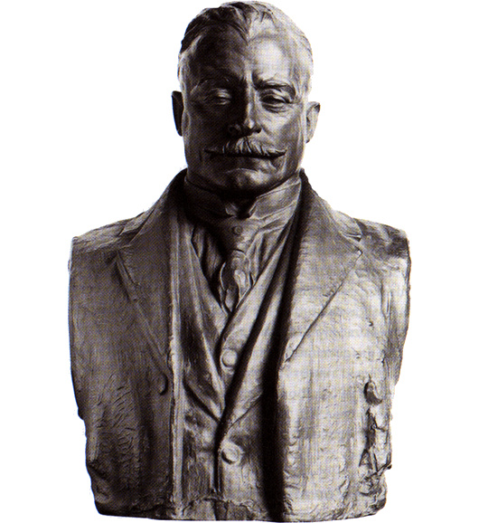
These days the Irish sculptor Albert Power is very rarely spoken of, and I can’t claim to know much about this bronze bust he did of the founder of the original Sinn Féin, Arthur Griffith.
It might be in the National Gallery in Dublin, though I didn’t notice it when I nipped in there with my sister the other day. More likely it is in Leinster House, where there are other busts of prominent figures of 1916-1921 by Albert Power and the better-known Oliver Sheppard.
Unlike Sheppard, Power was a Catholic, which is probably why he was chosen to sculpt the funerary monument of Archbishop Walsh of Dublin who died in 1921. He submitted designs for the new Irish coinage but the Free State wisely chose the far superior set designed by the English sculptor Percy Metcalfe.
As for the subject of this work of art, the Royal Irish Academy’s Dictionary of Irish Biography describes Griffith as “a lucid writer with a vivid turn of phrase”.
The first newspaper he edited was in South Africa where he took the helm of the Middelburg Courant in 1897, attempting to persuade the English-speaking readers with his Boer-friendly views. “I eventually managed to kill the paper,” Griffith wrote, “as the British withdrew their support, and the Dutchmen didn’t bother reading a journal printed in English – the Dutch were quite right.”
Griffith founded Sinn Féin more as a pressure group to support his pet project of reviving the “King, Lords, and Commons” of Ireland, influenced by the Austro-Hungarian Ausgleich of 1867. Independence, he argued, would satisfy the nationalists, while the shared monarchy would keep the unionists happy. In the event, neither half were much enthused by the prospect.
In the aftermath of 1916, Griffith came into his own as a leader and statesman rather than an agitating journalist. His role in the War of Independence and the Treaty negotiations is well known. Without his persuasive arguments in debates, it is highly unlikely the Dáil would have approved the Treaty.
Gloomy civil war soon overshadowed everything, but Griffith died of a cerebral haemorrhage on 12 August 1922 – just ten days before Collins was killed in ambush at Béal na Bláth.
Pretoria Philadelphia
Andries Pretorius grew up on his father’s farm near Graaf-Reinet in the Cape of Good Hope, but the Great Trek took him (and many other Boers) into the South African interior. Pretorius’s victory, against all odds, over Dingane’s Zulu forces at Blood River in 1838 was to be commemorated from that day forevermore by Afrikaner piety as Geloftedag — the Day of the Vow. When the South African Republic (ZAR) was established in 1852 the capital was Potchefstroom, but Andries’s son Marthinus founded the city of Pretoria Philadelphia in 1855 to be the new capital of the Transvaal.
The four colonies at the end of the continent were conjoined in 1910 as the Union of South Africa, with Pretoria (as it was soon shortened to) named the seat of the executive and thus the nation’s capital. The parliament met in Cape Town and the highest courts in Bloemfontein so that, in some sense, the new nation had three capitals — administrative, legislative, and judicial. As the seat of the visible sovereignty of the realm, the Governor-General, as well as the Prime Minister’s administration and cabinet, however, it was Pretoria that held precedence.
We’ve already examined Kerkplein — Church Square — at the heart of the city, but the rest of the capital is worth exploring further. (more…)
Lionel Smit
Suid-Afrikaanse portretskilder
Een van die mees geskoolde portretskilders vandag is die Pretoriaanse kunstenaar Lionel Smit (geb. 1982).
’n Skilder en beeldhouer, Mnr Smit woon en werk in Kaapstad en is die wenner van ’n ministeriële toekenning vir bydrae tot visuele kuns van die Wes-Kaapse regering. Sy werk is reeds ingesluit in die visuele kunste eksamen vir die Nasionale Senior Sertifikaat. Nie sleg vir ’n kêrel in sy dertigerjare!
Smit se skilderye herriner my aan die werk van die Engelse skilder Catherine Goodman. Hier is net sommige van sy portrette.
Physical Energy
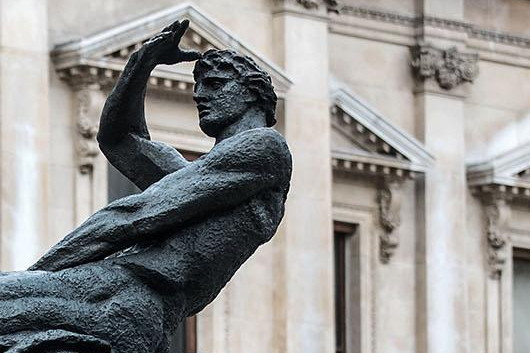
I came across it by surprise one day, walking through the park. It was almost eerie — all the more so for being unexpected. George Frederic Watts’s sculpture “Physical Energy” was well known to me when I lived in South Africa as it graces the Rhodes Memorial in Cape Town — a rough Greek temple staring out northwards into the vast continent of Africa, as Rhodes himself liked to do.
Unknown to me, another cast of the statue was made and given to the British government, which placed it in Kensington Gardens. It was this copy I stumbled upon while traversing the park to Lily H’s drinks party in the garden of Leinster Square.
It is one of the most aptly named sculptures I can think of, as there is a raw brutish physicality to it, and somehow a sense of tremendous force, power, and energy. Watts was primarily a painter, so that he achieved this great work of sculpture is all the more remarkable. I don’t actually like it: there is something uncomforting and almost vulgar about it, or perhaps just taboo. (Like Rhodes himself.) But it is amazing all the same.
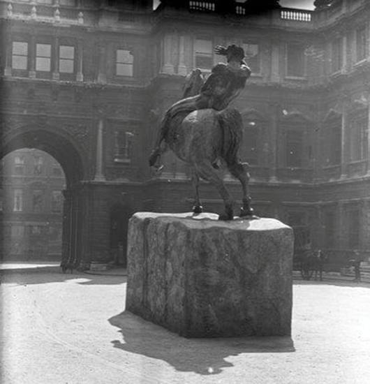
While “Physical Energy” is primarily associated with Cecil Rhodes it was not commissioned in his honour. Watts conceived it in 1886 after having done an equestrian statue for the Duke of Westminster. The first cast wasn’t made until 1902 and was exhibited at the Royal Academy for the first time in 1904 (above).
From there it made its way to Cape Town where it stands today a vital component of the monument to Rhodes. (It even features as the crest on Rhodes University’s coat of arms.) The second cast from 1907 is this one that sits in Kensington Gardens, while a third cast from 1959 now sits beside the National Archives of Zimbabwe in Harare.
This year the Watts Gallery in Surrey commissioned a fourth cast to commemorate the two-hundredth anniversary of the artist’s birth — and that cast now flaunts its bronze in the courtyard of the Royal Academy. It remains on view until the Cusackian birthday in March 2018.
Search
Instagram: @andcusack
Click here for my Instagram photos.Most Recent Posts
- Silver Jubilee November 21, 2024
- Articles of Note: 11 November 2024 November 11, 2024
- Why do you read? November 5, 2024
- India November 4, 2024
- The Lithe Efficiency of the Old Constitution November 4, 2024
Most Recent Comments
Book Wishlist
Monthly Archives
Categories

