Arts & Culture
About Andrew Cusack
 Writer, web designer, etc.; born in New York; educated in Argentina, Scotland, and South Africa; now based in London.
 read more
News
Blogs
Reviews & Periodicals
Arts & Design
World
France
Mitteleuropa
Knickerbockers
Argentina
The Levant
Africa
Cape of Good Hope
Netherlands
Scandinavia
Québec
India
Muscovy
Germany
Academica
Glass-plating the Coliseum

1775 Broadway, formerly the home of Coliseum Books (which I believe got its name from the splendid columns ringing the first two floors, as well as from the nearby now-demolished New York Coliseum), is to be glass-plated and re-addressed as “3 Columbus Circle”. As John Massengale commented, “Because if there’s anything New York City needs it’s another glass-covered office building…”.
“Brideshead” Regurgitated

Well, the trailer for the film adaptation of Evelyn Waugh’s classic novel “Brideshead Revisited” is out, and the film is slated for a summer release here in the States. (Trailer | Official Site). Waugh fans can but lament that, whereas Waugh said the book was essentially about “the operation of divine grace”, the screenwriter of this adaptation openly admitted that the script “turns God into a villain”.
Rather than being bold and creating a genuine work of cinematic art to match the novel, they’ve decided to take the easy and conformist route and do a God-hating rompy flick. (Because we can’t have too many of those!). A shame, of course, but entirely predictable. Shall we at least have a look at the cast?
Herald-Tribune Drops Iconic ‘Dingbat’
Famous Emblem from 1886 is Dropped in Move to ‘Modernize’
 The International Herald Tribune has unceremoniously dumped its unique 142-year-old nameplate logo, affectionately known as the “dingbat”. The graphic made its first appearance in the New York Tribune on April 10, 1866. The Tribune later merged with the New York Herald to become the New York Herald Tribune. The Herald had previously founded a separate European edition based in Paris. While the New York newspaper died in 1967, its weekly New York supplement survives as New York magazine and the Paris edition became the International Herald Tribune, jointly owned by the Whitney family and the New York Times. The Whitneys sold their stake to the Washington Post, which in turn ran the paper in alliance with the Times until 2002, when the New York Times Company became the sole proprietor of the IHT.
The Paris-based newspaper’s executive editor Michael Oreskes said he hoped that dropping the dingbat would make the front page “cleaner, more modern, more streamlined”. Vanessa Whittall, the Herald Tribune‘s communications manager, meanwhile said “by removing the traditional ‘dingbat’ graphic between Herald and Tribune we have created a more contemporary and concise presentation that is consistent with our digital platforms.”
The New York Times Company has been beset with problems in recent years, with both profits and circulation falling; one Manhattan outlet reported seeing an 80% drop in sales of the Sunday New York Times. Shareholders have claimed that the general downturn for newspapers has only been exacerbated by Arthur Ochs Sulzberger, Jr.’s poor management. The decline of the Times has been mirrored in the IHT, which it now markets as its international edition.
Under the Times‘s control, the IHT has been seen to become more of a newspaper for Americans abroad than an American newspaper for an international audience. The blogger of “Think!: The blog for readers of the International Herald Tribune” questioned the prominence the paper devotes to American stories: “How a piece about baseball in the Netherlands (where I lived for three years) got more play directly next to an article about a cyclone in Burma that has killed around 100,000 people is a little hard to follow.”

Above, the traditional nameplate. Below, the ‘modern, streamlined’ nameplate.

The decision to remove the dingbat certainly has its critics. Juan Antonio Giner, the founder of a media consulting group and blogger at Innovationsinnewspapers said the move was “not a big revolution or a smart strategic decision for a dying newspaper”. Mr. Giner compared the management’s decision to “play with such a traditional, magnificent, beautiful, well-done logo” as “like moving the chairs on a sinking Titanic”.

The original dingbat, above, with the most recent incarnation below.

In “The Paper: The Life and Death of The New York Herald Tribune”, the definitive history of the deceased journal, Richard Kluger described the dingbat:
“in the middle of the crudely drawn tableau is a clock reading twelve minutes past six – no one knows why (conceivably it was the moment of Horace Greeley’s birth); to the left, Father Time sits in brooding contemplation of antiquity, represented by the ruin of a Greek temple, a man and his ox plowing, a caravan of six camels passing before two pyramids, and an hourglass; to the right, a sort of Americanized Joan of Arc, arms outstretched beneath a backwards-billowing Old Glory, welcomes modernity in the form of a chugging railroad train, factories with smoking chimneys, an updated plow, and an industrial cogwheel (over which the incautious heroine is about to trip); atop the clock, ready to take off into the boundless American future, is an eagle – all for no extra cost.”
“It was a baroque snapshot of time arrested,” Mr. Kluger continued, “an allegorical hieroglyph of the newspaper’s function to render history on the run”.
The deputy managing editor Robert Marino said of the dingbat, “I’m kind of sorry to see it go, but that’s progress.” Many of the Herald Tribune‘s readers will remain unconvinced.
Slot Zeist
A country house in the Province of Utrecht

Utrecht is the smallest of Dutch provinces, being little more than a remnant of the once-powerful Prince-Bishopric of Utrecht. The city of Utrecht is the province’s capital and namesake, not to mention the primatial see of all the Netherlands. Just outside the provincial capital is the town of Zeist with its splendid little ‘palace’, Slot Zeist. The house was built from 1677 to 1686 on the ruins of Kasteel Zeist, the castle of the von Zeist family which died out in the fourteenth century (or survived through the Borre van Amerongen family, depending on how you look at it).
Our Lady of Esperanza
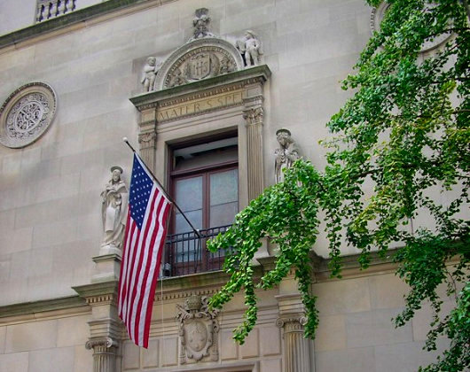
The Church of Our Lady of Esperanza, 156th Street & Broadway. The Church was built by Archer Huntington at the urging of Doña Manuela de Laverrerie de Barril and designed by Huntington’s brother Charles. The sanctuary lamp was a gift from King Alfonso XIII of Spain. The present façade dates from 1924, when the Church was expanded under the direction of Lawrence G. White, the son of Stanford White of McKim Mead & White and himself a partner in his father’s firm.
The right direction

What’s this? A building built from the ground up by a developer in New York, and designed to look like a New York building? Something to look forward to at 211 Elizabeth Street.

(more…)
“Valkyrie”

No, this isn’t a photograph of the latest Norumbega staff meeting, it’s a publicity shot from the upcoming United Artists film, “Valkyrie”. The film tells the story of Claus Philipp Maria Schenck von Stauffenberg, the heroic German Catholic noble who was the mastermind behind the July 20 plot against Hitler. Needless to say, there has been much anticipation over this film, especially since the lead role went to Tom Cruise, who has never quite got the knack of acting. Like Jeremy Irons, he seems to believe that completely different characters require little or no change in performance, but is mysteriously still making films nonetheless. (Cruise at least has the excuse of being a Scientologist to explain his success… what’s Jeremy Irons’s?).

Despite the poor choice of Mr. Cruise play Count Stauffenberg, the rest of the cast includes some pretty inspired choices. Playing Countess Nina von Stauffenberg is Carice von Houten (above), whom you will remember from “Zwartboek”. She’s joined by fellow “Zwartboek” actor Christian Berkel (top photo, seated far left), who played the evil General Kaütner in the Dutch film, the character responsible for the downfall of the good German, General Müntze, who was played by Sebastian Koch (better known for his role in the hit “Das Leben der Anderen”) who (pause for breath) actually played Count Stauffenberg himself in a 2004 German television production called “Stauffenberg”. Speaking of downfalls, Berkel (we’re back to him now) also played a nasty Nazi in the 2004 film “Downfall” depicting the last few days in Hitler’s bunker. [Correction: Berkel actually played Dr. Ernst-Günter Schenck, one of the good guys.] Some more of the cast…
(more…)
The Library of Congress
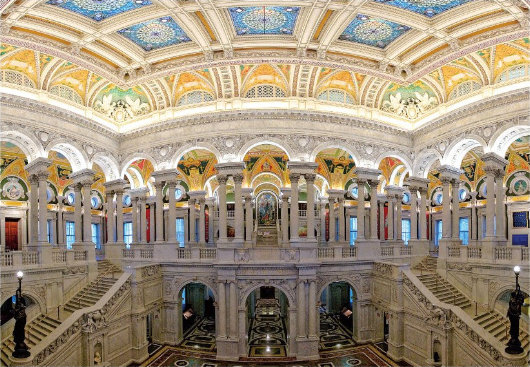
The national library is one of our underappreciated architectural achievements. Henry Hope Reed put together a handsome tribute to and record of the building. What a shame it is located in Washington, D.C.
Gadzooks!
 Tintin aficionados (such as your present scribe) have always had a certain nervousness with regards to putting the Belgian boy wonder on the big screen. Hergé’s creation is brilliant in the original comic books, acceptable in the 1990’s television cartoon version, but has produced only some thoroughly suspicious live-action film versions. (Namely, the 1961 “Tintin and the Golden Fleece” — not that Golden Fleece — and the 1964 “Tintin and the Blue Oranges”; neither of them based on books).
There was mention in the Economist some years ago of Spielberg doing a Tintin film and casting Leonardo diCaprio (!?!) in the lead role. I happened to cut it out of the Economist and so I have it somewhere amongst my clippings, but Hogarth claims his rheumatism and the current climate (“with respect, sir, wasn’t this humid before the war”) prevent him from classifying and filing my gigantic collection of clippings so I may have to wait until retirement to find it.
Word now comes, via the Guardian, that Herr Spielberg, fresh from his fourth and presumably final Indiana Jones adventure, is indeed to embark upon a Tintin film, and that he will cast the 17-year-old Briton Thomas Sangster as the heroic reporter. Cinephiles will recall Master Sangster from the 2003 Richard Curtis romantic-comedy “Love Actually” — which could have been a lovely, if typically sappy, film were it not for an entire subplot revolving around something rather lewd and not worthy of mention.
Unfortunately, my first reaction is that young Sangster is ill-suited for the role of Tintin. Firstly, he’s too young. I have always thought Tintin was permanently about 21, whereas Sangster will have just reach 18 when the film is in production. At a mere age of 18, can we really expect him to be undermining Bolshevism in the early Soviet Union? Or saving the ancient Syldavian monarchy from the threat of the dreaded Iron Guard? Or helping his pal General Alcazar regain the dictatorship of San Theodoros? I think not. But at 21, it seems much more possible.
(Of course, there are several more questions that any earnest Tintinophile feels compelled to ask. Will it be an adaptation or an original script? If an adaptation, of which book? Having a particular love of Scotland, I hope it’s The Black Island. Being a monarchist, I hope it’s the splendidly mitteleuropan King Ottokar’s Sceptre. But then perhaps, somewhat topically, they will choose Tintin in Tibet. And who will the rest of the cast be? Captain Haddock? Professor Calculus? Thompson and Thomson? Oh my…)
Well, we will just have to wait and see. After Herr Spielberg finishes his Tintin film, it appears that Peter Jackson (of “The Lord of the Rings” fame) will have a go at directing one himself. And there’s nothing to say he’ll use the same cast. Spielberg’s film is due in late 2009.
The Late Great Bank of New York

Doesn’t it often seem that as soon as something you actually like comes along, it’s only a short amount of time before it’s gone again? This is how I feel about the latest, and indeed last, logo and general visual identity of the Bank of New York. Readers are no doubt aware that the Bank of New York is the oldest bank in America (founded by Alexander Hamilton) and that its was the first share traded on the New York Stock Exchange when that great financial market was founded beneath a buttonwood tree in 1792.
In 2005, the Bank of New York finally dumped their 1980’s-feel, dated-but-traditional logo in favor of a new design put together by the New York brand house of Lippincott (then still known as Lippincott Mercer). The logo suggested an old stock or bank note but its polychromatic scheme gave it a modern vibrancy. The adjacent logotype was along similar lines: “Bank” and “New York” in a tasteful, restrained modern with “The” and “of” in a delightfully traditional fluid colonial script.

But on July 1, 2007, the ancient Bank of New York merged with a foreign interloper, the Mellon Financial Corporation of Pennsylvania and the disgusting hybrid child of the marriage is cumbersomely monikered: “The Bank of New York Mellon”. How awkward and ungainly! Along with the merger came a new logo, also designed by Lippincott, which you can see on the BNYM website. This pitiful modern arrowhead design says little, other than one might suffer bodily harm at its handling.
The 2005 Bank of New York logo evoked a sense of solidity. “I have deep roots and firm foundations,” it seemed to say, “but am nonetheless modern and adapting to change”. Think of the feel, the smell, of a worn bank note and then compare it to the dull, prickly arrowhead which threatens injury. The old logo you stick in you pocket and gain a sense of security from. The new logo you worry a ninja might hurl at you.
It was an error even to change the name, if you ask me. “The Bank of New York” has such a simplicity and a solidity to it, which the new name rather lacks. It is just like the old New York law firm of Dewey Ballantine, which suffered a takeover recently and is now known as “Dewey and LeBoeuf”. Rather sounds like a pair of huckster Louisiana lawyers hoping to make a few off the innocent inhabitants of the Bayou. So stick to the tried and the true, folks. It usually works.
You call this journalism?
The decline of the British newspaper, continued
THE DAILY TELEGRAPH is asking its readers to believe that Gordon Brown is going to repeal the Act of Settlement barring Catholics from the throne and that furthermore this would make Franz, Duke of Bavaria the heir to the throne of England (c.f. “Act repeal could make Franz Herzog von Bayern new King of England and Scotland”, by Richard Alleyne and Harry de Quetteville, Daily Telegraph, 7 April 2008). In reality, the British Parliament does not have the authority to unilaterally repeal the Act, since by convention it must consult with the sixteen commonwealth realms. (Hence why Edward VIII had only the options of either dumping Wallis Simpson or giving up the throne; London had consulted the dominion governments and they said they would not accept Mrs. Simpson as Queen, end of story). Thus Gordon Brown would actually need to consult with and receive unanimous approval from the governments of Antigua and Barbuda, Australia, the Bahamas, Barbados, Belize, Canada, Granada, Jamaica, New Zealand, Papua New Guinea, St. Kitts and Nevis, Saint Lucia, Saint Vincent and the Grenadines, the Solomon Islands, and Tuvalu, in addition to that of the United Kingdom.
Why, then, does the Daily Telegraph neglect to point out this necessity, seemingly obvious to anyone with more than a passing knowledge of the British constitution? Was the newspaper simply ignorant about the subject? If so, why did they choose to print an article about it without seeking further information from the plethora of readily-available sources? Or perhaps the newspaper did know but decided to ignore it in the interests of sensationalism? Either way, the proof is in the pudding: standards at the Daily Telegraph are not what they used to be.
In Old New York
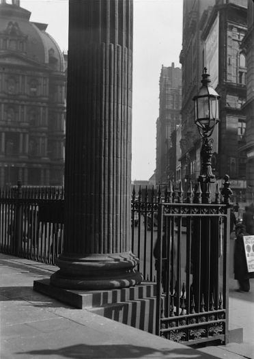
The steps of St. Paul’s Chapel, Broadway, looking towards Park Row, March 1937.
A Lawyer’s Studio in Recoleta

This property in the Recoleta neighborhood of Buenos Aires was once a residential apartment until a multi-generational family of lawyers bought and transformed it into a law office. (more…)
Sniffen Court
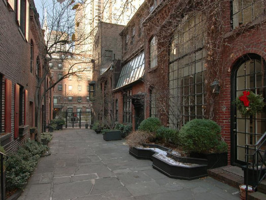
A PROPERTY IN Sniffen Court coming on the market is a rare event, but two up for grabs at the same time must be a first. Like Grove Court, MacDougal Alley, or Washington Mews, this little alleyway is one of the most desirable of those little nooks and crannies that hide amidst the hurly-burly of Manhattan. Tradition holds that Sniffen Court was built as stables by one John Sniffen around the time of the Civil War, but there is no record of any Sniffen ever having owned the properties (some therefore presume he was the architect). They were converted, like many mews around the city, from stables to residences in the 1920s and all have gradually adapted and changed since then.
Boullée’s Opera
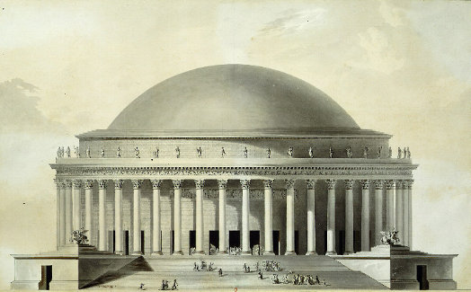
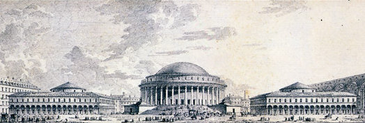
ÉTIENNE-LOUIS BOULLÉE was an architect whose great influence can chiefly be attributed more to his unexecuted designs than to those that were actually constructed. His most famous creation is the Cenotaph to Isaac Newton of 1784, conceived but never built. Many of his designs — especially his plan for a metropolitan basilica — exude a certain feeling as cold and soulless as can be expressed within the welcome restraints of classicism. One of his museum designs is almost proto-secessionist. But I am rather fond of his design for an opera house.
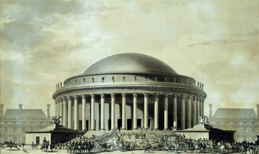
The perennial problem with opera house design is the flyspace: the large area above the stage into which elements of the set design can be lifted to change scenes during a performance. Garnier’s Paris Opera House uses a recessed pediment for its flyspace, while the Teatro Colon has a consistent sloped roof the length of the building tall enough to conceal the space. The modernist Metropolitan Opera House at Lincoln Center here in New York has a bland rectangular box stuck on top. At first, you glance at the exterior of Boullée’s design and think “Where’s the flyspace?” Boullée’s solution was simply to design on a scale large enough to encase the entire auditorium, stage, and flyspace in a single unified domed structure.
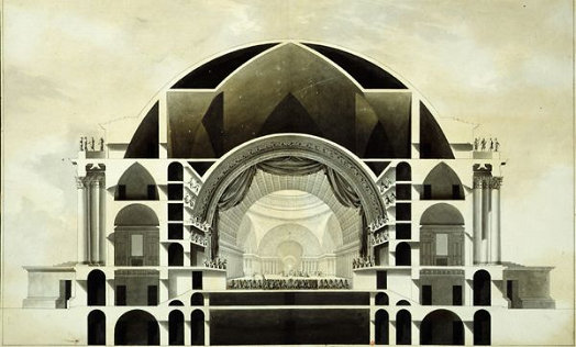
A sectional view towards the proscenium.
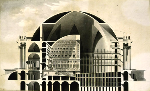
A cross-section from the side showing the auditorium on the left and the stage on the right.
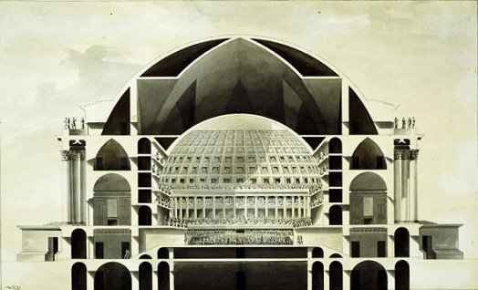
A sectional view looking from the stage towards the auditorium.

While Boullée’s opera was never built, I’ve often thought it had something of an imitator in the opera house of Novosibirsk, Russia’s third-largest city. The Novosibirsk State Academic Opera and Ballet Theatre is the largest theater in all of Russia and is located right at the center of the Siberian capital (which, founded in 1893, had originally been known as Novonikolayevsk, after Czar St. Nicholas II).

The first scheme for the Novosibirsk opera house was a modernist design drawn up in the 1930’s.
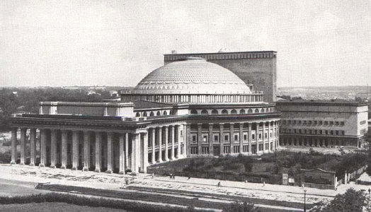
A classical design won the day, however, and the building was completed in 1945. As you can see, the Novosibirsk structure fails to follow Boullée in unifying the entire opera house under a single dome, but rather opts for the more pragmatic if less handsome separate flyspace. (Interestingly, the ratio of its dome’s thickness to its radius is less than that of a typical chicken egg). I still hope someone comes around and fulfills Boullée’s plan.
St. George Guards India’s Fleet Once More
In a return to tradition, the old Indian naval ensign is reinstated.

AFTER AN EXPERIMENT with an allegedly more ‘indigenous’ design, India’s traditional naval ensign has been restored, and so the Cross of St George once again snaps from the sterns of the Union’s warships. The old Indian Naval Ensign dated to 1950, when the Indian Union became a republic, three years after achieving dominion status as a wholly self-governing member of the British Commonwealth. The Royal Indian Navy had flown the unaltered White Ensign but with the changeover to a republic it was decided to simply exchange the Union jack in the canton with the national flag of India, retaining the red St. George’s cross on a white field. (more…)
A Tribute to Cockerell
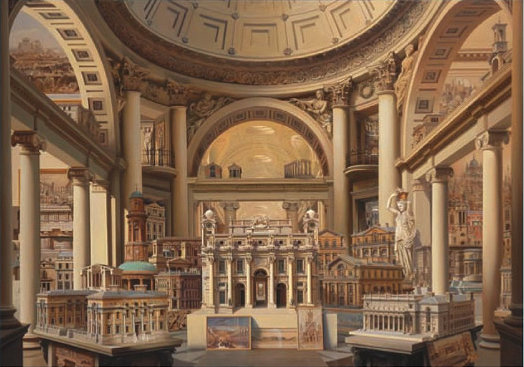
Carl Laubin, A Tribute to Charles Robert Cockerell, RA
Oil on canvas, 39′ 11″ x 60′
2005, Private collection
Ave Maria, Plena Gratia!

In thanksgiving for many petitions granted.
The Café Society of Ferenc Molnár
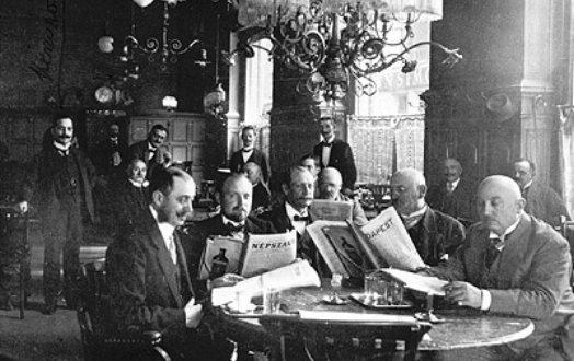
FROM 1887, the Café Central (or Centrál Kávéház, in Magyar) has been a meeting place for artists, intellectuals, professionals, and others located on Budapest’s Károlyi Mihály street. One of its most famous patrons was the novelist and dramatist Ferenc Molnár (born Ferenc Neumann and often anglicized as Franz Molnar), whose 1906 book The Paul Street Boys is perhaps the most widely-read Hungarian novel. His 1909 play “Liliom” was later adapted by Rodgers and Hammerstein into the musical “Carousel”. Both his plays “The Guardsman” and “The Swan” were later made into films (the latter being Grace Kelly’s final appearance on the silver screen), while “The Play at the Castle” was adapted by P.G. Wodehouse into “The Play’s the Thing” and by Tom Stoppard into “Rough Crossing”. (more…)
Search
Instagram: @andcusack
Click here for my Instagram photos.Most Recent Posts
- Amsterdam November 26, 2024
- Silver Jubilee November 21, 2024
- Articles of Note: 11 November 2024 November 11, 2024
- Why do you read? November 5, 2024
- India November 4, 2024
Most Recent Comments
- on The Catholic Apostolic Church, Edinburgh
- on Articles of Note: 11 November 2024
- on Articles of Note: 11 November 2024
- on Why do you read?
- on Why do you read?
- on University Nicknames in South Africa
- on The Situation at St Andrews
- on An Aldermanian Skyscraper
- on Equality
- on Rough Notes of Kinderhook
Book Wishlist
Monthly Archives
Categories


