Arts & Culture
About Andrew Cusack
 Writer, web designer, etc.; born in New York; educated in Argentina, Scotland, and South Africa; now based in London.
 read more
News
Blogs
Reviews & Periodicals
Arts & Design
World
France
Mitteleuropa
Knickerbockers
Argentina
The Levant
Africa
Cape of Good Hope
Netherlands
Scandinavia
Québec
India
Muscovy
Germany
Academica
In a Westchester auction house
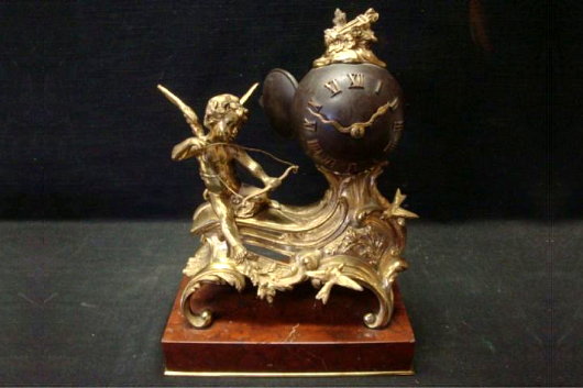
Saturday I popped in to have a friendly chat with Paterfamilias Gill, of which the usual topic of conversation is the decline of civilisation and the amusing side effects thereof. We had reached Afghanistan when Mrs. Gill eventually joined us, and, after showing me the latest addition to the Gill collection (a splendid maritime scene by William Edward Norton), Mr. Gill suggested an expedition to the auction house down a back alley in neighbouring Larchmont, and I happily agreed.
Above is a gilt bronze and patinated metal clock in the French style. I’m rather fond of the curvature of spherical clockfaces, and the serpentine hands are a nice detail as well. This clock would fit in at 15 East Ninety-sixth Street. Estimate of $800-$1,000. (more…)
Alexander Stoddart: “An Elite for All”
Scotland’s national newspaper interviews Scotland’s national sculptor
By SUSAN MANSFIELD
The Scotsman | 22 November 2008
ALEXANDER STODDART welcomes me into his studio, and into the 19th century. “It hasn’t gone away, you see,” he says, brightly. “The 19th century is not a period in time, it’s a state of mind.”
Indeed, if one could visit the workshop of one of the great monumentalists of a century ago, it might look a lot like this: plaster casts in various stages of assembly; imperious figures missing limbs or, occasionally, a head; bags of clay which until recently were a working model of physicist James Clerk Maxwell.
Stoddart is Scotland’s premier neo-classical sculptor, the man who made the figures of Adam Smith and David Hume for Edinburgh’s Royal Mile, Robert Burns for Kilmarnock, the beautiful Robert Louis Stevenson memorial on the capital’s Corstorphine Road. He’s 49, but looks boyish, with his sandy hair and dusty lab coat cut off at the elbows. He is a man of swift, enthusiastic intelligence, rarely still, and almost never silent.
Despite once being dismissed by the Scottish Arts Council as “backward-looking, historicist and not reflecting contemporary trends”, Stoddart is busy. Around us are the plastercasts of past commissions: immense allegorical figures for the £6 million Millennium Arch in Atlanta, Georgia; religious commissions for a mysterious private client who has her own chapel “somewhere in North Britain”; parts of 70ft frieze for Buckingham Palace. A bust of Pope John Paul II for a Chicago seminary.
Soon they will be joined by James Clerk Maxwell, whose statue, commissioned by the Royal Society of Edinburgh, will be unveiled on Tuesday at the East End of Edinburgh’s George Street. Stoddart is thrilled to be sharing a street with 19th-century sculptural greats like John Steel’s Thomas Chalmers. “It’s the greatest honour to be anywhere near the company of Steel.”
And he is ready and waiting for the next question, the one about relevance. (more…)
‘Handmade’ by Xavi García
‘A reaction to the soullessness of digital design’
Not many artists or designers have a business degree from Salamanca or studied management in Gothenburg. Xavi García has, though, and it’s obvious his grounding in the financial realm had an influence on his personal art project ‘Handmade’ — a banknote meticulously created by hand using drypoint, screenprinting, and stamps on newsprint. García describes the project as “a reaction to the soullessness of digital design”. (more…)
Carbuncle Alert in Queens
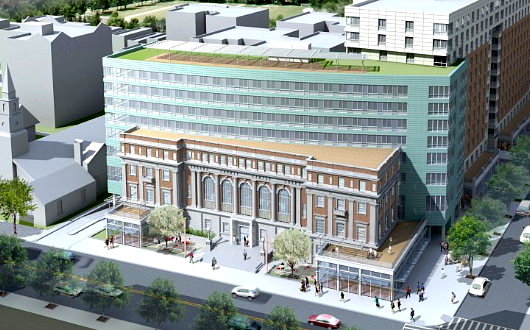
Our carbuncle alarm, which went haywire over the Brooklyn Museum’s offensive new entrance, has alerted us to a new monstrosity nearing completion in the adjacent borough. (more…)
A Palace on Princes Street
The North British & Mercantile Insurance Company, No. 64 Princes Street
PRINCES STREET IS the thoroughfare of the nation, and its sad decline during the second half of the twentieth century and only partial comeback since then are reflective of Scotland itself. The architects of Edinburgh’s New Town had no idea that Princes Street would evolve into a commercial avenue, and the street was originally laid out as a handsome row of Georgian townhouses, built between 1765 and 1800, facing Princes Street Gardens and the Old Town above behind them.
Almost immediately the mercantile and social nature of the street began to assert itself, with shops and traders setting themselves up in the converted basements and ground floors of townhouses. The New Club showed up at No. 86 Princes Street in 1837, coming from previous premises in St. Andrew’s Square and before that Shakespeare Square (where the former G.P.O. now stands).
As the Victorian era progressed, more and more of the Georgian townhouses were demolished and replaced with new buildings in the varying styles of age. It was just two years after Victoria’s death that an old company built a new headquarters in a brimming Edwardian baroque: the North British and Mercantile Insurance Company. (more…)
Alice von Hildebrand on Life
This superb lecture to a high-school audience by Alice von Hildebrand, the retired Professor of Philosophy at Hunter College of the City University of New York, was sent to me by an acquaintance at the University of Caen in Normandy (a town I had the pleasure of visiting some years ago).
The speaker is the widow of the famous Prof. Dietrich von Hildebrand, and speaks with a fascinating insight tempered by good humour. I thought I’d just listen to a bit of it but became entranced and couldn’t tear myself away from it.
Mrs. von Hildebrand covers an astonishing variety of subjects but the animating focus of the lecture is the relationship between body and soul, and how that is reflected in the relationship between man and woman.
“It’s a privilege for an elderly person to share her experience with young people,” Mrs. von Hildebrand says. “It’s a very special joy to share with you the gifts I have received.” However privileged the speaker feels, I’ve no doubt it is rather the listeners who are privileged to hear so a woman of such great wisdom speak to them at so young an age.
I know one of the most memorable interactions I ever had was with the Polish freedom fighter and Auschwitz survivor Jozef Garlinski when I was just sixteen years old — the late Mr. Garlinski’s most important lesson continues to exert a profound influence over me, and was one that I have always remembered at the more trying times in life since then.
These students are blessed to receive such an important life lesson.
The Houses of Parliament, Dublin
The Physical Incarnation of Ireland’s Golden Age
THE OLD HOUSES OF PARLIAMENT in Dublin are probably at the top of my list of favourite buildings in the world. Now the headquarters of the Bank of Ireland, it has a long and varied history, and its exterior composition is one of surprising unity for a structure the components of which were designed by three architects. It is supposedly the first purpose-built parliament building in the world, and stands on the site of Chichester House, a stately home adapted for use by the Irish Parliament from the 1600s onwards.
The location, with a history dating back centuries, is just south of the Liffey river upon what was then known as Hoggen Green. A nunnery existed on the site which was supressed during Henry VII’s Dissolution of the Monasteries. A large private house was then built on the site, set back from the street, eventually known as Chichester House. (It likely incorporated some of the old convent’s structure). Among the esteemed inhabitants of the house were Sir George Carew, sometime Lord President of Munster, Sir Arthur Chichester, after whom the house was named, and the Anglican Bishop Edward Parry is known to have had a lease on the place during his lifetime.
The building must have been seen as holding some public significance, not only because it was located adjacent to the University of Dublin (of which Trinity College is the sole constituent institution), but it was home to the Irish Law Courts for a time beginning with the Michaelmas legal term of 1605. Towards the end of the seventeenth century, no later than October 1692, the Irish parliament began to meet at Chichester House on College Green. (more…)
Unbuilt Cape Town: Municipal Offices
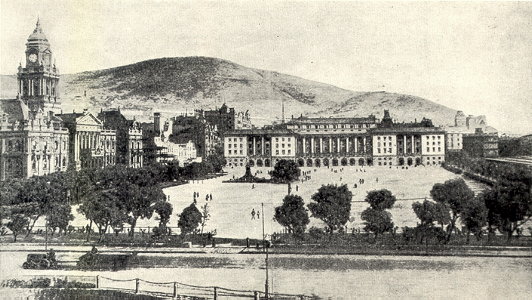
UNBUILT ARCHITECTURAL PROPOSALS fascinate me. Unfortunately most of the books documenting the more prominent examples of unbuilt buildings focus on space-age hyper-modernist ideas that never got off the drawing board, but these tend towards the tawdry and ridiculous. Far more interesting are the rejected proposals for buildings that did get built — for example the rival schemes to rebuild the Palace of Westminster after the 1834 fire — or this example of a proposal for a building never executed. I came upon these scheme thanks to the uploads of the Flickr user Berylmd. While Cape Town has a splendidly grand City Hall in an Edwardian Baroque style, the city fathers were unwise in providing insufficient space for the ever-blossoming municipal bureaucracy. This plan would have put a new municipal office building spanning the entire western side of the Grand Parade, replacing those little unremarkable market buildings whose existence on the square persists to this day. (more…)
4 de Junio
On June 4, 1943, 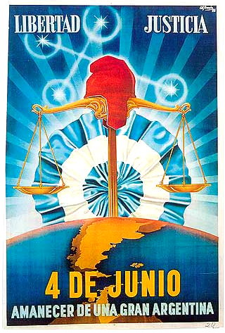 a murky group of Argentine military officers called the GOU (standing for United Officers’ Group, or Government, Order, Unity) overthrew President Ramon Castillo and ended the Década Infame, or ‘Infamous Decade’ that had begun with the 1930 coup against Hipólito Yrigoyen. The ’43 coup was led by General Arturo Rawson, who served as President of Argentina for a month before being replaced by the more politically minded Gen. Pedro Ramírez.
Ramírez sympathised with the Axis powers in the Second World War, and his inability to successfully maintain Argentina’s neutrality in the face of U.S. pressure led to his resignation and succession by Gen. Edelmiro Farrell, who was viewed by most as the instrument of his charismatic junior, the infamous Col. Juan Perón (with whom we are all too familiar).
This poster produced by the junta incorporates a number of the symbols of Argentine patriotism and nationalism. ‘Liberty’ and ‘Justice’ are proclaimed the principles of the junta, and underneath the date of the coup is announced the ‘Dawn of a Greater Argentina’. The Phrygian cap of liberty, a frequent Argentine emblem, rests atop the scales of justice while the stars of the Southern Cross imply a divine favour over the new regime.
The map of Argentina coloured in yellow includes the British colony of the Falkland Islands and Antártida Argentina, the Argentine Republic’s claimed possession on the Antarctic continent (which overlaps with competing claims by Chile and the United Kingdom). Behind the whole composition, the Argentine Cockade looms ascendant like a rising sun, affirming the text’s proclamation of a new dawn under the nationalist-revolutionary regime.
The TLS Online
I hope that one byproduct of the Times of London moving to a new website is that the Times Literary Supplement will finally get one of its own. Other Times spinoffs like Times Higher Education and the Times Education Supplement have them, so why not the jewel in the crown?
Also, I’d hate to see my pedantic letter to the editor of October 1, 2008 available only to paying subscribers (see here, scroll down to ‘Banking’, and ignore erroneous spacing).
Come on, TLS. If the LRB can do it, so can you.
What a Sad, Sad Life to Lead
While innocently playing billiards in a friend’s basement towards the later years of my school days, I was inexplicably forced to endure the latter portion of an episode of the HBO television series “Sex and the City”. The show centers on four middle-aged women who refuse to settle down and lead reasonable, ordered lives but instead involve themselves in ever more flippant affairs and commit ever greater sins against their own dignity. It would be a welcome warning to women were it not for the obvious fact that the show’s intent is to glorify the sad, pitiable existence lived out by the four main characters.
The show originated from a column of the same name in the New York Observer, and after the success of the television series, a cinematic continuation was filmed, followed by a more recent sequel.
Brendan O’Neill, a liberal atheist if ever there was one, has written a superb commentary on the second “Sex and the City” film, claiming that this “execrable” movie “offers an accidentally fascinating insight into the crisis of American values”. Click here to read O’Neill thoughts on the film and its sad reflection of today’s America, and say a little prayer that no-one really leads lives as self-centered, sad, and just plain pitiable as the characters involved.
The Versatility of the Cape Dutch Style
ORANJEZICHT IS ONE of my favourite parts of Cape Town, nestled in the bowl between Table Mountain and Signal Hill. Its name betrays it’s sloping location, which offers a view towards the Oranje bastion, one of the five of the Castle, which take their name from the titles of William, the Stadthouder of the United Provinces. The architecture is generally handsome, even if it often tends towards the Victorian. A few years ago, Cape Town Daily Photo featured a view (above) of the corner of Montrose Avenue and Bo-Oranjestraat in Oranjezicht. The late-autumn/early-winter street scene focusses on the Oranjezicht Carlucci’s, one of a small chain of delicatessens and wine shops founded in the mid-1990s.
The architecture of the shop is by no means in the strictest confines of the Cape Dutch style but is instead a more modern design influenced by the local architectural tradition of the Cape. While the Cape tradition is better known for larger country houses and wine-growing estates or small cottages, it’s just as useful a guide in the urban context. Dating the age of the building just by this photo would be tricky, as the region has some fairly convincing recent structures built in the old style (the dovecot at Alphen, for example), but I’d wager it’s 1900s-1910s construction that underwent a substantial renovation in the 1990s. (more…)
The new Times of London online

IAM MILDLY obsessed with newspaper design (in case you hadn’t noticed that already). But even those few newspapers that manage to either be attractive or worth reading (or indeed both) usually have websites that are astoundingly ugly. Check out the websites of The Scotsman, Le Monde, or the Times of India. They vary from awful to “meh”. The website of The Hindu is ugly, but is being replaced by a much more handsome design. Despite the over-sized ad on the index page, Die Zeit‘s website is on the handsome side of things, but that of the Neue Zürcher Zeitung is a mixed bag, some well-done details here, other poor ones there. I despise lefigaro.fr, especially since they started charging for their e-paper edition. The structure and flow of telegraph.co.uk is actually good, but the detailing isn’t and (like faz.net) it poorly reflects its newspaper’s personality.
Along then strolls the once-venerable Times (f. 1785), with a brand spanking new website at thetimes.co.uk. Clear, orderly, precise in its details, and just plain handsome in its overall design. There’s nothing particularly special or over-the-top about it; it’s just well done, but that is shockingly rare for newspapers today. (more…)
Swellendam Church Tower
In this video, the goodly folk of Swellendam demonstrate for us how not to remove a rotted wooden church tower. The little kid is a hoot — “It will get vrot and it will fall off on someone’s head”. The church tower has since been restored to its original iconic profile.
London Bridge City: The Neo-Venetian Scorned
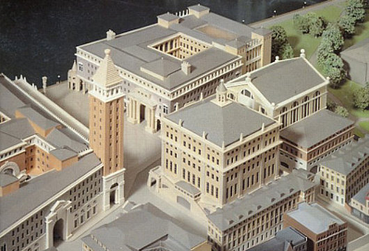
JOHN SIMPSON AND Partners 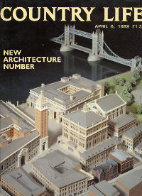 are one of the most prominent firms promoting classical architecture and urban design in Great Britain. They are perhaps most widely known for the work they did on the Queen’s Gallery at Buckingham Palace, as well as for the rejected scheme to redevelop Paternoster Square next to St. Paul’s Cathedral. Contemporary to their ultimately unsuccessful Paternoster Square bid was another ambitious scheme, Phase Two of the London Bridge City development. For Phase Two, Simpson composed a miniature Venice-on-the-Thames complete with Piazza San Marco and ersatz campanile. There seems, however, to be something just a bit un-English about the whole project. There are numerous examples of Ruskinian Venetian buildings throughout Britain, and indeed the Commonwealth, but an entire complex of Anglo-Neo-Venetian seems a bit over-the-top. Still, one can’t deny preferring a touch of Simpson’s over-the-top Venetian to the glass-plated boredom developers usually offer the public.
London Bridge City, Phase Two was proposed in the aftermath of the hugely popular speech by Prince Charles in which he condemned a planned modernist addition to the National Gallery as a “monstrous carbuncle on the face of a much-loved and elegant friend”. A bit of a donnybrook erupted between the architectural elite on the one hand (supporting the carbuncle) and the public on the other (supporting the Prince of Wales) and many a property developer was caught in the rhetorical crossfire. LBC’s backers decided, as an act of pragmatism, to come up with three radically different schemes in different styles and present them for consideration. (more…)
Cape Town’s Other St. George’s
The Greek Orthodox Cathedral of Saint George
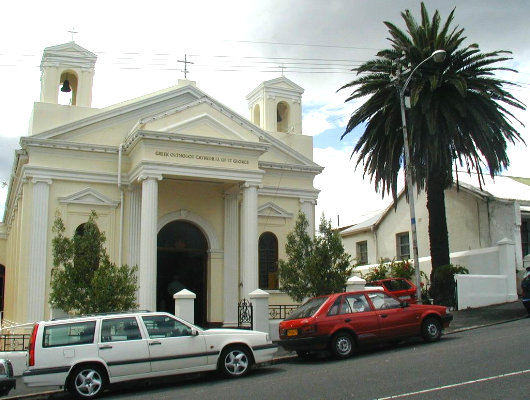
If you hear of “St. George’s Cathedral” in Cape Town, you naturally think of the big stone colossus at the bottom end of the Company’s Garden smack dab in the middle of the Mother City. There is, however, another St. George’s Cathedral, the Greek Orthodox Cathedral of St. George on Mountain Road in Woodstock. The Greek Cathedral was built in 1903–04, just a few years after Cape Town received its first Greek Orthodox priest, and expanded in 1983. Liturgies tend to be either in Greek or English, though there is an Afrikaans monastery at Robertson.
The Holy Archdiocese of the Cape of Good Hope was established in 1968 under the (Greek Orthodox) Patriarch of Alexandria and All Africa. The archdiocese covers the Western, Northern, and Eastern Cape provinces, the Orange Free State, KwaZulu-Natal, Namibia, Lesotho, and Swaziland.
I only ever knew one South African of Greek extraction (Dimitri! Not just a good egg, but a top-notch chef as well), but I assume that folks of Hellenic extraction enjoy the Mediterranean climate of Cape Town and its environs.
Cape Town’s New Way to Get Around

Over at Fascination Street, Brent Smith shows us the newly revealed branding for Cape Town’s new integrated rapid transit system: MyCiti. I’m not partlicularly impressed. Most of my fellow uitlanders will be forgiven for lacking an understanding of the stylised freehand letter ‘y’, which is rather tortured into representing an outline of Devil’s Peak, Tafelberg, and Lion’s Head. Mr. Smith diplomatically reserves judgement but I think they could’ve done better, although they could have done much worse.
A New Scots Town in the Highlands
The 20th Earl of Moray teams up with Miami-based firm Duany Plater-Zyberk to plant a New Town of 10,000 inhabitants outside Inverness
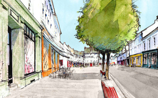
BELEIVE IT OR not, Inverness is one of the fastest-growing cities in Europe, and a local landowner, the 20th Earl of Moray, has teamed up with Duany Plater-Zyberk, an American firm known for its traditional architecture and urbanist ideas, to help create a sustainable new town of 10,000 inhabitants near the “Capital of the Highlands”. Tornagrain will rest on a 200-hectare (500-acre) site on the A96 corridor between Inverness and Nairn. Much of the recent growth in the Highlands has been poorly managed, raising concerns of suburban sprawl and poor land management. Moray Estates, the land holding company of the Earl of Moray (pronounced ‘Murry’) has decided to take the lead by planning a new town in the best tradition of Scottish architecture and urban development. (more…)
The Old New York Observer Building
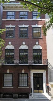
No. 54, East Sixty-fourth Street
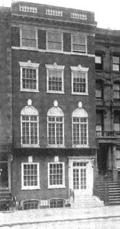
“FOR 17 YEARS,” writes Peter W. Kaplan, “since The New York Observer entered city life in 1987, it has existed within a red brick and white-marble-stepped townhouse on East 64th Street.” Designed by Ernest Flagg and Walter B. Chambers during their brief partnership, No. 54 East Sixty-fourth Street (between Park & Madison) was built in 1907 as a private residence for Robert I. Jenks. The AIA guide accurately describes it as “four stories of delicate but unconvincing neo-Federal detail… a minor Flagg.” In 1947, the townhouse was converted into offices for the Near East Foundation, which was founded in 1915 to provide relief for Armenian refugees from the Ottoman Empire and later took on greater responsibilities in North Africa and the Levant. It was then bought by Arthur L. Carter, the founder and publisher of the New York Observer for use as the salmon-tinted newspaper’s headquarters.
In 2004, the Observer moved down to Broadway, two blocks south of the Flatiron Building (and just a few blocks up from The New Criterion whose founder, Hilton Kramer, was for nearly two decades the art critic for the Observer). The townhouse was sold by Carter to the Russian-born Janna Bullock, real estate developer & sometime Guggenheim foundation board member for $9.5 million in the year the newspaper moved out. In 2005, Bullock renovated the building and had it used at the Kips Bay Decorator Show House for the year before selling it on to the Irish investor Derek Quinlan for $18.74 million. Quinlan put it on the market for $36 million but last year the asking price was chopped to $27 million.
Twenty-five feet wide, five stories, and with over 10,000 square feet, No. 54 was probably the only newspaper headquarters to feature nine working fireplaces, rosewood panelling, and oak wainscoting. But the best feature, by a mile, is the splendid iron-railed staircase, which looks like it was lifted straight from Paris. Elegant and graceful, a rare century-old survival in Manhattan. (more…)
Cockerell’s Carlton Club
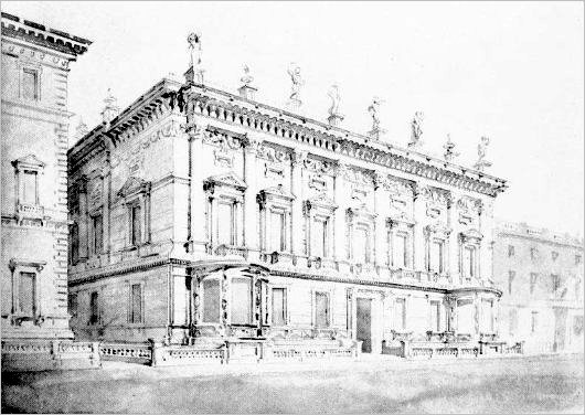
Charles Robert Cockerell is best known for designing both the Ashmolean Museum at Oxford and its Cambridge equivalent, the Fitzwilliam Museum. He is also, alongside William Henry Playfair, responsible for the twelve-columned National Monument that sits atop Calton Hill in Edinburgh — allegedly unfinished, though there is considerable debate over whether this is so. It’s not widely known, however, that the famous architect Cockerell completed a design for a new home for the Carlton Club on Pall Mall in London.
Originally Cockerell had declined the opportunity to submit a design, with such lofty names as Pugin, Wyatt, Barry, and Decimus Burton also declining the offer. A few years later, Cockerell nonetheless worked on this design for the Tory gentlemen’s club, which is superior to that conceived by another architect which was eventually built. Cockerell devised a “lofty Corinthian colonnade of seven bays” according to the Survey of London. “The columns have plain shafts, their capitals are linked by a background frieze of rich festoons, and the Baroque bracketed entablature is surmounted by an open balustrade with solid dies supporting urns and gesticulating statues.” (more…)
Search
Instagram: @andcusack
Click here for my Instagram photos.Most Recent Posts
- Amsterdam November 26, 2024
- Silver Jubilee November 21, 2024
- Articles of Note: 11 November 2024 November 11, 2024
- Why do you read? November 5, 2024
- India November 4, 2024
Most Recent Comments
- on The Catholic Apostolic Church, Edinburgh
- on Articles of Note: 11 November 2024
- on Articles of Note: 11 November 2024
- on Why do you read?
- on Why do you read?
- on University Nicknames in South Africa
- on The Situation at St Andrews
- on An Aldermanian Skyscraper
- on Equality
- on Rough Notes of Kinderhook
Book Wishlist
Monthly Archives
Categories


