Arts & Culture
About Andrew Cusack
 Writer, web designer, etc.; born in New York; educated in Argentina, Scotland, and South Africa; now based in London.
 read more
News
Blogs
Reviews & Periodicals
Arts & Design
World
France
Mitteleuropa
Knickerbockers
Argentina
The Levant
Africa
Cape of Good Hope
Netherlands
Scandinavia
Québec
India
Muscovy
Germany
Academica
The City of Unexpected Charm
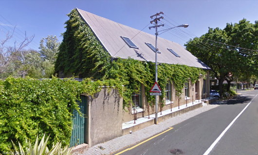
One of the things I like about Cape Town is its continual ability to surprise by throwing up surprisingly handsome buildings in unexpected places. To be honest, there is a great deal of mediocre architecture in the city, though I’d argue Cape Town’s mediocre architecture is better and more humane than, say, New York’s or London’s. But if you keep your eyes open to the world around you as you potter about the Cape, you can stumble across some happy little structures. This little building in Rondebosch is one such example. It sits on Rouwkoop Road, the street which takes its name from the old house that is no more. The N.G. Kerk Rondebosch is just down St Andrews Road one way, and St. Michael’s Catholic Church is just down Rouwkoop Road the other way. (more…)
Hail, Queen Europe!
The very name of Europe is feminine: Europa, the Phoenician princess of Greek lore, abducted by Zeus. From Strange Maps, we find this cartographic representation of Europe as a queen: Spain the crown, Germany the hearty bosom, Italy the graceful arm, and Sicily the Orb of Europe. The map was produced by Sebastian Munster in Basel in 1570 and was recently up for sale from Barry Lawrence Ruderman Antique Maps.
“During the late sixteenth century,” the map gallery writes, “a few map makers created these now highly prized map images, wherein countries and continents were given human or animal forms. Among the earliest examples is this map of Europa by Munster, which appeared in Munster’s Cosmography.”
Napier in the Overberg
NESTLED IN the Overberg, the little town of Napier owes its existence to a dispute between two neighbours. In the earlier part of the nineteenth century, as the little farm villages of the Cape became more firmly settled, the Dutch Reformed synod had to choose which towns were deserving of their own church. In 1833, the congregation in Swellendam decided to build a church further south to meet the needs of its members there, but couldn’t decide between two locations. Michiel van Breda wanted the church sited on his farm, Langefontein, while Pieter Voltelyn van der Byl wanted it built on his property, Klipdrift. Neither van Breda nor van der Byl would give way, so churches were built in both places, the town of Bredasdorp growing around van Breda’s church and the town of Napier founded around van der Byl’s church. (more…)
The Spott Estate, Dunbar
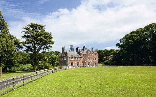
HERE IS A lordly demesne! In East Lothian, thirty-one miles from the centre of Edinburgh and three from the Royal Burgh of Dunbar, sits the Spott House and estate, now on the market from Knight Frank. The property is a whopping 2,463 acres in total, including 1,779 acres of arable land, 214 of pasture, and 356 acres of woodland. The estate has more than quadrupled in size in the past decade, under the ownership of the Danish-born Lars Foghsgaard, who bought just 600 acres in the year 2000.
As The Times wrote of Mr. Foghsgaard, “Clad in tweed jacket, plus fours and Hunter wellingtons, with several brace of partridge in his hand and his labrador at his side, he looks the very image of the country gentleman as he strides though his East Lothian estate.”
“The previous owner was very involved in the land,” Mr. Foghsgaard told the Times. “I am not a farmer, so I employed a farm manager: it’s crucial to have the necessary skills and connections in the area to do the job well, and as a foreigner I did not have those.” But the Dane does enjoy seeing the workings of the farm. “When I walk the dog, I always pass through the cowshed, where we have lambs being born each day — it’s such a joy to see.” (more…)
The Bozen Gate
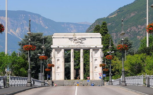
TRIUMPHALISM IN architecture is a double-edged sword. When done properly, it is glorious, like the Arc de Triomphe, standing majestically as avenues radiate forth from the stout, sculpted monument to Napoleon’s victories. The Italian monument at Bozen in Südtirol is the other end of the spectrum. The French emperor was wise enough to construct his triumphal arch in Paris, on his own turf, where it would prove relatively uncontroversial over the span of the years. Mussolini, meanwhile, had this gate celebrating the Italian victories of the First World War in Bozen, the capital of Südtirol, a region whose inhabitants are mostly German-speakers despite it being part of the Italian Republic. While the existence of a monument to Italian victories is acceptable, the placement and nature of this monument is a direct insult to the local population. (more…)
A Tale of Two Piazzas
My good friend Ian Corbin offers what he described to me as “a mere diversion” contrasting the brutality of Boston’s ‘Government Center’ with the beauty of Rome’s Piazza San Pietro.
David Goldblatt: Structures
“THE FIRST GROUP of photographs that I attempted of structures,” writes photographer David Goldblatt, “was a series made in 1961 on places of worship on the Witwatersrand. I came to this from two starting points. The first was a fascination with the idea of faith. Notwithstanding recurrent nightmares during childhood about the infiniteness of everlasting hellfire and uncertainty over the domicile of my unbaptised Jewish soul in the hereafter, arising from an otherwise happy primary school education by nuns, I don’t think I was ever able to believe in or pray to the deity with much conviction — except momentarily under extreme threat of imminent disaster. Neither nuns nor rabbi could ever enable me to transcend the banal with that leap of faith required of true believers. … I was — am — then, generally sceptical of believers’ beliefs but also in awe, and sometimes envious, of their ability to believe. If blind, unreasoning faith often repels me it sometimes moves and always intrigues.”
“Thus it was endlessly mysterious, even incredible to me that people — for the most part ‘ordinary’, ‘practical’ people, probably not much given to abstruse thought and discussion — should pour such effort and resource into the erection of structures devoted to so abstract an idea as God.” The photographer, understandably, doesn’t understand that, for we Christians, God is no less abstract than our father, mother, or neighbour down the street. “The ubiquity and persistence of the phenomenon, the immensity of humankind’s investment in God was to me quite awesome.”
“The second starting point for this early series of photographs of structures was an inchoate but growing awareness that whereas some structures seemed quite detached from this place, the Witwatersrand or, more broadly, South Africa, others grew almost viscerally from it. This seemed to have less to do with architecture than with indefinable qualities of ‘belonging’. I wanted to explore these notions and bring them into the light with the camera.” (more…)
Monument to the Latin Genius
The Palacio Barolo, Avenida de Mayo, Buenos Aires
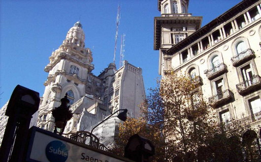
THE PROSPECT WAS horrifying. The year was 1919, and Europe had only just brought to an end an orgy of self-destruction lasting several years. The negotiations to conclude a peace treaty at Versailles were ongoing, but from abroad it looked as if the continent had descended into a trend of violence, decline, and destruction. That year, Luis Barolo, an Italian textiles manufacturer who had immigrated to Argentina, commissioned his fellow-countryman Mario Palanti to design a fascinating and mysterious structure as a monument to “the Latin Genius” Dante Alighieri — a repository in the New World for the poet’s legacy as the continent that gave him birth slid into oblivion. (more…)
An Aldermanian Skyscraper
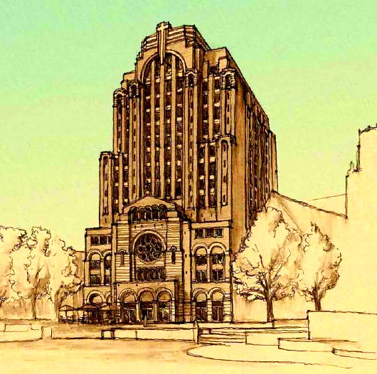
Good news from the Middle West: the Catholic chaplaincy at the University of Wisconsin at Madison announced plans for multi-use, high-rise structure in the city built in a traditional style. Matthew Alderman Studios served as the principal designer for the elevations of the St. Paul University Catholic Center, a 14-storey, $45-million structure in a Romanesque-Deco style that will include a chapel, meeting rooms, and student housing.
“Catholic life in Madison has undergone a remarkable renaissance under Bishop Morlino,” Matt Alderman says, “and St. Paul’s is one of the foundations of this resurgence. I can assert from personal experience that it is really heartening what is going on over there. St. Paul’s is molding a new generation of faithful, responsible, and joyfully serious young Catholics.”
Matt noted that the concept for the St. Paul Center is reminiscent of the skyscraper-church designs mooted during the first half of the twentieth century. In most of those proposals, however, the skyscraper factor tended to overwhelm the ecclesiastical visuality of the overall design. Matt has deftly avoided this in the St. Paul plans: from the perspective of the man on the street, the most prominent part of the façade is obviously ecclesiastical, and the many storeys above flow naturally, but unobtrusively, therefrom.
“It was important to impart an ecclesiastical character to the principal facade while at the same time asserting the building’s mixed-use status. In my own sketches, I drew on the work of Ralph Adams Cram at Christ Church Methodist in New York, a rugged urban ecclesiastical plant with a great deal of dignity and personality, and Bertram Goodhue’s slightly earlier St. Bartholomew’s, just down the street on Park Avenue.”
RDG Design and Planning of Omaha acted as principal architects of record. Matt Alderman is not yet an architect officially — the certification process in America is wisely prolonged — but as a design consultant he’s already serving up enough to whet our appetite. Diocesan chancelleries, parish boards, heck, anyone who wants to build anything: keep this guy in mind!
A Miscellany of Mexican Music
Juan Gutiérrez de Padilla was born in Malaga, Spain in 1590 but moved to New Spain in 1620, and was appointed choirmaster of Puebla Cathedral in 1628. His corpus is massive, with over 700 works surviving. His Stabat Mater is above, but you should also hear his Missa ego flos campi. (more…)
Ciudad de México
The Greatest City of the Americas
WITH A population of 20,000,000 people, Mexico City is the greatest city in the Americas — Tokyo and Seoul are the only metropolitan areas in the world that can claim a higher count of inhabitants. The old city of Tenochtitlan was founded by the Aztecs in the middle of a lake, 7,000 feet above sea level in 1325. According to legend, Huitzilopochtli — the Zeus or Jupiter of the Aztecs — indicated the site of the new capital through an eagle perched on a cactus with a snake in its beak. The city grew as the Aztec Empire augmented in size and strength, conquering hundreds of smaller surrounding tribes, enslaving their members, and offering their prisoners as human sacrifices. With great ceremony, vast numbers of prisoners were led one-by-one to the summit of the temples, where the priest would carve the living victim’s chest open with a blade of obsidian or jade, remove the still-beating heart and offer it to the appropriate god while the victim’s body was thrown down the steps of the temple. During the re-consecration of the city’s Great Temple in 1487, the Aztecs claim to have sacrificed 80,400 prisoners over the course of four days. It is not hard to imagine the relief of the conquered tribes when their liberation came at the hands of the Spanish. (more…)
A Forgotten Architectural Fantasist
Wilhelm Cornelis Bauer of the Netherlands
Boullée isn’t the only architect known more for the designs never built than for those that were. Wilhelm Cornelis Bauer (1862–1904) was a Dutch architect with a flair for the fantastic. He was born into an aesthetically minded environment in the Hague, where his father ran an interior decoration firm; his brother, the painter and engraver Marius Bauer, is better known. W.C. Bauer (sometimes known as Willem) studied at the Craft School before heading to the Royal Academy of Visual Arts and became involved in the circle of Dutch architects that included Berlage, Walenkamp, Kromhout and others.
Bauer had a very high opinion of himself, being convinced of his own genius, which often brought him into conflict with others, including potential patrons. The buildings of his that were constructed (such as a handful of houses in Bussum) were within the reasonable bounds of the Dutch contemporary vernacular, but Bauer was an inveterate dreamer with elaborate visions. Architectural competitions proved a perpetual draw, and while Bauer’s designs were often commended as highly artistic they usual brought simultaneous comments about impracticability. (more…)
Preservation is Not Enough
A Proposal for Enhancement
IT IS COMMONLY said of St Andrews that it is a place of beauty. This is often a compliment to its natural setting, with open skies arcing over the reaches of the bay, and ancient rock and cliff yielding to the changing rhythms of the waves. At the same time visitors are generally struck by the pleasing combination of natural and built environments: the ruined grandeur of the Cathedral and Priory standing bare to the elements; crowstep-gabled cottages gathered in against the wind; the broad thoroughfares interlinked with narrow cobbled lanes; and the church towers etched against the sky. There is also the scholarly dignity of Deans Court, the quizzical posture of the Roundel, the charm of the courtyards to the south of South Street, the sad ruination of Blackfriars juxtaposed with the aspiring frontage of Madras College, and other evocative sights besides.
Here and there within the midst of all of this stands, physically, historically, and socially, the University. Its contributions to the architectural distinction of the old town are obvious enough. They are, principally, the harmonious South Street complex of St Mary’s College (1593-41) to the west, Parliament Hall (1612-43) to the north, and the Library extension (1889-1959) – now the Psychology wing – to the east; and the North Street set of the Collegiate Church of St Salvator, Gate Tower and tenement (1450-60), and beyond it the west block (1683-90) containing the Hebdomadar’s Room, and to the east and north the College buildings (1829-31 and 1845-6, respectively). There are other smaller and oft-reworked jewels associated within the University: St John’s House in South Street (15th, 17th, 18th, 19th, and 20th centuries), St Leonard’s Chapel (remodelled c. 1512), and the ‘Admirable Crichton’s House’ (16th century), but the principal architectural benefactions of the University to the town are the North and South Street college complexes. I have not mentioned the Younger Graduation Hall (1923-9) and the Student Union (1972) and prefer to leave it for readers to determine what might be said of these.
It could hardly have passed unnoticed that the list of contributions dates mostly from the late middle-ages to the nineteenth century, and this fact raises two questions: first, whether in the second half of the twentieth century the University was sufficiently attentive to its role as principal architectural patron; and second, how it might now hope to enhance the built environment of St Andrews. (more…)
Fellowes Prynne in Johannesburg
A Rejected Proposal for St. Mary’s Anglican Church
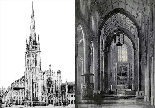
We rarely mention Johannesburg on this little corner of the web because our mother taught us that if you don’t have anything nice to say, don’t say anything at all. While ruffling through the archives the other day, however, I came across this design for the Johannesburg cathedral of the Church of the Province of South Africa. George Halford Fellowes Prynne (1853–1927) was an accomplished Gothic architect whose work is mostly found in the south of England. He’s notable for his rood screens in particular, worked in a variety of forms and materials (wood, stone, and metal), though this design employs a hanging rood. (more…)
Unbuilt St. Thomas
Lord & Hewlett’s Competition Entry for the Church of St. Thomas
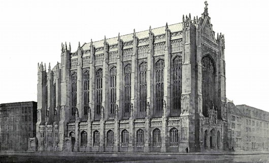
THE CHURCH OF Saint Thomas on the corner of Fifty-third Street and Fifth Avenue in New York is one of the artistic gems of the city: both as an architectural marvel designed by Ralph Adams Cram & Bertram Grosvenor Goodhue and as a musical paradise with its renowned choir of men & boys formerly under the tutelage of Gerre Hancock. (It’s foolish for anyone in the city during Advent to miss the Service of Lessons & Carols). The parish of the Episcopal Diocese of New York was established in 1834, and its first building was erected in the Gothic style on the corner of Broadway and Houston.
In 1870, after that neck of the woods became less fashionable, the congregation moved to its current location at 53rd & Fifth, to a new Gothic edifice by Richard Upjohn. That church hosted the marriage of Consuelo Vanderbilt to the 9th Duke of Marlborough. When it burned down in 1905, a competition was held to select the design of the new Church of St. Thomas, then perhaps at the peak of its high social status among Manhattan’s Protestant congregations. (more…)
Fated
WHETHER Parliament approves “therapeutic cloning” or not, will it make any difference in the long run? Whatever scientists can do, that will be done. Public opinion, at first aghast at artificial insemination and other landmarks on this infernal road, has largely come to accept them. So it is likely to be with this latest triumph.
 “Science has put into our hands innumerable gifts that we can use either for good or ill.” This mantra, once regularly intoned, has become less popular now that many of these gifts are plainly seen to be used for ill.
A new palliative has appeared instead: it says that we must be kept well informed about the latest scientific developments, as well as learning more about science and scientific methods, so that we can decide for ourselves whether we want these gifts or not.
But who are “we”? Would it make any difference if we said we did not want them? Would it make any difference if some scientists themselves decided they were too dangerous to proceed with? Others would somehow, somewhere, carry on the work. The progress of science and technology which has seized upon our world seems irreversible, even fated.
Will it, as in some environmentalist fantasy, gradually diminish in strength and become humanly manageable in a new, green and “sustainable” world? Or will it, as seems more likely, proceed to a catastrophic end?
Journowatch: Headline vs. Story
In an article about the soon-to-be-canonised Australian nun, Mary McKillop, the Daily Telegraph exhibits a peculiar example of the lows of newspaper journalism today.
The headline boldly states “Australian nun ‘to be made patron saint of abuse victims'” only for the sub-headline — “An Australian nun who will be canonised by the Pope next month should be made the patron saint of clerical sex abuse victims, Catholics have suggested.” — to directly contradict this.
Is Mary McKillop “to be” the patron saint of the abused or has it merely been “suggested”? The headline-writer put the ‘to be’ in quotation marks, but the article doesn’t supply a single quotation or piece of evidence showing this decision has been reached, only a quotation suggesting it would be a wise course of action.
I’ve read numerous examples of newspaper articles offering contradictory facts unreconciled, but to do so before the article has even started seems particularly bizarre.
The Daisy Wheel
Among the most well-known works of modern Scottish design, besides the ‘Clootie Dumpling’ of the Scottish National Party, there is the logo of the Royal Bank of Scotland: the Daisy Wheel. Now one of the most well-known financial brands in the world, the Royal Bank of Scotland was founded in Edinburgh in 1727, thirty-two years after its rival, the Bank of Scotland. (The Bank of Scotland, as it happens, was founded by an Englishman, John Holland — just as the Bank of England was founded by a Scot, Sir William Paterson).
The Scottish Parliament had declared in 1689 that King James VII had, by his absence, forfeited the throne, and handed the Crown to his Dutch rival William of Orange, who had already seized the throne in England. The House of Hanover succeeded to the throne of the new United Kingdom which had been created in 1707, but the Bank of Scotland was suspected of harbouring Jacobite sympathies. The London government was keen to help out Scottish merchants loyal to the Hanoverians and so, in 1727, King George granted a royal charter to the new Royal Bank of Scotland. (more…)
Antipodean Heraldic Philately
One of my favourite series of stamps comes from New Zealand. In 1929, the New Zealand Post Office commissioned the Englishman H. L. Richardson, an artist and teacher at the Wellington Technical College, to design a series of fiscal revenue stamps, or duty stamps. The design employed the New Zealand coat of arms in a variety of colours depending on the value of the stamp. Richardson erroneously had the lion in the crest of the arms hold aloft a New Zealand flag instead of the Union Jack that he was supposed to carry. The crest was changed to a crown in 1956 (along with a series of other changes) to signify that New Zealand had by then become a sovereign realm of its own. Richardson’s stamps were withdrawn from use in 1967 when New Zealand’s currency was decimalised. (more…)
Six to One Offered Against Xandover
The Late, Lamented Sporting Life, Daily Newspaper of the Queen Mum
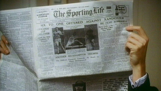
THE MOST FAVOURED daily reading material of the late Queen Mother, The Sporting Life did not survive into the twenty-first century, unlike the beloved former consort (who died 102 years of age in 2002). It was first printed in 1859, but through its 1886 acquisition of Bell’s Life in London, and Sporting Chronicle had a heritage dating back to 1822. Throughout the twentieth century, aside from being the racing newspaper of record, reading it gave a certain connotation of leisureliness, spiviness, or both. By the 1980s, it was thought the Life was getting a bit staid, and it was challenged when Sheikh Mohammed bin Rashid Al Maktoum founded the Racing Post as a daily competitor.
“The advent of the Racing Post in the 1980s was good for the Life,” Jamie Reid wrote after the older journal shut. “The old paper was in danger of becoming tired. What makes the Life’s closure so hard to take is that in the last few years it was better than ever.”
“The Post‘s editorial style was often a bit dry whereas the Life’s top writers… were clearly not good for you at all. They were basted in alcohol, toasted in tobacco and in constant desperate need of a winning tip.”
That the long tradition of The Sporting Life didn’t have to end is one of the more frustrating aspects: it was the Life’s owners, Trinity Mirror, that bought the Post in 1998 and decided to keep the title of the twelve-year-old paper instead of the one with one-hundred-and-forty-nine years of history behind it. Go figure.
Search
Instagram: @andcusack
Click here for my Instagram photos.Most Recent Posts
- Amsterdam November 26, 2024
- Silver Jubilee November 21, 2024
- Articles of Note: 11 November 2024 November 11, 2024
- Why do you read? November 5, 2024
- India November 4, 2024
Most Recent Comments
- on The Catholic Apostolic Church, Edinburgh
- on Articles of Note: 11 November 2024
- on Articles of Note: 11 November 2024
- on Why do you read?
- on Why do you read?
- on University Nicknames in South Africa
- on The Situation at St Andrews
- on An Aldermanian Skyscraper
- on Equality
- on Rough Notes of Kinderhook
Book Wishlist
Monthly Archives
Categories

