Arts & Culture
About Andrew Cusack
 Writer, web designer, etc.; born in New York; educated in Argentina, Scotland, and South Africa; now based in London.
 read more
News
Blogs
Reviews & Periodicals
Arts & Design
World
France
Mitteleuropa
Knickerbockers
Argentina
The Levant
Africa
Cape of Good Hope
Netherlands
Scandinavia
Québec
India
Muscovy
Germany
Academica
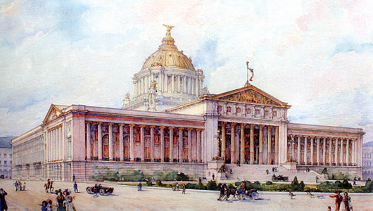
Palacio Legislativo Federal
MOST OF THE major American countries have large parliamentary buildings built at the height of their prosperity in the decade before and after 1900, but Mexico is a particular exception. (Brazil, for complicated reasons, is another). In the 1890s, the government of President Porfirio Díaz decided that it needed a grand legislative palace whose magnificence would be worthy of the head of state’s own grand appearance. A competition was held and an entry chosen as the winner, but the victor was disregarded in favour of a new design by a French architect.
Émile Bénard had assisted the great Charles Garnier in draught work for the celebrated Paris Opera House which now bears that architect’s name. In the 1890s, Bénard became famous for winning Phoebe Hearst’s architectural competition for the campus of the University of California at Berkeley with his entry “Roma”. The Spectator wrote from the London of the day, “On the face of it this is a grand scheme, reminding one of those famous competitions in Italy in which Brunelleschi and Michelangelo took part. The conception does honor to the nascent citizenship of the Pacific states.” Unfortunately, very little of Bénard’s scheme for the academic complex was completed.
Grace Jones, Artist
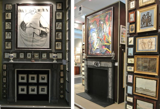
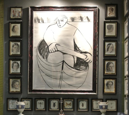
Among the surprises in store at the Collectors’ Preview of the Olympia antiques fair on Monday night were two works by the actress Grace Jones. When I was a wee bairn, “A View to a Kill” was one of my favourite Bond films, and Jones played May Day, the frightening sidekick to Christopher Walken’s Zorin. Apparently Grace Jones studied art for a period, and Charles Plante Fine Arts has two pictures by her amongst their offering: ‘An Eskimo rowing a boat’ (Charcoal with mixed media, 49 inches by 43 inches) and ‘Untitled abstract composition 1983’ (Mixed media on paper, 60 inches by 67 inches).
Fit for a Duke in Covent Garden
Russell House, No. 43, King Street
This apartment occupies the piano nobile of a 1716 house designed by Thomas Archer for the Earl of Orford, then First Lord of the Admiralty. He obtained the lease for the site from his uncle, the Duke of Bedford, on condition he tear down the house located there and build a new one. Batty Langley, the eighteenth-century garden designer and prolific commentator hated it, and devoted over 200 words of his Grub Street Journal (26 September 1734) to slagging it off. The Grade II*-listed building looks onto Covent Garden Piazza and has seen a number of uses over the years. (more…)
An Otto Wagner Embassy
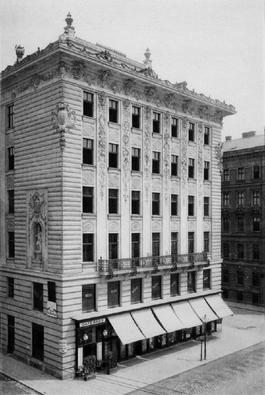
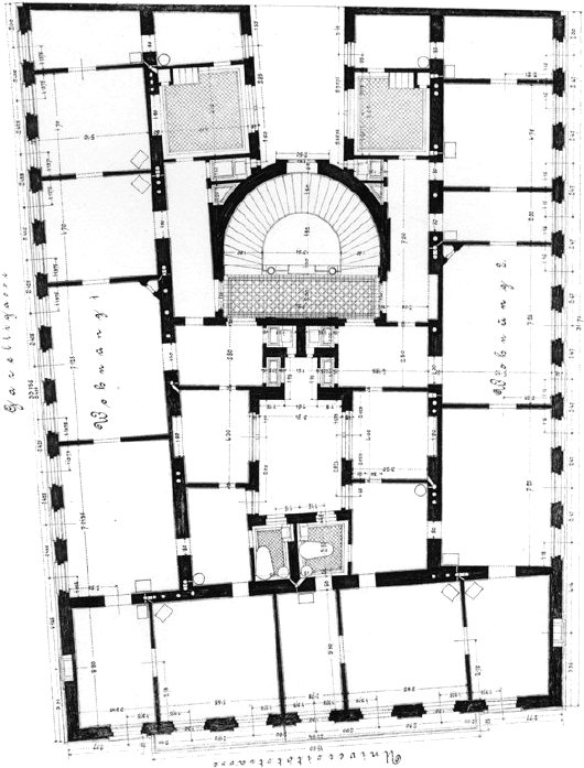
The unbuilt Imperial Russian Embassy in Vienna
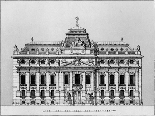
Otto Wagner was an exceptionally talented architect, though not, I think, the genius that many people would credit him with being. In the most emblematic work for which he is known, the Kirche am Steinhof in Vienna, there is too much angularity and not enough flow, curvature. For a free-standing structure it feels a bit stultified and uptight despite the brilliance of the individual elements of the design. I much prefer his Post Office Savings Bank and Stadtbahn stations.
Stumbling through the archives the other day, I came across this unexecuted Otto Wagner design for an Imperial Russian Embassy in Vienna: one now-vanished emperor’s embassy to another. From earlier in his career, it’s not as distinctively Ottowagnerian, but I admire the composition of the façade. The bulbous curved projections into the courtyard, however, are unfortunate, and too large for the space. (more…)
Arab Newspapers
Having recently made my first venture into the Middle East, I thought I’d provide a brief overview of the pan-Arab newspapers that are read by exiles, businessmen, and intellectuals in Arabia and the diaspora.
Marlow’s St Paul’s Capriccio
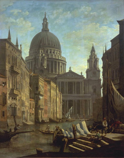
c. 1795; oil on canvas, 60 x 41 in.; London, Tate Gallery
The view of St Paul’s Cathedral as if it had been completed according to the original plans of Wren and with Hawksmoor’s baptistry (which I posted yesterday) reminded me of this capriccio by William Marlow. And then this in turn recalled my 2005 post If London Were Like Venice.
Carl Laubin’s Architectural Fantasies
While the subjects of his works are varied, Carl Laubin has become best known for his architectural paintings. Born in New York in 1947, he veered into architectural painting when he was taken on by the London office of Richard Dixon — now part of Dixon Jones, the firm responsible for, among other projects, the Royal Opera House and the redesign of Exhibition Road. With an eye for detail, he has completed capriccios displaying the total built corpus of Hawksmoor, Cockerell, and, most recently, Vanbrugh, while the National Trust also commissioned him to paint a capriccio of all the houses currently within their care.
More of his work can be viewed at the website of Plus One Gallery, and a book of his paintings has been published by Philip Wilson. (more…)
The UN at Quebec
IN 1943, THE BRITISH, Canadian, and American governments descended upon the city of Quebec, capital of la vieille province, for an intergovernmental conference to plan the invasion of France — surely one of the greatest military tasks ever undertaken in the modern era. The site proved auspicious due to a peculiar combination of factors: Quebec City enjoys a certain European cachet but with both the geographic safety of North America and the more spacious accommodation usual to that continent. The three governments held a second conference there in 1944, and in 1945 the International Labour Organisation met in the city, followed a few months later by the Food & Agriculture Organisation of the nascent United Nations.
With this track record of indisputable experience, the ville de Québec, lead by its mayor Lucien Borne, put in a bid to be the permanent seat of the United Nations Organisation. (more…)
Little Ben
 WALKING THROUGH Victoria recently, I was horrified to see the recent renovations and street improvements have led to the disappearance of ‘Little Ben’, the small Victorian clocktower that sat in a traffic island halfway between Westminster Cathedral and Victoria Station. Little Ben is a convenient meeting place in a district that is rather uninspiring and surprisingly lacking in conveniences.
Why, for example, is there no decent pub in Victoria? If you need a meal, Grumbles of Pimlico is walking distance, and they treat you well at Il Posto. But a decent pub atmosphere is not to be had, unless you fancy The Pub Formerly Known as the Cardinal (now styling itself as ‘The Windsor Castle’).
Happily, a simple Google search reveals that Little Ben’s absence is merely temporary: indeed, Little Ben is taking a rest-cure. The goodly folk at Wessex Archaeology have informed us as such.
The clock owes its creation to Gillet & Johnston of Croydon, who built Little Ben in 1892 and erected it in the middle of Victoria Street. It fell victim to a road-widening scheme and was removed in 1964 but, after sitting in storage unappreciated for some years, it was finally renovated and restored to its original location in 1981.
Transport for London is currently working on a significant upgrade to Victoria Underground Station, including a rearranged traffic alignment on surface level, in addition to new entrances and exits and a great big whopping ticket hall sous la terre. When all is finished and done and in tip-top shape, Little Ben will be returned to his traditional location, and some semblance of order will return to this sector of the most unglamorous Victoria Street.
Politigården
The Police Headquarters, Copenhagen
One of the pleasures of the recent hit Danish television series Forbrydelsen (released in the UK as ‘The Killing’) is the occasional view it provides of Copenhagen’s police headquarters.
Politigården (lit. police-yard) is in a restrained Scandinavian modern classicism and was designed by Hack Kampmann.
It was constructed from 1918 to 1922 but Knapmann died in 1920, and his role as chief architect was assumed by his son Hans Jørgen Kampmann (whose brother Christian was also an architect).
The interior hints towards a variety of styles from Renaissance to Baroque and Art Deco, while the building rises around a large central circular courtyard roughly the same diameter as the Pantheon in Rome.
Some architectural historians consider Politigården the last neoclassical public building in northern Europe (so far, that is). (more…)
Overwhelming the Farber Building
A bland glass-plated giant will piggy-back onto a sound example of the Modern Movement in Cape Town
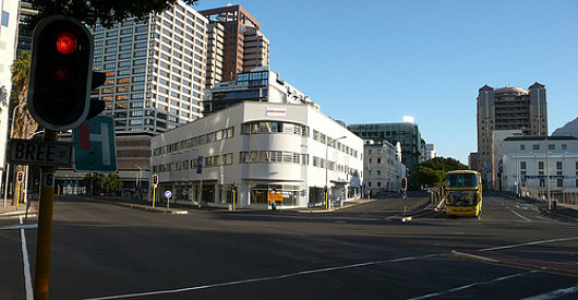
The Farber Building, one of the few extant examples of the Modern movement in architecture in Cape Town, is to be overwhelmed by an eighteen-storey plate-glass skyscraper. The developers had sought to have the 1935 building designed by Roberts & Small demolished, but the city fathers wisely refused permission. The price of its salvation, however, is that the boring skyscraper will piggy-back onto this actually rather inoffensive Modern structure. (more…)
The Iconography of Party
Taking into account the important aesthetical nature of politics, it might be worthwhile taking a sweep round the political parties to see what their emblems, logos, and symbols look like. (more…)
Cribbed from Hillenbrand
Persian: that’s the word I’ll always associate with Shusha Guppy. Uttered with a luxurious protraction of the first syllable — Purrrzhen, as if a … well, Persian cat were being stroked—it conjured up all those Oriental refinements rudely swept aside by the ayatollahs, a lost world of Hafez recitations and elaborate compliments (taarof, as she taught me to call them) paid in jewel-like gardens. Though she’d occasionally employ the bare geopolitical term “Iran,” the adjective was always “Persian,” and so was the name, in English, of her mother tongue—Allah help anyone who referred to it in her hearing as “Farsi,” which, she would witheringly point out, was like saying “Deutsch” or “français.”
— Ben Downing, The New Criterion
JUST 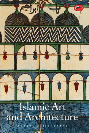 THE OTHER day I remembered what was quite possibly the nerdiest and most wonkish social interaction I ever had. Summering in Maine a summer or two ago, I came across Luke P., who studies Persian at SOAS here in London, standing on Sunset Rock staring out towards Strawberry Island.
There were six or seven of us there, and in the course of conversation Luke made some rather clever or obscure point about Islamic architecture, perhaps it was Cairene funerary monuments or maybe it was even within his Iranian remit — I don’t remember.
What I did remember is that the substance of this remark, seemingly original, was in fact cribbed in its entirety from Hillenbrand, which is to say from Professor Robert Hillenbrand’s Islamic Art & Architecture, pretty much the standard work on the subject. Like a flash, I came back, “Pah! You got that straight from Hillenbrand!” A flick of the cigarette, and a wry smile emerging from the corner of his mouth, Luke immediately and very graciously conceded this as being the case.
The lesson our tutors taught us at university rings true: always attribute and acknowledge sources! You never know who’ll have read Hillenbrand.
Tretheague
Stithians, Cornwall
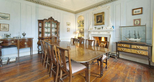
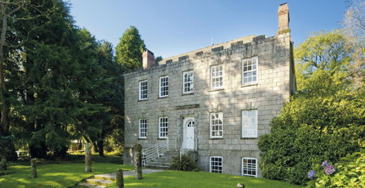
It having just been St Pirran’s Day recently, why not have a look at some Cornish property up for grabs? Just southwest of the Cornish village of Stithians is this curious little house named Tretheague, now up for sale from Savills with seventeen acres attached. Stithians is known for its agricultural show held every July since 1834 and “one of the largest and best-known ‘one-day’ shows in the West Country” according to the agents’ propaganda tells us.
“The Manor of Tretheague” the propaganda continues, “was owned by the ancient Cornish Beville family until the end of the 16th century. Philip Beville of Killygarth died leaving the property to his son in law, Sir Bernard Grenville of Stowe, who sold off various tenements and dismembered the manor as such. The family of Tretheague lived at the property for three centuries until Walter Tretheague died around 1602. They were followed by the Morton Family who did well from mining interests in the county until another wealthy tin adventurer, Nicholas Pearce, who developed Wheal Maudlin at Ponsanooth, took over the old manor in 1690.”
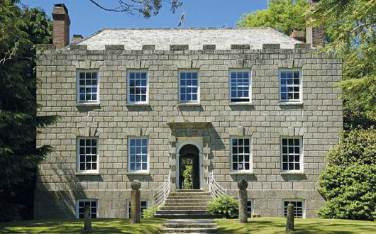
“John Pearce rebuilt the house the year before becoming High Sheriff of Cornwall in 1745 and his descendants sold the property to J M Williams in 1872, another member of a famous Cornish family that prospered from the Cornish mining boom. Under the guise of Williams Cornish Estate the property was sold privately to Bernard Penrose in 1962 who then spent almost 20 years restoring this somewhat unique and unspoilt gem that had remained almost unaltered since the time of its construction.”
“The house standing replaced an Elizabethan house that was recorded as having seven chimneys in the tax of 1660, although only small fragments of mullions and cut and chamfered stone survive. The major rebuild took place around 1744, almost certainly designed and overseen by the famous Greenwich architect Thomas Edwards who presided over several commissions in Cornwall for a period when rich County families and well-to- do mining adventurers felt it necessary to show off their new found wealth and elevation in Cornish society.”
“The house overlooks beautiful parkland which borders the drive and separates the house from the country lane. This parkland has been the scene of summer cricket matches from time to time and now contains individual specimen trees of lime, Canadian maple, beech and horse chestnut.”
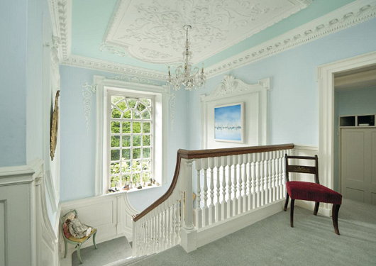
“An imposing set of granite steps with wrought iron railings rise to the entrance which is at upper ground floor level. Inside the house much of the original period detail is intact, and on the upper ground floor the hall, panelled dining room and magnificent shallow-rise turning staircase feature fine plaster ceilings with modillions and Rococo detail.”
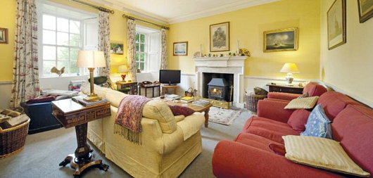
I like the exterior and setting, but from the photos the house feels curiously small on the inside. I somewhat dislike such primly contained box plans, and prefer a bit of awkward additions and extensions from centuries of use. Treatheague seems a bit too clean cut, but worth a look at least.
South Africa Gets Personal with Banknotes
New series will feature face of former president Nelson Mandela

South African President Jacob Zuma recently announced that the country’s central bank would issue a new series of banknotes featuring his world-famous predecessor, Nelson Mandela. As the South African Rand is a widely used currency throughout southern Africa, its banknotes have become well-known throughout the region, and current international standards recommend banknotes change their security features every seven-to-ten years. The changeover will take place as the South African government makes a significant investment in the state-owned South Africa Bank Note Company which also prints banknotes for a number of neighbouring countries. SABN hopes to upgrade its printing facilities to take into account the most recent improvements in banknote security features in order to prevent counterfeiting.

I’ll rather miss the old notes (above), branded into my memory from my time living in South Africa. For some reason (the exchange rate, perhaps?) I have nought but happy memories of the Rand and always enjoyed the beautiful animals in a variety of colours printed on the notes. While Mandela will feature on one side of the new issue of notes, the ‘Big Five’ game animals will continue to grace the reverse. The inoffensive animal theme was introduced to keep the currency relatively apolitical, and despite the widespread admiration for Mandela across South Africa, the introduction of the former president’s visage on bank notes is another symbolic way of imprinting the ANC’s grasp on power into the population’s psyche.
As for myself, being obsessed with everything Cape Dutch and Afrikaans, I rather miss the old image of Jan van Riebeeck which once graced South Africa’s rand notes.

FAZ and the art of newspaper web design
There is a certain pleasure in reading newspapers: the feel of the paper in your hands, the comfort of a seat in a café, the wide panoply of stories arrayed before you. Newspaper websites, on the contrary, are generally horrible. They are usually outrageously ugly (the Scotsman‘s website is particularly poor) and neither well organised nor designed with the proper aesthetics in mind. You might remember that the Times of London redesigned their website just before making it totally inaccessibly. I enjoyed their redesign at the time, but upon further consideration it seems a bit insipid.
The Frankfurter Allgemeine Zeitung, widely regarded by correct minds as the best newspaper in the world, engaged upon a wholesale redesign of their website, faz.net, in October of last year. Like the newspaper itself, there is a fine attention to detail, and I think FAZ might just take the biscuit for best online presence for a newspaper. (more…)
State Flags Considered
The famous Matthew Alderman provoked a disputation on Facebook the other day regarding amongst other things (jousting got a mention) the relative merits of U.S. state flags. I touched upon this subject previously in a post discussing the arms of the Commonwealth of Massachusetts, when I noted the lamentable tradition in American state flags is for the state seal or emblem to be presented on a blue field. Overall, I have to admit that Maryland has the best flag of any U.S. state: it is heraldic, relatively simple, and overwhelmingly traditional. The Facebook commenting led to an all-out war of annihilation between a lasse of Virginia and one of Maryland on the relative merits of their respective state flags. Right as it is for Virginians to defend the great inheritance of their fair dominion, there is simply no contest here: Maryland’s flag is the overlord.

Just look at Virginia’s (above) state flag! A total yawn-fest, I’m afraid. State seal on blue — how original. It would be far better if they took their ancient coat of arms and followed Maryland’s example by using a banner of arms. In Virginia’s case that would mean a red Cross of St George with the crowned shields of Scotland and Ireland in two quarters and of the quartered French & English arms in the other two quarters. Very handsome.

I don’t really like many other state flags (my geboorteland of New York is no exception: once again a banner of its arms would be much more handsome). Of the few I do enjoy, California rakes highly. It has a certain panache, and the words ‘California Republic’ are a healthy reminder of wherein lies the sovereignty. And interestingly, if the Soviets ever take California (“You mean they haven’t?”) they wouldn’t have to change the flag at all, as it already has a red star.

New Mexico’s is admirably simple and different, but one does worry if it’s a bit too simple: the Zia sun symbol veers eerily close to being a corporate icon. The uber-trad proposal would be to replace it with the yellow-field Cross of Burgundy.

The flag of South Carolina also gets an honourable mention, with its comely combination of palmetto tree and crescent moon. Rendered in red and white instead of blue and white, it is the flag of the Citadel, South Carolina’s military college.
Admiralty Arch for Sale
Sort of: Queen Offers Long Leasehold of Edwardian London Landmark
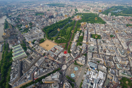
SIR ASTON WEBB’S great Edwardian Baroque office-building-cum-triumphal-gateway, Admiralty Arch, will be offered up for a long leasehold by HM Government. The Grade-I listed building, constructed between 1910 and 1912, is one of the best-known in London for finishing the long view down the Mall from Buckingham Palace and connecting it to Trafalgar Square beyond. Admiralty Arch features 147,300 square feet across basement, lower ground, ground, and five upper floors.
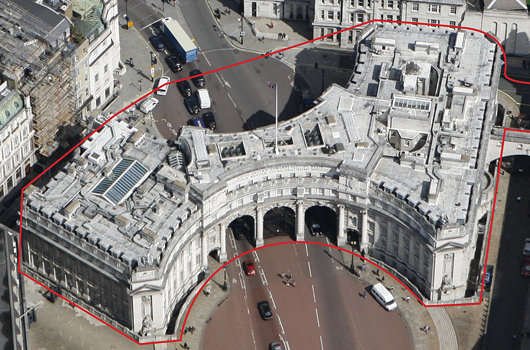
Savills have been appointed as the sole exclusive agent to seek interest in the long leasehold. “The Government’s objective is to maximise the overall value to the Exchequer from the re-use of Admiralty Arch,” the Savills press release noted, “and to balance this with the need to respect and protect the heritage of the building, now and in the future, enable the potential for public access and ensure awareness of, and be prepared to respond to, potential security implications.”
Our prediction: oil money from abroad will turn it into a hotel. Boring, I know!
Comper in Clerkenwell
The unbuilt Church of St John of Jerusalem
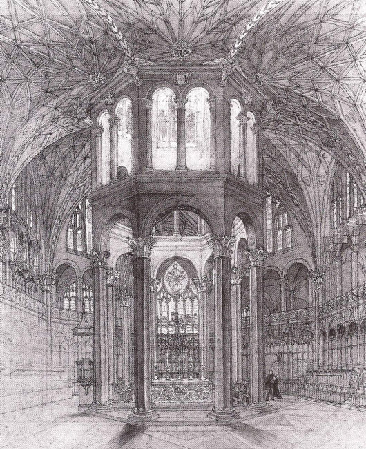
IN THE REALMS of architecture, the unexecuted project has a certain air of fantasy to it — the allure of what might have been. Ranking high amongst my favourite unbuilt proposals is Sir Ninian Comper’s project for the Church of St John of Jerusalem at Clerkenwell. Comper designed the scheme in the middle of the Second World War as a conventual church for the Venerable Order of St John, the Victorian Protestant revival of the old Order of St John (now more commonly known as the Order of Malta) which was banished from England at the Reformation. The design (below) is a Romanesque-Gothic hybrid, a splendidly exuberant cross-fertilisation of two styles more frequently opposed to one another in the minds of most.
One of the proposals for the serious reform of the Order of Malta in Britain is for the Grand Priory of England to divest itself of its interest in the Hospital of St John & St Elizabeth and its associated chapel in St Johns Wood. Owing to a complicated series of events, conventual events are taking place at the Church of St James, Spanish Place already. As the Venerable Order never executed Comper’s brilliant design, perhaps the Order of Malta might consider buying a suitable site in London and making Comper’s fantasy a reality.
Search
Instagram: @andcusack
Click here for my Instagram photos.Most Recent Posts
- Amsterdam November 26, 2024
- Silver Jubilee November 21, 2024
- Articles of Note: 11 November 2024 November 11, 2024
- Why do you read? November 5, 2024
- India November 4, 2024
Most Recent Comments
- on The Catholic Apostolic Church, Edinburgh
- on Articles of Note: 11 November 2024
- on Articles of Note: 11 November 2024
- on Why do you read?
- on Why do you read?
- on University Nicknames in South Africa
- on The Situation at St Andrews
- on An Aldermanian Skyscraper
- on Equality
- on Rough Notes of Kinderhook
Book Wishlist
Monthly Archives
Categories

