Design
About Andrew Cusack
 Writer, web designer, etc.; born in New York; educated in Argentina, Scotland, and South Africa; now based in London.
 read more
News
Blogs
Reviews & Periodicals
Arts & Design
World
France
Mitteleuropa
Knickerbockers
Argentina
The Levant
Africa
Cape of Good Hope
Netherlands
Scandinavia
Québec
India
Muscovy
Germany
Academica
New York & St Andrews
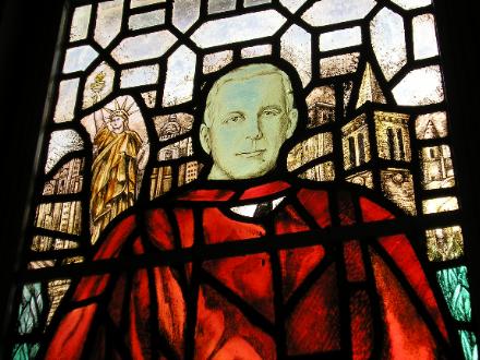
One of the interesting things about living in St. Salvator’s Hall is that one of the beautiful stained-glass windows in our wood-panelled dining hall is dedicated to Edward Harkness, and contains depictions of both the Big Apple and the Auld Gray Toon. Harkness was a benefactor of the University of St Andrews; in fact, he built St. Salvator’s Hall, as well as funding the renovation of the University Chapel (St. Salvator’s) and the restoration of the ruined St. Leonard’s Chapel. (more…)
Cassock Pursuivant
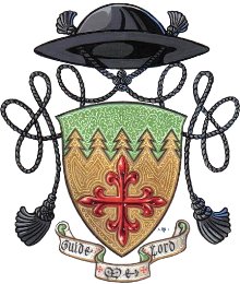 Last night the G&B played host to a lecture by one Fr. Guy Selvester, America’s ecclesiastical heraldist extraordinaire (arms at right). The good Reverend clearly has an unadulterated and unaffected love for heraldry, which, as he was very keen to point out, is unquestionably both an art and a science. He also has flaming red sideburns which give one the vague impression that he was a Civil War chaplain in a past life. After a brief introduction from a member of the G&B’s heraldry committee, the cassocked Father Guy gave a very clear and well-delivered talk, amply displaying his broad and deep knowledge of the subject, especially when responding to off-the-cuff inquiries from the audience.
Of course no talk on ecclesiastical heraldry would be complete without mentioning the late Bruno Heim, the expert on church heraldry as well as Grand Prior of the Constantinian Order and the first full papal nuncio to the Court of St. James since the Reformation. Heim’s book Heraldry in the Catholic Church (available in the St Andrews University Library) is the essential work on the subject. Fr. Selvester interestingly pointed out that Blessed Pope John XXIII intended to found a heraldic authority for the Church. He was dissuaded from this task by none other than Archbishop Heim, who believed the Church covered too far broad a swathe to effectively and appropriately constitute its own heraldic authority mindful of the vernacular traditions. (more…)
A Bit of Sun
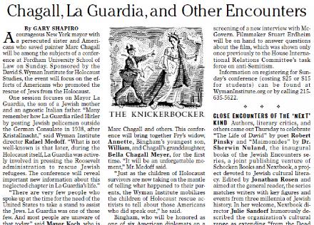
My ownly major aesthetic gripe against the Sun is the layout of the front page of their Friday second section, currently titled ‘Arts+’. (The ‘plus’ presumably refers to the inclusion of the Sports pages towards the end). Below at left is Section II as it appeared in the September 2-4 edition. The sans-serif font is just a tad too Gannett for a publication as esteemed as the Sun. To the right and below it I have placed two proposals for a reform of the Section II front page, both of which, I believe, are much more in keeping with the general aesthetic and demeanor of the rest of the New York Sun.
Elliott Banfield
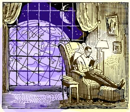
One of the best illustrators alive is Elliott Banfield. I have seen his work a few times in the New York Sun, but only managed to finally investigate him on the web this evening (thanks to the Irish Elk), and his website offers a plethora of wonderful retro illustrations that prove his skill and his worth. Why, if I ran a newspaper – one with a real budget I mean – I’d have this guy be the in-house illustrator and might be tempted to ditch photographs altogether.
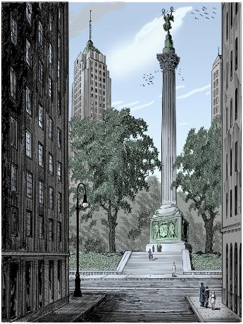
Mr. Banfield even gives us a wonderful impression of his proposal for a September 11 monument, inspired by critic Henry Reed. I love it. It oozes Gotham and reeks of Manhattan. I especially enjoy the use of New York’s civic arms on the base of the pillar, supported, appropriately, by a policeman and a fireman, rather than the official settler and native. The heraldic achievement of our city is, I’ll admit, somewhat provincial with its windmills and beavers, but all the more endearing for it, if you ask me.
Huzzah for Elliott Banfield!
Res Publica Nova Eboraci
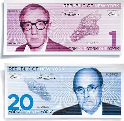
Gothamist picks up the idea of the City of New York seceding from either the State or the Country. Normally I’m in favor of anything seceding from anything else. However, the City and State have to stick together. I wouldn’t mind the State of New York regaining complete sovereignty, but I think we’d want to take Connecticut and northern New Jersey with us for the sake of geographic integrity.
New York currency illustrations from an article on secession in New York magazine.
Dingbat Through the Ages
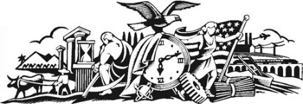
Newsdesigner.com has an interesting post enlightening us to the history of the ‘dingbat’, the vignette which can be found atop the International Herald Tribune.

The design first originated in the nameplate (also called, varyingly, the ‘masthead’, ‘banner’, or ‘flag’) of the New-York Tribune. The Tribune became the New York Herald Tribune, which my Aunt Naomi informs me was a very good newspaper while it lasted. The NYHT died in 1966, being merged into the ill-fated New York World Journal Tribune (aka the Widget) which only produced a few numbers before labor troubles killed it too.

The Herald Tribune, however, has two remnants which still exist today: the Paris edition (now the IHT) which continued under the auspices of the New York Times and the Washington Post, now solely owned by the Times; and New York magazine, which started out as a weekly supplement to the Herald Tribune.
Another Broadsheet Bites the Dust

The Scotsman has given in to the current Fleet Street mania and become a tabloid. The newspaper had experimented with the tabloid size for its Saturday edition and then just a few days ago converted the weekday editions as well.
For my fellow Americans in the audience, a little explanation. Going tab is all the rage amongst respectable newspapers in Britain over the past year. The ancient Times of London comes in both broadsheet and tabloid format. The Independent was the first broadsheet to publish both a broadsheet and tabloid edition, and then decided to become a permanent tabloid. The Guardian, to my knowledge, has kept out of the tabloid fray, and the venerable Daily Telegraph remains commited to broadsheetism.
The benefits of publishing in tabloid size are that the newspaper is easier to handle and read. Financially, however, it means page size, and thus potential advertising space, is reduced by half.
I am not a fan of this tabloid revolution. I fantasize periodically about the Mitre being published in broadsheet format instead of A4. Perhaps my anti-tabloidism is culturally ingrained. After all, we Anglophones are used to the formula of broadsheet = trustworthy. This formula is not true, for example, in France, where the two main respectable newspapers, le Figaro and le Monde, are printed in a format slightly smaller than the standard US/UK tabloid.
Nonetheless, one of the aspects of broadsheets that I enjoy is that they aren’t easy to read on subways and whatnot. It’s best to sit down in a comfortable chair in a well-lit location and peruse the goings-on and thoughts of New York, the nation, and the world in the New York Sun than to get tiny bits of news in a “convenient” format.
Search
Instagram: @andcusack
Click here for my Instagram photos.Most Recent Posts
- Christ Church December 29, 2024
- A Christmas Gift from the Governor December 24, 2024
- Oude Kerk, Amsterdam December 24, 2024
- Gellner’s Prague December 19, 2024
- Monsieur Bayrou December 18, 2024
Most Recent Comments
Book Wishlist
Monthly Archives
Categories

