Design
About Andrew Cusack
 Writer, web designer, etc.; born in New York; educated in Argentina, Scotland, and South Africa; now based in London.
 read more
News
Blogs
Reviews & Periodicals
Arts & Design
World
France
Mitteleuropa
Knickerbockers
Argentina
The Levant
Africa
Cape of Good Hope
Netherlands
Scandinavia
Québec
India
Muscovy
Germany
Academica
Propaganda Fide

Cheers to the unknown wag who created this delightful poster, parodying the Obama “HOPE” posters.
Le monde diplomatique

The German edition of Le monde diplomatique underwent a complete overhaul not too long ago. Unlike the main French edition of Le monde diplo, which exhibits the exact style of a French newspaper of mediocre design circa 1996, the German edition now exudes a certain calm and composed modernity. The redesign is the work of the German typographer and designer Erik Spiekermann, whom the Royal Society have named a Royal Designer for Industry (entitling him to an HonRDI after his name; only “hon” because he is not a British subject). Mr. Spiekermann was responsible for the much-lauded redesign of The Economist, the magazine you read when the airport lounge doesn’t have a copy of The Spectator.
The European I grew up with
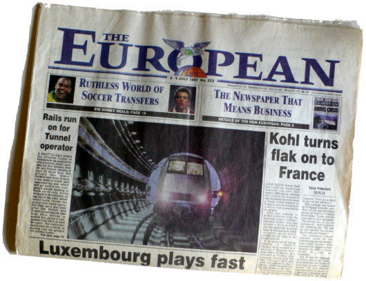
When I was a kid, The European — the weekly broadsheet that billed itself as “Europe’s national newspaper” from 1990 to 1998 — was my favourite newspaper and was an indelible part of our Sunday routine in the Cusack household. First Mass, then a trip to the pastry shop, then pick up The European at the newsagents next door, and back home to read and munch al fresco.
The paper was fiercely Euro-federalist until Andrew Neil took over, so I suspect were I to look back on a few copies now, I would probably strongly disagree with its politics. The late Peter Ustinov was a columnist, and he was not just a European integrationist but indeed a major supporter of world federalism (i.e. the abolition of nations and the rule of the planet by a single government; in theory democratic but inevitably a dictatorship of course).
Nonetheless, it was a very broad paper, with news from all across the continent from Cork to Constantinople, and I have no doubt its coverage played at least some role in the formation of your humble and obedient scribe.
The Primera Revista Latinoamericana

We are of the opinion that the more publications, the merrier, and so we certainly welcome the foundation of the Primera Revista Latinoamerican de Libros. The PRL, which is a sort of Hispanic version of the TLS, started printing last September and is based right here in New York. The bimonthly is published in Spanish but reviews both books that are printed in Spanish and books printed in English. Again, like the TLS, it is not limited to book reviews but features other literary essays as well.

The head honcho at the PRL is Fernando Gubbins, who has earned a master’s degree in Public Affairs from Columbia here in New York and a philosophy degree from the Pontifical Catholic University of Peru. Mr. Gubbins previously edited the opinion & editorial section of the Peruvian newspaper Expreso, and has worked with the Economist Intelligence Unit.
Not being a hispanophone, I am not qualified to render judgement on the quality of the publication’s content, the PRL in print is well designed and has a very traditional but modern feel to it, and it was a pleasure flicking through its pages. The Primera Revista is a welcome addition to the literary world of New York, and of Latin America.

New vice-regal flag for New Zealand

Elizabeth II, Queen of New Zealand, recently approved a new vice-regal flag (above) for her governor-general, His Excellency the Honourable Anand Satyanand, PCNZM, QSO, KStJ. The flag has a blue field charged with the shield from the coat of arms of Her Majesty in Right of New Zealand, topped by St. Edward’s crown. The previous flag (below) was of the standard viceregal type for the British Commonwealth of Nations, depicting the crest from the British royal arms with a scroll bearing the name of the dominion.
His Excellency, incidentally, is the first Catholic governor-general in the history of New Zealand.

How a newspaper should look

The Sunday edition of the Frankfurter Allgemeine Zeitung has always been a handsome newspaper. I admired its appearance so much that it provided much of the inspiration for the look of the Mitre during my editorship of that august publication. The weekday FAZ was famously reactionary in forbidding the appearance of photographs or any colour on the front page, so the Sonntagszeitung was viewed as an opportunity to be a bit more colourful and a little more free, but still within a solid traditional design.
It saddened me to learn that the Monday-through-Thursday FAZ has given in to the Spirit of the Age and now allows not only colour on its front page but photographs there as well. It now looks like a fairly conventional German newspaper, rather than the king of German dailies.
I will miss the old black-and-white FAZ because for me it brings back memories of visits to Dr. Timmerman‘s flat in St Andrews. Sofie and I used to go over to the good professor’s place for German pancakes on Shrove Tuesday (or to listen to his giant old radio, or to simply enjoy good conversation with good wine) and he had a massive pile of Frankfurter Allgemeine Zeitungs which I believe he only discarded at the end of the month.
Because the Frankfurter Allgemeine‘s front page is now a little less boring, the world in general is now a little less interesting.

The Late Great Bank of New York

Doesn’t it often seem that as soon as something you actually like comes along, it’s only a short amount of time before it’s gone again? This is how I feel about the latest, and indeed last, logo and general visual identity of the Bank of New York. Readers are no doubt aware that the Bank of New York is the oldest bank in America (founded by Alexander Hamilton) and that its was the first share traded on the New York Stock Exchange when that great financial market was founded beneath a buttonwood tree in 1792.
In 2005, the Bank of New York finally dumped their 1980’s-feel, dated-but-traditional logo in favor of a new design put together by the New York brand house of Lippincott (then still known as Lippincott Mercer). The logo suggested an old stock or bank note but its polychromatic scheme gave it a modern vibrancy. The adjacent logotype was along similar lines: “Bank” and “New York” in a tasteful, restrained modern with “The” and “of” in a delightfully traditional fluid colonial script.
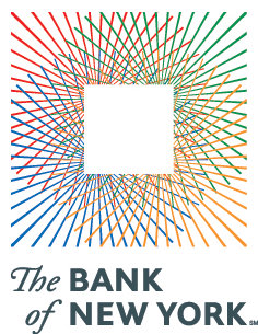
But on July 1, 2007, the ancient Bank of New York merged with a foreign interloper, the Mellon Financial Corporation of Pennsylvania and the disgusting hybrid child of the marriage is cumbersomely monikered: “The Bank of New York Mellon”. How awkward and ungainly! Along with the merger came a new logo, also designed by Lippincott, which you can see on the BNYM website. This pitiful modern arrowhead design says little, other than one might suffer bodily harm at its handling.
The 2005 Bank of New York logo evoked a sense of solidity. “I have deep roots and firm foundations,” it seemed to say, “but am nonetheless modern and adapting to change”. Think of the feel, the smell, of a worn bank note and then compare it to the dull, prickly arrowhead which threatens injury. The old logo you stick in you pocket and gain a sense of security from. The new logo you worry a ninja might hurl at you.
It was an error even to change the name, if you ask me. “The Bank of New York” has such a simplicity and a solidity to it, which the new name rather lacks. It is just like the old New York law firm of Dewey Ballantine, which suffered a takeover recently and is now known as “Dewey and LeBoeuf”. Rather sounds like a pair of huckster Louisiana lawyers hoping to make a few off the innocent inhabitants of the Bayou. So stick to the tried and the true, folks. It usually works.
St. George Guards India’s Fleet Once More
In a return to tradition, the old Indian naval ensign is reinstated.

AFTER AN EXPERIMENT with an allegedly more ‘indigenous’ design, India’s traditional naval ensign has been restored, and so the Cross of St George once again snaps from the sterns of the Union’s warships. The old Indian Naval Ensign dated to 1950, when the Indian Union became a republic, three years after achieving dominion status as a wholly self-governing member of the British Commonwealth. The Royal Indian Navy had flown the unaltered White Ensign but with the changeover to a republic it was decided to simply exchange the Union jack in the canton with the national flag of India, retaining the red St. George’s cross on a white field. (more…)
Sinterklaasfeest
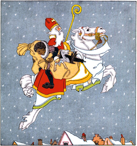
Wishing you all a very blessed Saint Nicholas day!
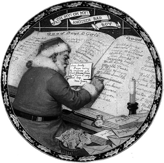
Imperial Airways
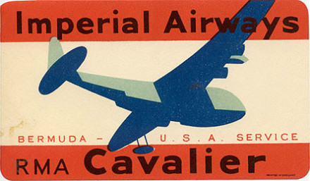
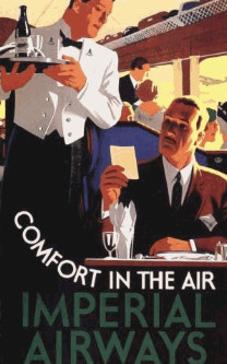

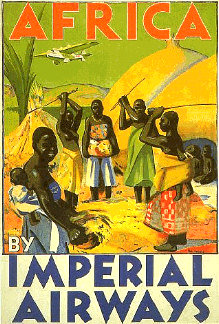
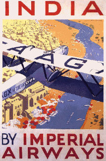
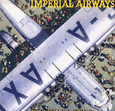
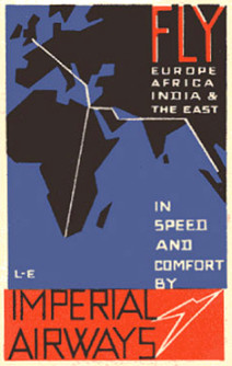

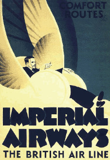

Previously: Bayerische Volkspartei | Lwow (Lvov/Lviv) | Empire State | Municipal Airports | Crêpes à Dentelles
Insiginia of the Society of Colonial Wars
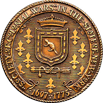
DEPRIVED OF THE hereditary principle by the lamentable break with Great Britain in 1783, Americans were eventually driven to inventing a hereditary social hierarchy, even more stringent than that of the mother country. Blood is the only qualification for membership of the numerous hereditary societies that dot the United States, unquestionably foremost among which is the Society of the Cincinnati. The Society of Colonial Wars, however, is one of the more prominent of the dozens of hereditary societies, and each state organization has devised its own seal or emblem. Below are exhibited a handful of examples.
Flags of the British Nations
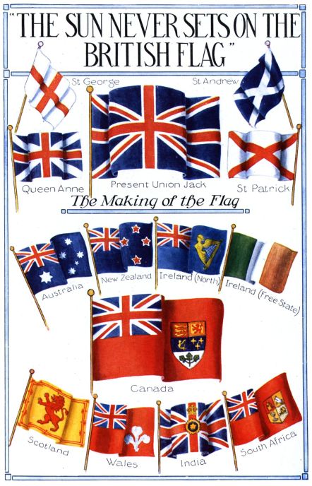
It is interesting how little-valued accuracy was in the depiction of flags “back in the day”. In this illustration, for example, the flags of Wales and “Ireland (North)” are mere inventions while the Scottish and Indian ones are arguable yet imprecise.
The “Welsh” flag depicted is a red ensign that is defaced with the three feathers of the Prince of Wales.
The “Ireland (North)” flag is handsome, but nonexistent. Northern Ireland had an official flag in use from 1953 until the Parliament of Northern Ireland was prorogued in 1972. (It was never recalled, and has since been superseded by the Northern Ireland Assembly). The flag of “Norn Iron” was a banner of the province’s coat of arms.
The flag of Scotland shown here is not actually the national flag (depicted above as the “St. Andrew” flag) but rather the Scottish royal standard, which is often (and improperly) used as an alternative national flag.
The Indian flag depicted is actually the flag of the Viceroy of India, which (admittedly) was sometimes used as a national flag for India. More often, however, a blue or red ensign was used, defaced with the Star of India.
The Canadian flag depicted here was changed in 1957, when the arms of Canada were themselves changed. The maple leaves in the bottom compartment of the sheild were specified to be “gules” (red). Up to that point, they had previously almost always been rendered “vert” (green). The Canadian flag itself was very controversially and unpopularly replaced by Prime Minister Lester B. Pearson with the Maple Leaf Flag. The Leader of the Opposition, the Rt. Hon. John Diefenbaker, derided the Liberal premier’s decision:
“We have had a flag. Flags can be changed. But flags cannot be imposed — the sacred symbols of a people’s hopes and aspirations — by the simple capricious personal choice of a prime minister of Canada. Now then, whenever the overwhelming majority of Canadian people want a new version, and when the design is meaningful and acceptable to most Canadians, that’s democracy. … I asked him [Prime Minister Pearson] this question: as to whether or not, under the circumstance, he would permit or he would arrange for a national referendum and his answer was no.”
‘Titus’

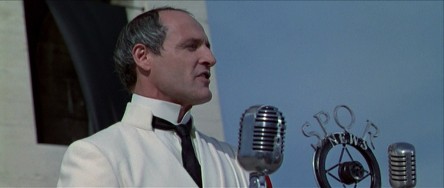
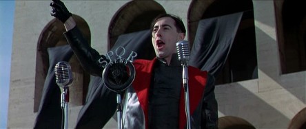
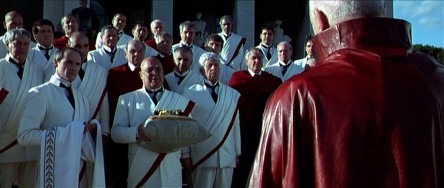
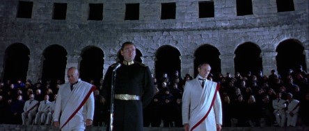
JULIE TAYMOR’S VERSION of Shakespeare’s “Titus Andronicus”, the 1999 film “Titus” (with Anthony Hopkins in the title role), is a rather interesting modern interpretation. It has rather whimsical aspects, such as the ‘SPQR News’ microphone the characters are seen speaking into. The rivals for the imperial throne bedeck their supporters in the colors of Rome’s rival football teams: the red and yellow of Roma for Saturninus and the pale blue and white of Lazio for Bassianus. I especially enjoy the Senators bedecked in old-school white suits making them appear like a convivium of Kentucky colonels. Worth seeing.






Lions and Torches and Trees (Oh My!)
Or, What £40,000 Gets You in Today’s World


A
MONG THE MANY changes which the Rt. Hon. David Cameron MP has wrought in his ten months as leader of the Conservatives one of the most public is the change of the party’s emblem. The flaming torch is out and the solid oak is in, at a cost of £40,000 to Conservative Central Office (according to the Times). There are three slightly different designs of the tree for the UK-wide, Scottish, and Welsh parties. Previously, the national party used the ‘flaming torch of liberty’ logo while the Scottish party used a blue lion rampant and Wales had its rather comely red-white-and-blue dragon with fire pouring forth from its mouth. The former logo was the ‘flaming torch of liberty’, which only entered into usage in the 1980’s under Mrs. Thatcher. In its place, we find instead an oak tree with healthy greenery on its limbs and a trunk made out in the traditional Tory blue. (more…)
New York in Philately
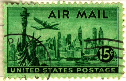
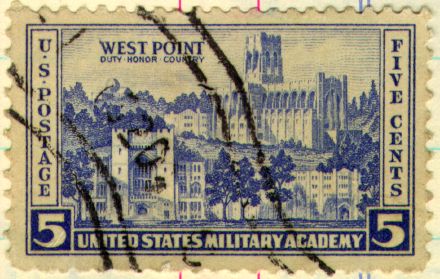
Wandering around the merry old world wide web I stumbled upon these stamps, which I bring to you for your own enjoyment. Above we have the Great Metropolis itself, the island of Manhattan in its swankier days. Below we have a view of the Crown of the Hudson, West Point, with the beautiful Cadet Chapel designed by that American Master, Bertram Grosvenor Goodhue himself, presiding over the campus of the United States Military Academy.
The postage stamp was once a thing of beauty and composition, but it’s heartening to see that some still design beautiful stamps. Just examine Elliott Banfield’s stamp of General Washington, based upon the staute in Union Square. Mr. Banfield believes that the decline in the design of postage stamps is due to a “moral void” most readily shown when the Postal Service unveiled its famous ‘Elvis Stamp’ a few years back.
“Elvis was important in the popular culture, yes,” writes Mr. Banfield. “But how important is the pop culture? Important only to those who can’t see anything higher or better. It’s scary to think that people like that are in charge of public policy. But they are, and the Elvis stamp proves it.”
Hear! Hear!
An irrelevant stamp, after the jump.
The Spectator

Empire State

Having been duly capped on the head by the Rt. Hon. Menzies Campbell QC MP with John Knox’s breeks last Thursday I have returned to the land of my birth a Master of the Arts. Details of the various rites and festivities are forthcoming, but in the mean time I share with you these three travel posters from back in the day when they made proper travel posters. All three advertise our blessed Empire State, two of them West Point, the glorious gothic crown of the Hudson. Excelsior!
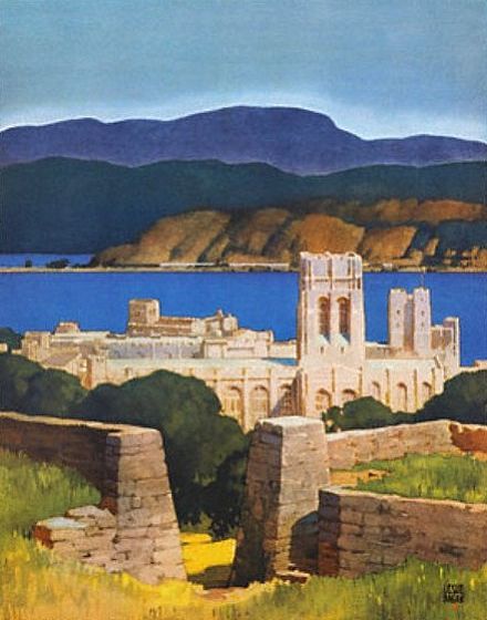
Click on the images for the full posters.
Search
Instagram: @andcusack
Click here for my Instagram photos.Most Recent Posts
- A Christmas Gift from the Governor December 24, 2024
- Oude Kerk, Amsterdam December 24, 2024
- Gellner’s Prague December 19, 2024
- Monsieur Bayrou December 18, 2024
- Dempsey Heiner, Art Critic December 17, 2024
Most Recent Comments
Book Wishlist
Monthly Archives
Categories

