Design
About Andrew Cusack
 Writer, web designer, etc.; born in New York; educated in Argentina, Scotland, and South Africa; now based in London.
 read more
News
Blogs
Reviews & Periodicals
Arts & Design
World
France
Mitteleuropa
Knickerbockers
Argentina
The Levant
Africa
Cape of Good Hope
Netherlands
Scandinavia
Québec
India
Muscovy
Germany
Academica
Austin Reed
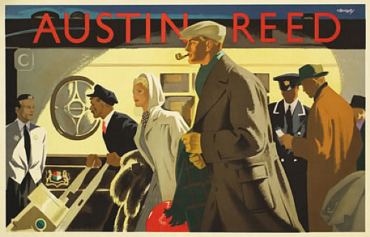
 The London mens’ clothier Austin Reed was founded in 1900 and set up shop in Regent Street in 1926 as the first men’s department store. The clothes were aimed at the upper middle class male, and the firm commissioned some of the best illustrator-designers of the day to promote its brand. The above poster, “Wagon-Lits”, is by a designer named Bomarry, about whom I can find absolutely nothing — surprising in this Age of Google.
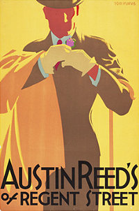
The remaining posters presented here are from the Bristol-born Tom Purvis, one of the finest commercial artists of the twentieth century. Purvis came from an artistic family, being the son of the sailor & nautical artist T. G. Purvis. Much of his output was work for LNER — the London & North Eastern Railway — producing posters advertising the various attractions to be found along the LNER’s routes from London to Edinburgh (via York & Newcastle) and on to Aberdeen and Inverness; the railway also had an extensive coverage of East Anglia. In 1936 he was among the first to be given the title of Royal Designer for Industry, but he gave up poster design after the Second World War to concentrate on portraits and religious themes. (more…)
Black Rod — Swart Roede
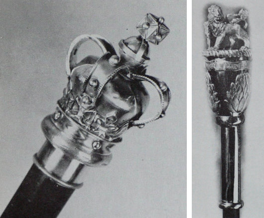
In my post on the 1947 Royal Visit to Cape Town, I mentioned just in passing the title of the Draer van Swart Roede — or the Gentleman Usher of the Black Rod, as he is known in English. Well, here is the Black Rod itself. The original South African Black Rod (left) dates from the Parliament of the Cape of Good Hope and was adopted as the Black Rod of the Union Parliament when South Africa was unified in 1910. After the abolition of the monarchy in 1961, a new Black Rod (right) was commissioned which featured protea flowers topped with the Lion crest from the South African coat of arms.
Black Rod (the person, not the staff) was the Senate’s equivalent of the House of Assembly’s sergeant-at-arms (ampswag). The first Gentleman Usher of the Black Rod in history was appointed in 1350 and the position still exists today in the British Parliament of today. Black Rod is sergeant-of-arms of the House of Lords, as well as Keeper of the Doors. The Usher’s best-known role is having the doors of the House of Commons ceremonially slammed in his face when he acts as the Crown’s messenger during each State Opening of Parliament, a ritual derived from the 1642 attempt of Charles I to arrest five members of parliament.
In South Africa, die Swart Roede traditionally wore wore a black two- or three-pointed cocked hat, a black cut-away tunic, knee breeches, silk stockings and silver-buckled shoes, but this costume of office has undergone a process of modernisation since the 1950s. After the vast expansion of the electorate in 1994 and introduction of an interim constitution, Black Rod’s title was officially shortened to “Usher of the Black Rod” to make it “gender-neutral”. (Regrettably, the Canadian Senate has also mimicked this innovation, though it is often unofficially ignored.) When a new, permanent constitution was enacted in 1997, the Senate was replaced by the National Council of Provinces as the upper house of parliament. A new Black Rod (the staff, not the person) was introduced in 2005, but is of such a garish design that it is best left uncommented upon.
Quebec Stamp
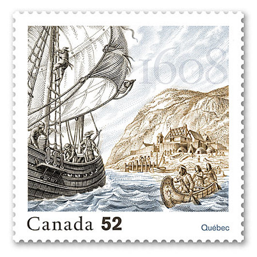
This stamp was designed by Jorge Peral, the artistic director of the Canadian Bank Note Company, for Canada Post to commemorate the four-hundredth anniversary of the foundation of Quebec.
St. Stephen and the Virgin & Child

The Hungarian Bishops’ Conference has a surprisingly handsome logo (above) depicting their patronal saint, King Stephen I, bestowing his crown to the Blessed Virgin and Our Saviour. Some might think the depiction of the Madonna & Child a touch too cartoonish, but I enjoy it.
A new look for The Walrus

The Walrus is Canada’s general-interest magazine, a sort of New Yorker for the Great White North. Founded just a few years back in 2003, it has taken many of its visual cues from The New Yorker and the result has been a very handsome monthly and a surprisingly interesting one. That’s not to say that it’s a very interesting magazine (like The Spectator), but one which surprises with the occasional article of note. Canada’s intelligentsia is notoriously boring and liberal; they tend to sneer at the neighbouring United States while simultaneously attacking long-held Canadian traditions. For some reason, Canadian intellectuals have yet to comprehend that making Canada less British doesn’t make it more Canadian but instead more American because it is precisely Canada’s Britishness that distinguishes the Great Dominion from the republic to the south.
De Volkskrant
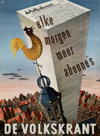
A FAVOURITE POSTER of mine combines a number of the things I love: newspapers, architecture, and the Netherlands. Arthur Goldsteen designed this handsome poster to advertise the daily newspaper De Volkskrant in 1950.
Fake Newspapers: “Bright Young Things”
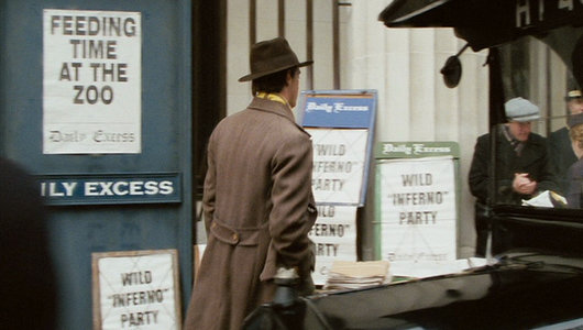
When it comes to newspapers, the visual element is all-important to an extent that shockingly few in the powerful parts of the industry comprehend. In the county of Westchester — my home turf — there is a monopoly when it comes to the newspaper as a means of local information delivery, and that monopoly belongs to the Gannett chain. Gannett newspapers are among the ugliest in the country, but then most American newspapers are abominations when it comes to design. The glory days of newspapers were, of course, the 1920s & 30s, and Stephen Fry’s film “Bright Young Things” — a rejigged dramatisation of Waugh’s Vile Bodies — highlights, as many Waughvian tales do, newspapers as a central plot instrument.
IHT Follow-up

Writing about the latest changes over at the International Herald Tribune, the Guardian‘s media blog “Organgrinder” linked to our “remarkably comprehensive” post covering the subject in depth. I’m slightly embarrassed to say I’ve never seen any of Jean-Luc Godard’s films, something I will have to rectify through the DVD collection at the French Institute’s Haskell Library when I’m back in New York.
Meanwhile, Erik Zenhausern, the IHT’s former Operations Director for the Americas, corrects some errors on my part and gives us an inside look at NYT-IHT operations [boldface mine]:
Some things in the article may not be 100% accurate. The dingbat, along with the whole paper (it does mention the switch to Poynter type)was redesigned in 2002-2003.
Also, the New York Times does not own the print sites around the world where the IHT is printed. These are contract printers. Of course the entire supply chain is already set up so it will be easy to pump NYT lite throughout Europe and Asia and NYT doesn’t have the cost of maintaining these facilities.
I sat in on early strategy meetings when the NYT forced out the WP. Even in the first few months of owning the newspaper, many people at the NYT were ready to call the newspaper New York Times International. If it wasn’t for focus groups saying they thought anything that says “New York” on it won’t sell in europe.
While in the early days the tread lightly, heavier footsteps are coming. The IHT will definitely be folded into the NYT at some point.
The Scottish Executive, 1999-2007

While naturally relieved that Labour are no longer in charge, one of the few objections I have to the current SNP government in Scotland is that they changed the name of the Scottish Executive to “the Scottish Government”. The new name is just so damned boring. Every country, region, town, and borough has a “government”; it’s the dullest word you can come up with. But “the Scottish Executive” had such a nice ring to it. Listening to the evening news on Radio Scotland, one heard the newsreader speak of “the Scottish Executive” and immediately thought “Ah yes, that’s our part of the government!” Now one hears the sultry phrase “The Scottish Government today announced new measures…” and thinks “Oh, the government. Nobody likes the government.”
To add to this lamentable change, they even dumped the Scottish coat of arms as the visual identity of Scotland’s authority (as seen above, in the Executive days) and replaced it with an exceptionally dull saltire-flag logo that can be seen on the Scottish Government’s website.
Premier Salmond, give Scotland back her heraldry!
The Continued Decline & Fall of the International Herald Tribune
The New York Times ‘tightens the leash’, shutting IHT website and redesigning newspaper as Times-lite; Herald-Trib loyalists cry foul

THE SAD DECLINE of one of the newspaper world’s most historic titles is continuing as the entire industry faces the challenges of the twenty-first century. The International Herald Tribune recently suffered a host of changes on the order of its proprietor, the New York Times, that have continued to assault the Paris-based newspaper’s individual identity. The paper’s website, iht.com, has been shut down and now redirects to a new portal on the New York Times‘s website, nytimes.com. Non-U.S. internet viewers are now automatically sent to the new portal — global.nytimes.com — upon accessing the Times website as well, but can switch to the U.S. edition at the click of a button. The rationalization for the move is centered on the New York Times Company’s attempts to boost online advertising revenue as print advertising and sales figures tumble. Furthermore, the actual print version of the Herald-Tribune has been redesigned, spurning the paper’s long design identity to make it look like a more light-weight version of the New York Times.
A new bookplate for the NYG&B

Fr. Guy Selvester reports on his resurrected Shouts in the Piazza blog that the great Marco Foppoli has designed a new bookplate for the New York Genealogical & Biographical Society. Mr. Foppoli is the most highly-regarded heraldic artist of our day, and the influence of the style of his mentor, the late Archbishop Bruno Heim, is apparent in his work.
Un soupçon de couleur
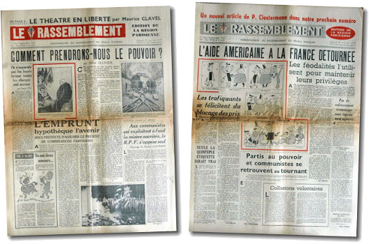
These two numbers of the Gaullist newspaper Le Rassemblement show what even a little dose of colour can do for a journal printed in black-and-white. The lack of additional colour was due to economical, not to mention technological, restraints, but we have now gotten well used to our newspapers being printed in a full array of colour. Yes, even the FAZ.
Von hier an blind
 The German band “Wir sind Helden” is a quartet purveying inoffensive pop rock, and recommended to us by one of our continental cronies. For their 2005 album cover, Von hier an blind, the band commissioned a group portrait in the ligne-claire style. The design is an obvious homage to Hergé’s Tintin. “Wir sind Helden” are little-known in the English-speaking world, though they have played three sold-out concerts in London, and are available from the iTunes Music Store.
Peter van Dongen
Dutch champion of the Ligne Claire style

No doubt one of the most enjoyable aspects of Hergé’s great Tintin series of bandes desinées is the brilliant ligne claire style in which they are drawn; the most talented living exponent of which is surely Peter van Dongen. This Dutch striptekenaar (“comic-strip draughtsman”) first came to the attention of the comic world in his mid-twenties with Muizentheater (1990), a tale of two working-class Amsterdammers growing up during the Great Depression. As van Dongen despises clichés, it is one of the few books about Amsterdam that doesn’t feature a single canal. It was nearly ten years before van Dongen produced his second comic work, Rampokan, depicting the Dutch East Indies during their final years before independence. (On Rampokan, van Dongen collaborated with fellow ligne-clairist Joost Swarte, whose work is often seen in The New Yorker).
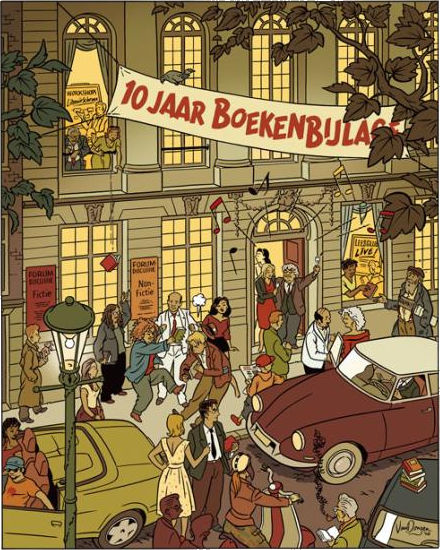
Van Dongen works as a commercial illustrator, and he often provides illustrations for NRC Boeken, the book review of the NRC Handelsblad. A celebration of the tenth anniversary of NRC Boeken was held at the Felix Meritis and is commemorated in the drawing above.
Search
Instagram: @andcusack
Click here for my Instagram photos.Most Recent Posts
- Faithful Shepherd of the Falklands April 8, 2025
- Articles of Note: 8 April 2025 April 8, 2025
- Proportionality Destroys Representation April 8, 2025
- Sag Harbor Cinema March 26, 2025
- Teutonic Takeover March 10, 2025
Most Recent Comments
Book Wishlist
Monthly Archives
Categories


