Comics
About Andrew Cusack
 Writer, web designer, etc.; born in New York; educated in Argentina, Scotland, and South Africa; now based in London.
 read more
News
Blogs
Reviews & Periodicals
Arts & Design
World
France
Mitteleuropa
Knickerbockers
Argentina
The Levant
Africa
Cape of Good Hope
Netherlands
Scandinavia
Québec
India
Muscovy
Germany
Academica
Fillon: Which Right?
A Rémondian Analysis of the French Presidential Candidate
One of the most significant contributions of the historian and political scientist René Rémond was his theory regarding the tendencies of the French right wing. He contended that, broadly speaking, there are three right wings in France: legitimist, bonapartist, and orleanist. These terms are not bound by their historic use, but rather (Rémond argued) serve as useful guides to understanding French conservatism today.
Gaullism, for example, with both its populism and its reliance on the authority of a charismatic leader, is classified as bonapartist. Social conservatism, meanwhile, with its affinity for the Church and for tradition, comes in under legitimism. And economic liberalism — the bourgeois supremacy of the markets — is orleanist.
What to make of the current presidential candidate of the French right, M François Fillon? The Québécois website Dessinons les élections (“Let’s draw the elections”) sought to apply a Rémondian analysis of Monsieur Fillon in one of its weekly cartoons (by Frédéric Mérand & Anne-Laure Mahé).
Their conclusions are as follows:
Legitimism: 60%
– social conservatism
– Christian values
– order and traditionOrleanism: 30%
– economic liberalismBonapartism: 20%
– a sense of the State
– idea of the providential man with reference to de Gaulle
Of course, many now think that, due to the usual scandals, Fillon is yesterday’s man and that Macron is the man of the hour. The two are chalk and cheese. Fillon is the family man from the country, loves hunting, and clings to the values of the Church. Macron is a socialist énarque and investment banker who married one of his school teachers (twenty-four years his senior).
The elephant in the room: Madame Le Pen. The leader of the Front national will, there is almost no doubt, top the first round of the election but then, in the second round, will have to face whichever other candidate gains the next highest number of votes. Whoever that candidate is will almost certainly gain all the anti-frontiste votes and be propelled to victory and the Elysée.
At the moment, it looks like the second candidate will only have to win around 22 per cent of the vote in order to effectively gain the presidency. Such a low level of actual support is one of the things the 1962 changes to the constitution sought to prevent, but when faced with an FN candidate as in 2002 or (presumably) this year the two-round system fails to prevent this.
As usual, the conservatives are calling for change and the progressives arguing for stasis, but it remains to be seen which option France will choose.
Loriot
Bernhard Victor Christoph Carl von Bülow, one of Germany’s most highly regarded humorists, was born 12 November 1923 and left this world on 22 August 2011. He was better known by his nom de plume of Loriot, the French translation of his surname Bülow, which is German for the oriole bird. Vicco (as his Christian names were shortened to) von Bülow began drawing cartoons for Stern in the 1950s. From cartoons he moved into television in the 1970s and films the following decade. Loriot’s humour focussed on the peculiarities of German people including the awkwardness of everyday situations and miscommunication in human interaction.
Asked in 2007 to describe what his influences were, he said: “I remember that, when I started studying, I was living between a madhouse, a prison and a cemetery. The location alone explains everything, I think.” Lexicographically, he will be remembered for introducing into German the term ‘yodel diploma’ signifying a worthless degree — what in Britain is known as a ‘mickey mouse degree’.
Loriot fans will miss his knowing eyes peering out from behind those familiar reading glasses. R.I.P. (more…)
‘I Have Prussiandom in my Blood’
Loriot on Prussia and Prussianness
 November 2003
The Viennese weekly Falter interviewed Vicco von Bülow — better known as Loriot — in November of 2003. In part of the dialogue, Loriot explored the Prussianness of his family and upbringing, musing upon some aspects of what it is to be Prussian, turning away from the simplistic categorisations. Via Günter Kaindlstorfer.
…
Loriot: I am committed to my Prussian roots. I was born a Prussian, I have Prussian, so to speak, in my blood. That this defines you for yourself is not new. One is born there, so one has to accept it.
Prussian vices have caused too much harm over the past 150 years.
Loriot: That’s right, I will not deny it at all. Nevertheless, I am proud of my native town of Brandenburg; I am also proud of my country of origin. Here I will not deny, however, that I have been occasionally affected by the disaster that this country has done throughout history, time and again. Only: Which country has, over the centuries, not caused many evils? I will not have the Prussian reduced only to its negative sides. (more…)
Tintin à Quebec
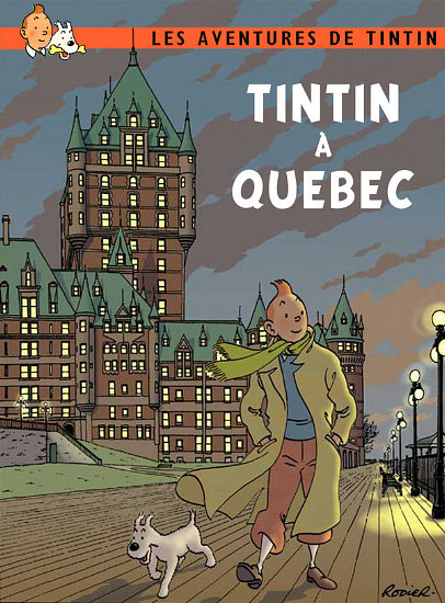
Tintinophilia and its allied science of Tintintology can almost seem like a cult sometime, with Moulinsart, the commercial wing of the Hergé Foundation, acting feverishly to quell any and all unauthorised outbreaks of Tintin resurrection. Their assiduity notwithstanding, Tintin pastiches are fairly common (though illegal) and vary in nature from respectful admiration to downright mockery. The Quebecois cartoonist Yves Rodier is one of the foremost pasticheurs of the famous Belgian boy reporter, and produced this cover (above) of a non-existant Tintin book set in the beautiful capital city of Canada’s French province.
While Tintin did visit Scotland in The Black Isle, I’d love to see a Tintin in Edinburgh book, and even more so Tintin in the Cape.
Joost Swarte

This year’s summer issue of The Walrus featured a cover from the cartoonist Joost Swarte, which occasioned a post about the Dutch ligne-clairist on the magazine’s blog. Mijnheer Swarte actually invented the term ligne-claire (or klare lijn) to describe the Tintin-esque school of bandes-dessinees, and has collaborated with the noted Peter van Dongen on the latter’s Rampokan series depicting the late years of the Dutch East Indies before it became Indonesia. Swarte’s work has also featured in The New Yorker, our “local” weekly which partly inspired the Canadian Walrus. Jumping from the printed page to brick and mortars, the new Musée Hergé in Louvain-le-Neuve was actually designed by Swarte. His previous architectural work includes a theatre building in his home town of Haarlem in North Holland. (more…)
Die Koninkryk van die Swart Pelikaan
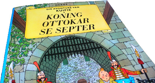
SYLDAVIA IS MY favourite country in the world. The buildings are old, the peasants are happy, and the king is ruling from his throne. Adding to my collection of Tintin books, the preponderance of which remain in New York, I know have three Afrikaans editions of Hergé’s works: Die Blou Lotus, Die Geheim van ‘De Eenhoorn’, and — my preferred among all the Tintin books — Koning Ottokar se Septer. Aside from Afrikaans, the rest of my copies are all either in French or English. I have a copy of the reprinted Tintin au Pays des Soviets and I just recently bought a copy of Tintin in the Congo, as I figured the European Union’s attempt to ban the book might make it harder to come by in years to come. I bought a copy of Le Sceptre d’Ottokar in a gas station in Brittany, one of the six special editions with a preface by Bernard Tordeur of the Hergé Foundation released in 1999/2000. Aside from Au Pays des Soviets & Le Sceptre, the only other French editions I have are L’Île Noire and Le Lotus bleu. (more…)
Von hier an blind
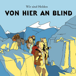 The German band “Wir sind Helden” is a quartet purveying inoffensive pop rock, and recommended to us by one of our continental cronies. For their 2005 album cover, Von hier an blind, the band commissioned a group portrait in the ligne-claire style. The design is an obvious homage to Hergé’s Tintin. “Wir sind Helden” are little-known in the English-speaking world, though they have played three sold-out concerts in London, and are available from the iTunes Music Store.
Peter van Dongen
Dutch champion of the Ligne Claire style
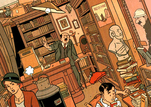
No doubt one of the most enjoyable aspects of Hergé’s great Tintin series of bandes desinées is the brilliant ligne claire style in which they are drawn; the most talented living exponent of which is surely Peter van Dongen. This Dutch striptekenaar (“comic-strip draughtsman”) first came to the attention of the comic world in his mid-twenties with Muizentheater (1990), a tale of two working-class Amsterdammers growing up during the Great Depression. As van Dongen despises clichés, it is one of the few books about Amsterdam that doesn’t feature a single canal. It was nearly ten years before van Dongen produced his second comic work, Rampokan, depicting the Dutch East Indies during their final years before independence. (On Rampokan, van Dongen collaborated with fellow ligne-clairist Joost Swarte, whose work is often seen in The New Yorker).
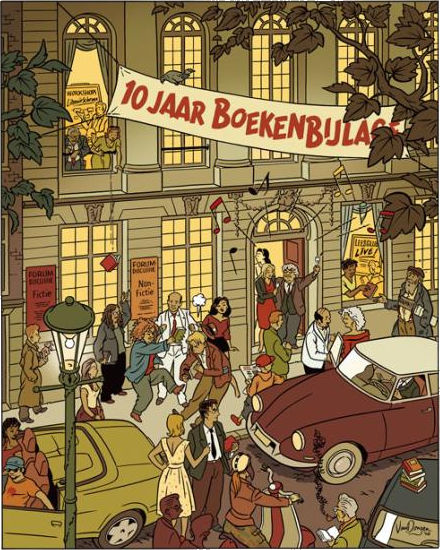
Van Dongen works as a commercial illustrator, and he often provides illustrations for NRC Boeken, the book review of the NRC Handelsblad. A celebration of the tenth anniversary of NRC Boeken was held at the Felix Meritis and is commemorated in the drawing above.
Tintin as Cusack or Cusack as Tintin?

A VERY BORED Liz Smith mocked this up on a rainy day during her August hols on the Atlantic coast of France.
Previously: The almighty loden coat
The Vicar’s Remorse
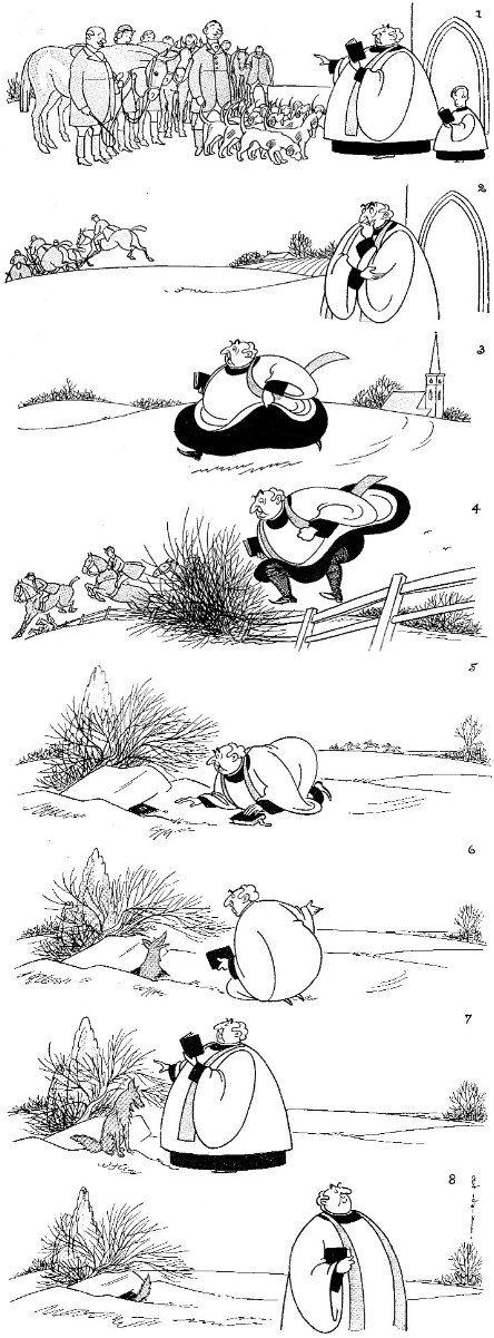
Previously: New York in November | The New Yorker Hunts | Tally Ho, Empire State!
Martyrs of Science
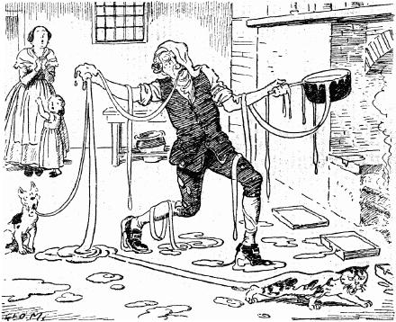
The Inventor of Toffee
Two Scotsmen
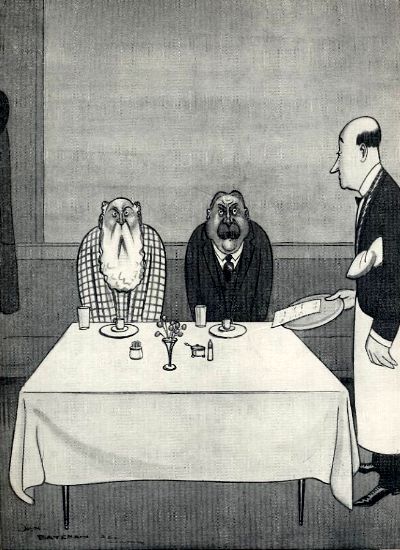
THE ORIGIN OF THE SLOW MOTION PICTURE
Study of two Scotsmen, having dined together, reaching for the bill.
H.M. Bateman
Dilbert on Gilbert
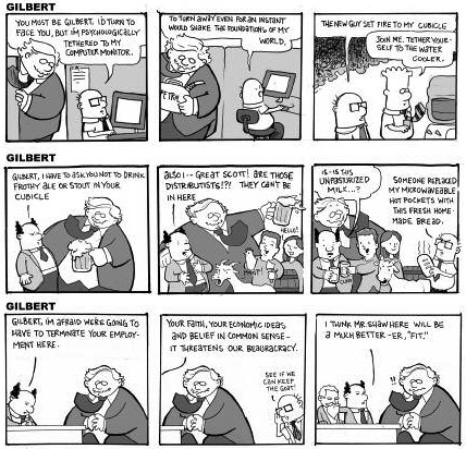
A recent Gilbert magazine featured G.K. himself interpolated into the popular Dilbert comic strip by Scott Adams. The text is quite small so I shall reproduce it below: (more…)
Elliott Banfield
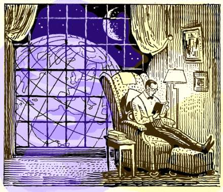
One of the best illustrators alive is Elliott Banfield. I have seen his work a few times in the New York Sun, but only managed to finally investigate him on the web this evening (thanks to the Irish Elk), and his website offers a plethora of wonderful retro illustrations that prove his skill and his worth. Why, if I ran a newspaper – one with a real budget I mean – I’d have this guy be the in-house illustrator and might be tempted to ditch photographs altogether.

Mr. Banfield even gives us a wonderful impression of his proposal for a September 11 monument, inspired by critic Henry Reed. I love it. It oozes Gotham and reeks of Manhattan. I especially enjoy the use of New York’s civic arms on the base of the pillar, supported, appropriately, by a policeman and a fireman, rather than the official settler and native. The heraldic achievement of our city is, I’ll admit, somewhat provincial with its windmills and beavers, but all the more endearing for it, if you ask me.
Huzzah for Elliott Banfield!
Search
Instagram: @andcusack
Click here for my Instagram photos.Most Recent Posts
- Sag Harbor Cinema March 26, 2025
- Teutonic Takeover March 10, 2025
- Katalin Bánffy-Jelen, R.I.P. March 3, 2025
- Substack Cusackiensis March 3, 2025
- In the Courts of the Lord February 13, 2025
Most Recent Comments
Book Wishlist
Monthly Archives
Categories


