Architecture
About Andrew Cusack
 Writer, web designer, etc.; born in New York; educated in Argentina, Scotland, and South Africa; now based in London.
 read more
News
Blogs
Reviews & Periodicals
Arts & Design
World
France
Mitteleuropa
Knickerbockers
Argentina
The Levant
Africa
Cape of Good Hope
Netherlands
Scandinavia
Québec
India
Muscovy
Germany
Academica
The Dome of the Custom House, Dublin
THE MOST RECENT series of the ITV detective drama “Foyle’s War”, though set in London, was filmed entirely in Dublin. (Ah, those Bord Scannán incentives!). I’ve noticed a phenomenon in which something set in England but filmed in Ireland suffers from English stereotype overcompensation. What this entails is unnecessarily sticking noticeably English ‘things’ (double-decker bus, red pillarbox) into the frame when, if filmed in England, the directors might otherwise be satisfied without these subconscious emblems reassuring the viewer that they are not in fact in the country the programme was actually filmed in.
So two characters meeting on a street of Georgian houses will have a red post box shoved into some arbitrary place on the street to remind us we’re in jolly old England. Despite this, any devotées of the Georgian style will recognise the Irishness of the houses because of the subtle yet noticeable difference between the Georgian styles of, say, London, Edinburgh, Bath, and Dublin.

Anyhow, not to reveal too much of the plot of this latest series, but Chief Superintendent Christopher Foyle is recruited into a post-war British intelligence gathering organisation. The exterior shots of the building used as this group’s headquarters is the Custom House on River Liffey in Dublin, only the show’s producers have digitally removed the building’s prominent dome, presumably in order to make it less distinctive and identifiable. (more…)
No. 6, Burlington Gardens
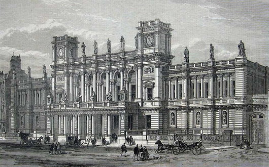
Sir James Pennethorne’s University of London
German university buildings are an (admittedly unusual) obsession of mine, and I’ve often thought that No. 6 Burlington Gardens is London’s closest answer to your typical nineteenth-century Teutonic academy’s Hauptgebäude. And the connection is appropriate enough, as No. 6 was built in 1867-1870 for the University of London in what had once been the back garden of Burlington House (which at the same time became home to the Royal Academy of Arts). Despite the building’s Germanic form, the architect Sir James Pennethorne decorated the structure in Italianate detail, providing the University with a lecture theatre, examination halls, and a head office. Pennethorne died just a year after drafting this design, and his fellow architects described it as his “most complete and most successful design”.
The University of London was founded as a federal entity in 1836 to grant degrees to the students of the secularist, free-thinking University College and its rival, the Anglican royalist King’s College. It now is composed of eighteen colleges, ten institutes, and a number of other ‘central bodies’, with over 135,000 students.
Since its founding, the University had been dependent upon the government’s purse for funding, as well as for housing. Accomodation was provided in Somerset House, then Marlborough House, before evacuating to temporary quarters in Burlington House and elsewhere. It was not until the 1860s that Parliament approved the appropriate grant for a purpose-built home for the University to be erected in the rear garden of Burlington House. (more…)
An Eclectic Vernacular in Charleston
Two new alleyways designed by George Holt & Andrew Gould
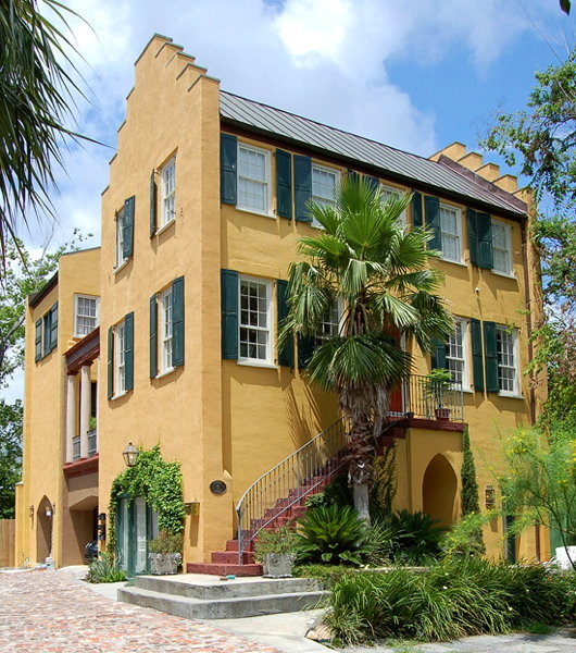
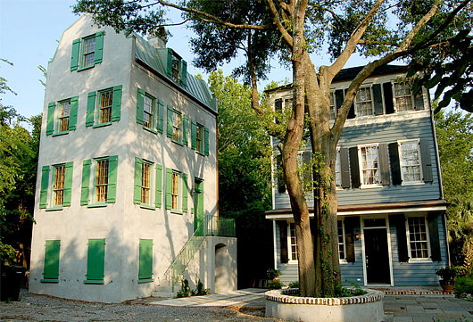
Charleston, the finest city of the American South, boasts two new alleyways designed by the architectural-urbanist partnership of George Holt and Andrew Gould. Holt began buying and restoring old Charleston houses two decades ago, and later expanded his work to building new houses in the traditional style of the town. Recently he’s combined with Andrew Gould, a specialist in the design of Orthodox churches, to craft an “urban infill project” plotting two short alleyways of modern houses built in an eclectic traditional vernacular: Charles Street and Tully Alley. (more…)
The Palace of Holyroodhouse
HOLYROOD IS SUCH a pleasant spot, despite the recent intrusion of an ostentatiously ugly government building designed by a Spanish architect. The other day, while visiting Edinburgh, I heeded the recommendation of the Prettiest Schoolteacher in Clackmannanshire to sample the burger at the Holyrood 9a. It was quite delicious, though not perfect, and was splendidly washed with a pint of Kozel (most un-Caledonian, I concede, but you can get Deuchars in London, you know).
Afterwards, our little party decided to have a little wander down Holyrood Road towards the Palace of Holyroodhouse, the epicentre of the Scottish monarchy.
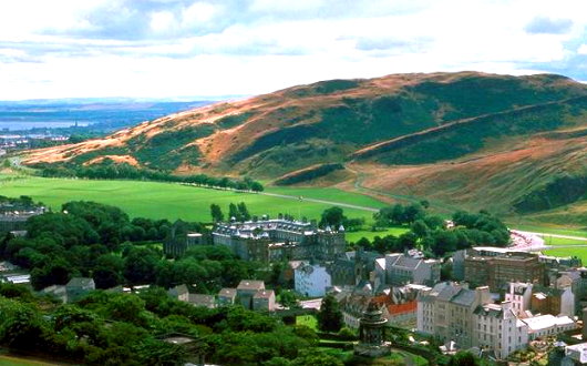
Nestled between Calton Hill and Salisbury Crags, the Palace sits at the end of the Royal Mile that runs between it and Edinburgh Castle. With the Old Town to its west, the expanse of Holyrood Park flows off to the south and east of it. (more…)
The Lady Altar
The Oratory Church of the Immaculate Heart of Mary,
Brompton Road, London
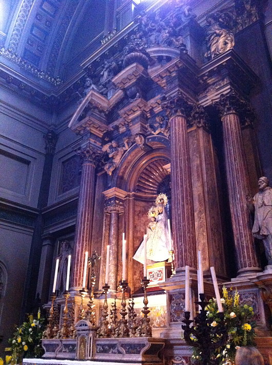
In the south transept of the Brompton Oratory is the altar dedicated to the Blessed Virgin, perhaps the finest altar in the entire church. It is a favourite place for getting in a few prayers and offering a candle or two or three or four. At the end of Solemn Vespers & Benediction on Sunday afternoon (above) it is where the Prayer for England is said and the Marian antiphon sung.
The Lady Altar was designed and built in 1693 by Francesco Corbarelli of Florence and his sons Domenico and Antonio and for nearly two centuries stood in the Chapel of the Rosary in the Church of St Dominic in Brescia. That church was demolished in 1883, and the London Congregation of the Oratory purchased the altar two years beforehand for £1,550.
The statue of Our Lady of Victories holding the Holy Child had previously stood in the old Oratory church in King William Street, and the central space of the reredos was slightly modified to house it. The Old and New Worlds are represented in the flanking statues, which are of St Pius V and St Rose of Lima — both by the Venetian late-baroque sculptor Orazio Marinali. The statues of St Dominic and St Catherine of Siena which now rest in niches facing the altar were previously united to it, and are by the Tyrolean Thomas Ruer.
A Decade of Driehaus
A Carl Laubin capriccio pays tribute to the first decade of Driehaus laureates
THIS YEAR MARKED the tenth anniversary of the Driehaus Prize, the annual award honouring a living architect who has contributed to the field of traditional and classical architecture. To commemorate the first decade of the Prize, the architectural painter Carl Laubin was commissioned to produce a splendid capriccio depicting the works of the first ten Driehaus laureates.
As Witold Rybczynski, a member of the Driehaus panel of jurors, writes:
In the foreground is the Choragic Monument of Lysicrates, a bronze miniature of which is presented to each laureate. It’s fun to try and identify the individual works in this large (5½ by over 8 feet long) painting. But what is more striking is that Laubin has created a convincing urban landscape solely out of landmark buildings.
That, of course, is the advantage of classicism: however it is interpreted, it is a tradition that manages to produce a more or less coherent whole. Even Abdel-Wahed El Wakil’s mosque, standing next to a Seaside beach house by Robert A. M. Stern, doesn’t look too out of place.
The Driehaus Prize was founded in part as a rival to the more publicised Pritzker Prize awarded to modernist architects. But, Mr Rybczynski points out, the fundamental nature of modernist structures is that they thrive only as a visual contrast to buildings constructed in a traditional style.
Can one imagine a similar townscape of Pritzker Prize winners? Well, maybe with the work of some of the early laureates—Pei, Bunshaft, Tange, Siza—but modern buildings need a background of nineteenth and early twentieth century urbanism to shine. A town made up of only signature buildings by our current generation of stars would resemble a carnival or a theme park—Pritzkerland.
I’ve often thought this of the United Nations headquarters in New York, which, when it was first built, must have stood out brilliantly as a bright and fresh harbinger of a better future, but which has been rendered altogether rather boring by the construction of neighbouring buildings of third-rate plate-glass modernist designs.
The UN headquarters on the East River and Lever House on Park Avenue were breakthrough buildings, but the increasing replacement of their traditional stone-clad or brick neighbours by cheap, tawdry modernist structures has exposed how reliant this type of architecture — even when well-conceived and properly executed — is on being surrounded by a contrasting style. (more…)
The Cathedral of the Bronx
The Augustinian Church of St Nicholas of Tolentine
The Church of St Nicholas of Tolentine dominates the busy intersection of University Avenue and West Fordham Road in the Bronx. The parish was erected by the archdiocese in 1906 and has been served by Augustinians ever since then. The present church is a modern gothic creation from 1927, and probably one of the most handsome Catholic churches in the borough — it is often nicknamed “the cathedral of the Bronx”. (Though that style is sometimes also ascribed to St Jerome’s in Mott Haven).
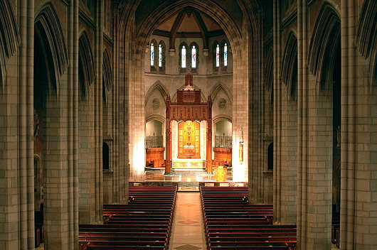
The church is of suitably grand proportions, but the effect is somewhat diminished by the unfortunate use of bulky wooden pews. They are ill-suited to such a large church, and detract from the spaciousness of the interior. This is unfortunately a very frequent problem in the United States, where clumsy pews crowd even great cathedral churches like St Patrick’s in Manhattan or the glorious Cathedral Basilica in St Louis. Regardless, St Nicholas of Tolentine is a splendid ornament in this borough of many churches. (more…)
Scipione Perosini’s Imperial Palace
An ambitious Italian’s mad plan to bulldoze the Roman Forum, destroy Michaelangelo’s Piazza del Campidoglio, and build a Napoleonic palace atop the Capitoline Hill.
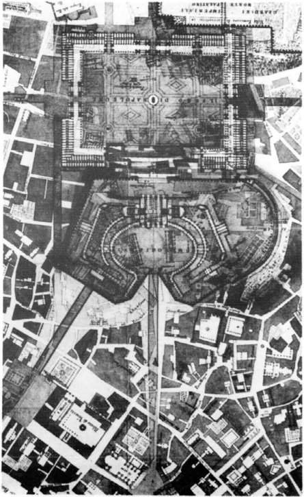 Some architectural projects are just so completely mental and insane that you actually have to doff your cap to the creativity of their inventors. Scipione Perosini’s ‘Projet d’un palais impérial à Rome’ is one such plan.
In the 1800s, with Napoleon the master of Europe, prominent citizens of various Italian cities submitted plans for the architectural aggrandisement of their communities under the beneficent patronage of the revolutionary monarch. In Rome, the architect and hydraulic engineer Scipione Perosini drafted his project for a imperial Napoleonic megapalace.
Atop the Capitoline, Michaelangelo’s Piazza del Campidolgio would be destroyed except for the Palazzo dei Senatori, which would be the central focus of a massive neo-classical palace encompassing the entire Capitoline Hill. From the Hill, a series of terraces would cascade down to the Roman Forum, which would be demolished and paved over to form a new ‘Foro di Napoleone’ celebrating the emperor. Across the Forum, on the Palatine, a new imperial residence circled by gardens would house Napoleon, who proclaimed himself King of Italy, during his prospective stays in the second capital of his empire. (more…)
The Malteserkirche, Vienna
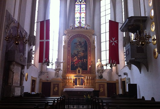
I happened to stumble upon the Order of Malta church in Vienna while meandering down the Kärntner Straße in the middle of a snowy day. It’s a small and relatively simple church consisting of a Gothic nave with an organ gallery. The Order has occupied the site since 1217, though the bulk of the current church dates from the fifteenth century. In 1806, Commander Fra’ Franz von Colloredo had the façade remodelled in the Empire style fashionable at the time. The altarpiece, a painting by Johann Georg Schmidt depicting the Baptism of Jesus by John the Baptist, is from a few decades earlier in 1730, and there is a splendid Neoclassical monument to Jean de la Valette including telamonic Saracens. The church is also decorated with forty coats of arms: five of grand priors, one cardinal, a grand commander, twenty-nine commanders, and one bailiff.
The Kaiserforum
The Unrealised Vision of an Imperial Forum for Vienna
SIDLING UP THE KOHLMARKT and entering the Hofburg through the Michaelerplatz is a glorious architectural experience, but viewing Vienna’s imperial palace from the Ringstraße end, one is left with a certain awkwardness. This is because what is now the Heldenplatz, open to the neighbouring Volksgarten, was conceived as part of a great imperial forum, the Kaiserforum, but the scheme has been left incomplete.
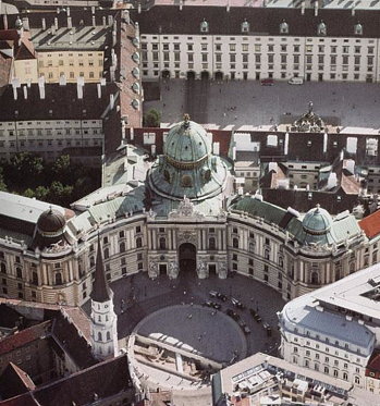
The original impetus for this forum was the plan to build the identical Kunsthistoriches Museum and Natural History Museum across from the Hofburg next to the former imperial stables. Emperor Franz Joseph held a closed competition for four invited architects — Carl Hasenauer, Theophil von Hansen, Heinrich Ferstel, and Moritz Löhr — to conceive of an overall scheme to expand the Hofburg in order to provide an architectural connection to the two new museums. (more…)
The most beautiful city never built
Ernest Gimson’s Canberra
Whenever I’m in in Westminster Cathedral, I feel obliged to nip in to and say a prayer in the chapel dedicated to St Andrew. The apostle is my patron many times over: in addition to being my name-saint, he is the patron of the university, the town, and the country in which I spent four luxurious years. His is one of the most finely decorated chapels in the cathedral, and boasts a beautiful mosaic depiction of the ‘Auld Grey Toun’ above the arms of the donor, the 4th Marquess of Bute. (His father, the eccentric 3rd Marquess, had been Lord Rector of the University of St Andrews.)
Stumbling upon the genial Cathedral Historian, Patrick Rogers, the other day, he shared with me that the stalls and kneelers in St Andrew’s Chapel are widely considered the finest works of arts-and-crafts furniture design in all of Great Britain. They are the creation of a man I had never heard of: the craftsman, designer, and architect Ernest Gimson.
An unfamiliar name is always a potential new avenue of knowledge down which to saunter, and so it proved with Ernest Gimson. His talent at furniture is undoubted but, given my obsession with architecture, it was instead that field of his expertise which particularly drew me in. It was then that I discovered his submission for the 1911-1912 Australian Federal Capital Competition.
The British colonies in Australia federated in 1901, and the dispute between Sydney and Melbourne as to which would be the capital of the youthful nation was settled by agreeing to build a new planned city within New South Wales (the state Sydney is in) but not more than 200 miles from Melbourne.
Ten years later, an international competition was announced to determine the design for this new capital being created ex nihilo on the banks of the Molonglo river, which was given the name of Canberra.
Of the 137 entries received, many of them were very handsome, but some of them were frankly awful. Rather than have a team of architects, artists, or urbanists choose the winning design, the Minister for Home Affairs, Mr King O’Malley, was the sole decision-maker.
He eventually chose the plan submitted by the Chicago architect Walter Burley Griffin, awarding a second prize to Eliel Saarinen of Finland, with third prize going to Alfred Agache of Paris.
The design I would have chosen, however, was Ernest Gimson’s.
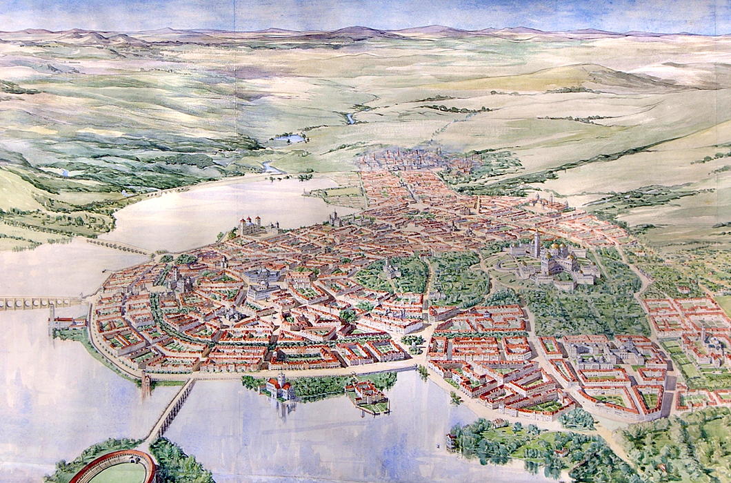
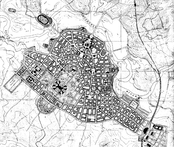
Gimson designed a compact capital city of 25,000 inhabitants that would be able to support itself based on neighbouring farms and small-scale industry.
The city is entirely concentrated along the south bank of an artificial lake and centred on a wooded park containing Kurrajong Hill and Camp Hill, with the streets of the city radiating down from there toward the lakeside.
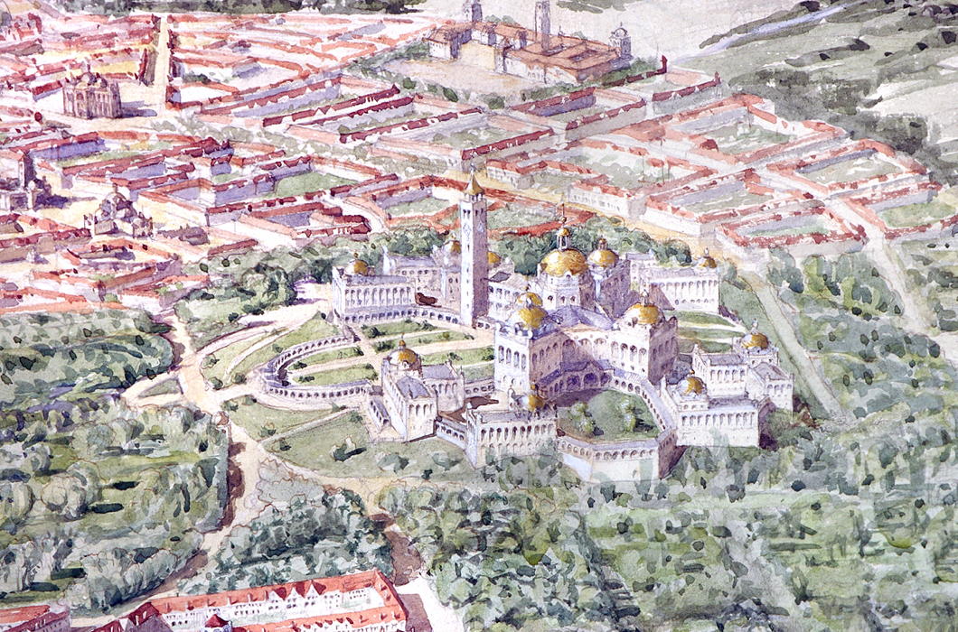
Kurrajong Hill, with its dominating position over the city, was selected for the Houses of Parliament, with eight departmental buildings surrounding it on a lower terrace.
Official residences for the Governor-General and Prime Minister are located nearby, each with six acres of private grounds.
The State Hall is located atop the adjacent, slightly lower, Camp Hill, with the Printing Office and Mint located at either side, where the park ends.
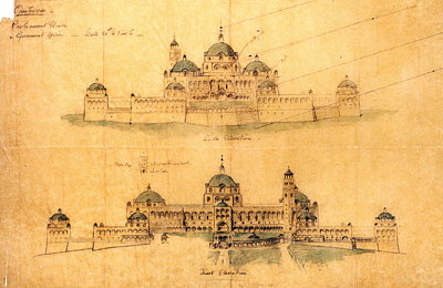
North-west of Kurrajong is the City Hall, flanked by the Courts of Justice, with its main entrance facing towards the central park.
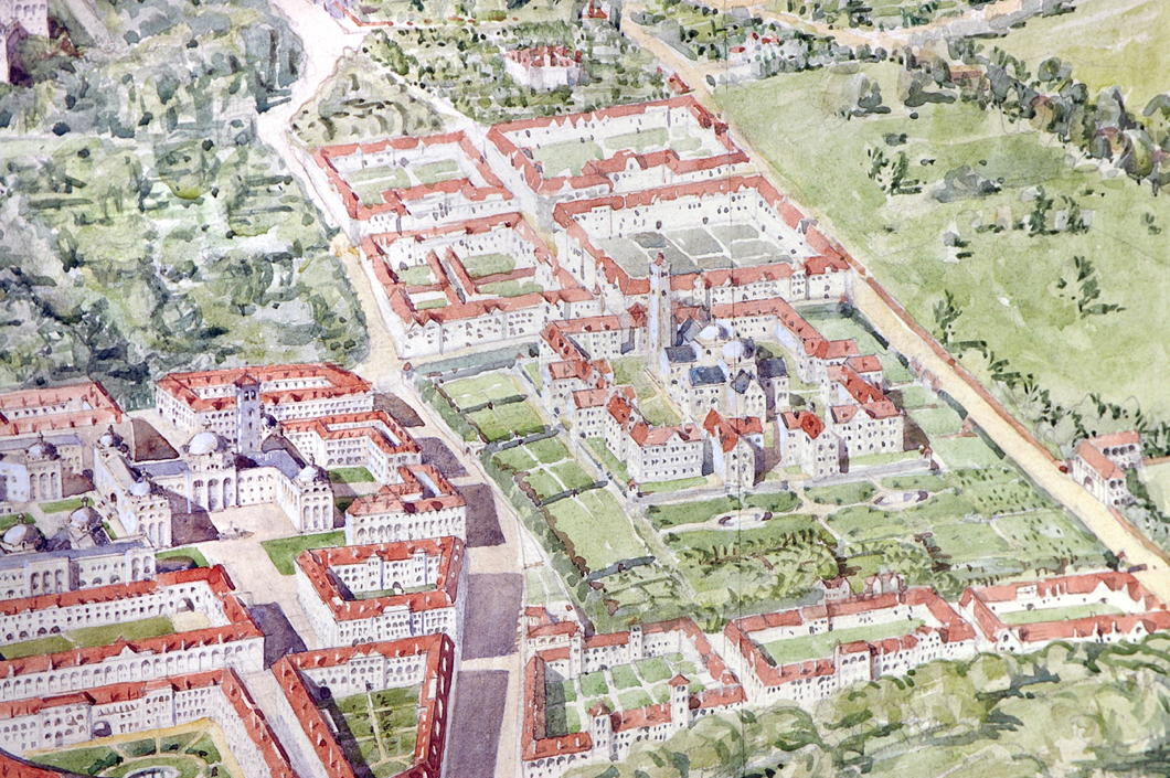
On a small hill nearby is the University, its double-domed central block surrounded again by ancillary buildings on a lower terrace. Playing fields are allotted nearby.
The market is located on the east side “with a covered arcade for the stalls enclosing an open square”, alongside a market house and technical colleges.
The Cathedral rises from the center of the city proper and forms an axis with the State Hall on Camp Hill and the Houses of Parliament atop Kurrajong.
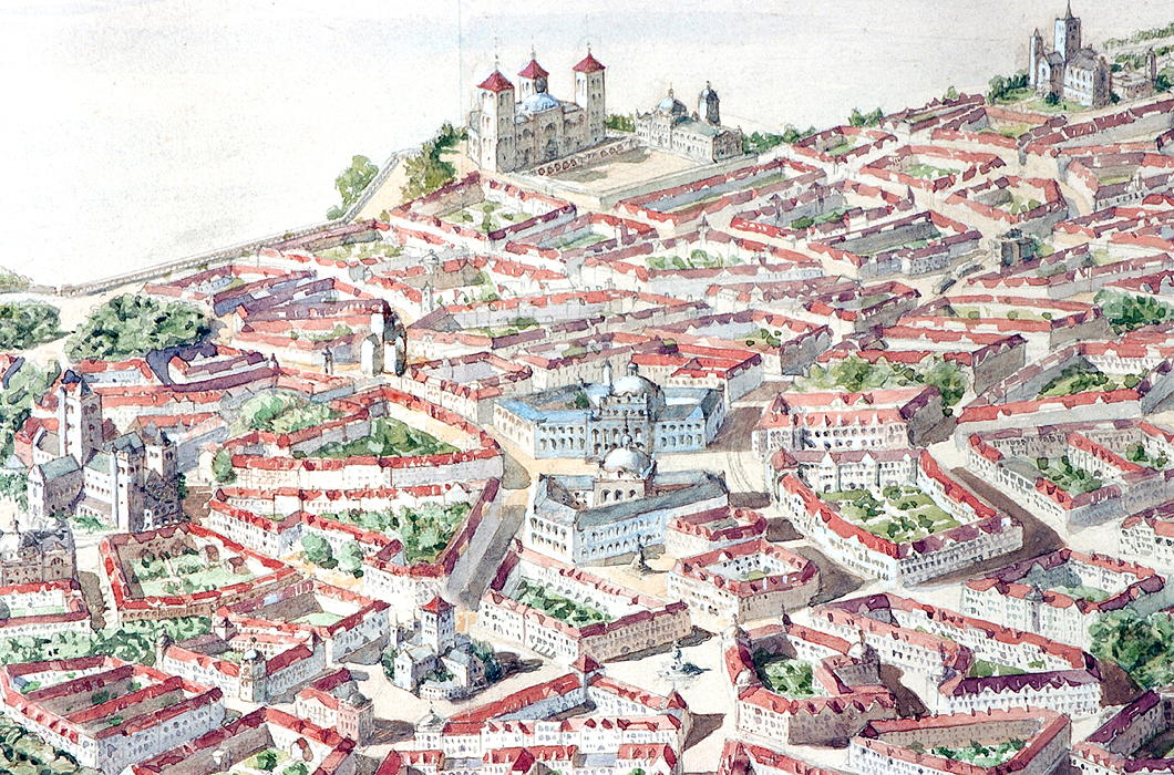
At the near-midpoint of the street connecting the Cathedral to the State Hall, a public square is flanked by a National Art Gallery and Library. Around the Cathedral itself are the National Theatre and the General Post Office.
A stadium is located on the north side of the lake, connected to the city by a bridge, and further provision is made for siting barracks, gas works, a power station, cattle market, and other necessities.
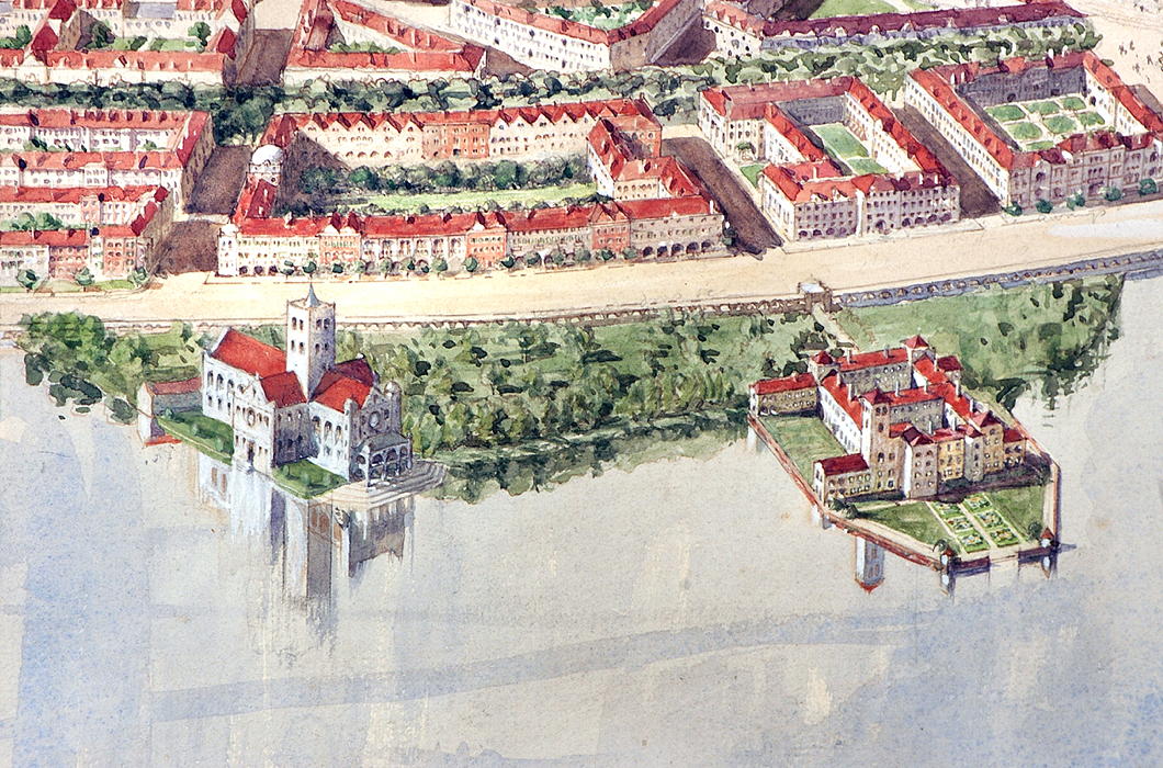
Buildings would chiefly be faced in a light-coloured local stone which gives the plan, deeply influenced by tradition, both a brightness and a more vernacular feel.
To discuss the design of the buildings is tricky: this proposal is an initial plan and, had it been selected, the architect would have had more time to then further refine what he was proposing.
The Houses of Parliament, with their eccentric X-footprint, are a curious conglomeration and not quite right. There seem to be a surfeit of towers that look too similar to one other.
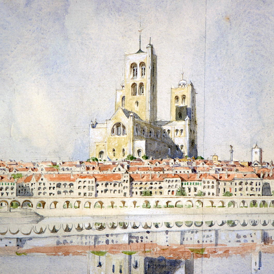
But the Cathedral — my favourite part of Gimson’s plan — is a magnificent creation with an assertive central crossing tower that doubtless would become the visual focus of the city.
The embankment, with its long, generous, 20-foot-deep arcade providing “sheltered walk in hot and wet weather”, is both picturesque and useful.
“While screening in some measure the near part of the lake from the ground floor windows of the houses opposite,” the arcade, Gimson notes, “would enhance rather than diminish, the interest of the wider views.”
Indeed, it provides a useful transition point from lakeside to the rise of the buildings.
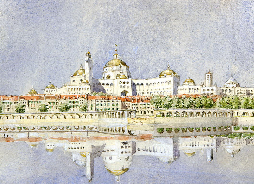
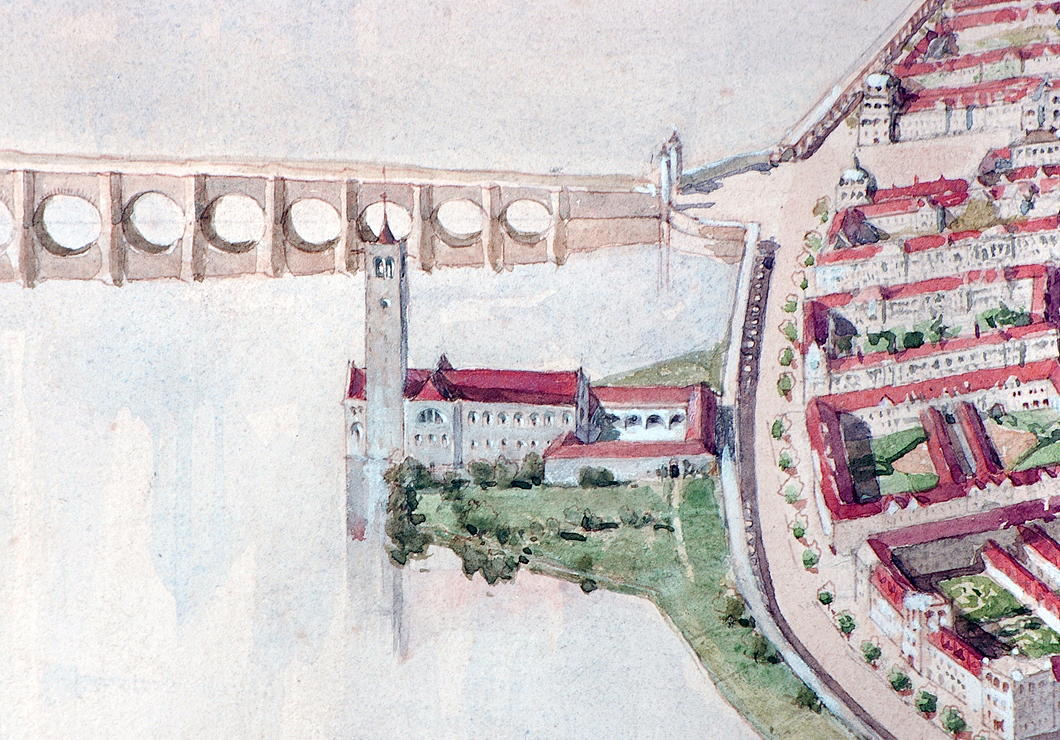
The architect’s layout of streets, public spaces, and important buildings, meanwhile, shows the influence of the aesthetic principles of the Austrian urbanist Camillo Sitte, now unjustly neglected since being contemptuously derided by Le Corbusier and other leading modernists.
Gimson’s Canberra is an unpretentious city: its lack of grandeur is what most likely secured its rejection by the fathers of the young and vigorous nation, who were keen to impress. Burley Griffin provided them with a plan redolent of modernity and progress, but marred by fading modishness.
The Gimson plan would have provided Australia a beautiful modern capital city with a design deeply rooted in tradition, and with appropriate consideration of locality and climate. One can imagine that, as the course of history continued, ‘Old Canberra’ would have formed a handsome and much-loved heart of an ever-growing city.
The humane, natural traditionalism of Gimson’s Canberra would have made it much more popular with ordinary people than the sprawling, overly spacious modern city that Canberra is today. Still, it provides a model that urbanists of the future should be mindful of and take inspiration from.

A Rainy Day in Winchester
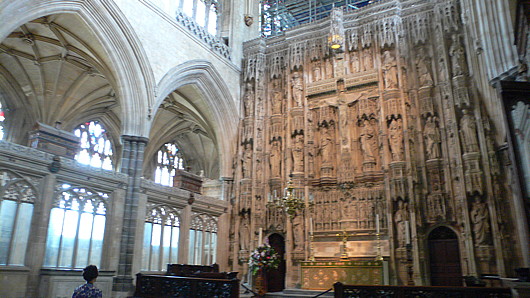
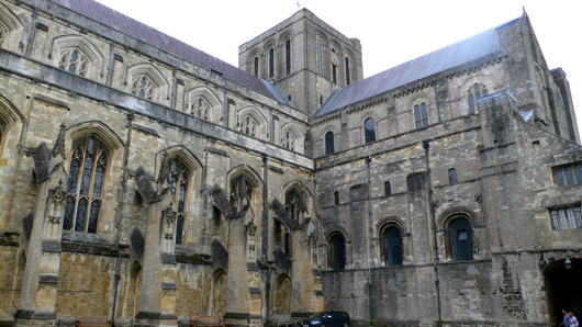
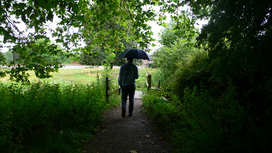
IT WAS LATE summer, neither particularly warm nor cold, and a bit rainy. I hadn’t seen Nicholas in a while but he wasn’t particularly keen on travelling into London. “Why not meet in Winchester?” he suggested, and, never having been to England’s former capital, I thought it was a good idea. I popped on the tube to Waterloo, got on a train, and in no time at all was in the county town of Hampshire. It’s a humanely size town, admirably located, and most famous for its medieval cathedral.
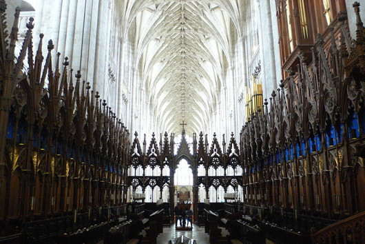
The thieving Protestants, not content with stealing all the cathedrals we built throughout the width and breadth of the land, highten the insult by charging admission to these former shrines and places of worship. I had arranged to meet Nicholas in the Cathedral, though, and the blighters got a good £6.50 out of me. I had a good wander round, though.

These mortuary chests contain the remains of the Saxon royalty of the kingdom of Wessex and later England.
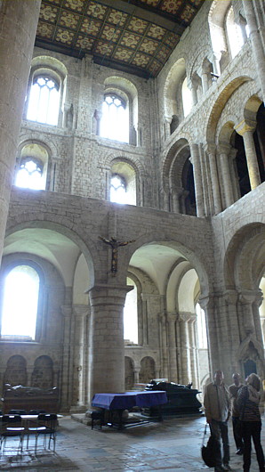
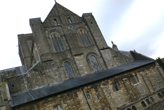
Norman architecture is woefully underappreciated, and might form a useful style to return to today given its relative simplicity. So much Norman architecture was destroyed and replaced by Gothic during later periods of medieval prosperity, but at Winchester the Norman transepts remain.
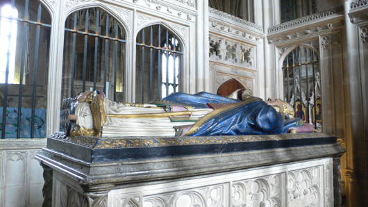
William of Waynflete, buried here, was a high-flyer in his day. He was, varyingly, Bishop of Winchester, Headmaster of Winchester College, Provost of Eton, Lord Chancellor of England, and founded Magdalen College, Oxford. Not a bad innings.
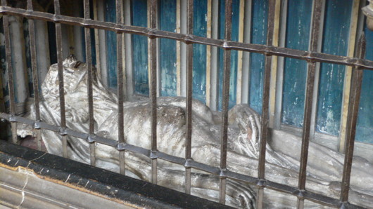
Richard Foxe chose a more macabre memorial, but enjoyed similar success in this world: he was Bishop of Exeter, then of Bath & Wells, then of Durham, and finally of Winchester. He was Lord Privy Seal and founded Corpus Christi College at Oxford. Foxe and Erasmus sometimes wrote to eachother, and his elaborate crozier is on display at the Ashmolean.
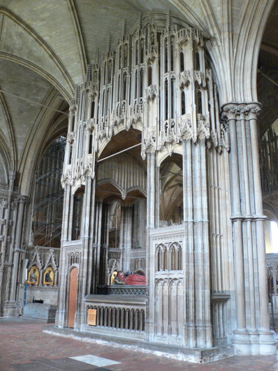
The tomb of Henry Cardinal Beaufort is my favourite memorial in the cathedral. Beaufort — a Plantagenet — was Dean of Wells, Chancellor of the University of Oxford, Bishop of Lincoln, Lord Chancellor of England, and finally Cardinal Bishop of Winchester. He was a sometime papal legate for Germany, Hungary, and Bohemia, and most famously presided over the trial of St Joan of Arc.
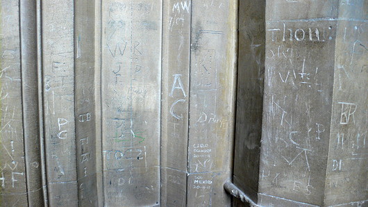
One of the walls was inscribed with graffiti.
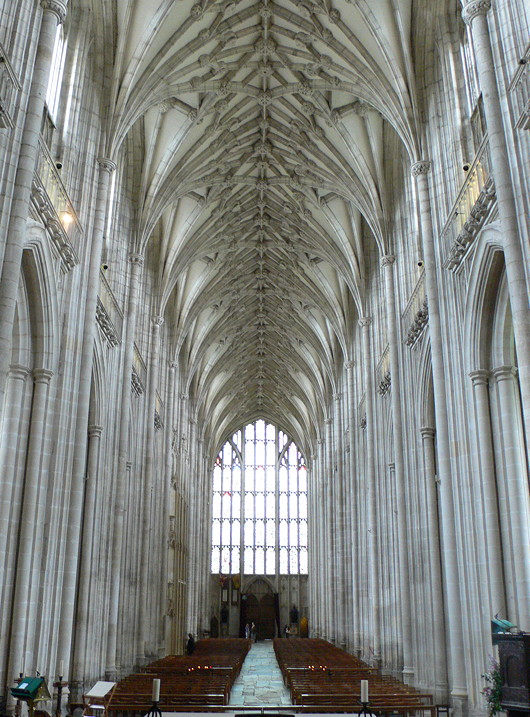
The cathedral is also the final resting place for the earthly remains of Hampshire native Jane Austen, but nevermind that.
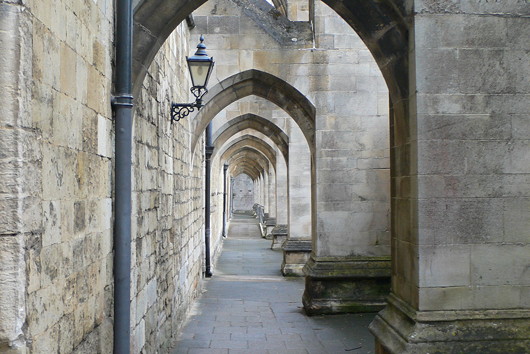
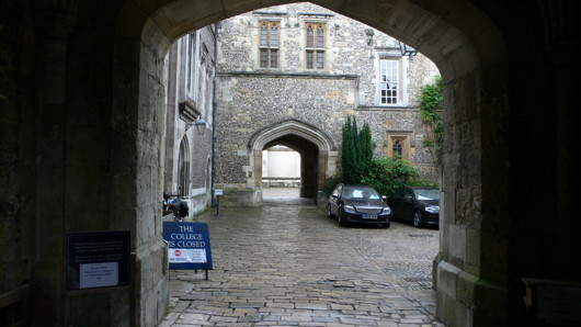
Tours of the College were available, but we decided to leave it for another visit, and went on a wander in the direction of the Hospital of St Cross.
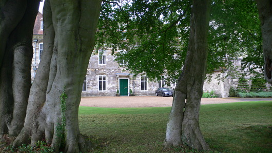
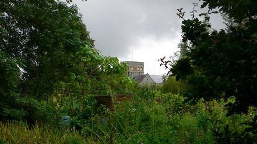
The Hospital of St Cross and Almshouse of Noble Poverty is the oldest charitable institution in England and the largest medieval almshouse. The church could be a small cathedral in and of itself, but as we arrived an interment was taking place, so we thought it best that it, too, was left for another day.
The Other Modern in Madrid
Miguel Fisac’s Church of Espíritu Santo, Madrid
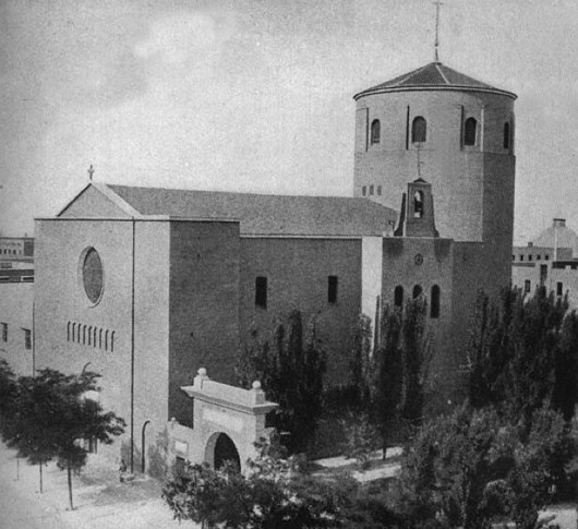
It might be difficult for some to imagine that the architect of the pagoda-like Laboratorios Jorba outside Madrid was an accomplished classicist, but, like many modern architects, Miguel Fisac began his career with more traditional works. His very first commission as an individual was to design a church for Spain’s Consejo Superior de Investigaciones Científicas (Higher Council of Scientific Research). The CISC had only been founded in 1939 and was originally housed in existing structures around Madrid. The Church of the Holy Spirit (constructed 1942–1947) was the first newly built structure for the research council, and the fact that it was an ecclesiastic building “eloquently expresses the spirit of commitment between religion and science that animated the new project” (according to the Fundacion Fisac). Around the corner from the Church of the Holy Spirit, the main headquarters of the CISC was designed by Fisac. (more…)
Yorkville Promenade
One of the thorough-going irritations of New York is that, for all its glories, one can’t help but feel that the individual, the human being, is simply not the priority there. This intriguing and worthwhile proposal from Massengale & Co, Dover Kohl & Partners, and H. Zeke Mermell, if executed, would go a long way to making the Upper East Side of Manhattan a much more people-friendly place.
It takes its inspiration from the Ramblas of Barcelona, one of the greatest streets in the world. While their written proposal (below) is couched in anti-car talk, I frankly don’t care about reducing auto use in New York City. The much more important priority is increasing people places in the city; that is, increasing the amount of public space in which it is clear that people have priority. (This will almost certainly have the same effect as the intention of reducing auto use, I’ll concede.) The city has taken some admirable steps in that direction in recent years (the increasing in pedestrian-oriented spaces, including previously unheard-of outdoors tables and chairs for the use of all and any).
The Yorkville Promenade proposal for Second Avenue is eminently suitable to its particular place and location, especially coupled with making First and Third Avenues bi-directional. It is a worthy attempt to tame and civilise streets that all too often feel quite inhumane, and should be enacted.
Yorkville Promenade on Second Avenue
FOR SO MANY REASONS, we must reduce auto use in New York City. Studies for Mayor Bloomberg showed that living on a high-traffic avenue in Manhattan is un-healthy, particularly for our children. To add insult to injury, 80% of Manhattan residents do not own cars, and only 20% of our out-of-town commuters drive to work. Our ugly, unhealthy avenues are more for the benefit of others than Manhattan’s workers and residents.
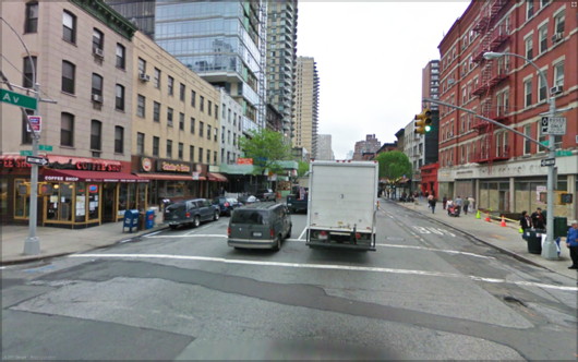
Most Manhattanites live in small apartments and spend a lot of time in public life. When the weather is nice, we spend lots of money to dine next to places designers call “auto sewers”: noisy, smelly streets made to move cars quickly, with wide, one-way lanes and no parking at rush hour so that the speeding cars and trucks are inches from the sidewalk. It doesn’t make much sense.
Then there are the problems of Climate Change and Peak Oil. We have built our way of life on an inexpensive but non-renewable resource that is simultaneously starting to run out, becoming more expensive than we can afford and changing the earth for the worse.
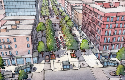
The New Yorkville Ramble
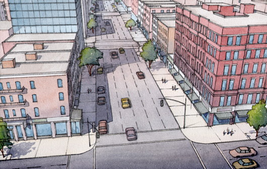
The Yorkville Ramble is an idea for a new way to rebuild Second Avenue, after the completion of the new subway under construction below the avenue. Inspired by the famous Ramblas of Barcelona, the design gives the center of the wide avenue that was once two-way to a new car-free linear park for walking, biking, sitting, dining and people watching. Cafés and restaurants along Second Avenue would be licensed to have tables on the center island. Narrow traffic lanes and short term parking lanes to each side would let cars and deliveries come and go while eliminating speeding traffic from Second Avenue.
Construction would be timed to work with the construction phasing for the subway, which will initially run from Sixty-Third Street to Ninety-Sixth Street. The Ramble would be a special place that enlivens the Manhattan grid, like Broadway on the Upper West Side and Park Avenue on the Upper East Side, with a vibrant street life unlike staid Park Avenue.
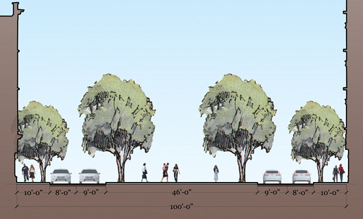
WEST OF THIRD AVENUE ON THE UPPER EAST SIDE, the introduction of Madison and Lexington Avenues into the normal city grid produced shorter blocks that made the grid more interesting for pedestrians and thereby increased the value of the real estate.
Yorkville’s longer blocks are less pedestrian-friendly, and Second and Third Avenues both used to have that New York oxymoron–the elevated subway–depressing real estate values and building quality for decades. In recent decades the area has boomed, and the Yorkville Ramble will give it a linear neighborhood center unique in New York City, drawing from both the neighborhood and the access provided by the new subway line.
Proposed Congestion Zone
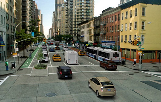
Mayor Bloomberg and the New York City DOT have proposed a congestion zone for the city. London’s congestion zone shows that roads like the Second Avenue design proposed by the DOT will then be oversized and inappropriate for the amount of traffic they will have. First and Third Avenues could go back to being two-way, as they once were, and traffic would move in a more civilized fashion. We don’t need to make express auto routes in and out of the city when we have the best mass transit in the country.
The bicycle lane in the DOT’s new design for Second Avenue is a good idea, but the design for the road shown above is still a traffic engineer’s dream, with wide, one- way lanes and no parking shielding the pedestrian from the speeding cars, buses and trucks. Studies show that walkers don’t like the visual clutter of all the signs and multi-color lanes that the engineers want. Walkers also of course want wider sidewalks.
Conclusion
Second Avenue is currently torn up for the subway con- struction and its rebuilding will start in the next few years. Combined with changing attitudes and perceptions about the car in the city, that makes now the perfect time for a humane and beautiful new type of post- auto road for New York.
Return to Downside
Christmas was marked by a return to the Abbey Basilica of Saint Gregory the Great at Downside for Midnight Mass. The abbey church always has a splendid feeling at night. One of the best points at the wedding of the century was in the evening when, after a fair bit of dining and drinking, a whole slew of guests slipped into the church where the monks who a few hours previous had sung the nuptial mass were singing compline and joined in their prayers.
Doubtless you will recall last year’s Christmas diary documenting my holiday with Garabanda, Ming, und Familie. In the time since then, my own parents have very wisely moved onto the same landmass as I, and — even better — moved to nary a half-hour’s drive from Downside, so this Christmas was spent in blessed Georgian comfort with my own parents and all the delights of that particular patch of the West Country. (more…)
Palacio Legislativo Federal
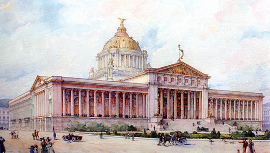
MOST OF THE major American countries have large parliamentary buildings built at the height of their prosperity in the decade before and after 1900, but Mexico is a particular exception. (Brazil, for complicated reasons, is another). In the 1890s, the government of President Porfirio Díaz decided that it needed a grand legislative palace whose magnificence would be worthy of the head of state’s own grand appearance. A competition was held and an entry chosen as the winner, but the victor was disregarded in favour of a new design by a French architect.
Émile Bénard had assisted the great Charles Garnier in draught work for the celebrated Paris Opera House which now bears that architect’s name. In the 1890s, Bénard became famous for winning Phoebe Hearst’s architectural competition for the campus of the University of California at Berkeley with his entry “Roma”. The Spectator wrote from the London of the day, “On the face of it this is a grand scheme, reminding one of those famous competitions in Italy in which Brunelleschi and Michelangelo took part. The conception does honor to the nascent citizenship of the Pacific states.” Unfortunately, very little of Bénard’s scheme for the academic complex was completed.
Fit for a Duke in Covent Garden
Russell House, No. 43, King Street
This apartment occupies the piano nobile of a 1716 house designed by Thomas Archer for the Earl of Orford, then First Lord of the Admiralty. He obtained the lease for the site from his uncle, the Duke of Bedford, on condition he tear down the house located there and build a new one. Batty Langley, the eighteenth-century garden designer and prolific commentator hated it, and devoted over 200 words of his Grub Street Journal (26 September 1734) to slagging it off. The Grade II*-listed building looks onto Covent Garden Piazza and has seen a number of uses over the years. (more…)
An Otto Wagner Embassy
The unbuilt Imperial Russian Embassy in Vienna
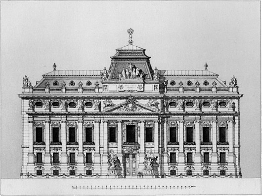
Otto Wagner was an exceptionally talented architect, though not, I think, the genius that many people would credit him with being. In the most emblematic work for which he is known, the Kirche am Steinhof in Vienna, there is too much angularity and not enough flow, curvature. For a free-standing structure it feels a bit stultified and uptight despite the brilliance of the individual elements of the design. I much prefer his Post Office Savings Bank and Stadtbahn stations.
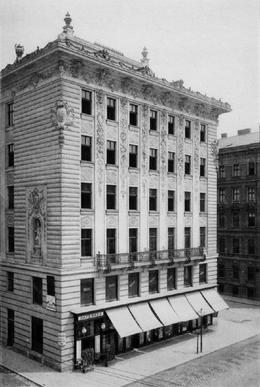
Stumbling through the archives the other day, I came across this unexecuted Otto Wagner design for an Imperial Russian Embassy in Vienna: one now-vanished emperor’s embassy to another. From earlier in his career, it’s not as distinctively Ottowagnerian, but I admire the composition of the façade. The bulbous curved projections into the courtyard, however, are unfortunate, and too large for the space. (more…)
Search
Instagram: @andcusack
Click here for my Instagram photos.Most Recent Posts
- Amsterdam November 26, 2024
- Silver Jubilee November 21, 2024
- Articles of Note: 11 November 2024 November 11, 2024
- Why do you read? November 5, 2024
- India November 4, 2024
Most Recent Comments
- on The Catholic Apostolic Church, Edinburgh
- on Articles of Note: 11 November 2024
- on Articles of Note: 11 November 2024
- on Why do you read?
- on Why do you read?
- on University Nicknames in South Africa
- on The Situation at St Andrews
- on An Aldermanian Skyscraper
- on Equality
- on Rough Notes of Kinderhook
Book Wishlist
Monthly Archives
Categories

