Architecture
About Andrew Cusack
 Writer, web designer, etc.; born in New York; educated in Argentina, Scotland, and South Africa; now based in London.
 read more
News
Blogs
Reviews & Periodicals
Arts & Design
World
France
Mitteleuropa
Knickerbockers
Argentina
The Levant
Africa
Cape of Good Hope
Netherlands
Scandinavia
Québec
India
Muscovy
Germany
Academica
Notre-Dame de Paris
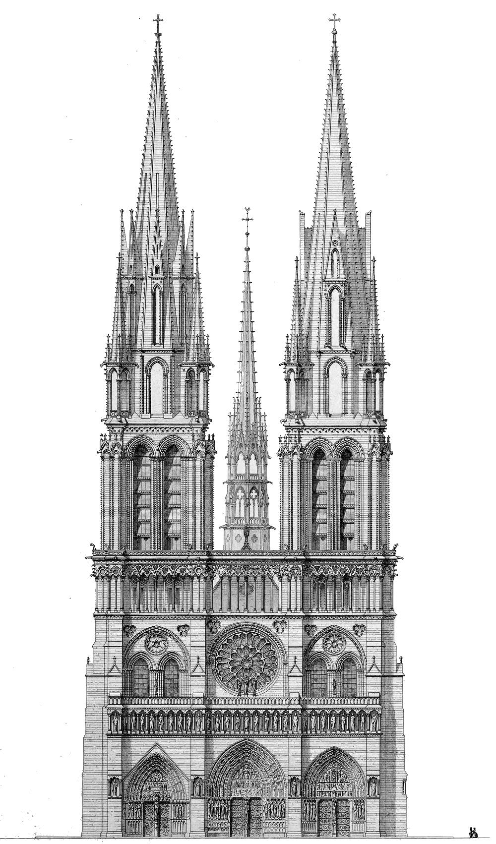
Eugène Viollet-le-Duc
1844
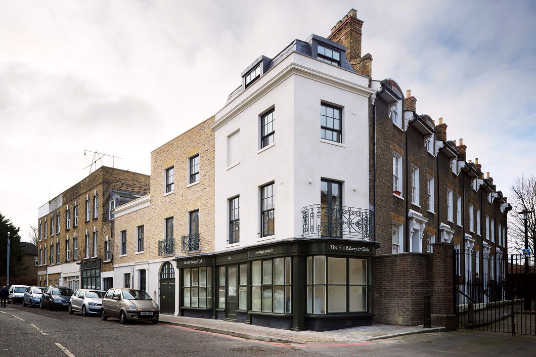
A Corner in Camberwell
4a-6 Grove Lane by MATT Architecture
Alongside some of its neighbouring streets in Camberwell, Grove Lane has some of the best preserved rows of Georgian houses in south London, interspersed with a few buildings of a more recent vintage. The latest addition to this street is no ostentatious interloper but a contextual classic showing admirable humility and good manners.
Designed by Leicester Square-based MATT Architecture, it’s easy to see why the Georgian Group deemed 4a-6 Grove Lane worthy of a Giles Worsley Award for a New Building in a Georgian Context in 2015.
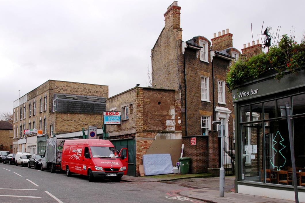
“The long, thin, wedge–shaped site had lain derelict for decades before being purchased by the current owner,” the architects note.
“The elevation is deliberately split into three to echo the plot width of neighbouring terraces and relies heavily on high quality detailing to lift it beyond pastiche.”
The Manor House
 Image: © HughJLF
For devoted fanatics of Netherlandic architecture — I’m sure you’d count yourself as one as much as I do — a curious example of Dutch revival architecture can be found at No. 316 Green Lanes in the Borough of Hackney. Alighting from Manor House tube station the other day I was surprised to find myself confronted by a fine building which, it turns out, used to be the pub that gave its name to the Underground station.
The first ‘public house and tea-gardens’ of that name was built in the 1830s, and in 1843 Queen Victoria and Prince Albert stopped there for a change of horses. This tavern soldiered on until the arrival of the Piccadilly line which necessitated street widening and the demolition of the pub in 1930.
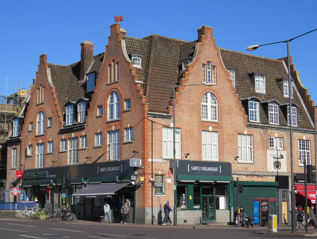 Image: © Stephen Benton
It was rebuilt in a very handsome brick Netherlandic revival in 1931 and continued on as a pub supplied by the London brewers Watneys.
A purist would object that the style of windows on the gables suggests a vulgar pakhuis (warehouse) on the Amstel while the stepped gable itself is more informed by domestic architecture. But is the privilege of architectural revivals to mix and match, so I don’t think we should complain.
Evidence suggests the pub shut in 2004 and the building was converted to its current retail use.
Alas, I can find no record of the architect, and the building remains un-listed, but I’m glad Hackney is home to this happy Hollandic interloper.
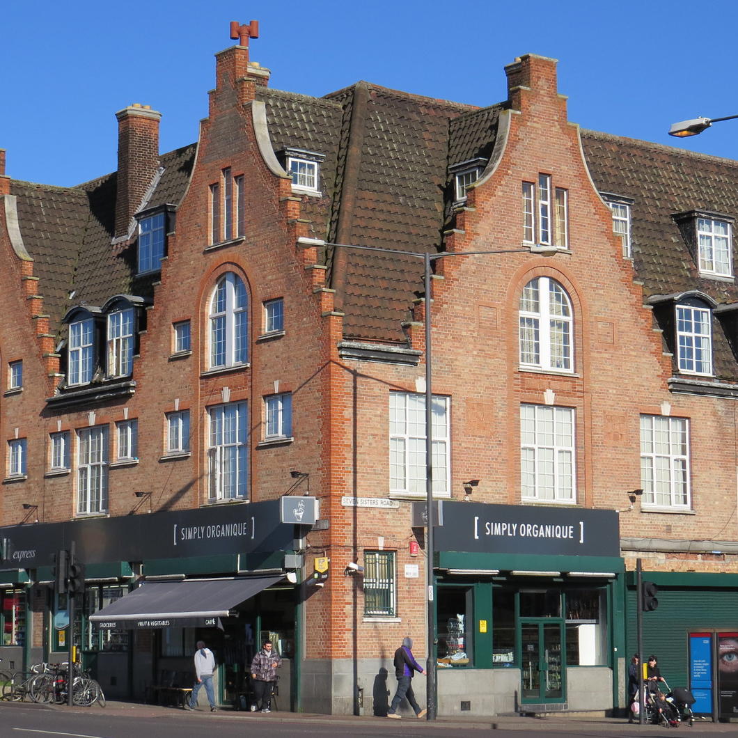 Image: © Stephen Benton
British Columbia in London
Colonial Agents & Provincial Agents-General in the Imperial Capital
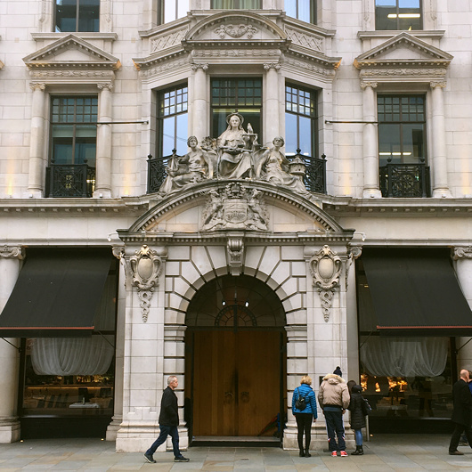
JUST WHERE THE elegant Edwardian urbanity of Waterloo Place turns into Regent Street there is an edifice that announces itself as home to the “Agent General for British Columbia”. Built in 1914-1915, it was designed by a not particularly prominent architect named Alfred Burr who did a lot of work for the Metropolitan Police and is also responsible for designing the charming little curator’s lodgings next to Dr Johnson’s House (which he restored 1911-1912).
The listing that protects British Columbia House, at 1-3 Regent Street, describes its style as “rich Baroque with both Roman and Genoese palazzo features composed on a large scale”.
The main entrance is on Regent Street with the province’s delightfully sunny coat of arms carved above the portal, guarded by allegorical figures of Justice and the like above. On the corner with Charles II Street, the inscription on the foundation stone proclaims its laying at the hands of Prince Arthur, Duke of Connaught on the sixteenth day of July in 1914.
But who or what on earth was the Agent General for British Columbia? (more…)
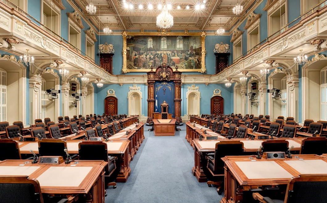
The politics of parliamentary colour
When Quebec’s « Salon bleu » was the « Salon vert »
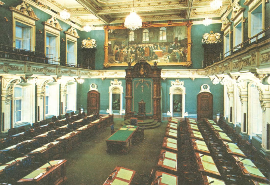
One Westminster tradition replicated in many times and places across the Commonwealth is a convention of colour: the lower house of a parliament is decorated in green, while the upper chamber is decorated in red. This reflects the green benches of the House of Commons and the red ones of the House of Lords.
Officially the plenary chamber of Quebec’s unicameral parliament is boringly the salle de l’Assemblée nationale but because of the colour of its walls it is more often known as the Salon bleu. One’s never surprised when Quebec bucks a trend or (more specifically) rejects an Anglo convention but it turns out the province’s plenary chamber did in fact used to be green until relatively recently.
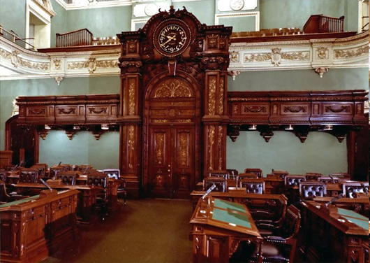
When the members of the Legislative Assembly (as it then was) first convened in the Hôtel du Parlement in 1886 the walls were actually white. By the opening of the 1895 session the desks had been reappointed in green, but Le Soleil still made reference to the room as the “chambre blanche”. It was only in 1901 that the room was painted a “soft green” and the carpets and other furnishings changed accordingly. It even made an appearance in Alfred Hitchcock’s 1953 film “I Confess”.
From then the chamber was a Salon vert until 1978, when the decision was taken to begin broadcasting the proceedings of the Assemblée nationale.
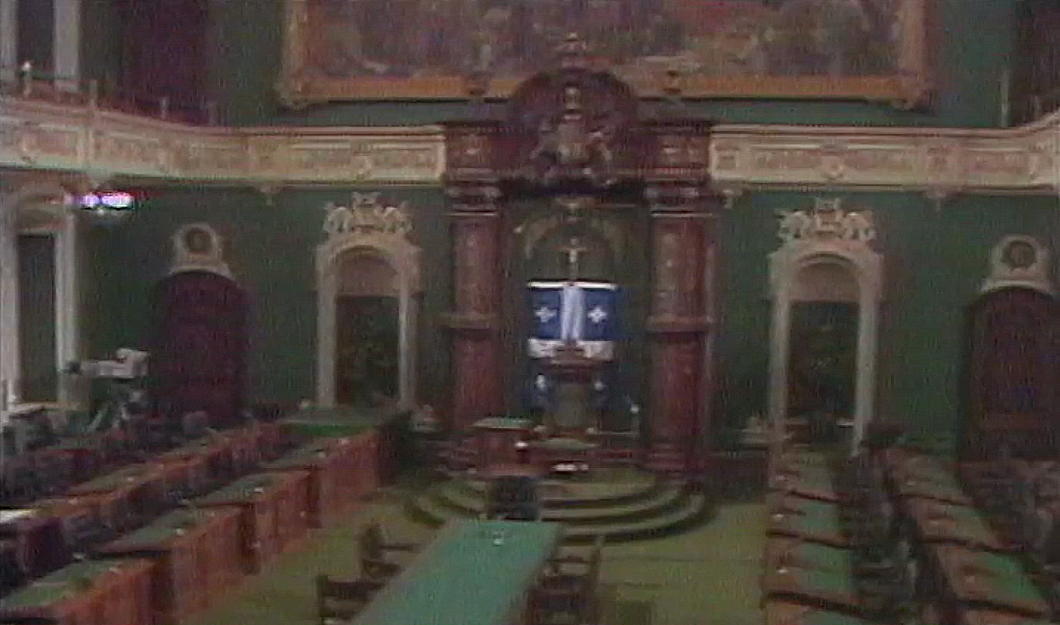
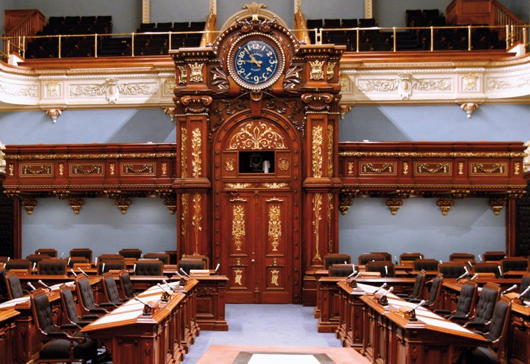
The television specialists complained that the dark green of the chamber was not visually conducive to the TV cameras available at the time and, looking at the evidence from the 1977 test session (above), one can see their point. Walls of either beige or blue were the options recommended in an official report, and unsurprisingly the national colour was chosen.
The historian Gaston Deschênes has mentioned the technical requirements of broadcasting also coincided with a desire to break with a “British” tradition. Certainly the government of the day, René Lévesque’s Parti Québécois, didn’t mind the change, while Maurice Bellemare — “the old lion of Quebec politics” and sometime leader of the old Union nationale — was deeply pleased that the chamber adopted the colour of Quebec’s flag.
So the walls were repainted sky blue and the furnishings changed accordingly, resulting in the Salon bleu we know today (below).
A tweet from the Assemblée’s official account shows two photos looking towards the chamber’s entrance from before (above) and after (below) it was made ready for television.
All the same, green is not universal amongst Commonwealth lower (or only) chambers. It’s not even universal in Canada: Manitoba joins Quebec in its azure tones while British Columbia’s is red-dominated.
Quebec was the last of Canada’s provinces to abolish its upper house, the Legislative Council, in 1968 (at the same time the lower house was renamed the National Assembly). The Legislative Council’s former meeting place is, of course, red, and the Salon rouge is used for important occasions like inductions into the Ordre national du Québec or the lying-in-state of the late Jacques Parizeau.
The Palais de Tokyo
In the early 1930s the City of Paris decided the Musée de Luxembourg had become too small to continue as the city’s gallery of contemporary art. At the same time, the French Republic was beginning to think it needed a proper museum of modern art to display its own collections as well. The City and the Republic joined forces to build a new palace of art in time for the 1937 International Exposition.
While the City and the Republic would house their collections at a single site the museums were to remain separate, so in May 1937 the Palace of the Museums (plural) of Modern Art was inaugurated by President Lebrun.
Because of its riparian location on the Avenue de Tokio (renamed to Avenue de New-York in 1945) the building quickly became known as the Palais de Tokyo. (more…)
Haussmanhattan
Paris and New York are two cities radically different in design and character, but they are smashed together in this little project from architect Luis Fernandes.
‘Haussmanhattan’ is a portmanteau of Baron Haussmann, the Prefect of the Seine whose reconfiguration of the French capital made it the Paris we know today, and Manhattan, the most renowned of New York City’s five boroughs.
Haussmann’s plan of broad boulevards and radial avenues is a far cry from the artless Commissioners’ Plan of 1811 which created the unforgiving city blocks that colonised the entire island of Manhattan ad infinitum.
The contrast only makes the pick-and-mix Fernandes has confected all the more fun/ridiculous/interesting.
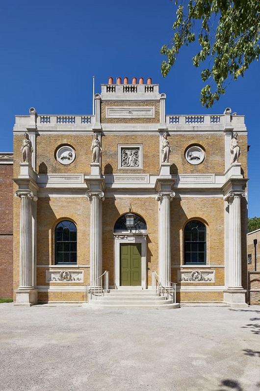
Sir John Soane
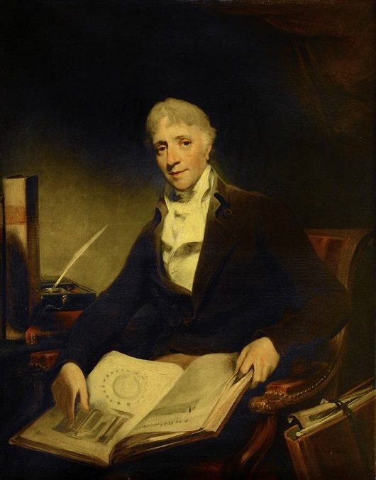
Sir John Soane still looms over the intervening centuries of architecture and design in Great Britain, but I’ve never actually known what he looked like. Apparently this is him, in an 1804 portrait by William Owen.
Everyone’s been to his house in Lincoln’s Inn Fields, but Pitzhanger Manor, his place in the country (though Ealing hardly seems rural today) was recently reopened after serious conservation works ongoing since 2015.
Hope to pay it a visit soon.
Neo-Classical New York
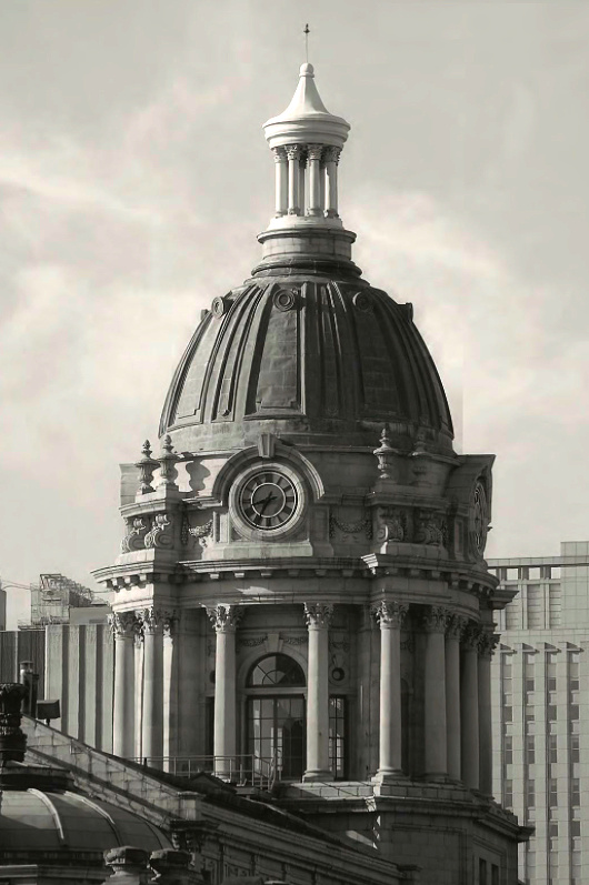
The dome of the old Police Headquarters Centre Street in New York.
Chartres Disfigured
Plans for modern monstrosity in venerable cathedral’s forecourt
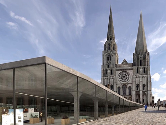
MORE BAD NEWS from Chartres. Fresh from the completion of a controversial and much criticised renovation of the ancient cathedral’s interior, le Salon Beige reports the city has unveiled plans to tear up the parvis in front of the cathedral and replace it with a modernist “interpretation centre”.
The original parvis (or forecourt) was much smaller than the one we know today. Between 1866 and 1905 the majority of the block of buildings in front of the cathedral, including most of the old Hôtel-Dieu, were demolished to give a wider view of the cathedral’s west façade and its “Royal Portals”.
After the war various plans to tart the place up were made and variously foundered — from a modest alignment of trees in the 1970s to Patrick Berger’s plan for an International Medieval Centre. More recently the gravelly space was unsuccessfully “improved” by the addition of boxes of shrubbery placed in a formation that, jarringly, fails to align with the portals of the cathedral.
The proposed “interpretation centre” designed by Michel Cantal-Dupart — at a projected cost of €23.5 million — destroys the gentle ascent to the cathedral and indeed reverses it. At a projected cost of €23.5 million, a giant slab juts apart as if displaced by an earthquake. The paying tourist is invited down into its infernal belly while others prat about on the slab’s upwardly angled roof, ideal for gawking at the newly commodified beauty of this medieval cathedral. It is practically designed for Instagramming, rather than reflection and contemplation.
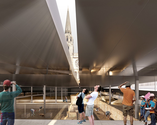
As you would imagine, reaction has been strong. Michel Janva, writing at le Salon Beige, says the project “plans to imprison the cathedral” and “will disappoint not only pilgrims on their arrival, but also inhabitants and tourists”.
In the Tribune de l’Art, Didier Rykner is damning: “All this is purely and simply grotesque.” The sides of the centre, he points out, will be glazed to allow in natural light, but this will both interfere with multimedia displays and be bad for the conservation of fragile works of art. “This architecture, which looks vaguely like that of a parking lot, is frighteningly mediocre, and this in front of one of the most beautiful cathedrals of the world.”
Rykner attributes blame for the “megalomaniac and hollow project, expensive and stupid” at the doors of the mayor of Chartres, Jean-Pierre Gorges, who he argues has allowed much of the rest of the city’s artistic and architectural heritage to go to rot while devoting resources to this pharaonic endeavour.
Having walked from Paris to Chartres myself I can imagine how much this proposal will injure the experience for pilgrims. After three days on the road, to arrive at Chartres, stand in the parvis, and gaze up at this work of beauty, devotion, and love for the Blessed Virgin is a profound experience. If constructed, this plan would deprive at least a generation or two from having this experience. (But only a generation or two, for it is simply unimaginable to think this building will not be demolished in the fullness of time.)
Chartres is part of the patrimony of all Europe and one of the most important sites in the whole world. For it to be reduced to the plaything of some momentary mayor is a crime. With any luck, the good citizens of Chartres, of France, and of the world will put a stop to this monstrosity. (more…)
Happy New Year
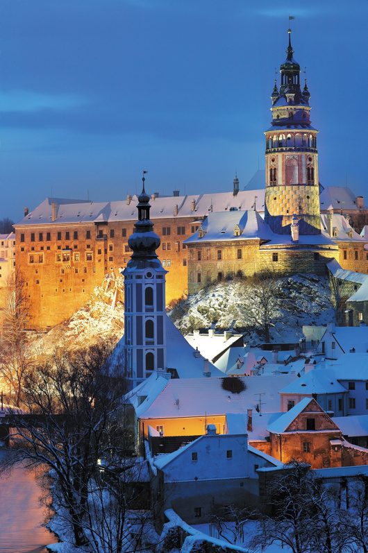
The castle at Český Krumlov (or Krummau) in southern Bohemia, as photographed in winter by Libor Sváček.
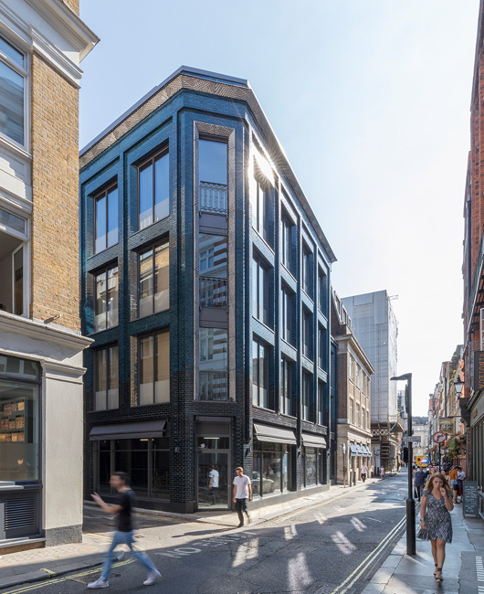
Soho Iridescent
Stiff & Trevillion’s 40 Beak Street in London
Beak Street in London is teeming with turquoise iridescence since the completion of a new office building by the architectural firm of Stiff & Trevillion earlier this year. A joint project between property investment companies Landcap and Enstar, Number 40 Beak Street has been purchased for £40 million by Damien Hirst — the canny businessman who sells dead animals in formaldehyde glass boxes. The over-27,000-square-foot building will serve as the primary London studio for Hirst and headquarters for his company, Science (UK) Ltd, in addition to housing a restaurant at ground level.
Five storeys tall, 40 Beak Street features a number of roof terraces in addition to cornice work designed by Hertfordshire-based artist Lee Simmons. The glazed bricks — “hand dipped” the architects tell us — make for a welcome change from the omnipresence of metal and glass on one end of the spectrum and cheap monotone brick on the other.
The PR hype makes much of bringing a bit of artistic and creative edge back into Soho, a neighbourhood whose final glory days have been depicted in a much-praised book by the Telegraph’s Christopher Howse. We’re not so sure.
Hype aside, 40 Beak Street is an excellent addition to the London landscape and the designers are to be commended for their fine eye for detail. Someone at Stiff & Trevillion knows what they’re doing.
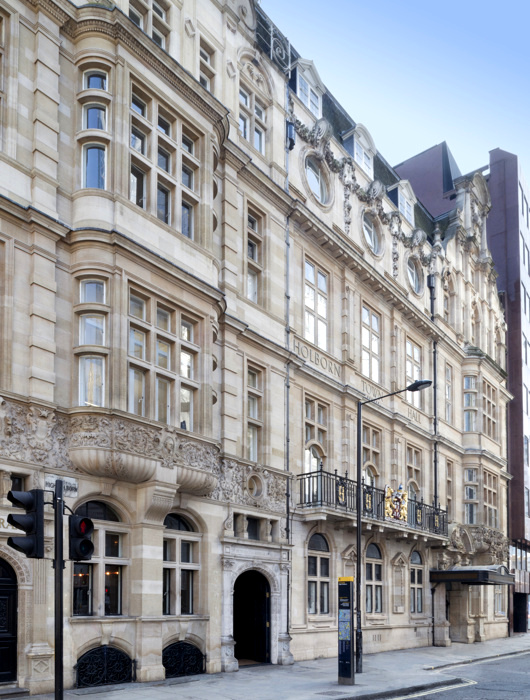
Holborn Town Hall
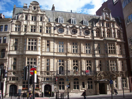
The Metropolitan Borough of Holborn was the smallest borough of London both in geography and population so perhaps it’s not surprising that its town hall was a pretty but rather humble affair. The civic pride and municipal pomposity for which this realm was once renowned are nowhere on show in this handsome building which, but for a few details, could easily be mistaken for a hotel, office building, or private residences.
Holborn Town Hall was built in stages, with the public library on the left-hand side completed in 1894 by the Holborn District Board of Works to a design by Isaacs. With the erection of the borough in 1900, a town hall was needed, and the central and right-hand sections of the building were added between 1906 and 1908 by the architects Hall & Warwick.
In 1965 the borough was merged with St Pancras to form the new London Borough of Camden. It was decided to consolidate the civic government at St Pancras Town Hall, to which the local government union members objected. To placate their ire, a bar for the use of employees was erected atop the annexe being added to the Camden (ex St Pancras) Town Hall — quickly nicknamed ‘the White Elephant bar’.
Though long sold off and converted into office space, the arms of the old borough of Holborn still grace the first floor balcony.
Knickerbocker Spires
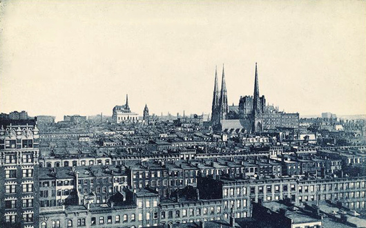
Before the age of the skyscrapers, New York’s church spires dominated the horizon and dwarfed their neighbours just like in the medieval towns and cities of the old world — as this photo from the 1900s shows.
Here St Patrick’s Cathedral holds court, with the St. Nicholas Collegiate Reformed Protestant Dutch Church poking up a few blocks down Fifth Avenue.
Slightly north on that same boulevard sits the grand renaissance palazzo of the University Club, with the spire of the Fifth Avenue Presbyterian Church poking up behind it.
Inside Governors Island
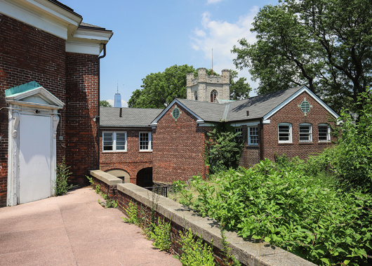
This intriguing little island in New York Harbour has always held something of a fascination for me — viz. articles previous on the subject. Aside from its interesting history there is the matter of the complete lack of foresight in ending its military use as well as the failure to imagine a future use suitable to its history and, if the word is not hyperbole, majesty.
Gothamist recently featured a new peek inside some of the abandoned buildings on Governors Island, a mere selection of which are reproduced here. (more…)
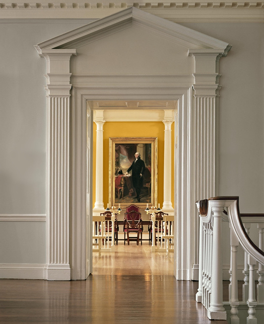
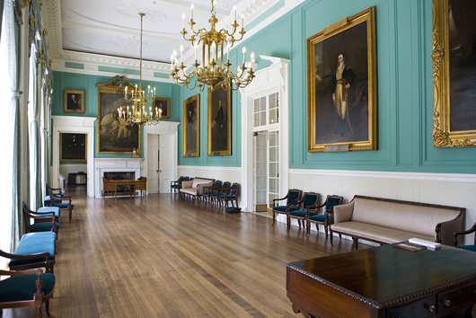
Classical New England
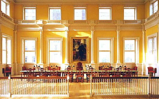
A reminder that Russell Kirk once described the piano nobile of the Old State House in Hartford, Connecticut, as:
“perhaps the most finely proportioned rooms in all America”
Given the elegant restraint and classical detail of the old Senate chamber, it’s hard to disagree.
The Governor’s Room
Pursuant to my post of John Bartlestone’s photographs of City Hall, I came across this photo the other day and it reminded me that this is still one of my favourite rooms in all New York. There’s something about that particular shade of green. I previously wrote about this suite of three rooms in 2006.
The above photo is by Ramin Talaie while below, in 2010, Mayor Bloomberg inspects a city flag being sent to a New Yorker serving in Afghanistan as reported by the Daily News.
The late & much-missed New York Sun also reported on the portraits hanging in City Hall in 2008.

Eton College Chapel
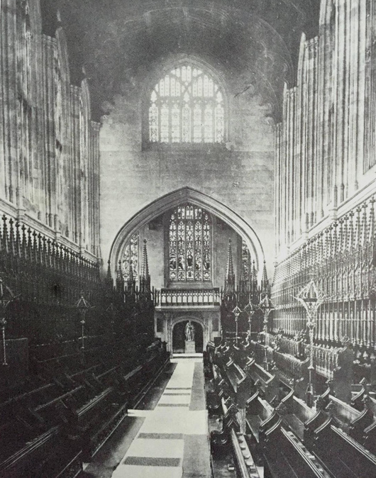
The interior of Eton’s chapel has changed markedly over the past hundred or so years, mostly so thanks to the rediscovery of the priceless medieval wall paintings which had been hidden for centuries by the choir stalls. Painted in the Flemish style in 1479–87, they were whitewashed over by the college barber in 1560 on orders from the wicked new Protestant authorities who had taken over this Catholic school.
The wall paintings were rediscovered in 1847 but it wasn’t until 1923 that the stall canopies in the photograph above were permanently removed, allowing the medieval paintings to be cleaned, restored, and permanently viewed.
In addition to this, in the 1880s (after this photograph was taken) the Great Organ was installed in the broad entrance arch between the narthex and the body of the chapel. The Victorians very handsomely painted it in the medieval fashion and it fits in rather well.
More recently, most of the stained glass was blown out by a German bomb landing in the adjacent Upper School in 1940. A decade later, deathwatch beetles claimed the wooden roof, which was then replaced by fan vaulting (of stone-fronted concrete) in line with the original intentions of Eton’s holy founder, King Henry VI.
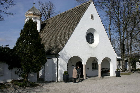
A Chapel in Bavaria
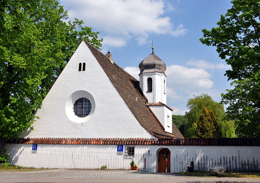
The Friedhofskapelle, or cemetery chapel, in Herrsching on the Ammersee in Upper Bavaria is a wonderful model of a small church or chapel.
It was designed in 1926 by Roderich Fick, who was a disciple of Theodor Fischer. Herr Fick participated in an expedition to traverse Greenland and joined the German colonial service in Cameroon, after the war moving to Herrsching in 1920.
During the Third Reich he was tasked with redesigning the city of Linz where Hitler had spent his childhood, but the dictator found Fick’s plans somewhat restrained, while Martin Bormann was constantly picking fights with the architect. The dominant style of the regime did not align with Fick’s preference for humble, unpretentious tradition in building design.
After the war he was sentenced to aid in the reconstruction of Munich, and also helped restore the magnificent Town Hall of Augsburg.
City Hall
These images of City Hall show the superb skill and eye for detail of the architectural photographer John Bartelstone — a licensed architect in his own right — and date from the completion of the most recent set of renovations in 2015.
Search
Instagram: @andcusack
Click here for my Instagram photos.Most Recent Posts
- Faithful Shepherd of the Falklands April 8, 2025
- Articles of Note: 8 April 2025 April 8, 2025
- Proportionality Destroys Representation April 8, 2025
- Sag Harbor Cinema March 26, 2025
- Teutonic Takeover March 10, 2025
Most Recent Comments
Book Wishlist
Monthly Archives
Categories


