Architecture
About Andrew Cusack
 Writer, web designer, etc.; born in New York; educated in Argentina, Scotland, and South Africa; now based in London.
 read more
News
Blogs
Reviews & Periodicals
Arts & Design
World
France
Mitteleuropa
Knickerbockers
Argentina
The Levant
Africa
Cape of Good Hope
Netherlands
Scandinavia
Québec
India
Muscovy
Germany
Academica
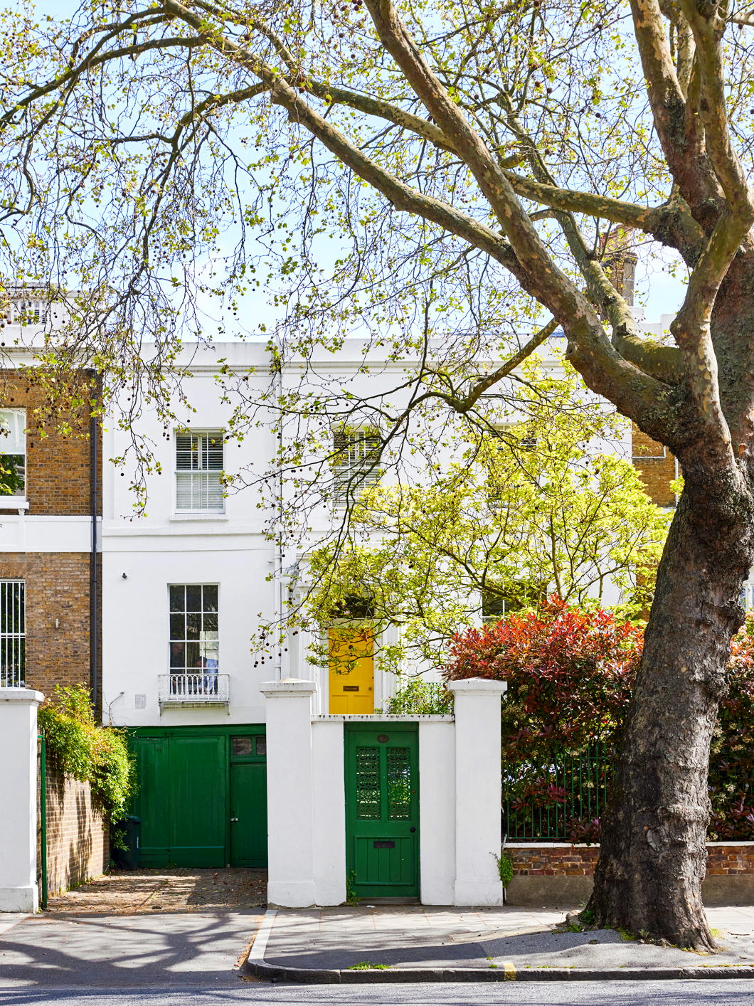
A Happy Home in Maida Vale
Her ‘Nurse Matilda’ series of children’s books was illustrated by her cousin, Edward Ardizzone RA, and was later adapted for the silver screen as the Nanny McPhee films starring Emma Thompson.
Brand and her husband lived in this rather happy looking home in leafy Maida Vale which has now come up for sale.
Built in 1822 (and Grade II-listed), the house was also deployed as a setting by the author — sometime chair of the Crime Writers’ Association — in her book London Particular.
As Brand described the story:
It is set in a London house and everybody is either a member or close friend of the family – it is a doctor’s house, a Regency house in Maida Vale; in fact, it is my own house with all my own family and animals and things in it just for fun.
Maida Vale has also been the setting for mysteries written by PD James and Ruth Rendell — and of course the ‘M’ in Alfred Hitchcock’s ‘Dial M for Murder’ stand for Maida Vale itself.
St Mary Overie in Lent
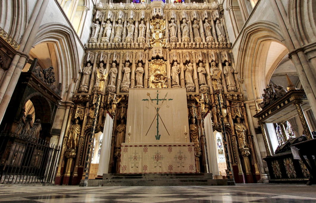
Here in Southwark I nipped in to Evensong in the late twilight of a winter’s day. They do it very beautifully with a full choir at the Protestant cathedral — old Southwark Priory or St Mary Overie to us Catholics, St Saviour’s to our separated brethren.
As it is the penitential season, the Lenten Array is up at Southwark Cathedral, theirs apparently designed by Sir Ninian Comper.
What is a Lenten Array? Sed Angli writes on the Lenten Array in general while Dr Allan Barton has written on Southwark Cathedral’s Lenten Array specifically.
And of course our friend the Rev Fr John Osman has one of the most beautiful Lenten Arrays at his extraordinary Catholic parish of St Birinus — a stunning church previously mentioned.
(The photograph of our local array is from Fr Lawrence Lew O.P.)
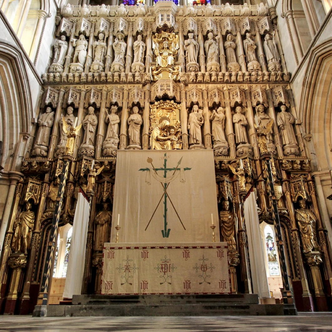
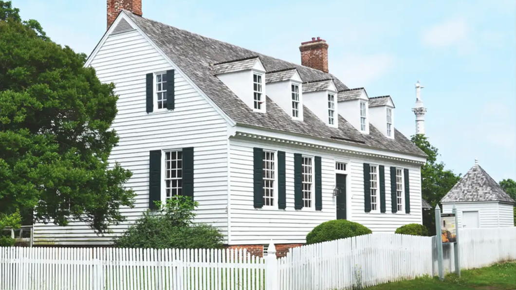
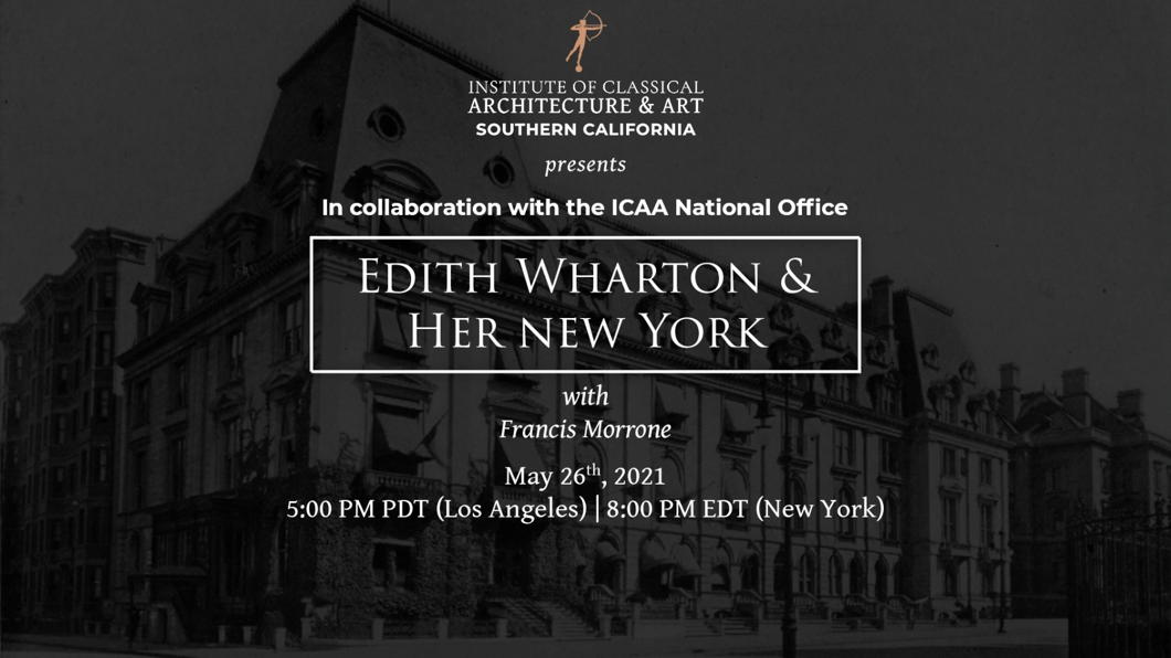
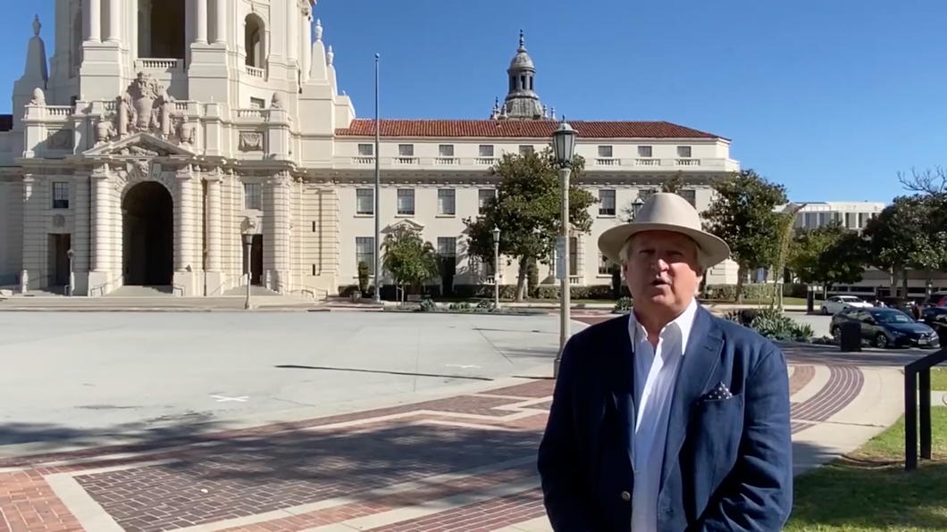
ICAA Videos on Architecture
The Institute of Classical Architecture and Art is one of the absolute gems of American civic society.
As part of their remit of promoting traditional architecture and its many associated arts they have a good many videos on their website covering numerous subjects and in a variety of depths and lengths of time.
Here are just a handful.

Hawksmoor’s Dream
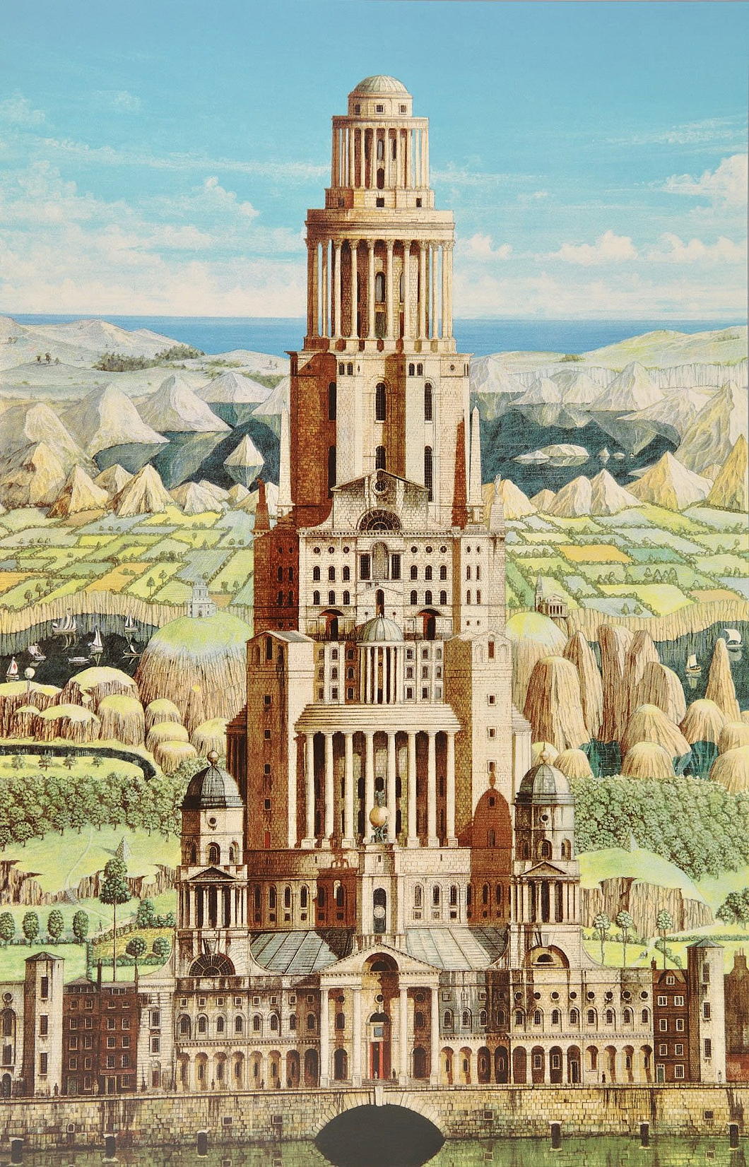
27½ in. x 17¾ in.; 1987-1991
Andrew Ingamells is an excellent draughtsman who is probably the finest architectural artist in Britain today.
His depictions of Westminster Cathedral and the Brompton Oratory (amongst others) are in the Parliamentary Art Collection, and he has done Loggan-style portrayals of the colleges of Oxford and Cambridge as well as three of the four Inns of Court in London.
The above capriccio is a wonderful treat. I think someone should build it.
Canterbury Gate
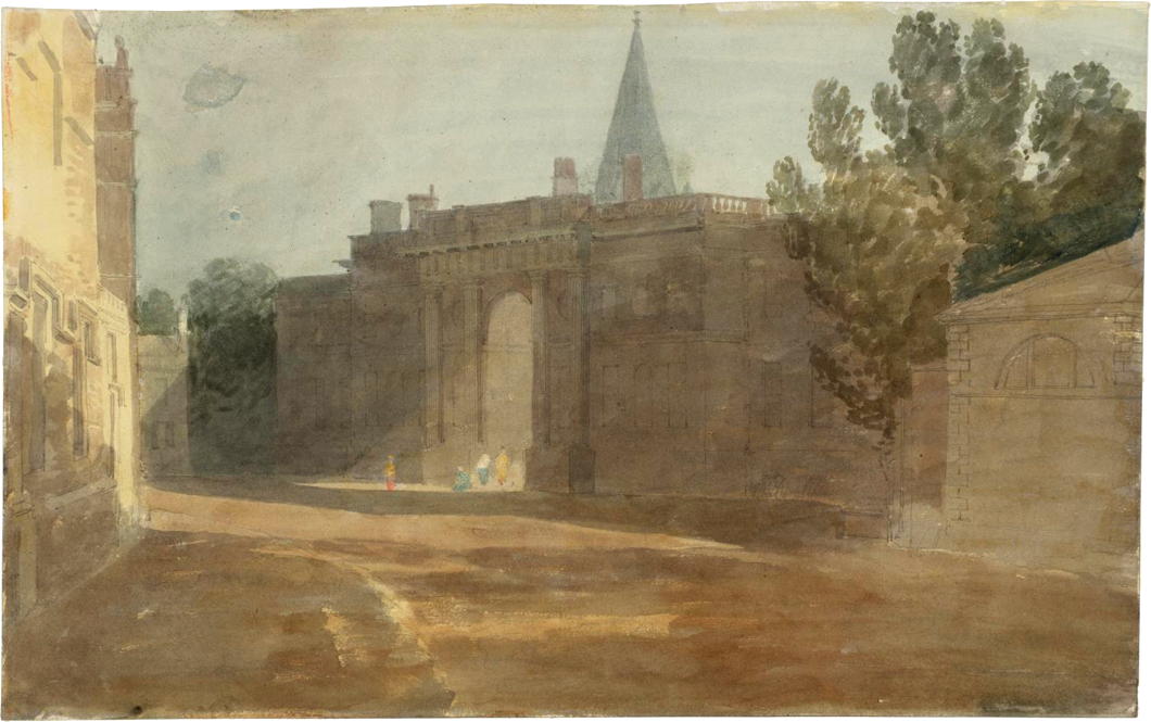
10 in. x 16¼ in., 1799; Tate Collection
Turner’s painting captures Christ Church’s Canterbury Gate from Oriel Square. (As it happens, this is Canterbury Gate at Christ Church in Oxford and, conversely, there is a Christ Church Gate at Canterbury in Kent.)
Given the greenery of the vegetation, this is almost certainly not the work that inspired Betjeman to write his winter poem ‘On an Old-Fashioned Water-Colour of Oxford’:
A winter sunset on wet cobbles, where
By Canterbury Gate the fishtails flare.
Someone in Corpus reading for a first
Pulls down red blinds and flounders on, immers’d
In Hegel, heedless of the yellow glare
On porch and pinnacle and window square,
The brown stone crumbling where the skin has burst.
A late, last luncheon staggers out of Peck
And hires a hansom: from half-flooded grass
Returning athletes bark at what they see.
But we will mount the horse-tram’s upper deck
And wave salute to Buols’, as we pass
Bound for the Banbury Road in time for tea.
Whitechapel Library
There are precious few suitable uses for former church buildings.
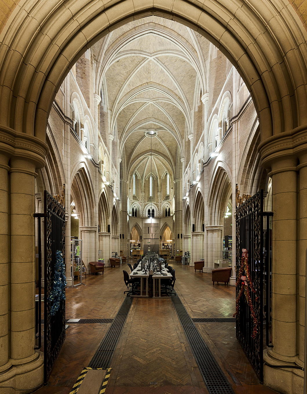
At the worst end of the spectrum is nightclub, though bar or restaurant often doesn’t fall terribly far behind either. To my mind, I can hardly think of a more suitable use for an elegant and beautiful former church than to be turned into a library.
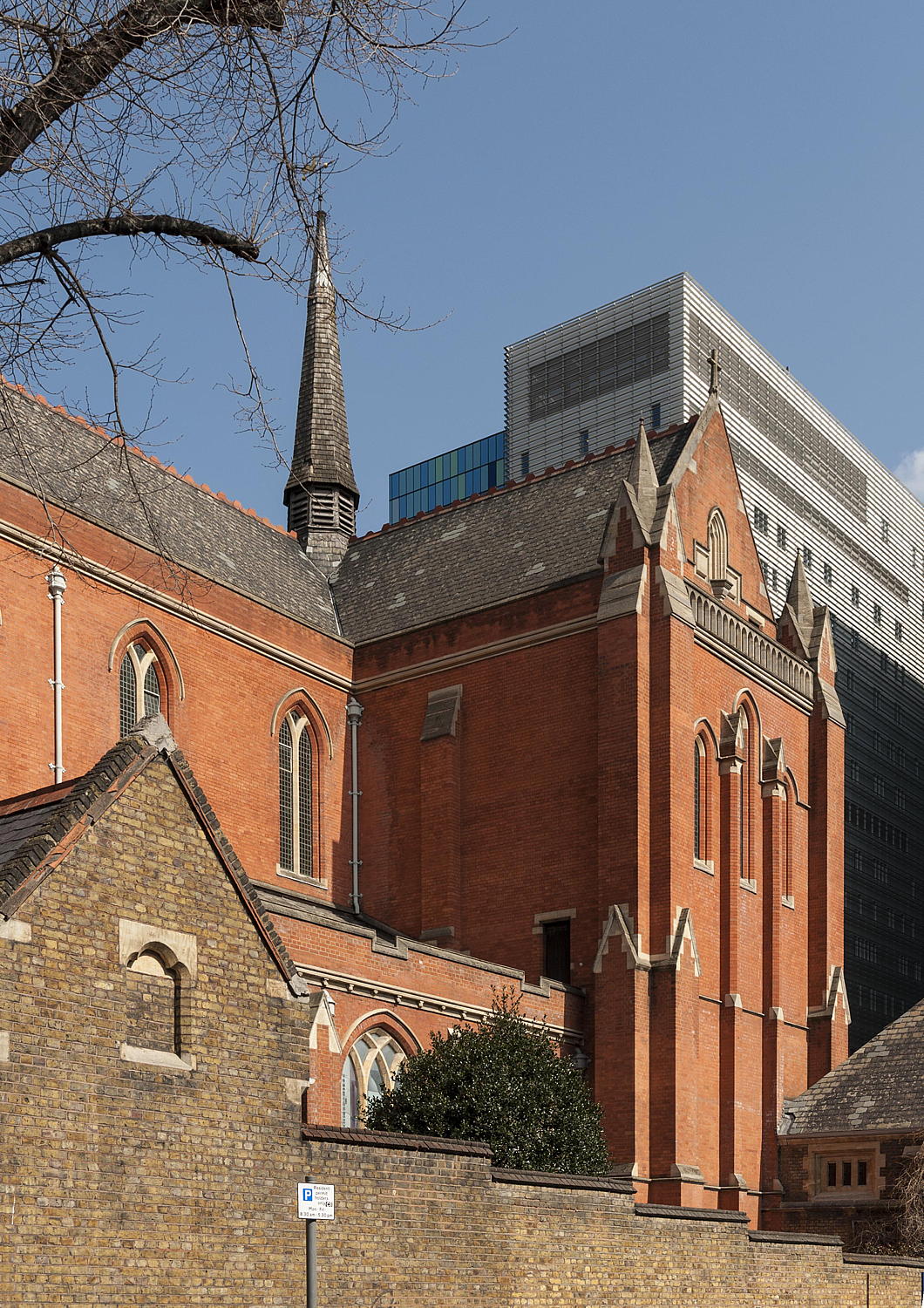
An example: the former Anglican parish church of St Philip, Stepney, in Whitechapel. Designed by Arthur Cawston, of whom I know little, it reminds me of J.L. Pearson’s Little Venice church for the eccentric “Catholic Apostolic Church”.
St Philip’s was declared redundant in 1979, at which time the neighbouring London Hospital still had its own medical school. This has since merged with that of St Bartholomew’s into “Barts and the London” or “Barts” or “BL”, under the auspices of Queen Mary University of London.
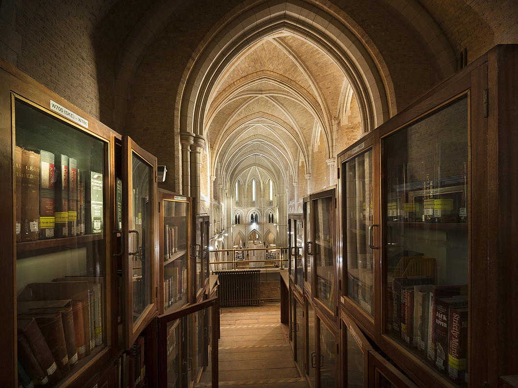
As St Philip’s sat pretty much smack dab in the middle of the campus of the London Hospital (augmented to the Royal London Hospital from 1990) and the college was surviving in cramped accommodation, it was decided to restore the fabric of the church and convert it to a library and study centre. The crypt of the church was adapted to house computer, teaching, and storage rooms as well as the museum of the Royal London Hospital.
Rather than preserve it in aspic, the medical school decided to keep this as a living building by commissioning eight new stained-glass windows to replace plain glass. They are completed along rather forthright German modernist designs and are dedicated to such themes as Gastroenterology and Molecular Biology. They will not be to everyone’s taste, but it is admirable for a medical school to commission stained glass windows at the turn of the millennium.
The Survey of London’s Whitechapel Project has a typically thorough entry on QMUL’s Whitechapel Library / the former church, including these applaudable photographs the Survey commissioned from Derek Kendall.
Architectural Exhibitions
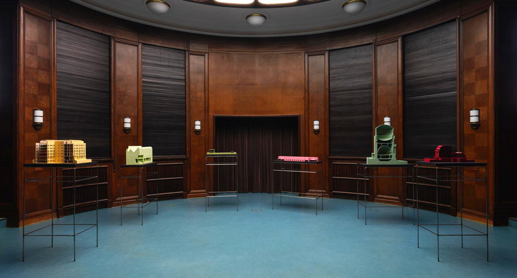
The Architecture Association is renowned as the most pedantic of training schools for the profession. Housed as it is in an immaculate set of Georgian townhouses in Bedford Square, its students are rigorously trained to avoid anything that might be beautiful, expressive of the inherited tradition of millennia, or pleasing to the human condition.
Nonetheless, I love architectural models, and the AA is having an exhibition of a handful of models of the various places in which the Warburg Institute has been housed across its peripatetic and tumultuous history until it found its thus-far permanent home in Woburn Square in Bloomsbury.
“Architecture and interiors were crucial for Aby Warburg’s interrogation of culture,” the AA opaquely tells us.
“Between 1923 and 1958, designs were commissioned for buildings, interiors, and exhibitions, as the Warburg Library and Institute moved through a series of homes, first in Hamburg and then in London,” they more helpfully inform.
“This exhibition, an itinerant archive of models and drawings that portray the seven different spaces the Warburg Institute has occupied, sheds new light on Warburg’s involvement with architecture.”
19 January 2024 to 7 March 2024
Mon-Sat, 11h00-19h00
Gallery, Architectural Association (free)
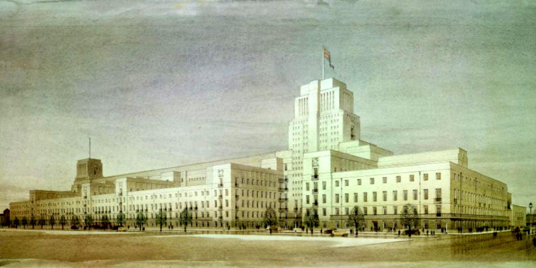
Connectedly, the University of London is hosting an exhibition looking at Charles Holden’s masterplan for that institution’s Bloomsbury campus.
This show “celebrates the architect’s vision of what a modern university could be through displays of detailed architectural models, archival documents, photo albums, and other mixed media”.
Senate House is an amazing building but I think we can be glad the full scale of its original plan — stretching all the way up towards Gordon Square — was never completed.
17 Jan 2024 to 17 March 2024
Mon-Fri, 09h00-17h00
Senate House, University of London (free)
City Hall Post Office
New York’s Lost Second Empire Gem
The Second Empire as an architectural style in America has always bad rap. The most prominent example in the New World is the Old Executive Office Building next to the White House in Washington, D.C. — formerly known as the State, War, and Navy Building after the three government departments it housed in the days of a slimmer federal state.
The OEOB was designed by Alfred B. Mullett, a Somerset-born architect who had immigrated to the United States when he was eight years old. Mullett trained as an apprentice under Isaiah Rogers who was Supervising Architect of the U.S. Treasury Department. In practice, the Treasury’s architect designed all the American federal government’s office buildings across the Union, and Mullett inherited the job in 1866.
At that time, the ever-expanding city of New York was desperately in need of a new post office, having occupied the former Middle Dutch Church since 1844. Congress approved funds for a new building, and an architectural competition attracted fifty-two entries. Instead of choosing one of the entries, five leading contenders were selected to collaborate on producing a single design.
Mullett criticised the joint design as too expensive and called in the job to his own office so that he could design the building himself.
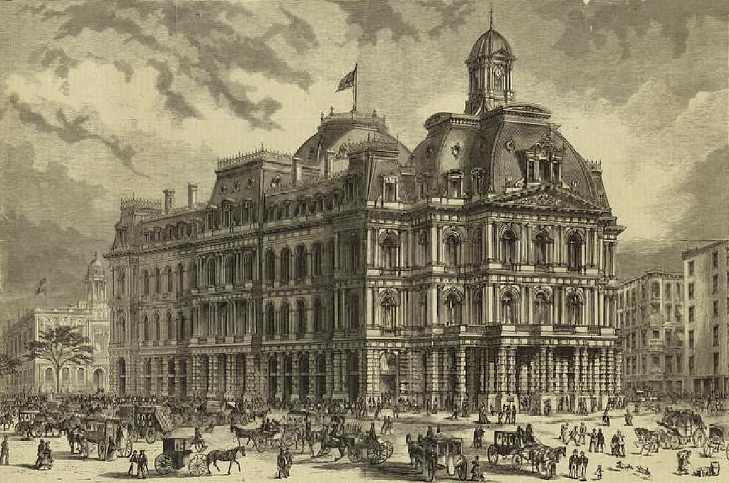
Mullett’s Second-Empire design provided for a post office open to the public on the ground floor, mail sorting rooms below it, and space for federal courtrooms as well as offices for federal agencies in the floors above the postal facilities.
The original design (above) called for only four storeys but during the design process the need for more space to serve the growing city moved Mullett to slip another floor in beneath the mansard roof. (more…)
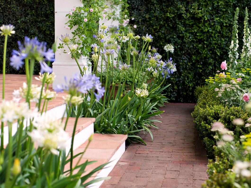
A Cape Dutch Garden at Chelsea
Jonathan Snow at the 2018 Flower Show
I’m ashamed to say I’ve never been to the Chelsea Flower Show, the most florid event on London’s social calendar. It is a delight flâneur-ing around the neighbourhood the week of the Show as many of the pubs, restaurants, and businesses in the vicinity pull out the stops in terms of their own floral displays.
I used to live in Chelsea but escaped to Southwark and there are some delightful gardens in our vicinity. But I’ve never regretted avoiding the Chelsea Flower Show more than when I discovered Jonathan Snow’s delightful entry of a Cape Dutch garden in the 2018 exhibition.
Snow and his wife had been on holiday in the Cape a few years before and the beautiful fynbos captured the designer’s imagination. The architecture must have too, for Snow topped his garden off with a pocket Cape Dutch house that ties it all together.
I can well imagine taking a morning koppie koffie on that stoep — and perhaps either a stiff gin-and-tonic or some ice-cold vin de constance as the sun goes down.
An excellent effort that makes me pine for the Cape.
Articles of Note: 6 January 2024
■ I had the great privilege of studying French Algeria under the knowledgeable and congenial Dr Stephen Tyre of St Andrews University and the country continues to exude an interest. The Algerian detective novelist Yasmina Khadra — nom de plume of the army officer Mohammed Moulessehoul — has attracted notice in Angledom since being translated from the Gallic into our vulgar tongue.
Recently the columnist Matthew Parris visited Algeria for leisurely purposes and reports on the experience.
■ While you’re at the Spectator, of course by now you should have already studied my lament for the excessive strength of widely available beers — provoked by the news that Sam Smith’s Brewery have increased the alcohol level of their trusty and reliable Alpine Lager.

■ This week Elijah Granet of the Legal Style Blog shared this numismatic gem. It makes one realise quite how dull our coin designs are these days. I don’t see why we shouldn’t have an updated version of this for our currently reigning Charles.
■ Meanwhile Chris Akers of Investors Chronicle and the Financial Times has gone on retreat to Scotland’s ancient abbey of Pluscarden and written up the experience for the FT. As he settled into the monastic rhythm, Chris found he was unwinding more than he ever has on any tropical beach.
Pluscarden is Britain’s only monastic community now in its original abbey, the building having been preserved — albeit greatly damaged until it was restarted in 1948. The older Buckfast is also on its original site but was entirely razed by 1800 or so and rebuilt from the 1900s onwards. (Pluscarden also has an excellent monastic shop.)
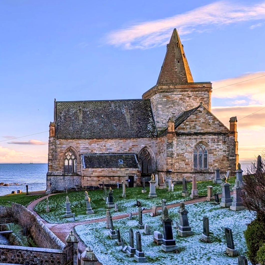
■ An entirely different and more disappointing form of retreat in Scottish religion is the (Presbyterian) state kirk’s decision to withdraw from tons of their smaller churches. St Monans is one of the mediæval gems of Fife, overlooking the harbour of the eponymous saint’s village since the fourteenth century, and built on the site of an earlier place of worship.
Cllr Sean Dillon pointed out the East Neuk is to lose six churches — some of which have been in the Kirk’s hands since they were confiscated at the Reformation, including St Monans.
John Lloyd, also of the FT, reported on this last summer and spoke to my old church history tutor, the Rev Dr Ian C. Bradley. More on the closures in the Courier and Fife Today.
What a dream it would be for a charitable trust to buy St Monans and to restore it to its appearance circa 1500 or so, available as a place of worship and as a living demonstration of Scotland’s rich and polychromatic culture that was so tragically destroyed in the sixteenth century. You could open with a Carver Mass conducted by Sir James MacMillan.
■ And finally, on the last day of MMXXIII, the architect Conor Lynch reports in from Connemara with this scene of idyllic bliss:

Unfinished Business at Audubon Terrace
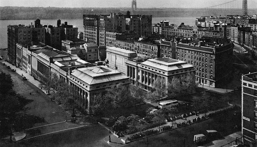
One of the little tragedies of New York urbanism is that when Archer Milton Huntington was transforming a block of upper Manhattan into an acropolis of culture he failed to buy the entire block.
Huntington named his complex Audubon Terrace in honour of the artist and ornithologist John James Audubon whose home, Minniesland, overlooked the Hudson at the western end of the block. His failure to obtain Minniesland meant that the remainder of the block was snapped up by developers instead of incorporated into his campus.
In the 1910s, the speculators built apartment buildings that turned their rather rude and unadorned backs to Audubon Terrace, terminating the vista from Broadway. When you imagine the potential prospect all the way to the river, it is all the more tragic.
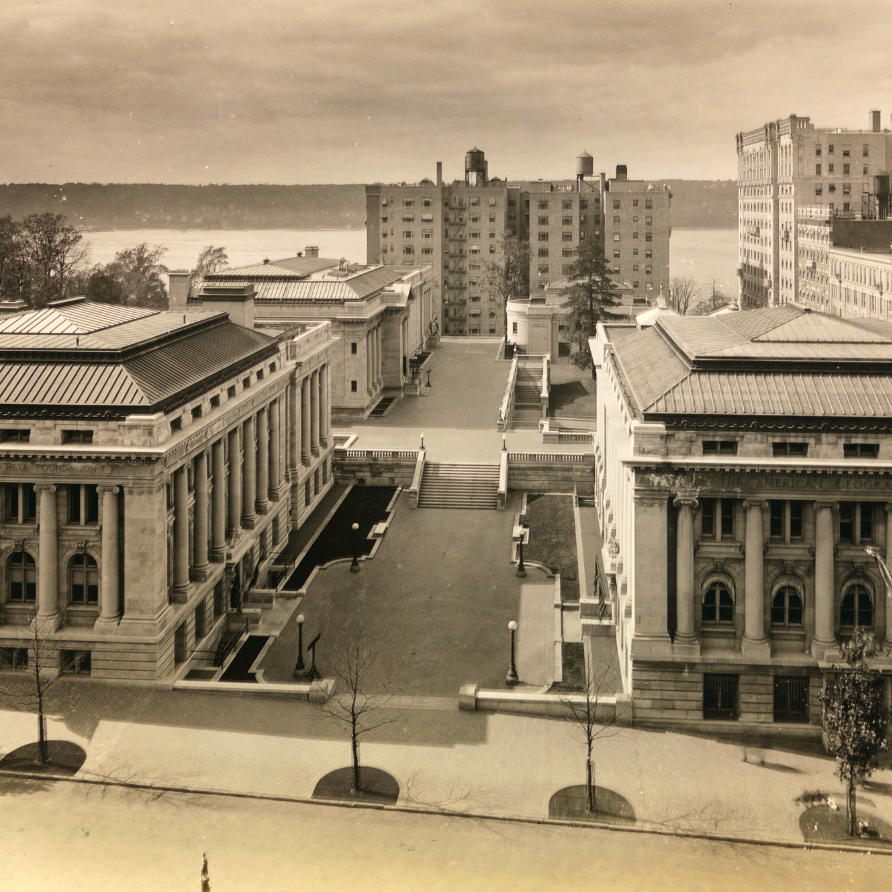
The crass posterior of these apartment blocks naturally dissatisfied the members of the American Academy of Arts & Letters, whose building sits on either side — and indeed beneath — the part of the terrace immediately adjacent to them.
McKim Mead & White had designed the first phase of the Academy’s handsome building facing on to West 155th Street, which opened in 1923, and Cass Gilbert was chosen to design the auditorium and pavilion which would complete the body’s portion of the site.
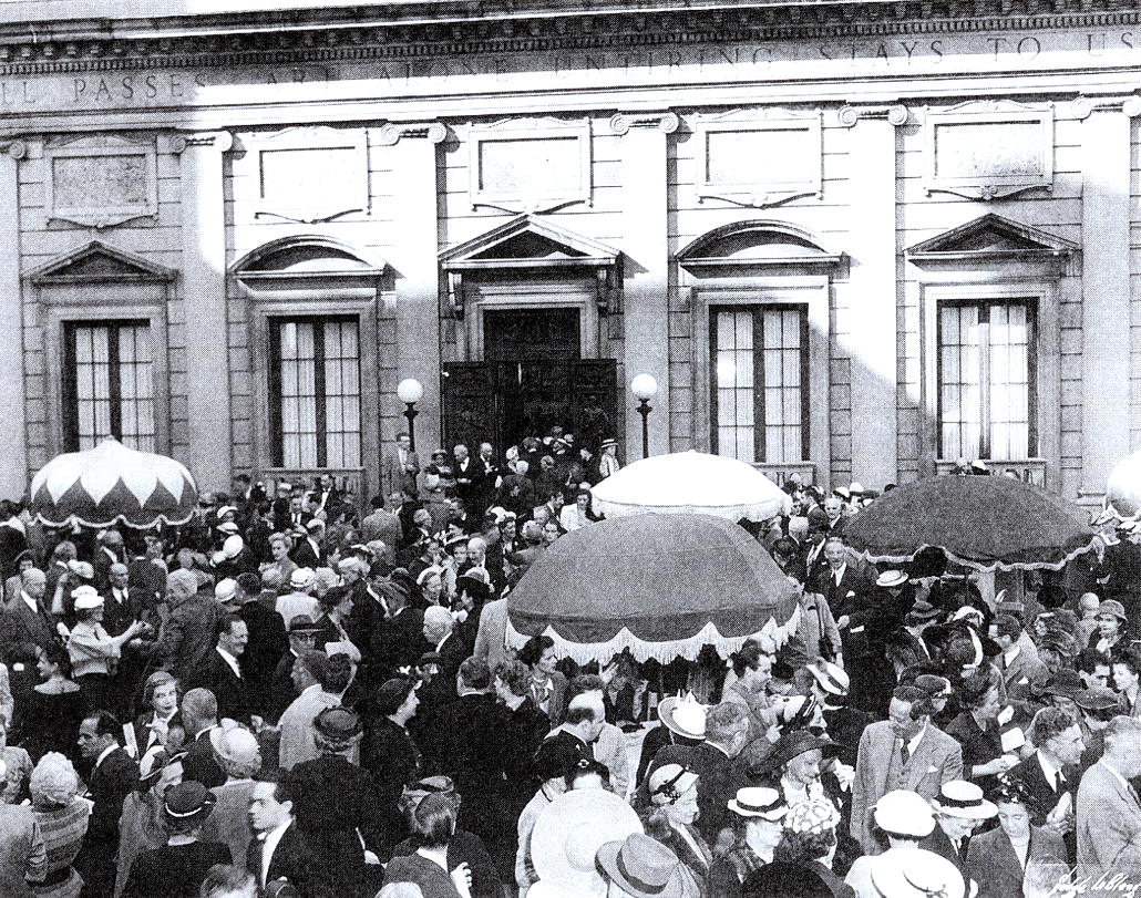
The Academy used the pavilion for art exhibitions and other events, with the terrace in between serving as a useful spot for springtime drinks parties for the academicians and their many guests.
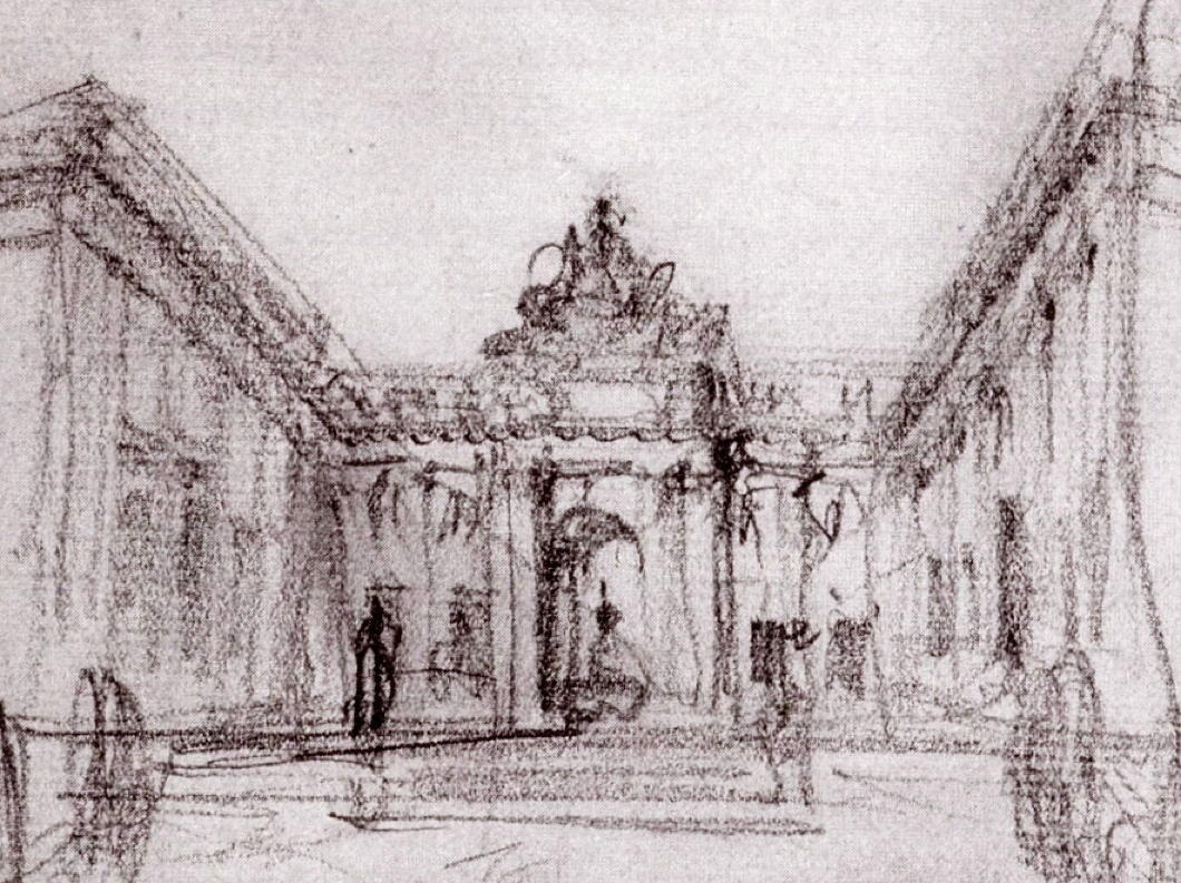
The infelicitous nature of their neighbours clearly irritated the Academy, and in 1929 they had a conversation with Cass Gilbert about designing some sort of screen to satisfyingly terminate the vista down Audubon Terrace and block the view of the apartment buildings.
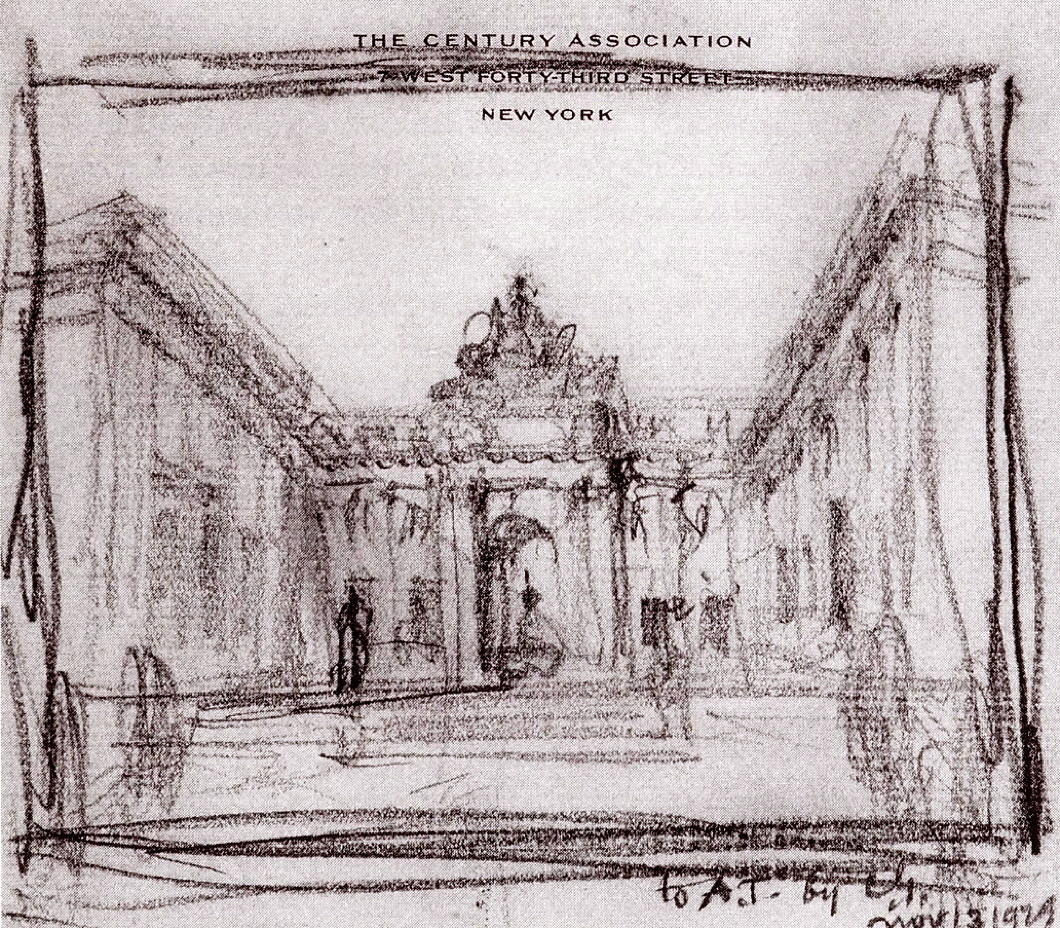
Gilbert sketched out a plan to build an arched screen connecting the pavilion to the main building across the terrace, topped off by a sculptural flourish.
There is a danger its scale may have overwhelmed the space, but that seems a preferable struggle to face when compared to the problem of the rude neighbours.
Events, as they so often do, intervened. The Wall Street Crash badly affected the American Academy’s finances, and Archer Huntington was forced to increase his already generous subsidy to the body even more just to make ends meet.
Gilbert’s final completion of Audubon Terrace was not to be.
The Academy was founded as a bastion of the old guard against the avante-garde, but in recent decades it has let its hair down a little, and leans more towards the modern than the traditional.
All the same, its current president is an English-public-school-and-Cambridge-educated philosopher from one of the most aristocratic families in Ghana, so it’s reassuring they’re keeping a bit of the old with the new.
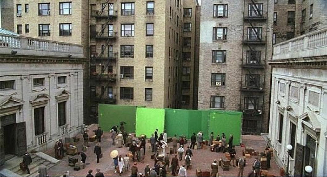
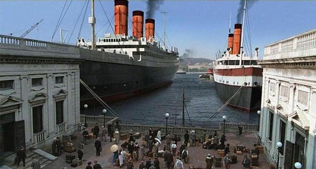
The terrace is often used as a filming location for cinema and television, given the high quality of its architecture and the fact that it is visually not well-known even among New Yorkers, so can be deployed as a foreign setting.
The HBO programme ‘Boardwalk Empire’ used the American Academy’s terrace as an Italian port, using green screens (instead of a Cass Gilbert monumental arch) to transform the piazza.
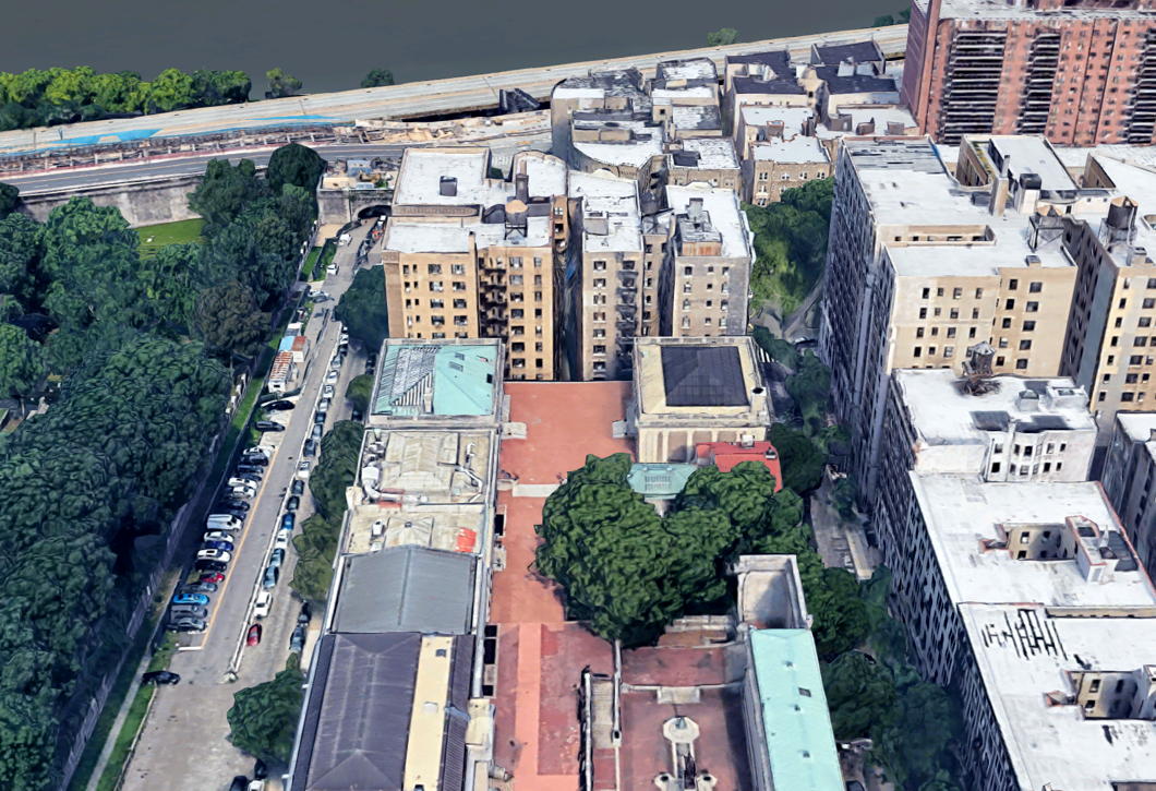
Audubon Terrace and its surviving institutions — the expanding and renovating Hispanic Society, the American Academy of Arts & Letters, and the Church of Our Lady of Esperanza — are an intriguing hidden gem of upper Manhattan, well worth a visit.
I don’t imagine anything like Cass Gilbert’s screen will ever be built, but every time I drop in to this neck of the woods I can’t help but thinking there’s some unfinished business.
Crisis Averted at Chartres
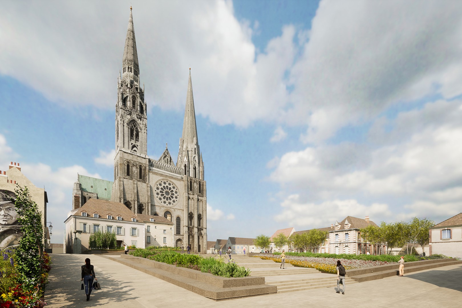
The rather garish and invasive plans to renovate the parvis of Chartres cathedral, turn it upside down, and install a museum underneath — previously reported on here in 2019 — have been radically revised in an infinitely less offensive direction.
The City of Chartres has released the final approved designs which show the esplanade of the cathedral renovated but left largely in place.
Instead of the original plan up reversing the grade of the parvis upwards away from the cathedral, the entire museum will be kept underground and out of sight. (more…)
Horseshoe for Quebec’s Salon bleu
Refit will change seating plan in Quebec’s parliament chamber
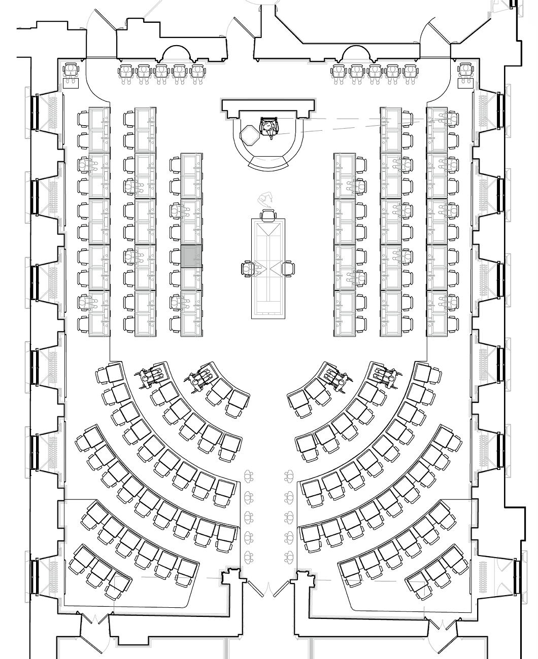
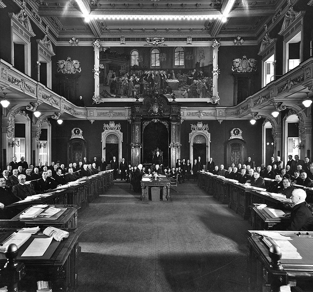
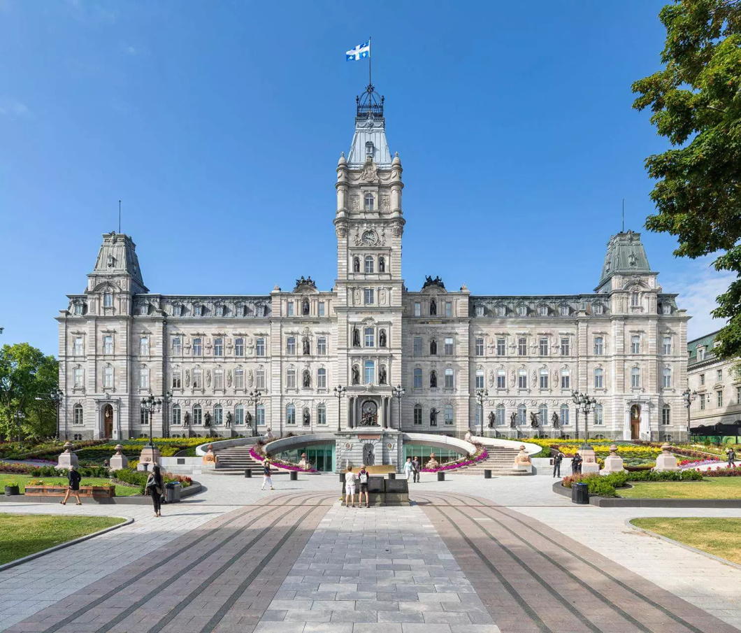
An upcoming renovation to the Hôtel du parlement in Quebec City will also bring a change in the seating plan of the Assembly’s parliamentary chamber. Deputés agreed a moderate alteration to the current Westminster-style seating plan: a horseshoe shape will replace the crowded back two rows of desks with a curved arrangement.
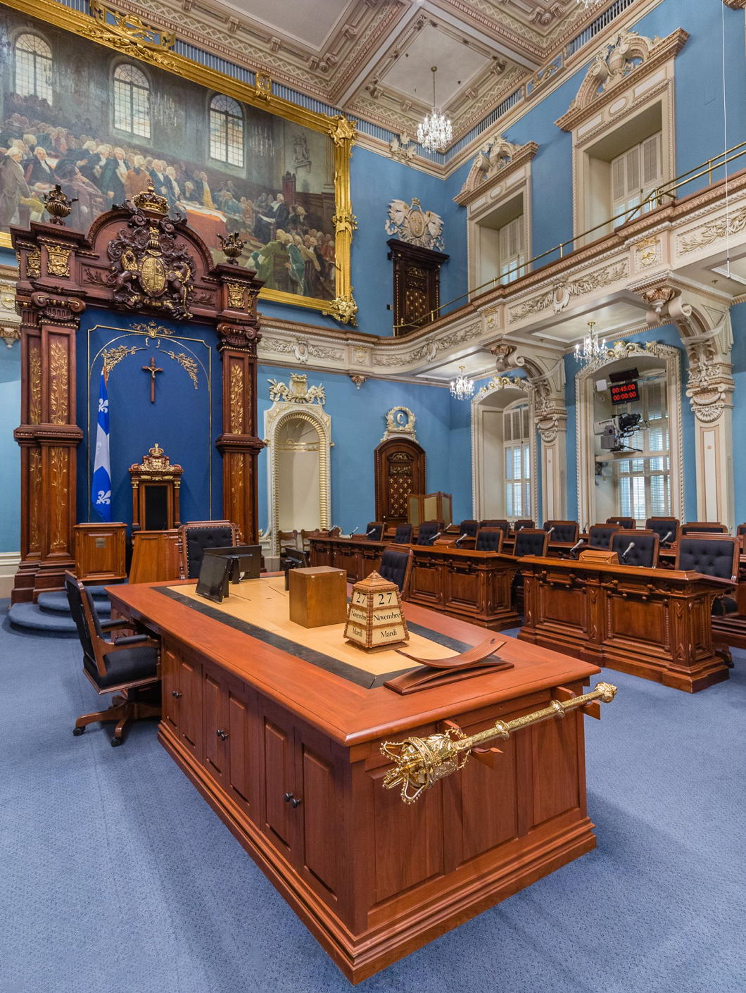
The original clerks’ table designed by the building’s architect, Eugène-Étienne Taché, in 1886 will also be returned to centre-stage in the Salon bleu (formerly the Salon vert) of Quebec’s National Assembly. The room is also, I believe, the only parliamentary chamber to feature in a film by Alfred Hitchcock.
Renovations are scheduled to begin in January of next year, when deputés will start convening in the Salon rouge that formerly housed Quebec’s Legislative Council, abolished in 1968. (Quebec was the last Canadian province to abolish the upper house of its parliament.)
“The Salon bleu has a strong symbolic value for the Quebec nation,” claims Éric Montigny, professor of political science at Laval University (founded 1663).
“We must respect this tradition and evolve in a very, very gradual manner,” Professor Montigny told the Journal de Québec. “A parliament is not trivial.”
The Assembly numbered only sixty-five members when Taché’s edifice was completed in 1886, while today 125 deputés have to fit into the parliamentary chamber.
The new arrangement would make room for as many as 130 legislators, plus the Président in the speaker’s chair. It will also allow for a good number of the historic desks in the chamber to be retained.

Other potential arrangements were considered and rejected, including introducing a half-moon hemicycle akin to Paris, Washington, and other republican legislatures.
Prof Montigny dismissed claims that semicircular arrangements lead to more collaborative dialogue and constructive work between government and opposition parties:
“It’s an argument that is raised regularly, but I don’t know of any studies that will support this theory.”
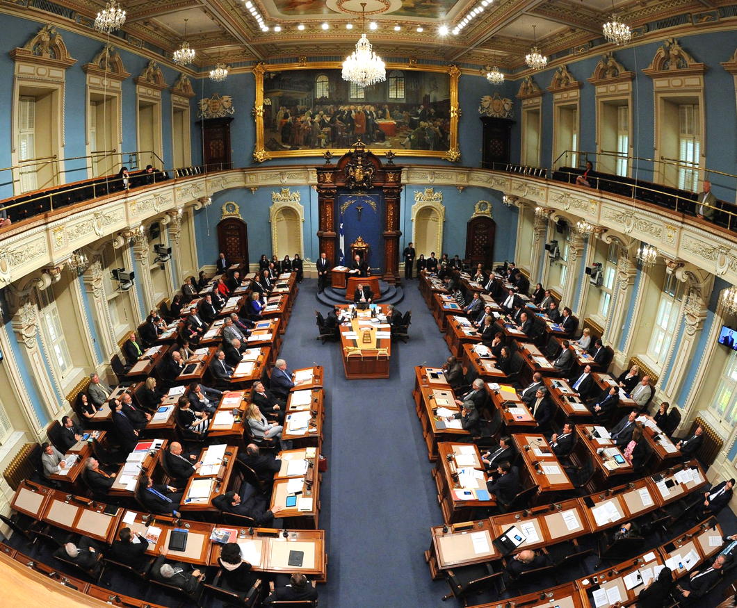
The most significant change to the chamber in recent years was the removal of the crucifix from above the président’s chair, first installed in 1936 by the giant of Quebec politics, premier Maurice Duplessis.
That crucifix, and its 1982 replacement, were removed in 2019 and are now displayed as historical artefacts in an ancillary part of the parliament building.
[NDLR: I wrote about the crucifix back in 2008.]
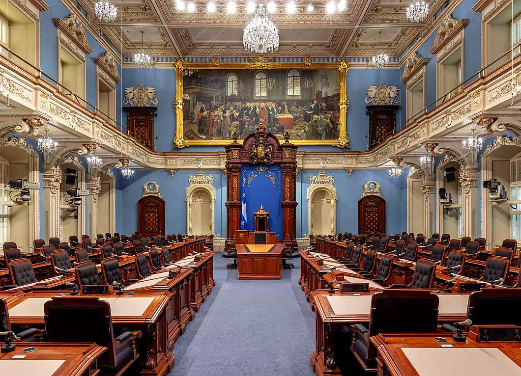
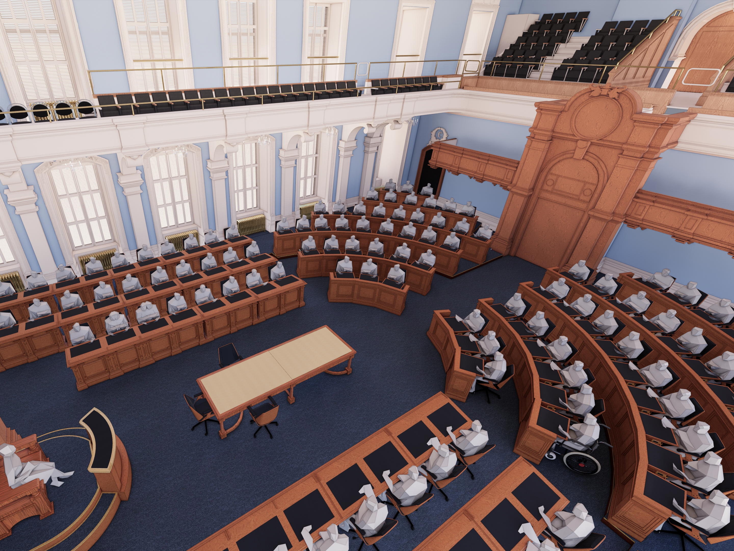
The horseshoe seating plan seems a happy compromise: Westminster-style parliaments — even those that are unicameral like Quebec’s — are honest about the antagonism between government and opposition, and the horseshoe preserves the antiphonal arrangement conducive to this, while rounding it off with a curve at the end.
For my part, I will be happy to see the removal of the arbitrary trapezoid of the modern clerks’ table (below) and its replacement by its historic predecessor.
St Paul’s: Before and After the War
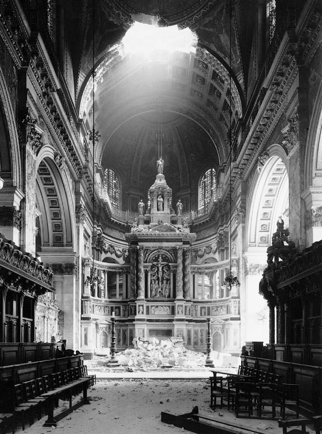
Wren’s post-Fire St Paul’s Cathedral was an icon of resistance to German aggression and an emblem of survival during the Blitz, but while the dome survived the church did suffer damage: A bomb fell threw the roof of the east end on the evening of 10 October 1940, tumbling masonry and destroying the high altar.
Despite the reredos remaining largely intact, as can be seen in the photograph above, it was decided to remove it and rebuild the High Altar under a baldacchino as Sir Christopher Wren had intended.
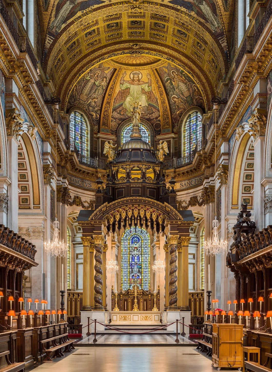
In 1958 the new High Altar, designed by W Godfrey Allen and Steven Dykes Bower, was dedicated with an American Memorial Chapel behind it.
This was proposed by the Dean of St Paul’s and General Eisenhower volunteered to raise money for it in the United States.
The Dean turned down the Supreme Commander’s offer, saying that this would be paid for by Britons as an appreciation of the American sacrifice during our common struggle.
A roll of honour lists the names of the 28,000 Americans who gave their lives while stationed from Great Britain.
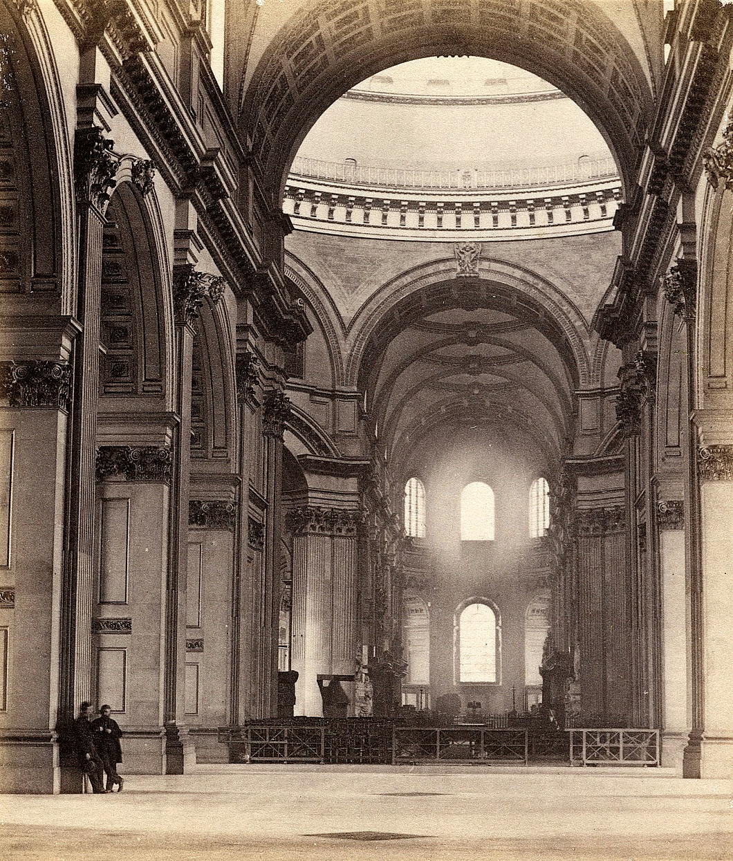
Perhaps more intriguing than either view is the one below of the interior of St Paul’s before the Victorian scheme for the High Altar was executed.
Irving’s Sunnyside
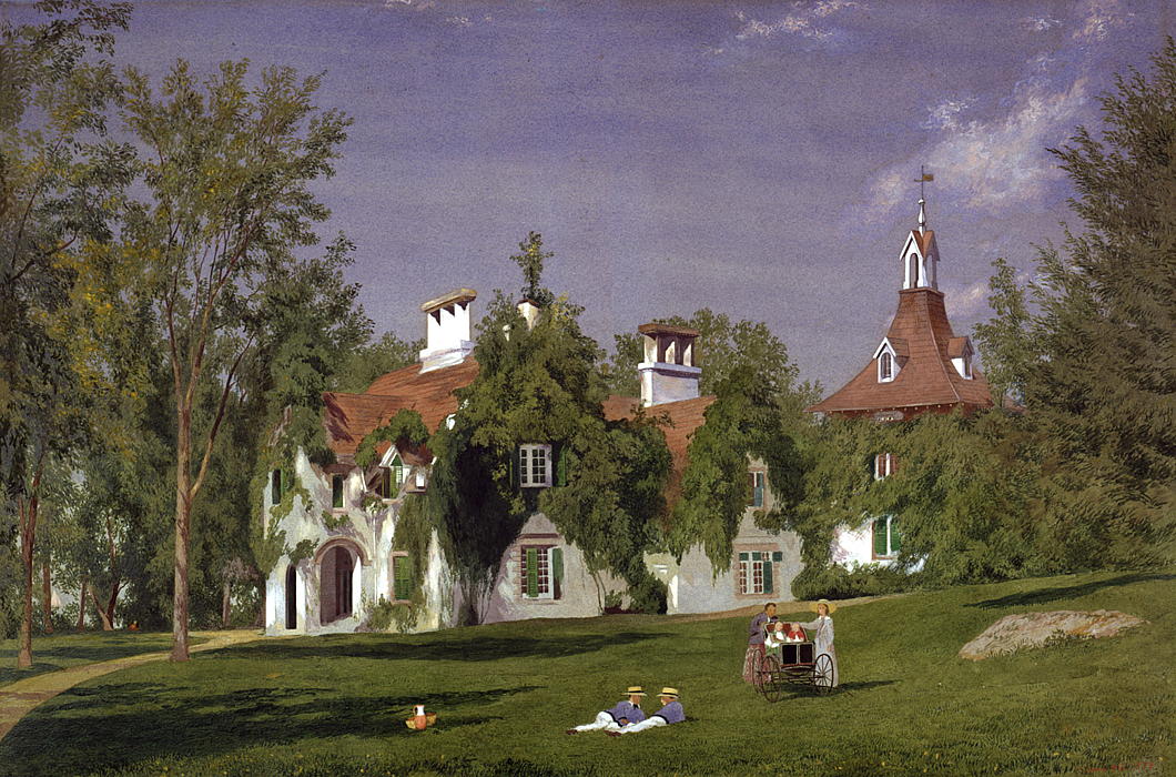
From the Westchester Herald (as reprinted in the Times of London, 24 April 1835):
On the premises just mentioned there is still standing an old stone house, built in the ancient Dutch style of architecture, during the French war, by Wolfred Acker, and afterwards purchased by Van Tassel, one at least of whose descendants has been immortalized in story by the racy pen of its present gifted proprietor.
It is the identical house at which was assembled the memorable tea-party, described in the legend of Sleepy Hollow, on that disastrous night when the ill-starred Ichabod was rejected by the fair Katrina, and also encountered the fearful companionship of Brom Bones in the character of the headless Hessian.
The characters in this delectable drama are mostly known to our readers; but time, that tells all tales, enables us to add one item more, which is, that the original of the sagacious schoolmaster was not the individual generally considered as such, who still resides in this country, but Jesse Martin, a gentleman who bore the birchen sway at the period of which the legend speaks, and who afterwards removed further up the Hudson, and is since deceased.
The location is a most delightfully secluded spot, eminently suited to the musings and mastery of mind; and it is the design of the proprietor, without changing the style or aspect of the premises, to put them in complete repair, and occupy them as a place of retirement and repose from the business and bustle of the world.
175 Years of St George’s Cathedral
ONE HUNDRED AND SEVENTY-FIVE years ago, at a time of great uncertainty in Europe, St George’s in Southwark was opened solemnly by Bishop Wiseman — writes the Cathedral Archivist Melanie Bunch. The ceremony was attended by thirteen other bishops in all their finery, of whom four were foreign. Hundreds of clergy of all ranks were in the procession and many of the Catholic aristocracy of England were present. The music was magnificent, the choir including professional singers.
Pugin’s neo-Gothic church was impressive but not finished, and it was not to be a cathedral for another four years. Dr Wiseman, who was both the chief celebrant and the preacher, was bishop of a titular see, as the Catholic dioceses of England and Wales did not yet exist. Nonetheless the opening marked a significant stage in the revival of the Catholic Church in this region. The spur had been the spiritual needs of the poor Irish who had long formed settled communities in parts of London and other cities. The plans for the church had been drawn up in 1839 – before the severity of the famine in Ireland, which began in 1845, could have been foreseen. Some had considered the size of the new church unnecessary, but it turned out to be providential, as immigration from Ireland to this locality and elsewhere was reaching a peak at this time.
The extraordinary turmoil in Europe that had started early in the year in Sicily could not be ignored. In February Louis-Philippe was dethroned in France. There was anxiety that revolution might cross the Channel. Pugin decided that he should obtain muskets to defend his church of St Augustine under construction in Ramsgate. Revolution spread to German and Italian states and countries under Austrian rule. For four days in late June, there was a brief and bloody civil uprising in Paris.
While Europe was ablaze, London was calm, and the opening went ahead. In his homily, Wiseman praised God for all his mercies to this country. From our perspective, we might have expected that he would have spoken about the dark days of persecution, or at least the struggles of the recent past to get such a large church built, constantly hampered by lack of funds. Rev. Dr Thomas Doyle, whom we honour as the founder of the Cathedral, was present and assisting at the Mass, but his courage, faith, and dogged persistence over many years were not acknowledged on this occasion.
We might remember that a Catholic event like this had not been witnessed in England since the Reformation, seemingly prompting Wiseman to take the opportunity to explain to the non-Catholics present that the ceremony and display of the Catholic Church came from a desire to show greater respect for God. To the foreign bishops he said that their presence proved the unity and diversity of the Church. At the end of his homily, Wiseman caused a sensation by reading out a letter from the Archbishop of Paris, Mgr Affre, regretting that he could not attend the opening. By then it was known that he had already died from wounds received on the barricades while he was trying to mediate with the rebels. Wiseman called him a martyr.
Among others who never saw the opening are some who served St George’s mission with Thomas Doyle at the earlier chapel in London Road. Three of them had died before their time, only a few years before, from diseases endemic among their flock. We remember them and all who have served the Cathedral with gratitude. At the time of the opening, St George’s was the largest Catholic church in London, and for the next fifty years was to be the centre of Catholic life in the metropolis. Much has changed since, including the rebuilding of the Cathedral, but we give thanks to Almighty God who continues to sustain it. (more…)
Skeleton Coast Baroque
Examples of baroque architecture in Namibia are — sadly — not numerous enough to deserve so much as a monograph. (Of the Namibian jugendstil, we can say more.)
But being few does not mean not existing at all.
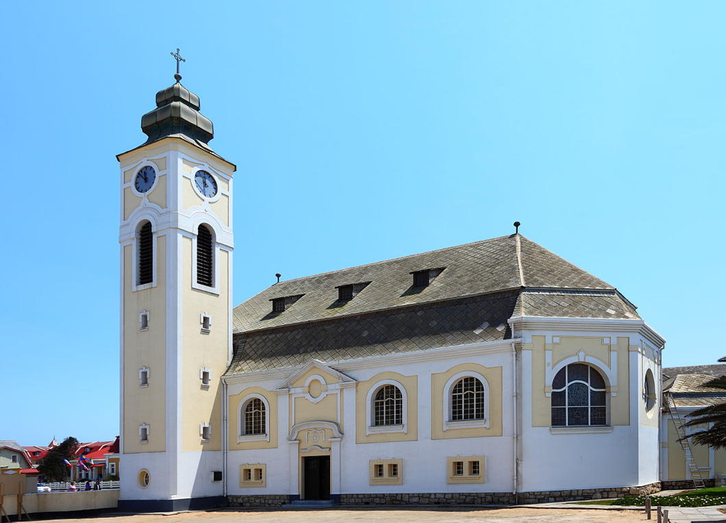
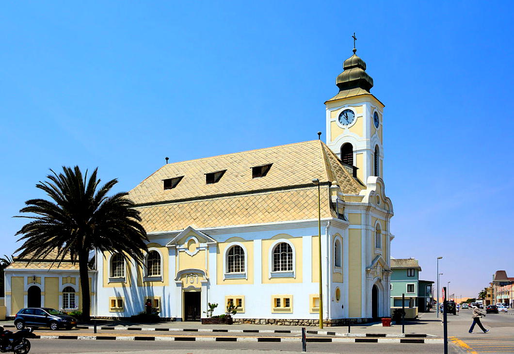
The best archetype of the Namibian baroque is the German Evangelical Lutheran Church in Swakopmund.
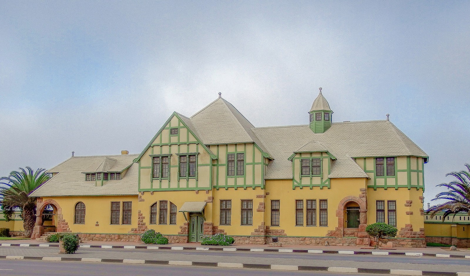
This beach town of 45,000 souls is known for its somewhat otherworldly architecture, the most common description of which might be Tropical Teutonic.
Just take a look at the Old Prison, whose moniker is something of a misnomer as it’s still in everyday use as the town lock-up.
In the 2000s, AMC filmed its remake of the classic television series ‘The Prisoner’ in Swakopmund.
“You couldn’t get more isolated than we are here,” the show’s star actor, Sir Ian McKellen, told the Daily Mail.
“Apart from being cut off by the sea in one direction and the desert in the other, the nearest big city, Cape Town, is two hours away by air. The tourist brochure lists the main attractions only as the prison, the war memorial and a steam engine museum named after Martin Luther.”
“But the most fascinating thing about this place is you never know what’s around the corner. You can walk down absolutely deserted streets, and believe there is no one else here. Then you pitch up at a restaurant and find it jammed to the rafters with people. Where did they all come from? What exactly is happening? It is like nowhere else on earth.”
The Mail’s journalist continues:
Then something happens which illustrates his point perfectly. Seemingly out of nowhere, a group of dog owners assemble outside Sir Ian’s apartment. The dogs are put through a series of trials before, after a few minutes and without fanfare, they all vanish into the rolling mist, as if instructed to do so by some unseen force. When it lifts, it is as if they had never been there.
“Typically Swakopmund,” says McKellen. “Strange sights everywhere.”
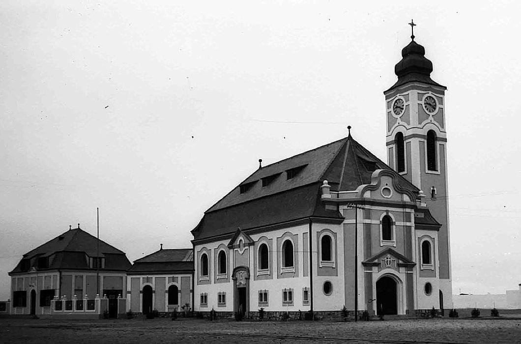
The Swakopmund church here is a congregation of the Deutsche Evangelisch-Lutherische Kirche in Namibia, one of three Lutheran denominations in the county.
The DELK is, obviously, for the German speakers who make up a third of the country’s whites (who altogether are six per cent of the population).
There is also the Evangelical Lutheran Church in Namibia, founded by Finnish missionaries and primarily made up of Ovambo and Kovango people, and the Rhenish-founded Evangelical Lutheran Church in the Republic of Namibia.
Like many Protestant churches in Africa (and beyond), the interior is unremarkable.
According to lore, the architect was a Bavarian, instigated by the government builder Otto Ertl, and the building was consecrated in January 1912 — twenty years after Curt von François founded Swakopmund.
Worth a look-at if you find yourself in the area.
Sibiu/Hermannstadt
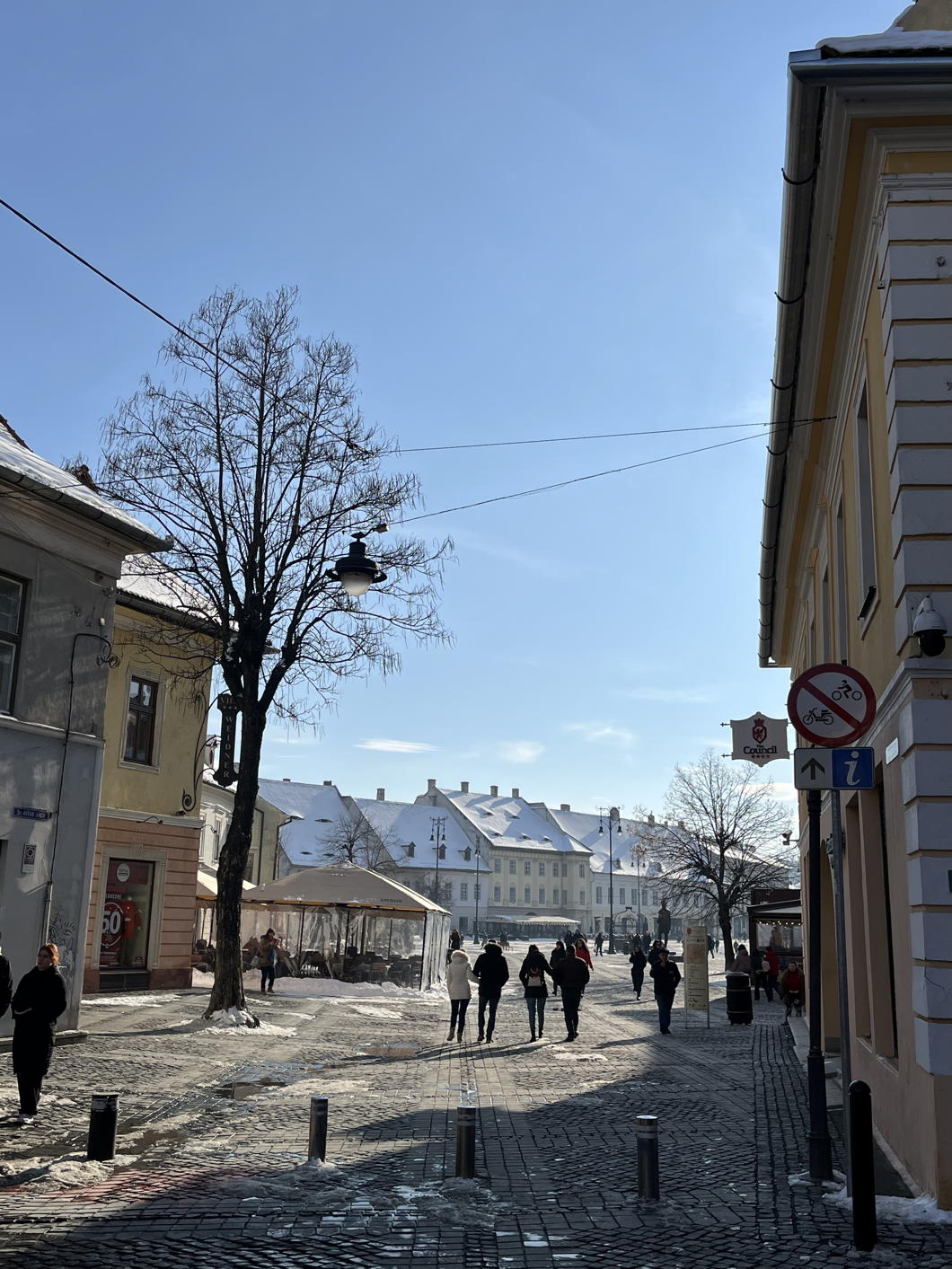
SIBIU’s name comes from a Bulgar-Turkic root word meaning “rejoice”, and having spent a few days in the city I can see why. It is handsome, clean, and clearly well looked after — perhaps well loved is the better term.
Unsurprisingly, the mayor partly responsible for this state of affairs was much vaunted for his efforts, to the extent that the Romanians elected him president of the entire country (and this despite him being an ethnic German).
As in all of Transylvania, there is a long history of mixture here, and while the past hundred years have seen a massive collapse in the Hungarian, German, and Jewish populations, many of them persevere all the same, sometimes even flourishing.
Hungarians are the largest and most visible minority in Transylvania — once the dominant people of this province of the Crown of St Stephen — but here in Sibiu they play second-fiddle to the Germans.
Arriving in the Church of the Holy Trinity in the great square for the Hungarian Mass on Sunday, the congregation at the Mass in German preceding it was still filtering away and clearly is the main event of the parish.
The Germans — or Saxons as they are often known — are today under two per cent of the city’s population but, as elsewhere, the Teutonic reputation for competence and efficiency means that a great many ethnic Romanians vote for the Germans’ party, the Democratic Forum of Germans in Romania.
When mayor Klaus Iohannis was elected to the Romanian presidency, he was succeeded as mayor by another member of the German community, the rather elegant Astrid Fodor.
But what of the ethnic Romanians that today make up ninety-five per cent of Sibiu’s townfolk? They are anything but ethnic chauvinists, and seem keen to preserve the traditions of the city and the province, and especially to highlight Sibiu’s distinctiveness. Those I had the pleasure of interacting with were effortlessly warm, courteous, and inviting. Their language is alluringly if mistakenly familiar.
Curiously, the Grand Duchy of Luxembourg maintains a consulate here in Sibiu / Hermannstadt with the ostensible excuse that the former German dialect of the town is a close relative of Luxemburgish. The connection bore fruit when Sibiu and Luxembourg City shared the honour of being European City of Culture in 2007.
It was around that time that Forbes magazine rated Sibiu as the seventh most idyllic place to live in Europe — ahead of Rome and just behind Budapest. While such ratings are always arbitrary, I can’t help but share their desire to praise this felicitous city. (more…)
St Vincent Ferrer
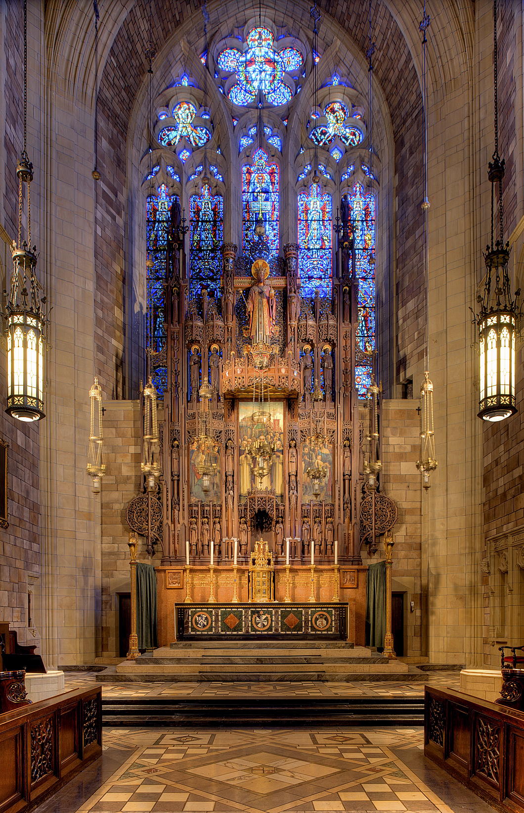
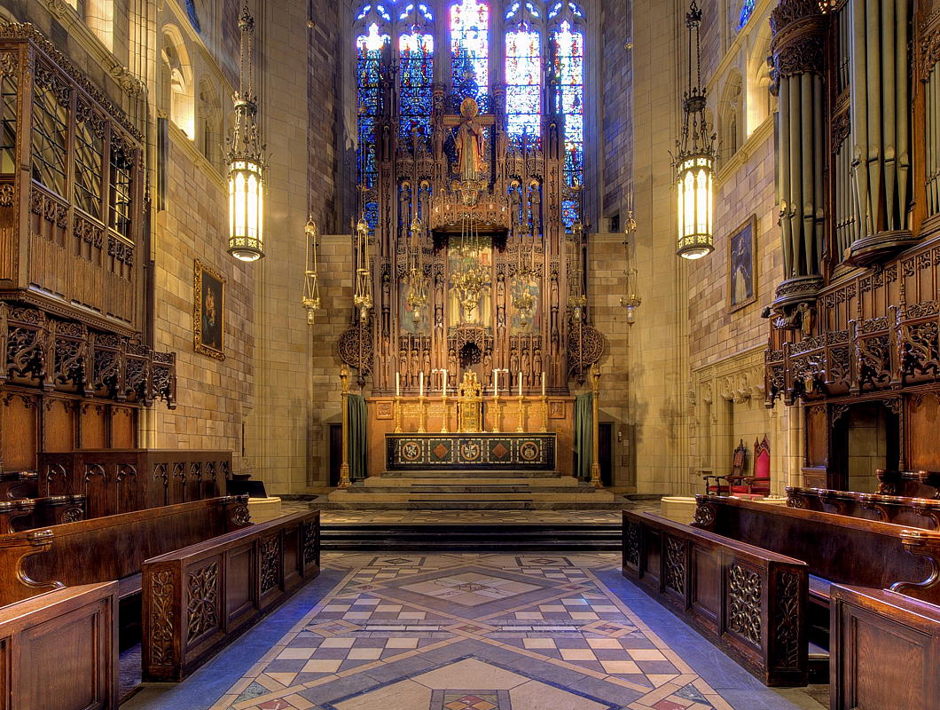
This week marked the ninetieth anniversary of the consecration of the high altar of the Dominican Church of St Vincent Ferrer in New York — one of the most beautiful churches in Manhattan.
To mark the occasion, a sung requiem Mass was offered in the Dominican rite (under the sponsorship of the New York Purgatorial Society) for the benefactors of the parish.
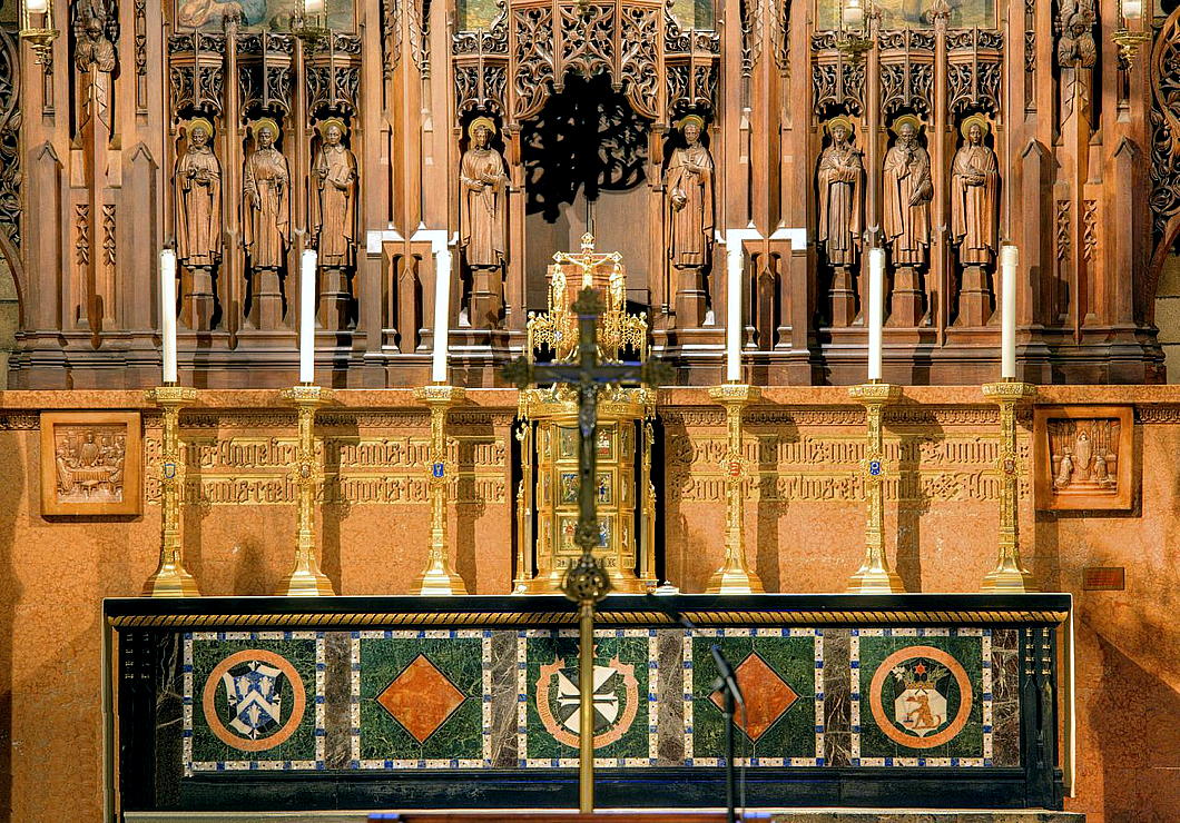
The parish also shared this explanation of the art and symbolism of the high altar:
The Altar itself, the footpace of which is atop five steps from the presbytery, is in the form of a sepulcher. The Mensa is of Belgian Black marble inlaid with five crosses of Red Verona. It measures 15 feet long, 3 feet wide, and 6 inches thick, weighing about 2 tons.
The Altar Front consists of uprights of Belgian Black and Lepanto Marbles. The Frontal has five panels in a field of Tinos Green surrounded by a border of Mother-of-Pearl and Lapis Lazuli. The three principal panels, left to right, are: the arms of the Dominican Province of Saint Joseph (notice the carpenter’s T-square and the lilies, symbols of Saint Joseph); the shield of the Dominican Order in black and white marble surrounded by a carved inscription of the Dominican motto, “Laudare, benedicere, praedicare” (to praise, to bless, to preach), this is capped with a star; another Dominican shield with the crown, dog, lily, laurel, and star. The carving on the Mensa and the Altar Frontal is finished off in gold.
The Reredos Wall, acting as a back to the Altar and a base for the Reredos, is of Siena Marble. The wall contains a carved inscription of the Eucharistic hymn “Panis angelicas” written by St. Thomas Aquinas, O.P. On each side of the inscription are carved two large corbels the subjects of which are the Last Supper and the Elevation of the Mass.
On the Mensa of the Altar there are also six large candle- sticks of gold-plated bronze. Each candlestick weighs eighty-five pounds. On each candlestick is a medallion containing a symbol of the Passion or the Holy Eucharist, from left to right: Crown of Thorns and Three Nails on a background of blue; silver Rooster; silver Chalice with a Host bering the emblem IHS; three fish on a background of red enamel representing the Holy Trinity; Veronica’s veil; money bag of Judas on a background of red.
The Reredos is a magnificent structure of wood carving which forms the setting for a central painted triptych by Alfredo Mira depicting the miracles of Saint Vincent Ferrer, twenty-four statuettes of saints, and thirty angels of varying sizes. Dominating the entire structure is a majestic figure of Christ the King, approximately eight feet tall. The Reredos, extending forty-four feet above the floor, is of Hungarian oak which is stained to preserve the natural color of the wood. The color work has been done sparingly since it was not intended to destroy the natural finish of the wood by complete polychroming; yet the figure of Christ the King and the tester or canopy above it have been elaborately colored.
The Tabernacle at the center of the Altar is of gold-plated bronze, with twelve panels of symbols and miniature Biblical scenes in colored enamels. On the left door are six images from the Old Testament in which the Eucharist is prefigured. On the right door is the fulfillment of those types in the New Testament and the early Church. The Tabernacle, with its triple crown, is intended to look like a medieval tent, the literal meaning of tabernacle.
The Altar and Reredos were imported from Belgium where they were constructed by Joseph Van Uytvanch of Louvain. Almost two years were required to complete the work. The scheme was conceived by Wilfred Anthony, Bertram Goodhue’s assistant on the project.
The George
“FORTUNATE IS SOUTHWARK in her possessions,” Sir Albert Richardson wrote, “for she holds in this fragment a key to the aspect of her many vanished inns…”
The George Inn features largely in the deep psychogeography of Southwark, ours the most ancient of boroughs. Here is the greatest living remnant of the coaching inns of old, even if much reduced in form. The current structure dates from the 1670s but we know an inn on this site was well established by the 1580s. It is now in the possession of the National Trust, but is a functioning Greene King pub where you can find a good pint.
Up and down our High Street, for centuries merchants, travellers, traders, and revellers would slake their thirst in a procession of pubs, inns, and taverns. English pilgrims heading to Canterbury would start off here, and recent arrivals to London from the Continent would make their first acquaintance with England’s capital by arriving at “The” Borough after journeying from the Channel ports.
“One enters the inn yard with pleasurable anticipation,” Sir Albert continues in his 1925 volume, The English Inn, Past and Present; A Review of Its History and Social Life.
“There is fortunately sufficient of the old building remaining to carry the mind back to the days of its former prosperity. There are the sagging galleries, the heavily-sashed windows and the old glass in the squares. The rooms are panelled. In the dining-room are the pews, and the bar is typical.”
In Richardson’s time, just a century ago, these rooms would have often been full of hop growers from Kent and the hop merchants who traded with them, though they are all gone now.
And yet, some things have not changed:
“Here we can obtain old English fare, and, heedless of the beat of London, commune with ghostly frequenters to whom the place was at one time a reality.” (more…)
Search
Instagram: @andcusack
Click here for my Instagram photos.Most Recent Posts
- Sag Harbor Cinema March 26, 2025
- Teutonic Takeover March 10, 2025
- Katalin Bánffy-Jelen, R.I.P. March 3, 2025
- Substack Cusackiensis March 3, 2025
- In the Courts of the Lord February 13, 2025
Most Recent Comments
Book Wishlist
Monthly Archives
Categories

