Architecture
About Andrew Cusack
 Writer, web designer, etc.; born in New York; educated in Argentina, Scotland, and South Africa; now based in London.
 read more
News
Blogs
Reviews & Periodicals
Arts & Design
World
France
Mitteleuropa
Knickerbockers
Argentina
The Levant
Africa
Cape of Good Hope
Netherlands
Scandinavia
Québec
India
Muscovy
Germany
Academica
Old Dutch Gable
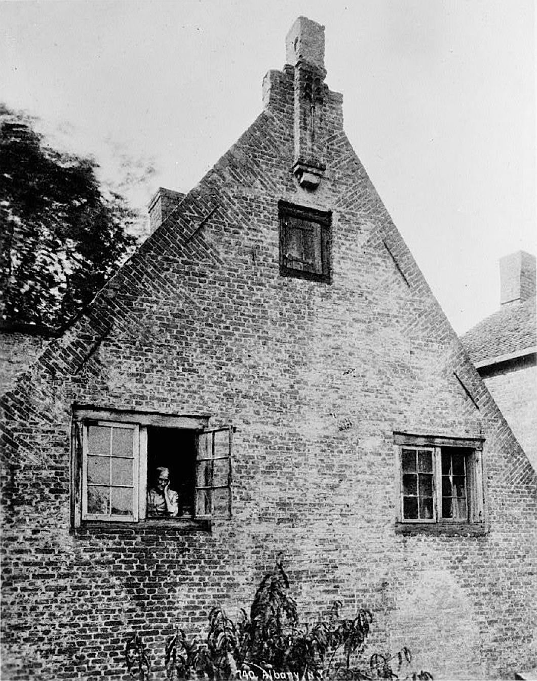
An old Dutch gable complete with old Dutch vrouw gazing miserably from the window. Albany County, New York, 1930’s.
The form of brick course on the gable is known as ‘mouse-tooth’ and is found primarily in Holland, East Anglia, and the Hudson Valley of New York, though also here and there in the American South.
Old Yale Boathouse Faces Wrecking Ball
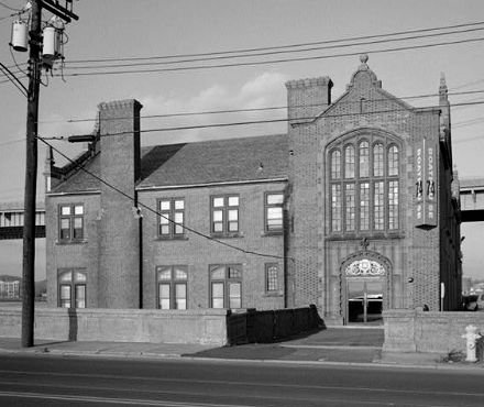
AND SO, THE ONWARD march of progress continues. Yale University’s old Adee Boathouse on New Haven harbor is to face the wrecking ball to make way for traffic improvements to the Pearl Harbor Memorial Bridge which carries Interstate 95 across the Quinnipiac River. Despite some quite extraordinary plans to physically cut the building from the shore and float it across to the opposite side of the river, it now appears that the boathouse is to be demolished. (more…)
The Old Police Headquarters
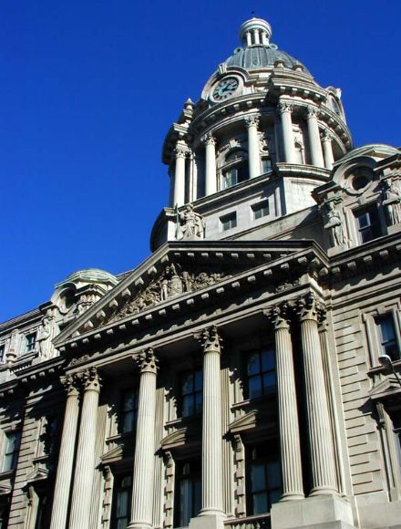
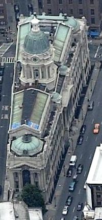 ONE OF THE finest buildings in all New York is also one of the least-appreciated and most forgotten. The old Police Headquarters at No. 240 Centre Street was built in 1909 on a triangular lot in what was then solidly Little Italy. Arguably, it is today located in the ever-expanding Chinatown, but real estate brokers usually describe its location non-ethnically as Soho, just on the cusp of the area which is increasingly (and most irritatingly) known as NoLIta, ‘North of Little Italy’.
From the basement shooting range to the rooftop observation deck, the building was designed in the monumental Beaux-Arts style by the firm of Hoppin & Koen, “to impress both the officer and the prisoner with the majesty of the law.” The New York Times wrote that “its grandeur contrasted utterly with the little buildings and crooked streets around it.”
The older old Police Headquarters, where reformer Teddy Roosevelt held court as Police Commissioner, was located nearby on Mulberry Street and when the nerve center of the N.Y.P.D. shifted to Centre St. between Broome and Grand, the gun shops, cop saloons, and police reporters followed suit. One restaurant across the street was simply called ‘Headquarters’. With its oak bar and ceiling of carved wood, the ‘Headquarters’ restaurant became a particular favourite among the higher brass of the N.Y.P.D. According to popular lore, a tunnel was actually constructed connecting the restaurant with the actualy Police HQ, in which a number of the Boys in Blue used to enjoy a drink during the trying days of Prohibition. (more…)
Vienna on 43rd Street
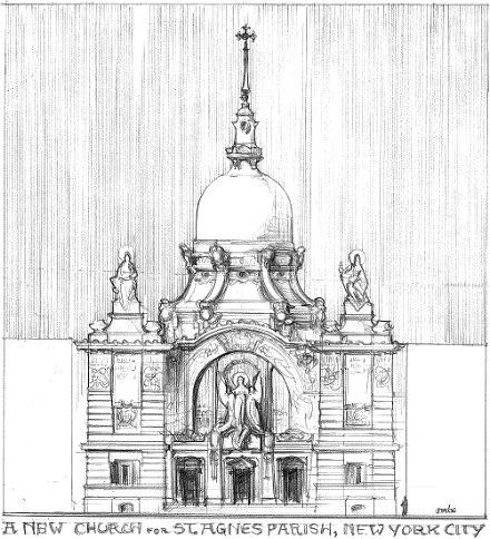
A WEEK AGO AFTER the 11 o’clock Sunday Mass at St. Agnes, Dino Marcantonio, Matt Alderman, and I stood in front of the church and fantasized about how we would fix the old place. Well, perhaps ‘old’ isn’t the right word for the place. While the parish was founded in the 1840’s, the current church building only dates from the late 1990’s, built after the old Victorian edifice was consumed by fire. As for design, its heart is in the right place, but as they say the Devil is in the details. The interior is marred by quite obviously large joints between component parts of arches and cornices and the exterior just looks fake. Is craftsmanship dead? No, but it helps to search it out instead of accepting just any old thing.
At any rate, Matt Alderman has thrown together these esquisses of what his St Agnes would look like, and it’s all rather Austrian. (more…)
Centro Naval, Buenos Aires
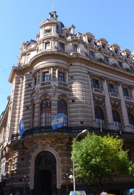
OUR GOOD FRIEND Tori Truett sends greetings from Buenos Aires where she is visting relatives and her salutation sparked a number of memories from my all-too-short time down there. One of these memories was being relieved upon by a bird whilst pottering about the market of San Telmo one afternoon (it remains the only time I have suffered the indignity of such an aerial bombardment). The good city, however, has more beautiful buildings than the Big Apple, both in quality and quantity. Their good buildings are better than ours, but then their ugly buildings are even uglier. (As terrible as the Whitney Museum is, I doubt it matches the Biblioteca Nacional for sheer vulgarity). (more…)
The Neue Galerie

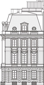 THE RECENT PURCHASE for the Neue Galerie of Gustav Klimt’s 1907 ‘Adele Bloch-Bauer I’ (above), alledgedly for a record-breaking price of $135,000,000, gives me the perfect opportunity to write a post on the eponymously recent addition to New York’s coterie of art museums. Since its 2001 opening, the Neue Galerie has resided in the handsome 1914 beaux-arts mansion on the corner of Fifth Avenue and 86th Street, designed by Carrère and Hastings (of New York Public Library fame) for industrialist William Starr Miller and later inhabited by Mrs. Cornelius Vanderbilt III. In the time since the construction of No. 1048, the rest of Fifth Avenue has undergone a lamentable transformation from a boulevard of beautiful townhouses and mansions to an avenue predominantly consisting of apartment buildings. While one appreciates the inoffensive design of the pre-war buildings on Fifth, there remain a number of thoroughly opprobrious modern interlopers which offend the graceful avenue. One can’t help but pine for Fifth Avenue before the mansions came down, but we can at least give thanks for holdouts like the Neue Galerie. (more…)
The Haunting Richardsonian
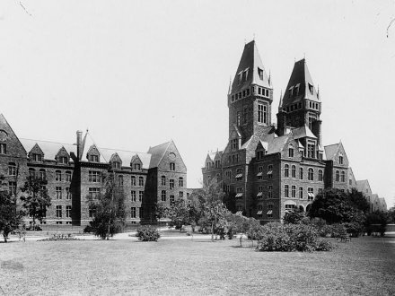
ONE OF THE splendid things about New York is that it’s a land which continually manages to throw up a surprise or two, even to time-hardened devotées of all things knickerbocker such as yours truly. One of my most recent discoveries is the fabulously haunting and impressive Buffalo State Hospital out in the far west of the Empire State.
The magnificent building was built to the design of Henry Hobson Richardson, the progenitor of the eponymous ‘Richardsonian Romanesque’ style, as one of a series of governmental asylums for the insane founded throughout the nineteenth century. Richardson also did a great deal of work on the Capitol in Albany, designing the south façade which, since the construction of Nelson Rockefeller’s Little Brasilia, is now the main façade of the building and was inspired by the Hôtel de Ville in Paris.
Construction on the State Hospital began in 1870, and the central administration block with its two towers and a number of flanking pavilions housing patients were opened in 1880. Interestingly, the towers which so dominate the building are purely decorative and remain unfinished on the interior.
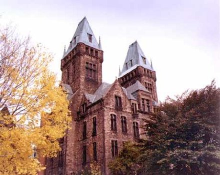
The footprint of the building follows the V-shaped Kirkbride plan, conceived by Pennsylvania’s Dr. Thomas Story Kirkbride in his 1854 opus, On the Construction, Organization and General Arrangements of Hospitals for the Insane which revolutionized care for the mentally unstable in the nineteenth century. The location was a 100-acre parcel of property near the city of Buffalo, and the grounds were landscaped by Frederick Law Olmsted, who designed Central Park with Calvert Vaux.
The grounds originally included farms which helped to feed the patients and staff, but in the 1920’s this land was redeveloped as the Buffalo State College, now the University at Buffalo (State University of New York). The hospital, renamed Buffalo Psychiatric Center, moved out of the Richardsonian complex into a plain, ugly, modern building on the grounds in the 1960’s, leaving the beautiful Victorian structure to rot and ruin.
However recent efforts by Buffalo and New York state officials have led to the replacement of the roof and other work to ensure the continued integrity of the building. The latest plans would have the building serve an educational function under the auspices of the State University next door, an appropriate purpose for this majestic gem of New York architecture.
Avenida de Mayo, Buenos Aires
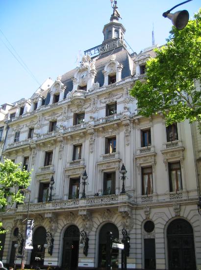
The La Prensa building, formerly home to the newspaper of that name, now the Casa de Cultura.
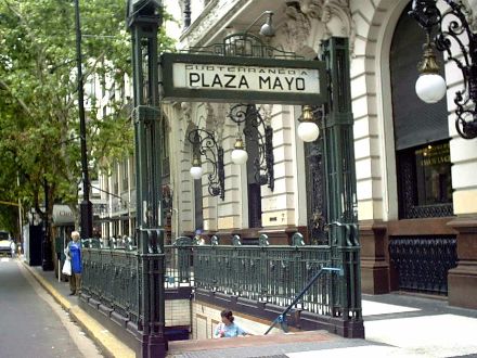
The subte entrance in front of the edificio La Prensa.
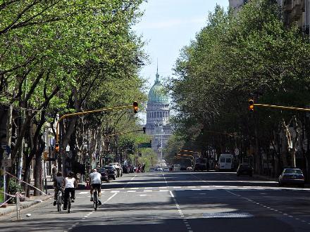
Looking down the Avenida toward the Palacio del Congreso.
New York in Philately

Wandering around the merry old world wide web I stumbled upon these stamps, which I bring to you for your own enjoyment. Above we have the Great Metropolis itself, the island of Manhattan in its swankier days. Below we have a view of the Crown of the Hudson, West Point, with the beautiful Cadet Chapel designed by that American Master, Bertram Grosvenor Goodhue himself, presiding over the campus of the United States Military Academy.
The postage stamp was once a thing of beauty and composition, but it’s heartening to see that some still design beautiful stamps. Just examine Elliott Banfield’s stamp of General Washington, based upon the staute in Union Square. Mr. Banfield believes that the decline in the design of postage stamps is due to a “moral void” most readily shown when the Postal Service unveiled its famous ‘Elvis Stamp’ a few years back.
“Elvis was important in the popular culture, yes,” writes Mr. Banfield. “But how important is the pop culture? Important only to those who can’t see anything higher or better. It’s scary to think that people like that are in charge of public policy. But they are, and the Elvis stamp proves it.”
Hear! Hear!
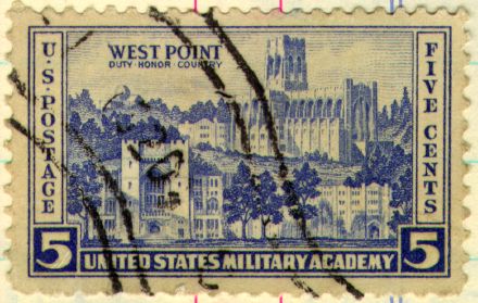
An irrelevant stamp, after the jump.
An Old Boathouse in Spuyten Duyvil
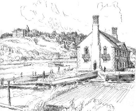
Flipping through an old book called ‘Magical City: Intimate Sketches of New York’, I came upon this sketch of the Gould Boathouse of Columbia University on the Harlem River by Spuyten Duyvil. I had never come across this little building before and had significant doubts as to whether it was still there, but to my pleasant surprise it does. I’m afraid I don’t know much about the boathouse nor its history, but here follows a number of photos and images of it, and of various Columbia boathouses of the past. (more…)
The Rome of the West
The Churches of Glorious St. Louis, Capital of Middle America
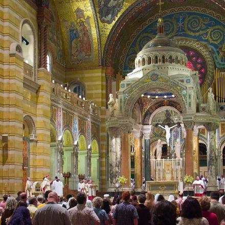
WE ON THE EASTERN Seabord often think that our cities are the last word in ecclesiastical architecture, but Mark Scott Abeln’s splendid ‘Rome of the West‘ site goes a long way towards reminding us of the great physical deposit of Western Civilization and Christian culture situated in the city of St. Louis on the Mississippi River, deep in the heart of America. To show my fellow provincial knickerbockers the richness of St. Louis’s church architecture, I’ve chosen a few photos from Mr. Abeln’s site for posting on this site. A wonderful exhibiton of America’s (which is to say Europe’s) rich cultural heritage.
The jewel in this crown of Catholic Middle America is most certainly the Cathedral Basilica of Saint Louis (above and below). The Cathedral was begun in 1907 and contains the largest collection of mosaic artwork in the world covering 83,000 square feet, the last tesserae of which was installed in 1988. The architecture of the basilica features a number of styles, from the Romanesque Revival exterior to the Byzantine plan and interior, and even contains a chapel designed in the Viennese Reconstructionist style. (more…)
The Perils of Over-Restoration
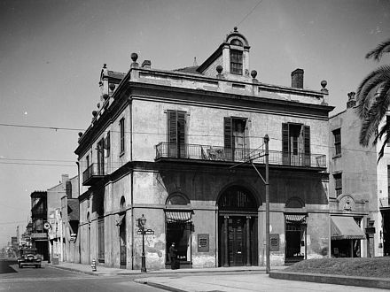
A rather good article I was reading in the Oxford American (via V&V) reminded me of a building I stumbled upon in the Historic American Buildings Survey, digitized at the Library of Congress. No. 403 Royal Street in the French Quarter of New Orleans was designed by one of the first master architects in America, Benjamin Latrobe, who also designed the Baltimore Basilica, the Mother Church of the United States. Resting at the corner of Royal and Conti streets, the building was constructed by the Louisiana State Bank (later subsumed into la Banque de la Louisiane) and features a domed banking hall in the center. After having outlived its usefulness under its original purpose, it became a private residence, with the central banking hall turned into a living room, before being turned into an events venue as it remains today. (more…)
Columbus Circle and the Human Scale
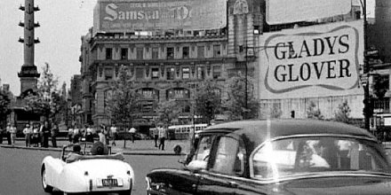
Meandering through the internet yesterday, I came across the above image from the 1954 film ‘It Should Happen to You!’ (via a New York Times article). The film capture shows Columbus Circle in 1954 and was I immediately struck by the superiority of the scale of the buildings to the street, especially compared to today when the Columbus Column is rather overshadowed by the AOL Time Warner Center. It’s not that I don’t like tall buildings; after all New York has some of the most beautiful skyscrapers in the world (though I can’t think of a single great one built after the second war).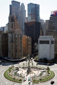 I don’t even object to the residential apartment buildings lining Central Park on Fifth Avenue and Central Park West, except for the fact that on Fifth Avenue they almost always replaced superior, smaller buildings. However, with a public square as small as Columbus Circle, it somehow seems as if lower buildings of only 3-10 storeys would be more appropriate.
The latest brouhaha concerns No. 2 Columbus Circle (the shorter, white building in the photo on the right), designed in the early 1960’s by Edward Durell Stone to house the art collection of Huntington Hartford. The current owners want to chic-ify the building by taking off the façade and recladding No. 2 in the more fashionable glass, akin to the neighboring Time Warner Center, and this has roused the ire of many of New York’s preservationist crowd. Though No. 2 has its charms, I’m not a huge fan of the building myself, but the redesign would only make it worse. The chief value of the building is its comparitively low height which, when viewed from the northwest, contributes to the feeling as if the midtown buildings are gradually lowering in height to meet the scale of Columbus Circle. Unfortunately the Time Warner Center doesn’t comply well with this lessening scale, though it at leasts goes through the motions by have a consistent, low base from which its two towers rise. The stone cladding of the Center, however, is rather too dark and gives a slightly gloomy feel to what ought to be a lovely, bright place. (more…)
‘Voltaire’s Castle’ Up For Sale
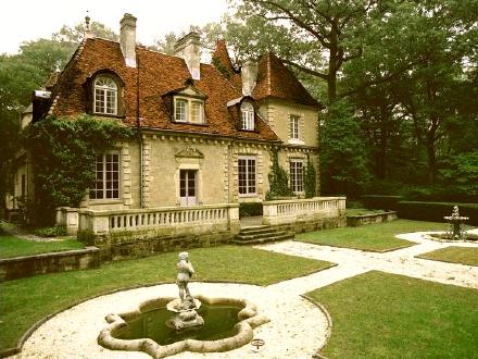
Want to live in a French philosophe’s petit chateau but don’t want to put up with high taxes, soaring unemployment, and immigrant neighborhoods in a permanent state of rebellion? Then boy have I got the house for you! The seventeenth-century Château des Thons, which tradition claims is where the dastardly ‘Enlightenment’ thinker Voltaire carried out his affair with Madame de Chatelet, was shipped during the 1920’s to the peaceful village of Upper Brookville, L.I. in the Great State of New York and is currently on the market. The house features Louis XIV panelling, a sweeping staircase, a tower, and a good few fireplaces.
One of my favorite Voltaire anecdotes is his confident claim – hilarious in hindsight – that “One hundred years from my day there will not be a Bible in the earth except one that is looked upon by an antiquarian curiosity seeker.” Two hundred and twenty eight years after his death, the Bible is still a best-seller and the most widely-read book in the world.
Bronxville Library
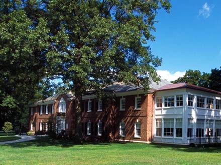
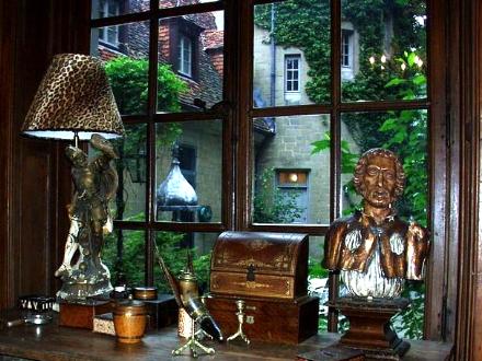
I do miss my library. In a perfect world, I would spend half the day wandering through various libraries of lower Westchester and the City. Of course we have a university library here in St Andrews, but its selection is fairly poor, especially in the subjects in which I am particularly interested. (more…)
Chinatown Bus Terminal
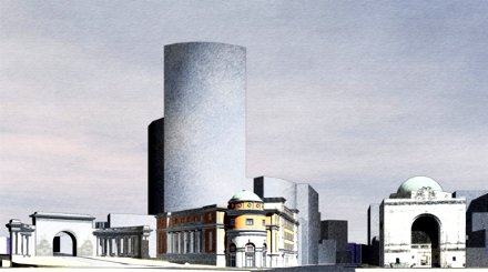
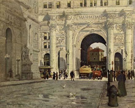
Chinatown’s Fung Wah bus is famously one of the cheapest ways to get to Boston, costing only only $15 to get to New York’s most northerly suburb. The preferred mode of transport between home and university for many a student and an economical mode of transport for the traveller-in-the-know, the chief deficiency of the ‘China bus’ as it is known is that in New York it just lets you off on a random street corner at the eponymous end of the Manhattan Bridge. Wendan Tang, a graduate student at Notre Dame’s School of Architecture (arguably the best in the country), produces his solution to the problem with a hypothetical design for a bus terminal in Chinatown, nudged between the bland modern Confucius Plaza and the beautiful classical entrance collonade and arch of the Manhattan Bridge.
Recent Floridian Architecture
One of the unfortunate factors about places like New York which have been settled for hundreds of years is that they are generally over-developed. This leaves little land for new developments, and likewise for large-scale semi-planned communities like the ones currently being built in Florida. While much, perhaps even most, of Florida’s booming development in the late 20th century suffered from severe architectural defects, a number of outstanding works have bucked the trend.
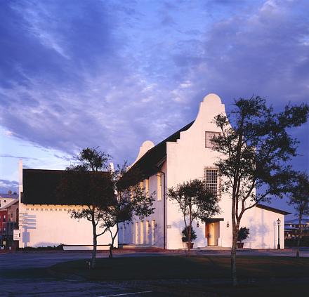
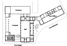 Rosemary Beach is one such development. The Town Hall, seen above, was designed by the firm of Merrill, Pastor, & Colgan. This, and other buildings in Rosemary Beach, follow a St.-Augustine-esque Spanish Colonial style, with wooden balconies, and a few Cape Dutch elements, as with the gables of the Town Hall. What’s more, most of these buildings are designed to take advantage of natural cooling methods to cut down on energy consumption, as well as being built to high standards of hurricane resistance. Below are a series of photos from Rosemary Beach and other places demonstrating some of the better trends in recent Floridian architecture, both public and domestic. (more…)
The Governor’s Suite, City Hall
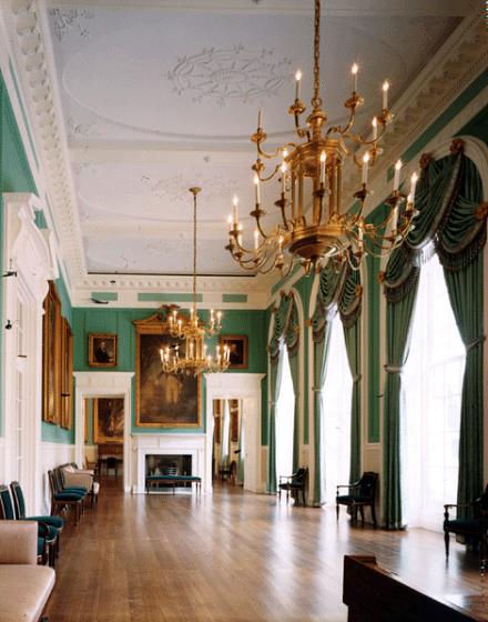
I HAVE NEVER been inside New York’s City Hall, though I have walked or driven past it on a number of occasions. With tall skyscrapers of various ilks towering over it, it always seemed rather small and inconsequential, and I knew nothing of the interiors save the Blue Room in which the Mayor usually gives press conferences and the rotunda which is fairly well-known as well.
I was delighted, therefore, to stumble upon the above photo of the recently-restored Governor’s Suite in City Hall, which shows it to have a rather handsome interior. Since the state government embarked upon an up-river journey to Albany, I presume the purpose of the Governor’s Suite is to provide a place for New York’s head of state to receive and entertain important dignitaries visiting the Big Apple. The current green color of the walls seems much preferable to the previous and rather dull white. I must endeavour to visit City Hall when I next return to the metropolis. (more…)
Search
Instagram: @andcusack
Click here for my Instagram photos.Most Recent Posts
- Amsterdam November 26, 2024
- Silver Jubilee November 21, 2024
- Articles of Note: 11 November 2024 November 11, 2024
- Why do you read? November 5, 2024
- India November 4, 2024
Most Recent Comments
- on The Catholic Apostolic Church, Edinburgh
- on Articles of Note: 11 November 2024
- on Articles of Note: 11 November 2024
- on Why do you read?
- on Why do you read?
- on University Nicknames in South Africa
- on The Situation at St Andrews
- on An Aldermanian Skyscraper
- on Equality
- on Rough Notes of Kinderhook
Book Wishlist
Monthly Archives
Categories

