
About Andrew Cusack
 Writer, web designer, etc.; born in New York; educated in Argentina, Scotland, and South Africa; now based in London.
 read more
News
Blogs
Reviews & Periodicals
Arts & Design
World
France
Mitteleuropa
Knickerbockers
Argentina
The Levant
Africa
Cape of Good Hope
Netherlands
Scandinavia
Québec
India
Muscovy
Germany
Academica
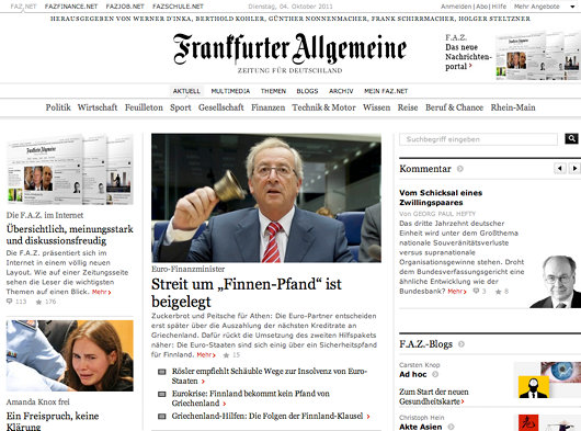
FAZ and the art of newspaper web design
There is a certain pleasure in reading newspapers: the feel of the paper in your hands, the comfort of a seat in a café, the wide panoply of stories arrayed before you. Newspaper websites, on the contrary, are generally horrible. They are usually outrageously ugly (the Scotsman‘s website is particularly poor) and neither well organised nor designed with the proper aesthetics in mind. You might remember that the Times of London redesigned their website just before making it totally inaccessibly. I enjoyed their redesign at the time, but upon further consideration it seems a bit insipid.
The Frankfurter Allgemeine Zeitung, widely regarded by correct minds as the best newspaper in the world, engaged upon a wholesale redesign of their website, faz.net, in October of last year. Like the newspaper itself, there is a fine attention to detail, and I think FAZ might just take the biscuit for best online presence for a newspaper.
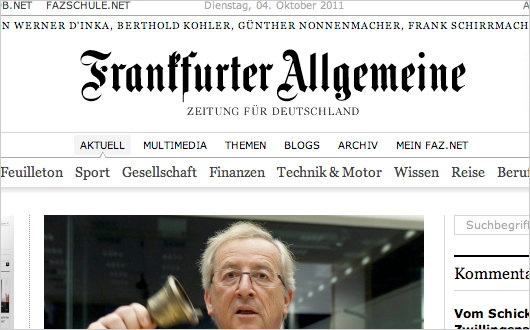

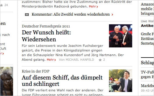
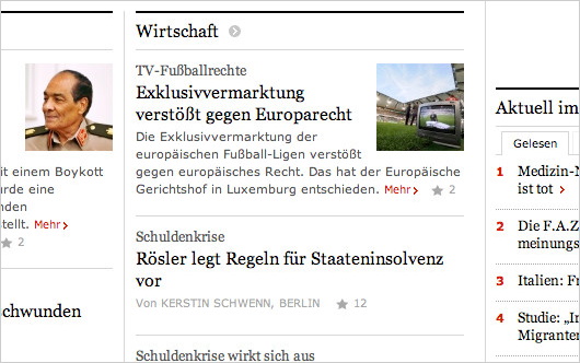
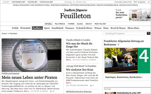
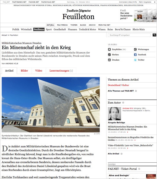
Search
Instagram: @andcusack
Click here for my Instagram photos.Most Recent Posts
- Faithful Shepherd of the Falklands April 8, 2025
- Articles of Note: 8 April 2025 April 8, 2025
- Proportionality Destroys Representation April 8, 2025
- Sag Harbor Cinema March 26, 2025
- Teutonic Takeover March 10, 2025
Most Recent Comments
Book Wishlist
Monthly Archives
Categories


