
About Andrew Cusack
 Writer, web designer, etc.; born in New York; educated in Argentina, Scotland, and South Africa; now based in London.
 read more
News
Blogs
Reviews & Periodicals
Arts & Design
World
France
Mitteleuropa
Knickerbockers
Argentina
The Levant
Africa
Cape of Good Hope
Netherlands
Scandinavia
Québec
India
Muscovy
Germany
Academica
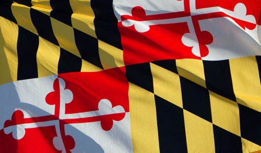
State Flags Considered
The famous Matthew Alderman provoked a disputation on Facebook the other day regarding amongst other things (jousting got a mention) the relative merits of U.S. state flags. I touched upon this subject previously in a post discussing the arms of the Commonwealth of Massachusetts, when I noted the lamentable tradition in American state flags is for the state seal or emblem to be presented on a blue field. Overall, I have to admit that Maryland has the best flag of any U.S. state: it is heraldic, relatively simple, and overwhelmingly traditional. The Facebook commenting led to an all-out war of annihilation between a lasse of Virginia and one of Maryland on the relative merits of their respective state flags. Right as it is for Virginians to defend the great inheritance of their fair dominion, there is simply no contest here: Maryland’s flag is the overlord.
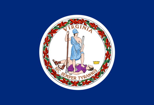
Just look at Virginia’s (above) state flag! A total yawn-fest, I’m afraid. State seal on blue — how original. It would be far better if they took their ancient coat of arms and followed Maryland’s example by using a banner of arms. In Virginia’s case that would mean a red Cross of St George with the crowned shields of Scotland and Ireland in two quarters and of the quartered French & English arms in the other two quarters. Very handsome.
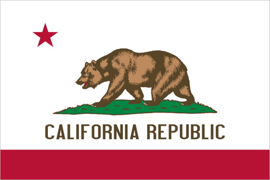
I don’t really like many other state flags (my geboorteland of New York is no exception: once again a banner of its arms would be much more handsome). Of the few I do enjoy, California rakes highly. It has a certain panache, and the words ‘California Republic’ are a healthy reminder of wherein lies the sovereignty. And interestingly, if the Soviets ever take California (“You mean they haven’t?”) they wouldn’t have to change the flag at all, as it already has a red star.
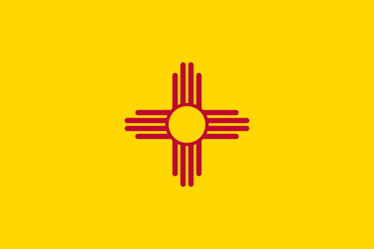
New Mexico’s is admirably simple and different, but one does worry if it’s a bit too simple: the Zia sun symbol veers eerily close to being a corporate icon. The uber-trad proposal would be to replace it with the yellow-field Cross of Burgundy.
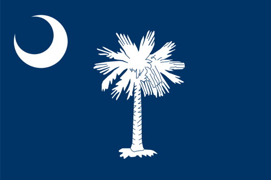
The flag of South Carolina also gets an honourable mention, with its comely combination of palmetto tree and crescent moon. Rendered in red and white instead of blue and white, it is the flag of the Citadel, South Carolina’s military college.
Search
Instagram: @andcusack
Click here for my Instagram photos.Most Recent Posts
- How to Make a Pope April 24, 2025
- Faithful Shepherd of the Falklands April 8, 2025
- Articles of Note: 8 April 2025 April 8, 2025
- Proportionality Destroys Representation April 8, 2025
- Sag Harbor Cinema March 26, 2025
Most Recent Comments
Book Wishlist
Monthly Archives
Categories


Andrew …
I agree with you about Maryland … when I first saw this flag (an enormous, vast sheet that took up the entire wall of our loft in a big Victorian along the Panhandle in San Francisco many years ago), I had no idea what it was. (I had not been long in the USA) … the flag looked European and like something from « Le Camp du Drap d’Or ».
I also like New Mexico’s flag … but I am surprised you have not included the flag of Arizona, which is my favourite of all the American states.
I bought a massive Arizona flag on one of my many tours of that beautiful place … it is strangely militaristic and communistic with its blazing sun rays and enormous dominant star. It always reminds me of the flag of the Viet-Cong or the Japanese Rising Sun.
I am rather partial to the North Dakota state flag. It is based on the US army infantry color. Not bad at all.
I mostly agree, Andrew, though I would like to point out how proud I am to hail from Louisiana, where the flag is a classic Eucharistic symbol: the pelican feeding its young. Possibly the opposite of a republic if we translate this to state government, but the state legislature recently decreed that on the pelican’s breast there must be three drops of red blood clearly visible. It may be on the state seal too but at least it sits freely on the field, not placed in a circle. Stylized versions of this image also appear in the masonry of the State Capitol (built by Huey Long) and the seal of Louisiana Sate University.
Indeed, we covered the flag of Louisiana herein:
http://www.andrewcusack.com/2008/01/14/christological-vexillology-in-louisiana/
Dear Andrew,
I agree with you about Mariland’s flag; very elegant and distinctive, as ever when good traditional heraldry is used on a flag.
Between other States’s flags I like Hawaii, Alabama and Colorado too.
Other flags not have so great ideas, stile or fantasy; above all “blue & round stamps” :) a vexillological bureaucratic style… not so charming
Ciao
Glad to see Maryland so wonderfully lauded! I hope that the state, or rather the history thereof, figure more often on this fine website.
Maryland was my home state growing up and I agree wholeheartedly with the approvals above. My old county and its seat have elegant, heraldic flags too, but I do not know if that is the case in most counties and municipalities in Maryland.
Ahem, California’s red star is an homage to Texas and to the Texas flag, which was, in fact, the flag of a nation and real Republic recognized abroad… :)
Umm, I don’t want to insult any Virginians, but … the first thing I thought of was that the State Seal is a rather unfortunate depiction of the results of overthrowing a tyrant. The design is … um, ambiguous at best. Thank God for the inscription; but for the “Sic Semper Tyrannis”, I could well make a case for this being an illustration of … how shall I say? Immoral conduct? I mean, a guy trying to look up a gal’s skirts? And that is a symbol for Virginia?
No flag of an U.S. state is recognised abroad save for the glorious flag of Texas. Today being San Jacinto Day in Texas seems a fine time to make mention of said ‘national’ flag.
Maryland’s is the best. Oregon’s is the worst. North Dakota’s is second worst, being singularly unoriginal — only the words “North Dakota” make it distinguishable from any other place!
I must disagree with the merits of the Maryland flag, i find it far too busy. Personally I think the flag of Hawaii is the best of all the 50, but I may be biased on account of being British!
No doubt many have seen this page on the NAVA website http://www.nava.org/flag-design/survey/state-provincial-survey-2001
Also informative is the NAVA page “Good Flag, Bad Flag.”
Regarding South Carolina’s flag (blue field with white palmetto tree and crescent), and the flag of The Citadel Cadets (red field with white palmetto tree and reverse crescent), a correction is in order. The Citadel Cadet flag you refer to is “Big Red” and its is not the same design as the state flag adopted by SC January 28, 1861 after it seceeded from the Union. The current Cadet spirit flag is a copy of the original pre-Civil War flag given to Citadel Cadets by members of the Vincent family in early January 1861 as they arrived on Morris Island to establish an artillery position – fort Morris. This was before the design of the SC flag was adopted. The design of the palmetto tree and the position of the crescent on the Cadet flag are different than adopted for the SC flag. Citadel Cadets flew their unique flag when they manned an artillery battery on Morris Island and fired the first shots of the Civil War – January 9, 1861, to repel a Union ship attempting to carry 200 troops and supplies to Fort Sumter in Charleston harbor. The flag was lost for nearly 150 years, until discovered in an Iowa museum and is now on loan to The Citadel.
I agree with your assessment on these three. Some other state flags worthy of mention in my opinion are Alabama, Hawaii, Mississippi (despite the CSA battle flag and all the baggage attached to it, it’s a decent looking flag), Ohio, Tennessee and Wyoming. The seal on blue standard is a bad precedent, especially the ones that have the name of the state boldly affixed to them, negating the reason for a unique graphic symbol for the state in the first place…
My state of Oregon, unfortunately, has one of these boring flags as well, save for the fact it is the only 2-sided flag, of which the reverse side is the more interesting of the two. I designed a few proposals for a new Oregon flag sponsored by the Oregonian newspaper a few years back based on that reverse side. You can see three of them here: http://25.media.tumblr.com/4b7484a9a3bc36da4291b49338f91cfe/tumblr_mhxcepR3uN1qk3zs5o1_1280.jpg
Totally agree that Maryland is the best of all the state flags in the Union.
I would add as an honorable mention Indiana, which I think is pretty cool and rich in symbolism.
Any state flag that consists of a state seal on a field of blue or white is a snore fest.
Course, for full disclosure, I am a Marylander born and raised, so I’m biased.