
About Andrew Cusack
 Writer, web designer, etc.; born in New York; educated in Argentina, Scotland, and South Africa; now based in London.
 read more
News
Blogs
Reviews & Periodicals
Arts & Design
World
France
Mitteleuropa
Knickerbockers
Argentina
The Levant
Africa
Cape of Good Hope
Netherlands
Scandinavia
Québec
India
Muscovy
Germany
Academica
The Iconography of Party
Taking into account the important aesthetical nature of politics, it might be worthwhile taking a sweep round the political parties to see what their emblems, logos, and symbols look like. We will move chromatically and begin with the revolutionary red, through to blue, green, and ending up yellow.
The Australian Labor (sic) Party have one of my favourite modern political party logos. I find the ubiquitous five-pointed star so boring and Australia’s seven-pointed “Commonwealth star” or “Federation star”, with points representing the British colonies which federated into the Commonwealth of Australia in 1901, a much more handsome symbol.
The ALP’s logo employs the Southern Cross constellation very well and balances nicely with the neighbouring red box. The logotype is Helvetica at its best, providing a suitable variation between light and bold versions of the typeface.

The current version of the British Labour party’s logo is rather uninspired and dull. The font is poor and the boxed-out rose is poorly executed. It will probably be replaced within a year or two.

The Labour party of New Zealand is much better: the typographical ligature between the ‘a’ and ‘b’ references traditional Maori design and is handsomely combined with the fern leaf, the country’s national plant.
The Sozialdemokratische Partei Deutschlands, or Social-democratic Party of Germany, has a very stark and bold logo of the party acronym in a red box. There is sufficient blank space to make this an interesting, if bold, emblem. But the letters-in-a-box theme has been frequently used elsewhere (viz. Orange).

The rose-in-fist has been used by numerous socialist parties across Europe and elsewhere. Roses and fists had both been employed as emblems of socialist movements, but I think it was the 1960s before they were combined into the rose-in-fist.
Transitioning from red to blue, we begin with Italy’s Christian Democrats. The party is officially the Unione dei Democratici Cristiani e di Centro (“Union of Christian Democrats and the Centre”), but is in an alliance with several smaller parties under the name Unione di Centro.
The red cross with LIBERTAS stamped upon it was the emblem of the old party ‘Christian Democracy’ which dominated post-war Italy until the Tangentopoli scandal. In the blue background, the emblems of the two parties (Centro Cristiano Democratico and Democrazia Europea) that in the 1990s merged with Cristiani Democratici Uniti to create the UDC are referenced. The party leader’s name is emblasoned up top.
I’ve always liked this particular shade of blue, and it goes well with the bright red.
Parties that have blue as their colour tend to go for darker shades than the UDC’s. From 1976 until 2002, the Rassemblement pour le Republique was the main Gaullist party, and used the Croix de Lorraine as its emblem.
I recall the logo above from my childhood, and it was used for most of the later half of the RPR’s existence. Bit weak, if you ask me.
The RPR was folded into what is now the Union pour un mouvement populaire, or Union for a Popular Movement. A dull logo, bad choice of lettering, and rather shabby excuse for a tree.
The logo of the dominant United Russia party is much stronger: a sturdy Russian bear is combined with a flowing banner of the country’s flag and a Cyrillic logotype of the party name in bold lettering.
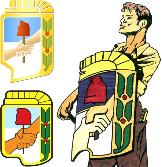
The escudo of Argentina’s Partido Justicialista is one of my favourite party logos. It has a nice 1950s modernist feel to it. Designed privately in the 1930s, it was employed by Peronists from 1945 onwards.
The emblem is dripping with symbolism. Atop the national colours of blue and white, two hands are both clasped together in unity representing the unity of the classes and they hold a rod of order topped with the Phrygian cap of liberty for Argentina’s republican tradition. Surmounting this all is the rising sun, originally depicted with an all-seing eye to represent the divine, also alluding to the Sun of May on the national flag.
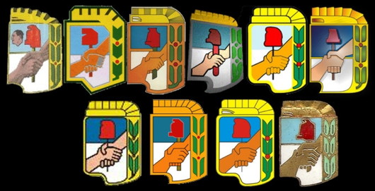
As you can see below, the Justicialist shield has been interpreted in many forms, and it has been employed by the various Peronist factions of left, right, and centre (though courts have recently restricted its official use to the Partido Justicialista itself).
Sweden’s Christian-democrats have a handsome and very peaceful-looking floral emblem. Even the typeface is middle-of-the-road. Whether that’s a strength or a weakness depends on the opinion of the observer.
There’s nothing middle-of-the-road about the logo of South Africa’s ruling African National Congress. It’s a bit of a jumble-box and has a very 1970s feel to it. Given the deep pockets of the party, its surprising the emblem hasn’t been streamlined even a little in the past few years, but it always looks good on the ANC’s election placards, which tend to be the best.
South Africa’s largest opposition party, the Democratic Alliance, is so modern as to soon be out of date. The sun has been used by a variety of South African political parties, from the pro-apartheid National Party (which eventually merged into the ANC) to the liberal Democratic Party. A few years ago, the DA reinvented its sun logo showing an obvious influence from Barack Obama’s ‘O’.
Great Britain’s Conservatives introduced a tree logo in 2006, which we covered at the time from a Scottish perspective. The tree is an excellent symbol which could be well used, but this one looks a bit artsy-airy-fairy and it gives the feeling of not really saying anything.
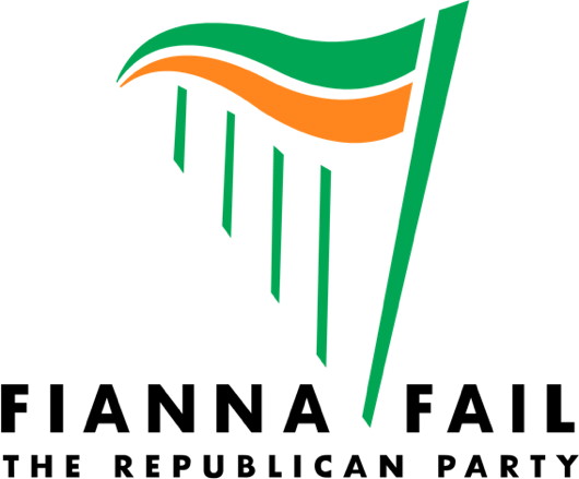
The case of the missing fada! (There should be an accute accent on the ‘a’ in Fáil. Despite having come first in every Irish election from 1932 until the most recent one, Fianna Fáil have tended to be a party of colour rather than iconography.
The harp logo (incorporating a green and orange banner) only dates from the 1990s but has already achieved a certain feeling of permanence. One wonders if it might be time for a new interpretation of it, however.
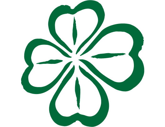
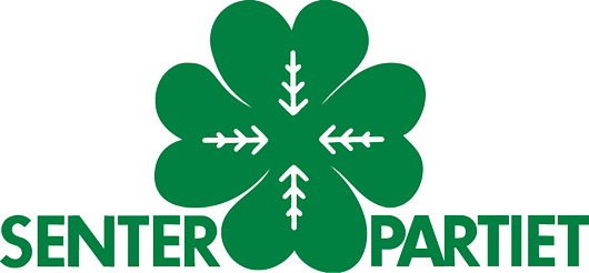
The Nordic tradition of agrarian or centre parties have all tended to use green as their colour and a four-leafed clover as their emblem. Above is that of Sweden’s Centerpartiet and below is Norway’s Senterpartiet. This is one of the traditions of political iconography I find most attractive.
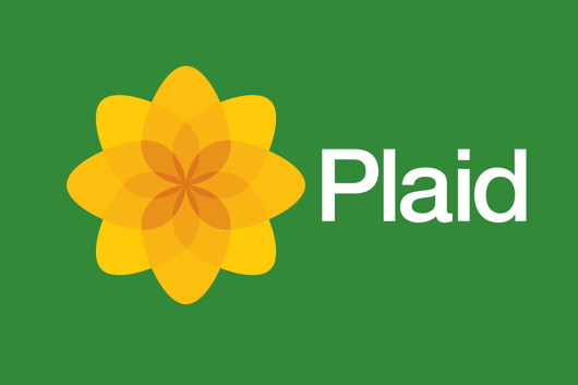
Plaid Cymru dumped their dragon-trapped-in-mountains logo for an infinitely more handsome floral emblem. This might be the best branding of any political party in Great Britain today. The SNP logo is simpler and arguably better but the Scottish party’s recent choices in typography leaves much to be desired. Plaid, however, get full marks.
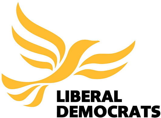
Which leaves us with the sad Lib-Dems, currently the junior partner in Britain’s governing coalition. I’ve always liked the ‘bird of liberty’ — sometimes nicnknamed ‘Libby’. For something designed in 1989, it’s held up surprisingly well.
Search
Instagram: @andcusack
Click here for my Instagram photos.Most Recent Posts
- Christ Church December 29, 2024
- A Christmas Gift from the Governor December 24, 2024
- Oude Kerk, Amsterdam December 24, 2024
- Gellner’s Prague December 19, 2024
- Monsieur Bayrou December 18, 2024
Most Recent Comments
Book Wishlist
Monthly Archives
Categories

Beware of peronists!
Profoundly boring, all of them. As, come to think of it, are the parties they represent.
A look back to the superb symbolism of both Right and Left in the twentieth century would be much more worth your while.
Great list! Far Right and Left are excluded. Residing on the former, I would have included the Lega Nord logo as a favorite, and the new BNP heart as an abject failure.
These are the arms of the main political parties in Malta:
The Nationalist Party
http://upload.wikimedia.org/wikipedia/mt/1/1c/Partit_Nazzjonalista_(Malta)_(Arma).jpg
The Labour Party
http://www.maltarightnow.com/content/images/711201010025pl_new_emblem.jpg
The Greens
http://www.alternattiva.org/mothership/wp-content/uploads/2012/04/AD_Emblem_2012_web.jpg
The most notable feature of the ALP (Australian Labor Party) logo is that it uses a defaced form of the national flag: the Union Jack, which ought to be in the top right quadrant, has been removed. This was first done by the party in 1995 when then PM Paul Keating launched the party’s quixotic campaign to abolish the monarchy.