
About Andrew Cusack
 Writer, web designer, etc.; born in New York; educated in Argentina, Scotland, and South Africa; now based in London.
 read more
News
Blogs
Reviews & Periodicals
Arts & Design
World
France
Mitteleuropa
Knickerbockers
Argentina
The Levant
Africa
Cape of Good Hope
Netherlands
Scandinavia
Québec
India
Muscovy
Germany
Academica
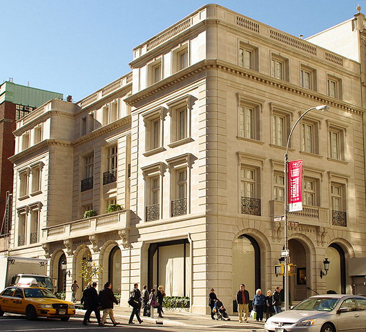
Reviving Manhattan’s Parisian Splendour
The new Ralph Lauren building at Madison & 72nd
“PRACTICALLY PERFECT in every way” was how the nanny Mary Poppins described herself in the Disney film, but fashion designer Ralph Lauren has given birth to an architectural grande dame on the Upper East Side that might justifiably make a similar claim. In this age of fashionable-today-dated-tomorrow starchitecture, the Bronx native has swum against the current and delivered for the people of New York a most welcome piece of architecture with his new store on the corner of Madison Avenue and 72nd Street.
Those familiar with the neighbourhood might be a bit confused: doesn’t Ralph Lauren already have a beautiful French chateau on that street corner? Worry not, the old Rhinelander mansion has not been demolished. Rather, its interior was recently given a ‘masculine makeover’ so shoppers can peruse and purchase any of Ralph Lauren’s men’s lines there.
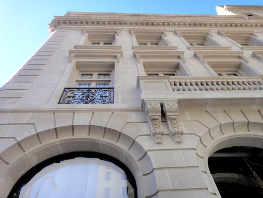
Across the street, meanwhile, with his new women’s store, Ralph Lauren has reinvigorated Manhattan’s faded glory with a new injection of Parisian splendour. The unremarkable “taxpayer” two-storey on the site was razed and a completely new four-storey structure has risen in its place. Two smaller wings flank the middle, which is recessed above the ground floor’s triumvirate of skilfully curved arches. The two central storeys above are topped by a more reserved attic, with the facade clad in American-sourced limestone throughout.
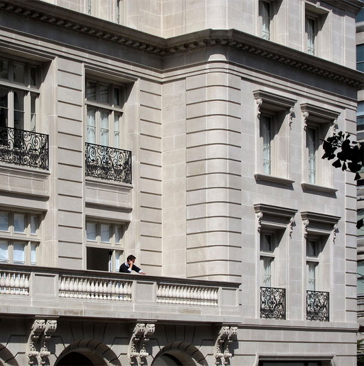
Often when clients are desirous or willing to choose a traditional design, they skimp on the actual materials and building costs resulting in a building that looks cheap and fake. Such results are then used by the hypermodernists as a stick with which to beat the traditionalists, citing poor execution as evidence of the inappropriateness of traditional style to contemporary architecture.
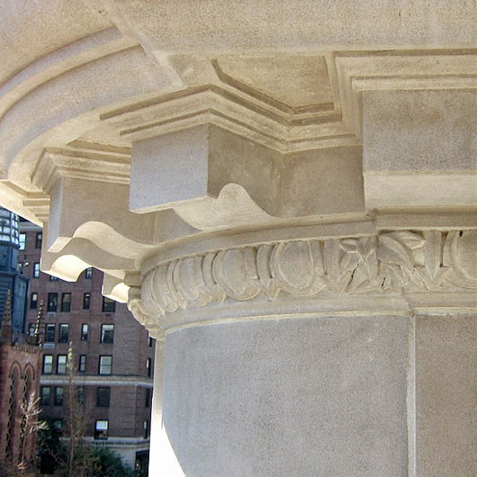
Here, however, the patron has clearly backed up his daring choice of style with the resources to see it done properly. The execution and detailing superbly match the quality of the design, and upon his visit to the building Mayor Bloomberg asserted “We can no longer say, ‘They don’t build them like this anymore’.”
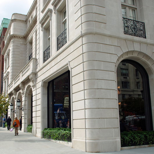
James Gardner, formerly the architectural critic for the defunct New York Sun, agreed with the mayor, writing that the new Ralph Lauren building is “something mightily substantial, as sturdy in its forms and structure as the Metropolitan Museum, the New York Public Library or City Hall”.
It is a canny and scrupulous re-enactment of the sort of Beaux Arts buildings of the turn of the last century, which themselves were imitations of the French high-classicism of such 17th-century architects as Le Vau and J.H. Mansart. And that architecture was itself, of course, a reinterpretation of ancient Greek and Roman models.
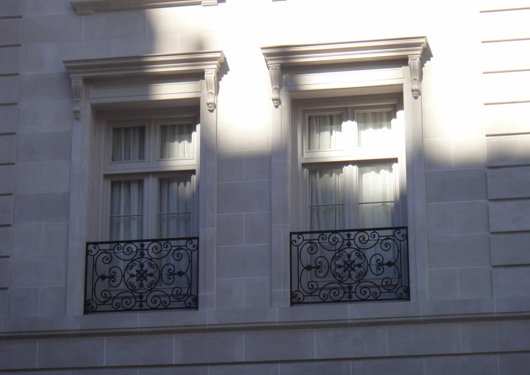
The irreplaceable Christopher Gray, meanwhile, describes the structure as “suave, exhilarating interpretation of a small 18th-century Paris palace”. Mr Gray relates further:
Such archaeological accuracy is rarely seen in New York architecture, and is often regarded with suspicion, viewed as silly or even subversive.
Indeed, when it was under review at the Landmarks Preservation Commission, neither the Friends of the Upper East Side Historic Districts nor the Historic Districts Council supported the application, considering the building imitative. That reflects the longtime preservation ideal that any new building should represent “our time,” usually by being modernist in style.
The second hint was a proposal two years ago to replace a forgettable 1966 facade at 12 East 72nd, which itself replaced the little 1890 Gothic-tinged castle. The new No. 12 was to match the limestone row houses from 14 to 20. There the Historic Districts Council said that it would be “false history,” since the original No. 12 looked nothing like the proposal.
The architect and critic Steven W. Semes has dared to challenge this notion, particularly with his 2009 book The Future of the Past: A Conservation Ethic for Architecture, Urbanism and Historic Preservation. He maintains that there is no reason to lock historic styles in the closet, that they are just as contemporary as anything else, just as the classical style was used in the Renaissance without a second thought. As far as Mr. Semes is concerned, there is nothing false about the new Ralph Lauren store — it is not a matter of making something stand out, but of making it fit in.
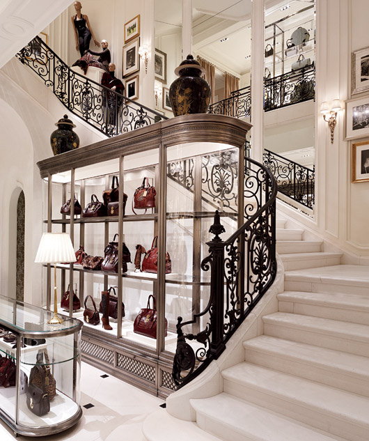
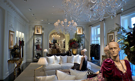
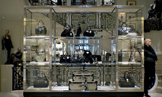
The building’s interiors were handled by the firm Wendle Gillmore, and have echoes of the partnership’s previous work for Ralph Lauren on the Avenue Montaigne in Paris.
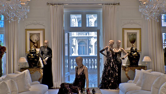
My above claim that the building is “practically perfect in every way” is a bit of appropriate hyperbole. While the overall project is deserving of immense praise, I must offer just some sparse criticism.
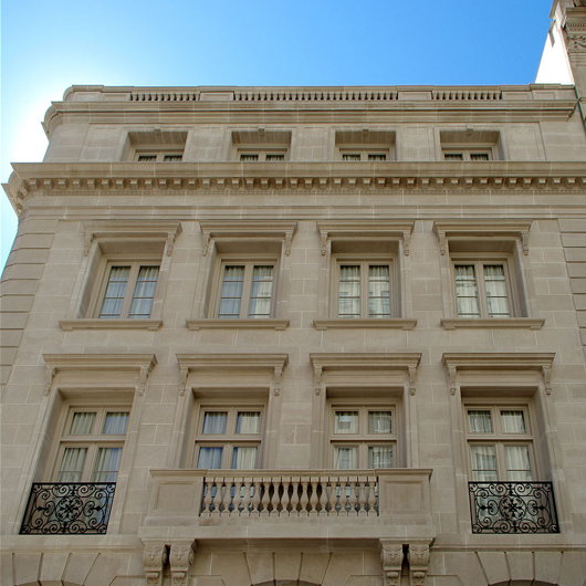
The balustrades, for example, have rather overdosed on balusters: there are far too many of them. Removing a third of them and spacing them further apart would be a welcome and easy improvement.
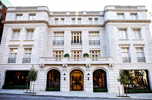
Furthermore, the attic seems a rather dull, flat end to a promising start. Some sort of sculptural adornment or varying of the strict horizontal would be a welcome addition to the building’s Madison Avenue facade.
These small criticisms aside, it’s difficult to restrain oneself from giving this building full marks all around. Would that we had more architectural patrons like Ralph Lauren – whether commercial or private – to demand traditional architecture and ensure it is realised properly.
Search
Instagram: @andcusack
Click here for my Instagram photos.Most Recent Posts
- Sag Harbor Cinema March 26, 2025
- Teutonic Takeover March 10, 2025
- Katalin Bánffy-Jelen, R.I.P. March 3, 2025
- Substack Cusackiensis March 3, 2025
- In the Courts of the Lord February 13, 2025
Most Recent Comments
Book Wishlist
Monthly Archives
Categories


I love it!!! I have to say I’ve always enjoyed Ralph Lauren’s classical taste and the way he kept that wonderful chateau across the street. This is actually a store I’d want to shop in. I wish there were more of that ilk going up on 5th avenue, well, I guess we’ll see what happens inside the former Disney store, which is a grand old building. Bravo Mr. Lauren!
About the balustrades:
I agree fewer balustrades would be more aesthetically pleasing. Unfortunately(in the aesthetic sense), building codes force the architect to put them that close together.
I’ve been waiting to hear your take on this building!
A mansard roof might have been the 18th century French finish. But it is a very pleasing building just the same.
James Richardson, and to an extent Andrew: I see the critical appraisal of this building approaching it from a French angle. I, however think it belongs more to school of late 19th century Italian neoclassicism. One merely has to look at a picture of Milan or Turin to see its relatives.
I didn’t mean to suggest that a Manhattan building should be *that* French. The building as it stands (minus the balustrades) would be perfect on the Pall Mall also.
That was not a cheap undertaking
Dear Mr. Cusack: I’m thinking you might be capable of putting up,in your customary sophisticated and cosmopolitain manner, a post that would address the matter of the wheels coming off the western financial system. You probably see all this commotion in a way from which your readers who follow such things could begin to make some other and fresher inferences. Yours, S. Petersen