About Andrew Cusack
 Writer, web designer, etc.; born in New York; educated in Argentina, Scotland, and South Africa; now based in London.
 read more
News
Blogs
Reviews & Periodicals
Arts & Design
World
France
Mitteleuropa
Knickerbockers
Argentina
The Levant
Africa
Cape of Good Hope
Netherlands
Scandinavia
Québec
India
Muscovy
Germany
Academica
A Little Update
Haven gone a whole month without blogging, I give you the newly renovated andrewcusack.com. Doubtless you are opposed to all change and are disappointed that the whiff of innovation has entered these sacred realms. Nevermind: you’ll recover soon enough. If you see something that doesn’t work, do drop me a line.
Since the dawn of time, I have designed this blog myself, being generally dissatisfied with the blog ‘themes’ (as they are styled) created by others. In November 2009 we updated to a theme I named ‘Goteborg’, while in February 2010 Goteborg was replaced by a new design I christened ‘Elsenburg’. Elsenburg was mildly altered and renamed ‘Rouwkoop’ in May 2010.
The current WordPress theme we are employing is another of my creations and I have named it ‘Roskilde’.
Search
Instagram: @andcusack
Click here for my Instagram photos.Most Recent Posts
- Sag Harbor Cinema March 26, 2025
- Teutonic Takeover March 10, 2025
- Katalin Bánffy-Jelen, R.I.P. March 3, 2025
- Substack Cusackiensis March 3, 2025
- In the Courts of the Lord February 13, 2025
Most Recent Comments
Book Wishlist
Monthly Archives
Categories


Oh, very nice! A bit too light(It kind of hurts my eyes) but otherwise excellent design.
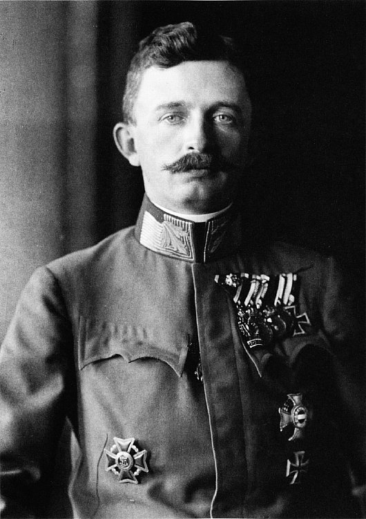
I say, what has happened to Bl. Charles?
Andrew …
I have a long history with the Web (hand-coded my first web site in 1995, as you know). In terms of aesthetics and look-and-feel (not to even mention content), your web log is the best I have come across in all my years on the Internet. I recommend it to other colleagues in IT as an example of good taste.
Every day, a couple of times a day, it is a routine for me to peruse the Web … mostly sources of news, from around the world. We share many of the same sources. And Andrewcusack.com is always up there with all these other professional sites. You always occupy a position in my top five.
Like anyone, I get attached to a familiar theme and motif … and it takes time to shake out the curmudgeonly stuck-in-the-mudness. But my immediate impression is that this new look is a little less cluttered, and that is a always a good thing. And I like the light and the white.
Carry on!
This incessant striving for novelty will be the death of you Mr Cusack!