About Andrew Cusack
 Writer, web designer, etc.; born in New York; educated in Argentina, Scotland, and South Africa; now based in London.
 read more
News
Blogs
Reviews & Periodicals
Arts & Design
World
France
Mitteleuropa
Knickerbockers
Argentina
The Levant
Africa
Cape of Good Hope
Netherlands
Scandinavia
Québec
India
Muscovy
Germany
Academica
Carbuncle Alert in Queens

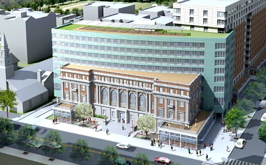
Our carbuncle alarm, which went haywire over the Brooklyn Museum’s offensive new entrance, has alerted us to a new monstrosity nearing completion in the adjacent borough.

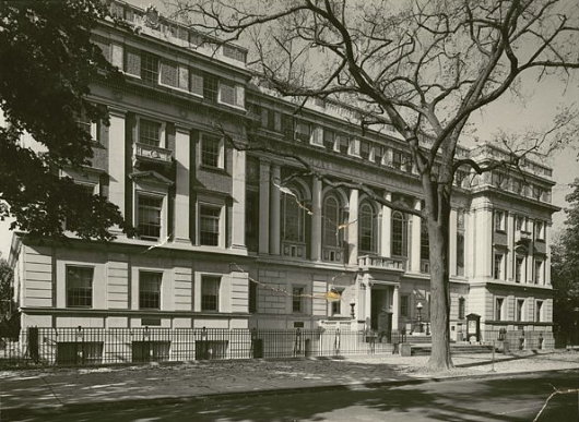
The former Queens Borough Public Library is being turned into Moda, ‘the most modern, fashionable place to live in the heart of vibrant Jamaica, Queens’. The building first went up in 1930 as the main building of the Queens Borough Public Library, a handsome structure in a classical style which was renovated and added on to in the 1960s to become the Queens County Family Court. (Queens Borough and Queens County are contiguous).

In addition to the small branch library and commercial retail space in the building, Moda will offer the residents of its mixed-income apartments a concierge service, a rooftop deck, fitness center, 24-hour indoor parking, “charming” parquet floors, and hopefully an unabated sense of shame for having ruined a perfectly decent building.

I’ve seen worse additions (like the Royal Ontario Museum), but it still is pretty awful. Curbed describes it as ‘a glassy flesh-eating bacteria swallowing an old building whole’.

Search
Instagram: @andcusack
Click here for my Instagram photos.Most Recent Posts
- Sag Harbor Cinema March 26, 2025
- Teutonic Takeover March 10, 2025
- Katalin Bánffy-Jelen, R.I.P. March 3, 2025
- Substack Cusackiensis March 3, 2025
- In the Courts of the Lord February 13, 2025
Most Recent Comments
Book Wishlist
Monthly Archives
Categories


Ah! You beat me to it. The scaffolding just came down this week and I took photos, but haven’t yet put them up on my blog. It’s a cut-rate Renzo Piano.
The buildings immense size and blockiness is also offensive.
It’s about 15 minutes or so walking from my house to my office. This building is right in the middle (and cater-corner from the Church of my territorial parish.
They also had a launch party on their roof this afternoon, which we could see from the windows of our office.
On the plus side (for me anyways), they’re planning a supermarket for the first floor and it’ll be conveniently on my way home from work.
That looks bad. I could have imagined at least a dozen different ways to have an equally modern looking expansion that didn’t look like it was trying to swallow the poor thing whole.
Well, at least they didn’t demolish it. It was the 60s, after all.
Huh, it’s the same aliens that landed on Soldier Field.
Bloody awful. I hope they blew lots of vuvuzelas during the grand opening to make the artistic picture complete.
As Bill Bryson distinctly put it about another architectural abomination elsewhere;”It was obviously designed by a graduate of the F… You School of Architecture.”
Ag, siestog nee man! Wat verskrikkelik kak !
At least its GREEN and will stay green. Its a breath of fresh air compared to aging Brutalist cement of a half century ago. Besides, if you duck your head and wear a duck-bill cap you can go in and out of the classic bit of Queens architecture and avoid seeing it entirely.
It reminds me of what they did to St Ann’s Church in the East Village. Keep the antique facade and put something behind it that clashes terribly. They could have made the back look like a continuation, maybe using brick that matched, but no, they had to choose something that clashes so badly it dominates.
Somehow fitting in a culture with a greater commitment to reality television than to literature that this grand, old library should be “swallowed up”.
It speaks volumes.
Anyone who calls a glorified block of flats “Moda” should be summarily executed.
I have just encountered this building in person. It is, perhaps unsurprisingly, worse than the renders depicted it, and the overall effect is one of cheapness. It does not so much look like the old library is being swallowed by the apartment block as it appears to be in the midst of bursting out of its glass-and-aluminum prison.