
About Andrew Cusack
 Writer, web designer, etc.; born in New York; educated in Argentina, Scotland, and South Africa; now based in London.
 read more
News
Blogs
Reviews & Periodicals
Arts & Design
World
France
Mitteleuropa
Knickerbockers
Argentina
The Levant
Africa
Cape of Good Hope
Netherlands
Scandinavia
Québec
India
Muscovy
Germany
Academica
The new look of things
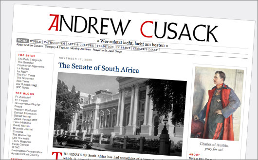
Bienvenue, baie welkom, and whatnot to the latest version of andrewcusack.com. Changes here are usually quite slow and evolutionary, but I got bitten by the redesign bug and this latest incarnation of our little corner of the web is what I came up with. There might be some kinks yet to be worked out with it, as time will shortly tell. The new WordPress theme I have designed, for those who are interested in such mundane things, is named “Göteborg” (the previous one I rather boringly named “ALPHA”), and there are few (though we hate the word) “improvements” perhaps worth mentioning.
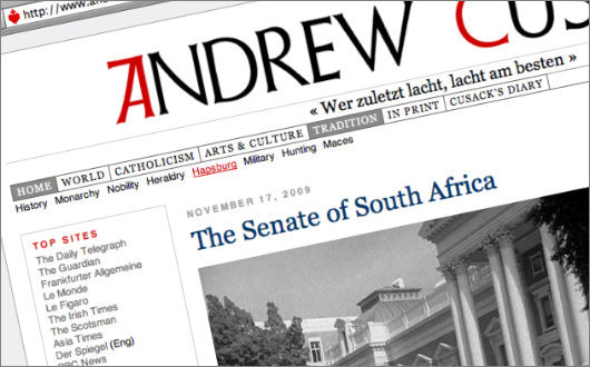
The first is the navigation bar at the top, which is not exactly as it should be, but better than before. Some reader once mentioned that he didn’t like that the categories were no longer accessible from the menu bar as they had been many moons ago, when there were very few categories and they were very random at that. Well I have completely reorganised the categories, and herded them into mega-categories, which you can see in the menu. ‘World’ contains geographical categories; ‘Catholicism’ is slightly misnamed, as almost anything Christian-related is chucked in there; ‘Arts & Culture’ gives a few subcategories, the ‘Art’ one being painting, more or less; and so on and so forth.
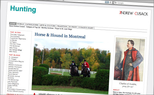
The category indexes themselves have been redesigned, in a very simple, striking, but I hope not too modern style. I might fiddle around with these a bit more.
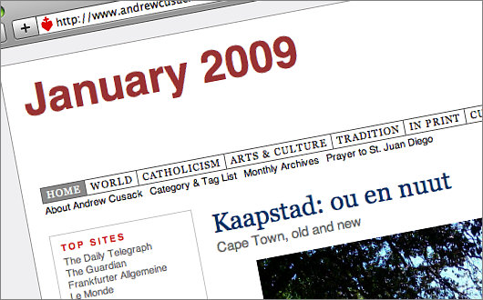
Monthly archives have also been redesigned along the same lines.
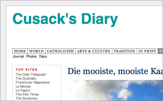
One new category is ‘Cusack’s Diary’. This includes ‘Journal’ entries, which are posts enunciating random thoughts, or telling tales of Cusackian life, ‘Photos’ indexing personal photo-based entries, and ‘Diary’, which is Cusack’s Diary proper, namely the so-far-only five diaries in that particular style.
Any thoughts on the new look of things?
Search
Instagram: @andcusack
Click here for my Instagram photos.Most Recent Posts
- Sag Harbor Cinema March 26, 2025
- Teutonic Takeover March 10, 2025
- Katalin Bánffy-Jelen, R.I.P. March 3, 2025
- Substack Cusackiensis March 3, 2025
- In the Courts of the Lord February 13, 2025
Most Recent Comments
Book Wishlist
Monthly Archives
Categories

Very nice. I’ve been looking for something similar. Did you start with a known theme and modify it, or build it from scratch yourself?
I built it from scratch, so to speak.
Put back the guy reading the paper. That element encompassed much of the theme of the site, and now it’s gone. Now it’s just your name.
Ya see, this is why it’s so hard to maintain tradition–even those beholden to it get the itch to start tinkering. “Well, that’s been there for a long time, we should try something new…” Granted this isn’t the Eucharist, but it is perhaps analogous to when the Wall Street Journal moved Pepper and Salt.
I think the new design is a change for the better (started to type “improvement” but caught myself in time). But yes, the guy reading the paper was part of your site’s tradition. And moving Pepper…and Salt from its former place of prominence is a great loss to Journal readers. You always need a magnifying glass for the poor tiny toons that cling to their banished life in the Journal’s back pages.
If this were Facebook I would give a thumbs-up.
Also count me in favor of the little guy reading the paper.
I hate to think that rampant participatory democracy has broken out on an ubermonarchist’s site, but it does appear our paper reading digbat has been restored.
Welcome back. Faster than I had feared.
Re: the revamp – I like it. The navigation bar at the top is a good idea.
Thank you for restoring the guy reading the paper.