
About Andrew Cusack
 Writer, web designer, etc.; born in New York; educated in Argentina, Scotland, and South Africa; now based in London.
 read more
News
Blogs
Reviews & Periodicals
Arts & Design
World
France
Mitteleuropa
Knickerbockers
Argentina
The Levant
Africa
Cape of Good Hope
Netherlands
Scandinavia
Québec
India
Muscovy
Germany
Academica
The Edificio Metrópolis, Madrid
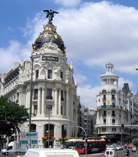
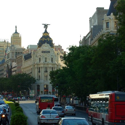
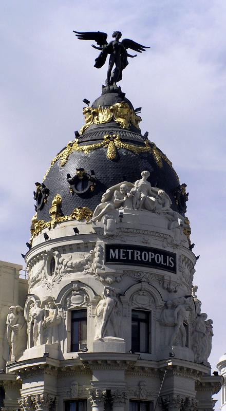
WHERE THE GRAN VÍA meets up with the Calle Alcalá in Madrid, there is a wonderful building which these days is known as the edificio Metrópolis. Designed by Jules and Raymond Février of France, it was built in 1911 for the Union and Fénix insurance company. The architects took advantage of the awkward but prominent site to create a landmark building for the company, one of the largest insurance firms in Spain. At the apex of its triangular site is a splendidly decorated round tower, originally topped by the Union and Fénix symbol of a phoenix with Ganymede.
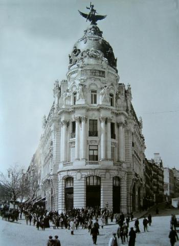
An early view of the building.
Rising from a relatively plain ground floor, the sculpture and ornamentation increases towards its centerpiece at the tower’s fourth level and above. Allegorical statues of Commerce, Agriculture, Industry, and Mining adorn the façade.
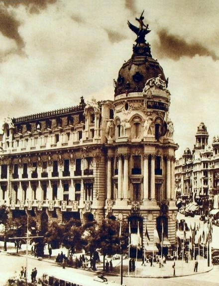
In the 1970s, the Union and Fénix company sparked controversy among Madrileños when it sold the building to Metrópolis Seguros, another insurance firm, taking the phoenix statue with them to their new headquarters. Metrópolis replaced the nameplate of the old company with a very smartly done version of their own.
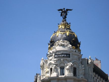
With the absence of the phoenix keenly felt, Metrópolis commissioned Federico Coullaut-Valera, the son of legendary sculptor Lorenzo Coullaut Valera and an accomplished sculptor in his own right, to create a winged Victory, installed in 1975. If you take the Gran Vía to its western end, you will reach the Plaza de España, where the elder Coullaut-Valera’s Monument to Cervantes, with its representation of Don Quixote and Sancho Panza, was later joined, in 1957, by the son’s sculpture of Dulcinea.
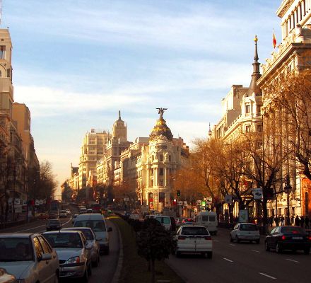
The afternoon sun illuminates the buildings on one side of the Gran Vía, which had been renamed “the Avenue of the Soviet Union” during the brief years of the socialist republic before the liberation of Madrid.
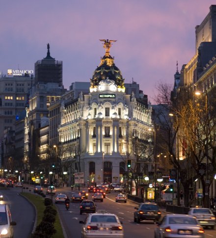
Beginning at dusk, the building is artificially illuminated…
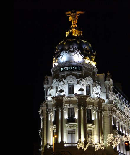
…which continues through the night…
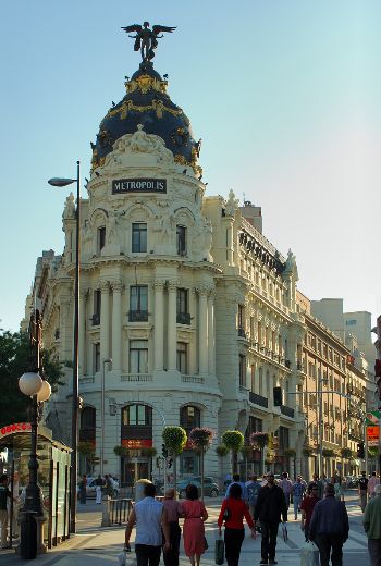
…until the sun’s rays greet it the following morning.
Except for its street plan, the surrounding neighborhood looks quite like how Manhattan once looked, from beautiful earlier beaux-arts structures like the edificio Metrópolis to later art deco movie palaces and skyscrapers like the edificio Telefónica. Disappointingly, the confluence of continued prosperity and emerging tastelessness led to the destruction of most of New York’s handsome structures from the period. More happily, higher architectural tastes were preserved under Franco’s rule, and many of the fine buildings from that period were explored in detail in “The Other Modern: The Traditional City and its Architecture in the Twentieth Century”, an exhibit (with 520-page impossible to find catalogue) at the International Triennale of Architecture and Urbanism held in Bologna in 2000.
Search
Instagram: @andcusack
Click here for my Instagram photos.Most Recent Posts
- Gellner’s Prague December 19, 2024
- Monsieur Bayrou December 18, 2024
- Dempsey Heiner, Art Critic December 17, 2024
- Vote AR December 16, 2024
- Articles of Note: 12 December 2024 December 12, 2024
Most Recent Comments
Book Wishlist
Monthly Archives
Categories


Wonderful Post !!
Thank you for another enlightening post on traditional architecture. Where were you able to procure the impossible-to-find catalogue you mention (any tip-off is appreciated)?
I was not able to procure the impossible-to-find catalogue, much to my consternation.
Hmmm. Well, I shall seek this out using a few avenues and let you know what I discover!
Thanks for the illuminating post. I admire the Edifico Metropolis, but only to a point. The lofty facade, in spite of the skillful design, disappoints the cultivated observer when he remembers the interior is devoted to the insurance business. An allegory of victory has no place here, as it would in the classic buildings of Rome and Greece. The other contrivances of design and conception are too numerous to name. Consequently, I do not believe such pedestrian business activities deserve the use of the epic strain employed by the edifico. This is the same “false monumentalism” which constitutes the chief flaw of Grand Central Station in New York City. As a supporter of classical design, I prefer such buildings to the alternative in the contemporary city. At the same time, I vigilantly remind myself that such buildings don’t represent the heights of human achievement.
I’m rather more of a simpleton. It’s a pretty building, so I like it!
Besides, if I owned an insurance company, for example, I think it would be a good and admirable thing to erect beautiful buildings for my workers to toil in, and to project an outward beauty that aids the overall composition of the city.
Found said catalogue in the New York Public Library at 42nd Street, call number JQG 02-562, under the title L’altra modernità 1900-2000.
Happy reading!
Andrew wrote:
“Besides, if I owned an insurance company, for example, I think it would be a good and admirable thing to erect beautiful buildings for my workers to toil in, and to project an outward beauty that aids the overall composition of the city.”
Do not suppose I am arguing against the generous distribution of beauty. Rather I think the Edifico’s beauty is spoiled by a lack of modesty. Were the same insurance business relocated to Florence, a city that everyone knows to be the superior of Madrid, it would occupy one of those attractive but frugal structures that yield the monumental effects to buidlings elsewhere in the city of far greater civic and spiritual importance.
This is becoming a fascinating thread.
“Were the same insurance business relocated to Florence, a city that everyone knows to be the superior of Madrid, it would occupy one of those attractive but frugal structures that yield the monumental effects to buidlings elsewhere in the city of far greater civic and spiritual importance.”
I believe there are two ways of seeing this building: as a stand-alone piece of architecture (a stance through which architects usually collect their plaudits and occasionally wreaths of laurel, if the design is a good one) and as an element within a larger composition (which is the view that ultimately concerns urban designers and planners). It seems that in your first comment you critique the building for ideological reasons (i.e. it’s an insurance firm, lose the statuary), but in the second comment you conclude that the design of the building is a matter of context (i.e. if it were in Florence, they wouldn’t have had the gall to build such a wedding cake design).
Given the other building designs in this area of Madrid from that period, I’m inclined to believe that the design of this building was influenced by its context just as the structures in Florence are influenced by their context. (Other examples would include Bordeaux, Edinburgh, and 19th-century Barcelona).
Anyway, many writers of popular books on architecture and planning (Stewart Brand, Jane Jacobs) have reminded readers of the fact that buildings often outlive their original uses. And I must disagree with you about the idea of “false monumentalism”; Grand Central Station is one of the jewels of New York and is a true civic space. Even if the architects had originally intended to glorify the commercial tenant that commissioned the design, there’s no reason to believe that a well-designed structure would not find another use later in its lifetime, or that a bit of baroque architectural folly and visual delight wouldn’t lead the odd pedestrian to seek spiritual uplift. Must it always be serious to be good?
Amazing post & blog!
Great post and very nice pictures.
Regards
Thank you very much: I was looking for some pictures about “el edificio Metropolis” for a post I published today :-))
I did not know the story, but, at least, I managed to explain what’s between Calle Alcalá and Gran vía in my beloved Madrid :-))
Thanks a lot,
Paquito.
Nice article & great shots