
About Andrew Cusack
 Writer, web designer, etc.; born in New York; educated in Argentina, Scotland, and South Africa; now based in London.
 read more
News
Blogs
Reviews & Periodicals
Arts & Design
World
France
Mitteleuropa
Knickerbockers
Argentina
The Levant
Africa
Cape of Good Hope
Netherlands
Scandinavia
Québec
India
Muscovy
Germany
Academica
The Greatest Building Never Built

LUTYENS’ SCHEME FOR the Metropolitan Cathedral of Christ the King, Liverpool is oft hailed as the greatest building to never have been built. Strictly speaking, this is not accurate, as the building was structurally finished, although not completely decorated, up to the crypt level. Nonetheless, had it been finished, the cathedral almost certainly would have been considered Sir Edwin Lutyens’ greatest work; though his hand (with Herbert Baker) in building the Indian capital of New Delhi, including the monumental Viceregal Palace, would certainly vie for the title.

The Great Model of Liverpool Metropolitan Cathedral by Sir Edwin Lutyens as presented at the Royal Academy in London.
The cathedral, seat of the Roman Catholic Archdiocese of Liverpool, would have been a massive 530 ft long, larger than any other cathedral in England. The ceiling of the nave would reach 138 ft from the floor, while a great dome, 168 ft in diameter and 300 ft high would crown the church. Aside from the high altar, which would be twelve feet above the floor of the nave, fifty-three side altars would be located down the nave, along the aisles, and in the transepts and apse. The cathedral’s dome would have been larger than St. Peter’s. The entrance arch on the west portal would have been able to contain the tower of Liverpool University. At 520 ft, the cathedral’s height would overpower the nearby Anglican cathedral, itself 330 ft tall. Somewhat ironically, the design of Liverpool’s Catholic cathedral was by Lutyens, an Anglican, while the modern gothic of the city’s contemporary Anglican cathedral, was designed by Gilbert Scott, a Catholic.

A visualization (not-to-scale) of Lutyens’s Catholic cathedral on the right foreground, with Gilbert Scott’s Anglican cathedral in the left background.
The construction of the cathedral was paid for mostly by the contributions of the multitude of working-class Catholics of the burgeoning industrial port. The foundation stones were lain on Whit Monday, June 5, 1933, amidst the great worldwide depression. Contrary to popular belief, work did not cease for want of money; the contributions of the faithful, both rich and poor, continued to flow towards the building of the great cathedral which, on the suggestion of Pope Pius IX, was to be dedicated to Christ the King. Work continued, even after the start of the Second World War, until 1941 when the growing restrictions of wartime finally meant that construction had to cease.

The crypt, seen here, is the only part of the cathedral completed to Lutyens’s design.
While 1945 brought victory over Germany, it also heralded the advent of socialism in Britain, as wartime restrictions continued into the peace, and the power of the state over society increased. With a sullen economy and what seemed like perpetual austerity, the cost of beginning again work towards Lutyens’s grandiose design was evaluated to cost £27,000,000. Upon ascending to the archiepiscopal throne of Liverpool in 1953, Dr. William Godfrey decided that in order for the cathedral to be completed, it would have to be scaled down. Archbishop Godrey chose Adrian Gilbert Scott, of the Catholic family of architects, to reduce Lutyens’ proportions to a more suitable plan. Nonetheless, work never restarted, though in 1960 it was decided to hold an architectural competition to choose a new design for the cathedral atop Lutyens’ crypt. The ugly, concrete modernist design of an upturned funnel by Sir Frederick Gibberd was the winner. Commemorating the many Irish laborers among the swarms of Liverpool Catholics, it was genially nicknamed “Paddy’s Wigwam”.
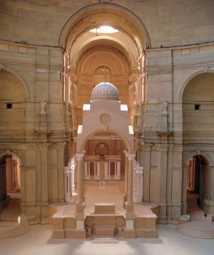
While the plan was discarded, the Great Model of the Lutyens design, seen in the previous photograph on exhibition at the Royal Academy, survived, though in an increasingly poor condition. A recent government grant went towards restoring the Great Model to its former glory, and it will be shown at the Walker Art Gallery, Liverpool as the centerpiece of an exhibit entitled ‘The Cathedral That Never Was: Lutyens’ Design for Liverpool’ from January 27 to April 22 of 2007. Above, and onwards, are a number of photographs of the restored model.
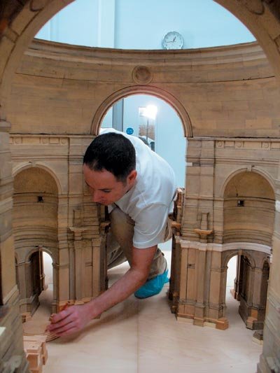
A restorer finishes a detail on the high altar.
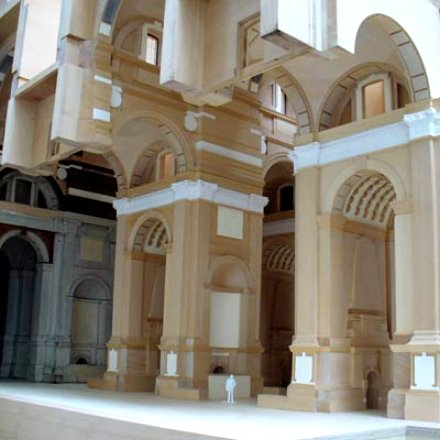
A cross-section of the nave.
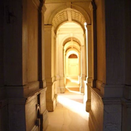
A view of a side aisle.

Details on the exterior of the model.
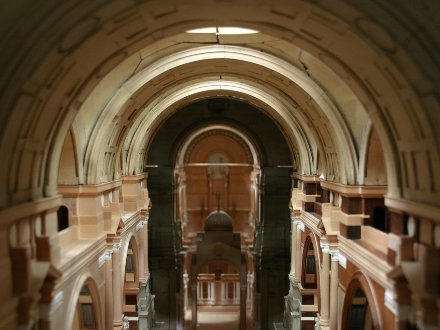
The vaulted ceiling of the nave.

The high altar, with chancel behind.
Via the Shrine of the Holy Whapping
Search
Instagram: @andcusack
Click here for my Instagram photos.Most Recent Posts
- Faithful Shepherd of the Falklands April 8, 2025
- Articles of Note: 8 April 2025 April 8, 2025
- Proportionality Destroys Representation April 8, 2025
- Sag Harbor Cinema March 26, 2025
- Teutonic Takeover March 10, 2025
Most Recent Comments
Book Wishlist
Monthly Archives
Categories


Lord have mercy. Andrew, i think you should add a link to a photograph of the cathedral poor liverpoolians (?) have to live with. How unfortunate. very interesting though.
Liverpudlians.
And the Cathedral from outer space.
Magnificent design. Too bad we must settle for a model… And to think that ugly tee-pee is what Liverpudlians have gotten stuck with. (I remember seeing it when I visited Liverpool. Oh!, the horror!)
In my opinion, however, the greatest building never built (or, more accurately, never completed) is Gaudi’s Sagrada Familia in Barcelona. Thankfully, devoted artists, artisans and architects continue to work on it. As Gaudi intended, each generation of worker has put his personal touch into it – and this is perhaps most notable by comparing the classical Nativity Facade completed by Gaudi himself with the cubist Passion Facade. It continues to ‘grow’ organically, although constantly guided by Gaudi’s vision.
If there’s any building I’d like to see completed, it’s the Sagrada Familia.
At least they’re still working on Sagrada Familia. They gave up on this.
Did Lutyens design this after his work in India? It would look more at home there than some of the things he built in Delhi. Sort of reminds me of an Indian fortress.
Good post. I’d heard about this but had never seen it.
I’ve read many articles on Lutyen’s Liverpool cathedral, but never previously have I seen what was actually built in lieu of his design. It’s just terrible, isn’t it? You say that this monstrosity won a design competition. I’d really love to know who the judge of the competition was. The archbishop? Some committee? A drunkard? It really is amazing just how often this bizarre flying saucer look seemed to surface in the sixties. And in all sorts of buildings. Look at the Toronto city hall. Or almost any ballpark built in that decade. If it hadn’t had such tragic results on our urban landscapes, it would actually be quite funny. You look at these ghastly structures and you can see that the architects of the period thought they were right out there on the cutting edge. They would have been put to better use designing rides for something with a name like Futurama at Disneyland.
Fascinating post, Andrew.
Indeed, the existing sci-fi tee-pee is bizarre! What in the world do they teach at architectural schools?
I’d have to agree with Jeffrey Smith that Lutyen’s design, handsome as it is, does in fact resemble an Indian fortress.
Many thanks for another fine post!
If we’re going to call Liverpoolians Liverpudlians, shouldn’t we say that the foundations stones were laid on Whit Monday (from which time they have lain undisturbed)?
Nice post, nevertheless.
Regarding KD’s question, very little is taught in architecture schools today, besides the One Great Dogma that traditional architecture is verboten.
Considering how depressing much of Liverpool is, I think Gibberd’s Cathedral adds a welcome touch of whimsy to that otherwise bleak and colorless Lancashire skyline. Presumably the upturned funnel effect is designed to escort the prayers and hymns of the faithful upwards to Heaven rather like smoke rising through a chimney.
Having visited Gibberd’s cathedral, may I suggest that your readers search for more photos than the one you posted? Particularly ones of the interior and the new processional entrance.
I suspect that Gibberd’s ‘in the round’ design probably serves the modern services better than Lutyen’s would. It is a building that appears designed for it’s interior space and the needs of it’s users, rather than for an external wow factor (although to my mind it does have that).
I have to agree that the Catholic Cathedral of Christ the King in Liverpool is more impressive from the inside than out. The lantern (not an upturned funnel) is stained glass in large, vivid panes. The internal colour and ambience change with the light. Obviously would have prefered the Lutyens building but there you go.
Actually, the interior design often reminds me of the sculpture within the Passion Facade of the Sagrada Familia (or rather, vice versa).
And it is Liverpudlians. And Liverpool is in Merseyside, not Lancashire.
Nice site.
Just come back from a concert in the crypt (the only bit of the Lutyens cathderal to be built). In the interval, I was reading all the cathedral memorabilia about the history of the building of the cathedral.
I am trying to find out the name of the person who was runner up in the design competition. I have forgotten what it said now, and will be able to check at the next concert in March. However, I have to say if you don’t like the horrible pointy thing (which really is called Paddy’s Wigwam by Liverpudlians) then you willprobably HATE the runner up, if you don’t fall allover the floor laughing. SO much a design of its Jetson period, it looks like a cluster of spaceships about to take off. The third was a very boring 1960s glass wall thing, somehow reminding me of Coventry cathedral, which I hate.
Well, if it wasn’to be the Supercathedral, then the Gibbert at least stands out on the horizon. Oh and the accoustics arte HORRIBLE inside the main bit – useless for concerts, and the seats are especially designed to guarantee backache.
Karen,
Liverpool is in Lancashire (Merseyside was abolished some years ago). Besides, whenever the Loyal Toast is proposed, Liverpolitans traditionally say “The Queen, Duke of Lancaster”.
Just picked up your blog through a comment left on mine. Having seen Liverpool Anglican Cathedral, I thought it magnificent in its sparse, gigantic Gothic style. Maybe Gothic isn’t popular at the moment?
Ooops! Got confused with t’other cathedral. Actually, I still prefer that one to Lutyens’, never being much of a fan of Classical myself (unless it is used for real classical buildings, in ancient Greece and to a certain extent, ancient Rome).
wonderful model, which is now exhibitioned at the liverpool walker art gallery, i never knew about this and it was a good insight to what could of been, been an architecture student i learned a few things from it.
I have one word only for Paddy’s Wigwam: disgraceful.
Liverpool is in Merseyside, I should know, I live there. Plus the Wigwam is home to the largest stained glass window in the world.
@AZ God knows where you got your info from but you are wrong on both counts. Liverpool IS in Merseyside. Lancashire was broken up in the 70s to create the Metropolitan counties Merseyside and Greater Manchester with the remaining area staying in Lancashire.
No-one has EVER used the term Liverpolitans.
The Catholic Churchs’ brief for the Cathedral was to reflect a new wave of inclusiveness in Catholic thinking that had been rubber stamped by the Pope. This may be why other designs where also of a ‘futurist’ design. Its why the Cathedral is round for instance which is inclusive for a congregation almost by default.
It must also be said that the architect directly took ,and reflected well, his inspiration which was the ‘crown of thorns’ given to Jesus at the crucifixion. Hence the sharp barbs that the structure shows.
Out of the two I think there is no decision to be made & we can all agree Lutyens design would have been the wonderous but it must be said the people of Liverpool are not as agrieved with Gibberds Cathedral as your ‘out of town’ posters seem to think we should be.
Lancashire was not broken up, but rather administrative districts were created that were different from the traditional county boundaries. Nonetheless, legislation specifically stated that the traditional county boundaries would not change. I tried to address some of this in County Confusion.
Liverpool is in the ancient county of Lancashire but everybody who lives there knows that it is now Merseyside.
As to the cathedral it’s pretty cool. I like it lots and it’s generally looked upon fondly by fellow scousers.
The Luytens design is magnificent but i’m glad we’ve got Paddy’s Wigwam
Barbara.
You posted comments in February 2007.
I can tell you the name of the architect who was the runner up in 1963. It was Claude Bailey.
His design was designed around the same period as Utzon’s Sydney Opera House and is from the genre. I believe it to be equally as elegant a design as the admirable building and it is interesting that the Sydney Opera house is one of the iconic buildings of the 20th Century (even tough it too is Jetson like..as you put it). Also I would refer you to a much praised and awarded design of the Bahai Temple in New Delhi by Fariborz Sahba though this was designed 20 years later as is astonishingly similiar (no comment) though dumpier than Bailey’s entry for the Liverpool Metropolitan Cathedral competition. Sahba’s building which is even more akin to Bailey’s design is also regarded with much admiration as one of the seminal structures of the 20th Century (again Jetson like). The are many other examples of “shell concrete” around the world which are much admired such as those of Oscar Niemeyer in Bazilia and elsewhere.
The description Bailey’s design is basically as series of dramatically rising shell concrete petals overlapping at two levels and enclosing what is in effect a slender glass steeple rising 300 feet. At the foot of each petal structure was one of twelve glass fronted chapels each with an internal paraboloidal ceiling which in turn opened out on a great circular space composed of large concentric circular terraces stepping down auditorium like to the central altar. From within one would have looked up at the inside of the glass spire 300 feet high surrounded by enormous conical vaulted shell comprised of the inside of the concave concrete petals each rising to a point. Each of these petals met at the top to create a jagged edge from which the glass steeple would emerge, like a flower. Inside the central cone suspended some 100 feet up would have been an internal lattice vault through which the coloured light from the steeple would have been diffused across the auditorium in a most dramatic way.
It is important to note that at the time this competition was being judged Utzon’s shell concrete design for the Sydney Opera House had encountered much publicised great engineering issues, which Ove Arup fixed with the compromise design we see today. No such engineering issues existed for Bailey’scheme as it had been designed cogniscent of the issues encountered by Utzon. However, perception is everything and the design which was favoured aesthetically by the panel, came second because it was felt it could not be built. A cruel irony indeed for Liverpool which could have homed a building to rival that which Sydney has. Ironically 20 years later the construction of the Bahai Temple in Delhi proved the panel to be incorrect in their premise, and illustrated that indeed such a building could be built. Truely Liverpool is now the site of two of the greatest buildings that were never built.
Fascinating discussion. But forgive me everyone if I venture a shocking opinion. Considered as monumental follies I love both the Scott and the Lutyens designs. I love follies, especially big ones, so I think that both deserve to exist for this reason alone.
But as practical Diocesan buildings I think they’re gargantuan nightmares! I would not like to be the Dean of either. Would You?
Gibberd’s replacement for the Lutyens design (Paddy’s Wigwam)is of course far more practical, a veritable machine for worshipping in, and is saved from excessive clinical coldness by an arresting shape and dramatic, almost ‘psychedelic’, manipulation of light. But too much is going on behind the altar – the theatre-in-the-round approach did not succeed in creating a restful focal point in the sanctuary.
Brentwood seems to me to be a bizarre cross between the ‘modernist’ planning of Maguire and Murray’s famous St Paul’s, Bow Common, and a rather non-conformist-looking essay in 18th century classicism. An interesting hybrid, but i’d rather have Bow Common, thanks. Which, unlike Brentwood, even has a baldacchino!
Middlesbrough, from what I’ve seen of it, seems to be a building that is a little too desperate to fit into a modern housing estate without being noticed! This may be grossly unjust, but looking at the pictures does not make me want to put it on my ‘must see’ list.
Neither Maufe’s Guildford nor Spence’s Coventry convince either as neo-traditional or modern churches. Coventry is noteworthy more for the quality of its fixtures and fittings, while Guildford is a seldom-acquired taste, despite praise from the great Alec Clifton-Taylor.
Which leaves my shocking opinion. As the best 20th century, English, PRACTICAL Diocesan mother church of the lot (Catholic or Anglican) I nominate the Cathedral Church of Ss. Peter and Paul, Clifton, Bristol, by Weeks, Jennett and Poremba of the Percy Thomas partnership.
This design evolved out of exhaustive and profound discussions with the Diocesan clergy as to what they actually wanted in their cathedral church. It was then built with painstaking love and care, despite the low budget and difficult economic circumstances.
The ‘brutalist’ exterior shape is actually a far cry from the ugliness of failed buildings like Owen Luder’s Tricorn Centre in Portsmouth, or the town centre in Cumbernauld. It’s more striking than ugly, especially when you appreciate how it all works in terms of planning, structure and light. I think that it’s ready for reappraisal as the hidden gem among modern English cathedrals. Everyone who’s interested in modern church architecture should visit this building. (Shame it lost its original doors, though.)
It’s not perfect – it could do with more and larger chapels, for instance – but that was a consequence of the tight budget and tight site. Pound for pound, I think for architectural and liturgical value this building makes anything resembling the Scott or Lutyens designs look like very bad bargains indeed.
After all, the Orthodox church has always managed with a big network of mostly small buildings, has it not – even the Cathedrals are more ornate than grandiose. (Result – no need for a ‘liturgical movement’ to re-involve alienated congregations who were never banished far from the eucharistic action in the first place, by great long thin church buildings.) But I suppose I’d better stop before someone decides to boil me in oil….
Oh and a PS. Basil’s comment about Claude Bailey Is intriguing, but information on modern church architecture on the net is frustratingly sketchy. Can Basil or anyome else tell us more?
The Ba’hai’s ‘Lotus Temple’ at New Delhi is indeed a striking structure, but of course not built with liturgy in mind, since Ba’hai’s are not fans of ritualism. So if the Bailey design is similar I wonder how it would have worked any better than Gibberd’s?
And may I just note that all of this means that Liverpool has FOUR unbuilt great cathedrals – the ones unmentioned so far being (a) the handsome Victorian project at Everton (designed by Pugin’s son) which was the first expression of Liverpudlian Catholics’ aspiration for a cathedral. Shame that Lady Chapel could not be saved. And (b) the alternative proposal for the Anglican building by W R Lethaby and friends, which would have produced a less triumphalist but more unusual arts-and-crafts gem; I particularly regret the rejection of this design, Scott notwithstanding, since nothing like it was built elsewhere.
So one last PPS. Clifton, 900 seats, £12 – 15,000,000 at 2010 prices. Guildford, 1000 seats, about £50, 000, 000 at today’s prices. Liverpool Anglican, perhaps 3000 seats max, £600, 000, 000 at today’s prices. Lutyens’ cathedral, perhaps 4000 seats max, about a BILLION pounds at today’s prices. There are NO economies of scale in cathedral-building. The Orthodox are right: keep the Dioceses and thus the Cathedrals reasonably SMALL!
I found this site whilst looking for more information on Lutyens’ cathedral as I recently visited the crypt. I’m a professional photographer based in Liverpool and as such have spent a lot of time in both cathedrals. The Metropolitan is generally regarded with warmth in the city, for two reasons I think – one, the light in the interior (if caught on the right day) is sometimes spectacular to behold and two, the contrast in the skyline between the more modern Cathedral and the gothic Anglican. If anything can be said of the architecture in Liverpool, it’s that it’s very varied.
I was a chorister at Liverpool’s Anglican Cathedral, and had organ lessons at the RC Cathedral. Generally I think the two designs are well contrasted and I’m always proud to show off both of them to visitors.
Liturgically Gibberd’s design works best for modern liturgies – it was the post Vatican II pioneer, and Clifton, rightly commended in E J Kimber’s comment, learned from Gibberd’s mistakes. A mobile nave altar has had to be constructed in Scott’s great basilica to make it user-friendly today, though the original brief of no fixed seating (unacceptable in RC churches) makes for a very versatile space – not only for worship but concerts and exhibitions. Incidentally, at ecumenical services in the Anglican Cathedral, nuns used to admit to us how much they envied us our building as it was more like a ‘proper’ cathedral than theirs!
From a musical point of view there is no contest. The vast space of the Anglican Cathedral is fabulous for voices – especially so for ‘a capella’ singing, the slightest, quiestest sound can be heard clearly throughout the building, and the accoustic holds choral harmonies beautifully. From my point of view (ex chorister) the 11 second reverberation was great until you sang a wrong note! When I sang in the choir we often used all the nooks and crannies – the bridge, the galleries, the corona gallery in the tower (nearly a hundred feet up)for wonderful antiphonal effects. The building comes alive with music.
The great Willis organ is unrivalled in this country, and holds its own with the world’s greatest. It was designed to have been much, much larger, but some bits were destroyed by bombing during the war (awaiting dispatch in a railway siding), and were never replaced, the rest was never built. I enjoyed playing the Walker instrument in the Wigwam, and it’s ‘en chamade’ motor horns made a fine sound, but it’s not a patch on its rival down the road.
There is an intriguing and convincing discussion (by Sir John Summerson, possibly, but I forget exactly who) attributing a much greater influence by Bodley on Scott’s design than the usually acknowledged Lady Chapel. As Scott was so young when he won the competition the experienced Bodley was engaged to oversee his work. His influence is readily seen in the Ladychapel (completed first, then Bodley died leaving Scott on his own) but compare Scott’s completed cathedral (much altered from his competition winning design) with Bodley’s church at Clumber Park; look at his use of double transepts, central tower, mouldings melting into the walls without capitals, and many other signature features, and they are all re-used by Scott at Liverpool (Scott’s St Paul’s Stoneycroft, Liverpool, is almost a scale model of the Cathedral in brick, and a direct crib from Clumber Park).
Finally, as regards great unbuilt designs, Charles Rene Mackintosh submitted a breathtaking Arts and Crafts design for Liverpool, which I definitely wish could have been built. There are extant drawings.
Graham Beard
Andrew – very good website, keep up the good work with it. Especially interested in the above article and others. So thank you. I wish I hd the intelligence to do this sort of thing! Take care, Paul.
This thread came across as a mutual-appreciation society of the learned but they were all missing a key point. The only thing that ran true in this entire thread is the quote that the “Metropolitan is generally regarded with warmth in the city”. The paucity of design was of a direct (unfortunate) consequence of WW2 but they cracked on and “cut their cloth” (a £4m budget in 1967, £50-100m today?). But the HEART in this project is ALL there – witness the gold Pruden chalices in the crypt made from wedding rings donated to the building fund by the poor of the city. The budget for the crypt initiation per se was also largely raised by subscription from the population. That “heart” and its legacy make it a treasure of Liverpool – these points are not lost on locals who know. They generally embrace its weirdness as characteristic of the time it was built in – a radically different expression trying to get away from the horrors of the past – on an impossible budget. Please weigh these critical points up when writing academic papers or making reputations.
It is easy to have mixed emotions with Sir Edwin Lutyens.
His Arts & Crafts houses leave me cold and most of his New Delhi
designs seem to be without a soul.
However, his classical works right through the 1930’s – the last gasp
of British Empire extravagance – are lovely, such as Britannic House, Country Life Magazine offices, and the Midland Bank buildings.
This Liverpool Roman Catholic Cathedral falls between the two groups –
much closer to the Indian than the Classical.
Its exterior has the frightening horizontal ‘stripes’ of that perfectly ghastly Roman Catholic Cathedral in London that pretends it’s ‘Byzantine’ to the horror of most Orthodox Christians and Anglicans alike.
It is highly likely that the world was spared another atrocity when it was not built beyond the foundations. The interior models do show a classical purity, but blow that up & you will see New Delhi although with saints decorating smallish portions.
It’s another sad story that its replacement is hideous beyond belief.
The real nail in the coffin for this cathedral was the spiralling costs. At a time when poverty was rife in Liverpool the money (approx £250 million in todays money) was obcene. In reality it was the Catholic Church just want to get one-up on the Anglicans by having a bigger, flashier cathedral. There was a scaled-down proposal, but even this was too expensive.
If you think the modern Catholic Cathedral is bad on the outside DON’T go inside ! I’ve worked in offices that are more awe inspiring.