London, GB | Formerly of New York, Buenos Aires, Fife, and the Western Cape. | Saoránach d’Éirinn.

About Andrew Cusack
 Writer, web designer, etc.; born in New York; educated in Argentina, Scotland, and South Africa; now based in London.
 read more
News
Blogs
Reviews & Periodicals
Arts & Design
World
France
Mitteleuropa
Knickerbockers
Argentina
The Levant
Africa
Cape of Good Hope
Netherlands
Scandinavia
Québec
India
Muscovy
Germany
Academica
Some Photographs

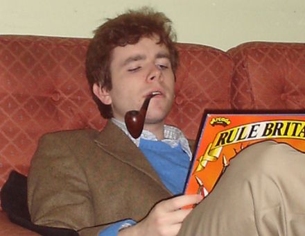
A young lass of Ulster claims I look “adorably marriageble” in this photograph.

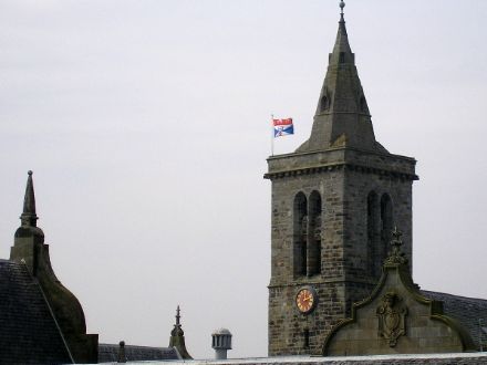
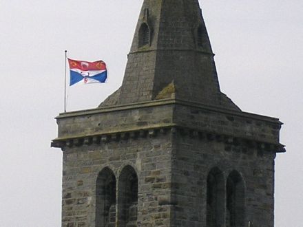
Owing to the recent installation of the new Chancellor the University’s heraldic banner snapped proudly from the tower of St. Salvator’s Chapel. Sadly, the flying of this flag is a rare occurence, though I understand that heraldic banners ought properly to be of the proportions 1:1, whereas this one looks more like 3:4 or thereabouts.

Published at 6:43 pm on Sunday 23 April 2006. Categories: Photos St Andrews.
Search
Instagram: @andcusack
Click here for my Instagram photos.Most Recent Posts
- Teutonic Takeover March 10, 2025
- Katalin Bánffy-Jelen, R.I.P. March 3, 2025
- Substack Cusackiensis March 3, 2025
- In the Courts of the Lord February 13, 2025
- American Exuberant February 10, 2025
Most Recent Comments
Book Wishlist
Monthly Archives
Categories
Home | About | Contact | Paginated Index | Twitter | Facebook | RSS/Atom Feed
andrewcusack.com | © Andrew Cusack 2004-present (Unless otherwise stated)


I just wanted to say thank you for a wonderful website. As a Canadian considering attending St. Andrews in September, I truly thank you for your wonderful insight!
Cheers.
Misproportioned or not, I much prefer the University flag to the rather slipshod effort that is the United College flag. For some reason this particular article takes the form of a shiled on a flag, which results in a surfeit of white around the edges. Most unpleasant.
Splendid!
You better snap her up because everyone else will be thinking you look like their dad.