
About Andrew Cusack
 Writer, web designer, etc.; born in New York; educated in Argentina, Scotland, and South Africa; now based in London.
 read more
News
Blogs
Reviews & Periodicals
Arts & Design
World
France
Mitteleuropa
Knickerbockers
Argentina
The Levant
Africa
Cape of Good Hope
Netherlands
Scandinavia
Québec
India
Muscovy
Germany
Academica
Lions and Torches and Trees (Oh My!)
Or, What £40,000 Gets You in Today’s World


A
MONG THE MANY changes which the Rt. Hon. David Cameron MP has wrought in his ten months as leader of the Conservatives one of the most public is the change of the party’s emblem. The flaming torch is out and the solid oak is in, at a cost of £40,000 to Conservative Central Office (according to the Times). There are three slightly different designs of the tree for the UK-wide, Scottish, and Welsh parties. Previously, the national party used the ‘flaming torch of liberty’ logo while the Scottish party used a blue lion rampant and Wales had its rather comely red-white-and-blue dragon with fire pouring forth from its mouth. The former logo was the ‘flaming torch of liberty’, which only entered into usage in the 1980’s under Mrs. Thatcher. In its place, we find instead an oak tree with healthy greenery on its limbs and a trunk made out in the traditional Tory blue.

The old torch logo, or ‘the flaming ice cream cone’ as it was often known.
Having taken a little while to consider the new logo, I’m still of two minds about it. I prefer the solid, organic tree to the transient, somewhat clinical torch but I confess I’m going to miss the old lion rampant. Certainly the last particular incarnation of the blue lion left something to be desired — it looked as if it was floating into a red cartoon doorway — but its heradic nature was appealing. Also, it seems wise to have a properly seperate logo for the Scottish Conservative and Unionist Party, not just a different version of the same logo. Considering the Unionists were the dominant party in Scotland for much of the twentieth century until the 1965 unification with the Conservatives, perhaps the merger was a mistake. (Even if that was not a mistake, severing the Scottish party’s current links with the national party is an idea well worth considering).

The UK-wide, Welsh, and Scottish Tory trees.
Anyhow, perhaps this would be a good time to examine the various logos, emblems, and insignia by which we have known the Scottish Conservatives. At this point I should admit I was unable to find a suitable example of the ‘swish’ which was used for a little while in the 2000’s. In first year, I had a massive ‘Vote Scottish Conservatives’ sign (featuring the swish) which nearly covered an entire wall in my room in University Hall. Matt Gorrie, Jon Roberts, and myself had liberated it from the back garden of James North,(Scottish Conservative and Unionist candidate for Central Fife in the Scottish Parliament election of 2003) one night and paraded it around town until we realized that everyone was in bed and that we ought to be as well.
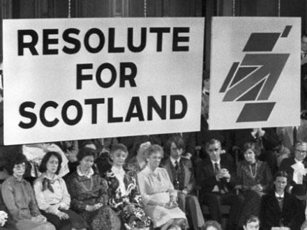
The flag-arrow-map design on display at the 1975 conference of the Scottish Conservative and Unionist Party.
| The earliest specific logo I could find for the Scottish Conservatives is this series of shapes. The symbolism is three-fold. First, in the center is a corner of the Union Flag. Second, this corner takes the form of an upward-moving arrow. Thirdly, the shapes are arranged to look like a stylized map of Scotland. | 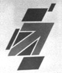 |
| Second we find the Scottish logo of the 1990’s, a stylized blue lion rampant with a red ribbon. It looked like a lion in the rain, but also brought Peugeot to mind. | 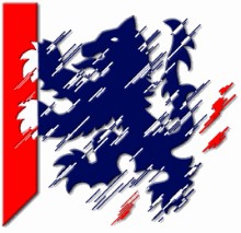 |
| Third is the destylized incarnation of the lion-and-ribbon motif of the millennium. While displaying an admirable simplicity, it still lacks something. | 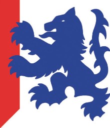 |
| Finally, the brand spanking new Tory tree, given a slightly different shape and form for use in Scotland. Solid and natural, but there’s nothing particularly Scottish about it, and that’s a shame for which, despite current doldrums, has a long and storied legacy in the past two centuries of Scottish history. |  |
Elsewhere: Blue and green tree logo set to replace Tory torch | Scottish and Welsh logos revealed | “That blue thing with red flames”
Search
Instagram: @andcusack
Click here for my Instagram photos.Most Recent Posts
- Sag Harbor Cinema March 26, 2025
- Teutonic Takeover March 10, 2025
- Katalin Bánffy-Jelen, R.I.P. March 3, 2025
- Substack Cusackiensis March 3, 2025
- In the Courts of the Lord February 13, 2025
Most Recent Comments
Book Wishlist
Monthly Archives
Categories

Why not a stylized thistle?