About Andrew Cusack
 Writer, web designer, etc.; born in New York; educated in Argentina, Scotland, and South Africa; now based in London.
 read more
News
Blogs
Reviews & Periodicals
Arts & Design
World
France
Mitteleuropa
Knickerbockers
Argentina
The Levant
Africa
Cape of Good Hope
Netherlands
Scandinavia
Québec
India
Muscovy
Germany
Academica
The Vicious Carbuncle of Brooklyn

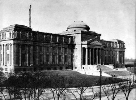
The Brooklyn Museum ought to be ashamed of itself. Though frequently overshadowed by its civic compatriot, the world-class Metropolitan Museum of Art in Central Park, this institution in Brooklyn’s Prospect Park is still considered one of the best museums in the United States. Its overall design was the work of the renowned McKim, Mead, and White who planned a sprawling beaux-arts palace for what was then known as the Brooklyn Insitute of Arts and Sciences. Their own illustration of the final design can be seen above and below (click the below image for a larger version).

The plan, of course, featured a lofty classical staircase leading to a grand main entrance; an aspect practically considered a requirement at the time for an institution of such importance. The photograph below from the 1920’s shows the furthest extent to which the Brooklyn Museum realised the McKim, Mead, and White plan.

In 1930, in a fit of egalitarian pique, the Museum demolished and removed the grand staircase. The idea was to make the Museum more “democratic”; no doubt the word today would be “accessible” or perhaps even the dreaded “relevant”.

“That atrocity preceded by 30 years the destruction of Penn Station,” writes James Gardner of the New York Sun, “and, though little spoken of these days, was scarcely less corrosive in its consequence.” I was glad then when three or four years ago the word on the street was that the Brooklyn Museum was restoring the staircase. I was to be much disappointed, however, as nothing could have been further from the truth.

This was to be no restoration, but instead a dreaded addition. A vicious carbuncle was plonked onto the façade of the Brooklyn Museum. Shorn of its grand staircase the building looked as if it was missing something yet, like the Emperor Charles exiled to Madeira, in spite of its loss it managed to maintain an air of dignity.
“The entire point and logic of the original plan of 1897,” Gardner continues, “was that entry into the House of Art required ascent. With the abolition of the stairs, we were condemned to descend into the museum, and no array of glass or planters or fountains in the new plan […] can efface the fact that we are entering through the basement.” The visitor now passes through this 15,000 sq ft barnacle of trendy glass and steel, pays admission, and continues on to the main lobby, “its granite cladding stripped away, somewhat pretentiously, to the level of bare brick in an ostentatious display of fake honesty”.
It all seems a bit immature for an institution over a century old, and we all know the only reason they can get away with it is because they’re in Brooklyn. If the Met tried this sort of nonsense, no one would have it. Half the dainty ladies of the Upper East Side had a fit when they merely added the long water fountains flanking the main entrance to the Metropolitan, and again had a fit last year when it looked like the fountains might be removed (a false alarm). Still the Brooklyn Museum should be ashamed. I had never been to the Brooklyn Museum and when I was under the impression that the staircase would be restored I convinced myself to wait until it was finished to pay a visit. Discovering this most unfelicitous fault, I doubt I will ever bring myself to pay an admission fee.

Search
Instagram: @andcusack
Click here for my Instagram photos.Most Recent Posts
- Teutonic Takeover March 10, 2025
- Katalin Bánffy-Jelen, R.I.P. March 3, 2025
- Substack Cusackiensis March 3, 2025
- In the Courts of the Lord February 13, 2025
- American Exuberant February 10, 2025
Most Recent Comments
Book Wishlist
Monthly Archives
Categories


Try visiting the site. You might be impressed by the experience you get.
Architecture is not meant to be felt… understood through the photos on a piece of paper or an LCD panel. Architecture should enrapture your senses… stir your emotions and angers through your own physical involvement with it. How can you understand the power of a work from a photo? It is impossible.
It gets worse … go around to the back of the Museum and look at what some architect designed, and what some board approved as an addition at the rear. Plain concrete walls that shout “why was I built?”
I think that you should go there and experience the space for yourself before you say something like this. I,ve been there and i think it’s quite nice. The pavilion reflects the original plan of the staircase so i think that the architect is not really disrespecting the building. He also made it seem invisible so yiu can still see the mother building behind it.
I agree with some of your review but one thing in it bespeaks a need for this renovation. You never visited it! And many like you the same. There was need to build up attendance. You know the old saying,’more people go to zoos… ” This was made to excite the senses to bring people in, what ever happens after that, well they are on their own.
However, that being said, I have a deep criticism in what the architects neglected to save. They truncated those gorgeous pillars by blocking their bases, something they could have avoided by being sensitive to what the viewer would see in driving by or walking by. I can’t forgive them for that. I have not been in the museum since the addition. And therefore, the jury being out all this time, I have finally registered a verdict but not as excoriating as yours. There has been a marriage of classic and contemporary going on for quite a while in some noteworthy places like Soldier’s Field and the Louvre. As far as this not happening in Manhattan, i think you are wrong. They don’t need to do anything to the Metropolitan Museum of Art. The outside entry and stairs always give me chills and they are good chills in that. It’s nearly perfect. The attendance there is probably higher in one day than the Brooklyn Museum’s is in a month. Here and there in the Met, there are some little additions that launched without too much outcry. Not all asthetically pleasing. And Manhattan has a sloppyville of its own and I cringe everrytime some new building goes up. Will it be in harmony with its surroundings. I didn’t know about the original staircase at the Brooklyn Museum. It’s sad to think it was taken down, What were they thinking? Stairs are very important to buildings, their ascent to its front porch. But porches and stairs have gone the way of the dinosaurs. The architect thinks about ways to move people in and sometimes that’s too much of a price to pay. One last note. I think they enter through the basement at the Louvre too.
EF
I almost always agree with you, actually i always agree with you and i love your blog but i must say that i visited this museum lately and it’s not bad. it’s not as inspiring as the original, but it is certainly better than it was most recently. and as for the back of the building, absolutely disgusting!
Not sure anyone will ever see this but here we go. It’s not mentioned in this article that my museum (I live in the neighborhood) is only one sixth completed. No architect approved the horrid back-side of the building. That is essentially the dead end of where the building process ran out of cash. For what it is,…well I guess it could be worse (not much though). The grandiose plans of the 1890’s called for the largest museum in the world. Plans changed. I do agree that MAYBE they should have put the cash into the rear of the building, but at that point the damage was already done by taking out the stairs. That is where they messed up, NOT with the glass front. Some visitors from the neighborhood like it, some don’t. You can please some of the people sometimes,…